
Ecommerce Optimization: 27 Examples of High Converting Product Pages
This post originally appeared on the Talia Wolf CRO blog.
A common request I get on new Ecommerce optimization projects is to improve performance of their homepage because of the amount of traffic they get on it. Since many E-commerce sites have many different products for various target audiences, their main concern is usually how to appeal to various potential customers on that singular page.
While the homepage may attract a lot more traffic to it than any other page on their site, it isn’t the case when it comes to conversions. A recent study shows that the average conversion rate of shoppers landing on the homepage is less than 2.5% (Monetate), significantly lower than shoppers who land on individual product pages.
In fact, during 2016 we consistently observed more and more shoppers skipping the “front door” (the homepage) and landing directly on product pages. Due to long tail search and dedicated posts or ads on social media for specific products, traffic to product pages has gone up and so has their conversion rate.
A recent study by Conversio found among the 2,687 stores surveyed, that the average product page conversion rate is 7.91%. This research easily proves what we’ve been seeing for our clients: those who land on specific product pages are far more likely to convert. This isn’t to say you shouldn’t optimize your homepage, but rather it’s a wakeup call to put a lot more emphasis on optimizing your product pages and perhaps to spend more time on promoting specific products vs. the entire site.
Your #ecommerce product pages are worth a lot more than your homepage. Here’s how to optimize them:The intent of a visitor that lands on a specific product page is usually higher than those on the homepage, and it is our job to do everything we can to help that potential customer complete that purchase by addressing their concerns and providing all the information they need to make their decision.
And that’s what we’re going to do today–discuss all the ways you can optimize your product pages to provide the experience your potential customers are looking for and to increase your conversion rates. Let’s take a look at some of the most important elements that each product page should optimize and then critique some product pages of some of the most well known ecommerce shops.
10 Rules for High Converting Product Pages
#1 Image Optimization
It is a well known fact that our brains process visuals far faster than text, and it is often said that 2/3 (60%+) of the brain is involved in vision. In fact, it only takes us 150 milliseconds to process a symbol and 100ms to attach a meaning to it (FIAS). Since our brains are overloaded with information and messages, some believe as high as 4000-10,000 messages a day(Red Crow Marketing), visuals help us analyze context better. The way things are presented to us have a huge affect on our decision making process. Here are a few ways to optimize your product page visuals:
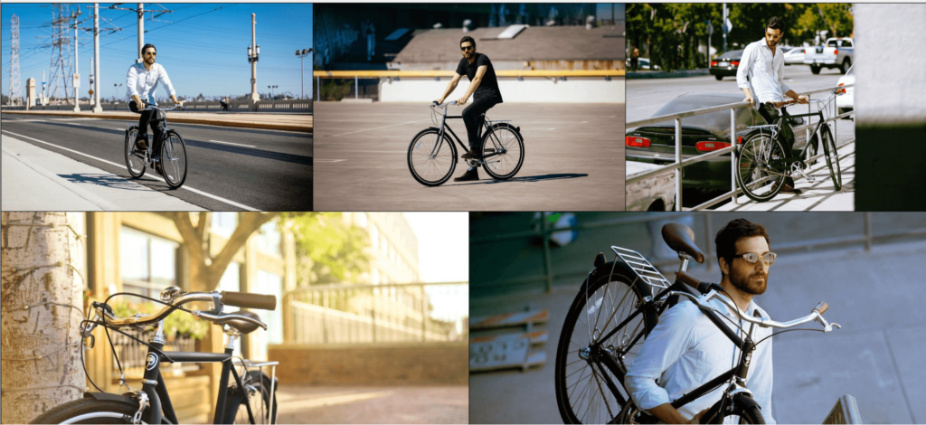
1. Other than showcasing the actual product, add a visual of someone using or wearing it. These type of images help people envision themselves using or wearing the products and give them a sense of what the final product will look like on them. These type of images also provide more clarity in terms of size.
2. To reduce noise and increase clarity, especially if you have a “noisy” or complex-looking product, consider adding more whitespace around the image. Whitespace helps the eye focus on the important elements and eliminates any distractions. Another option is to completely remove the borders of the image like done below:

3. For details, make sure to allow a zoom feature and consider adding an everyday object around your product to better represent its size.
#2 Product Information and Overviews
Back in 2008, Nielsen & Norman group found that most website visitors read only 28% of a site’s content. Contrary to popular belief, I’ve seen from many A/B tests that this isn’t because people don’t read. Most experts like to say people don’t read which is why you should reduce your amount words or “try and say it” with 2 words only. However, I’ve learned that the reason people only read this little is because we, as marketers we don’t give them a reason to.
Most of the content on websites, product pages included, focus on a product, its features and pricing, technical information meant to “sell” you on the service or product while what shoppers are really looking for is the value or what’s in it for them. In order to do that, you need to change your content from “about the product” to “about the customer”. How will this product make a meaningful impact on their life or work?
Poor or missing content on product pages can affect sales, brand trust levels and retention rates.…In their latest research, Shotfarm found that poor or missing content on product pages can affect sales, brand trust levels and retention rates. “Detailed product descriptions ranked first in regards to a consumer’s decision to make a purchase, higher than reviews (second place) and price (third place).”
How to optimize your product descriptions:
- Add personal comments and suggestions for using the product – how can the shopper get better value by using this product? Perhaps wearing it in a certain way, adding an accessory to it? Examples include:
- “This dress goes great with black sandals or blue navy high heels”
- “Grandmothers love these as a birthday present”
- “Also works great with the PlayStation 4”.
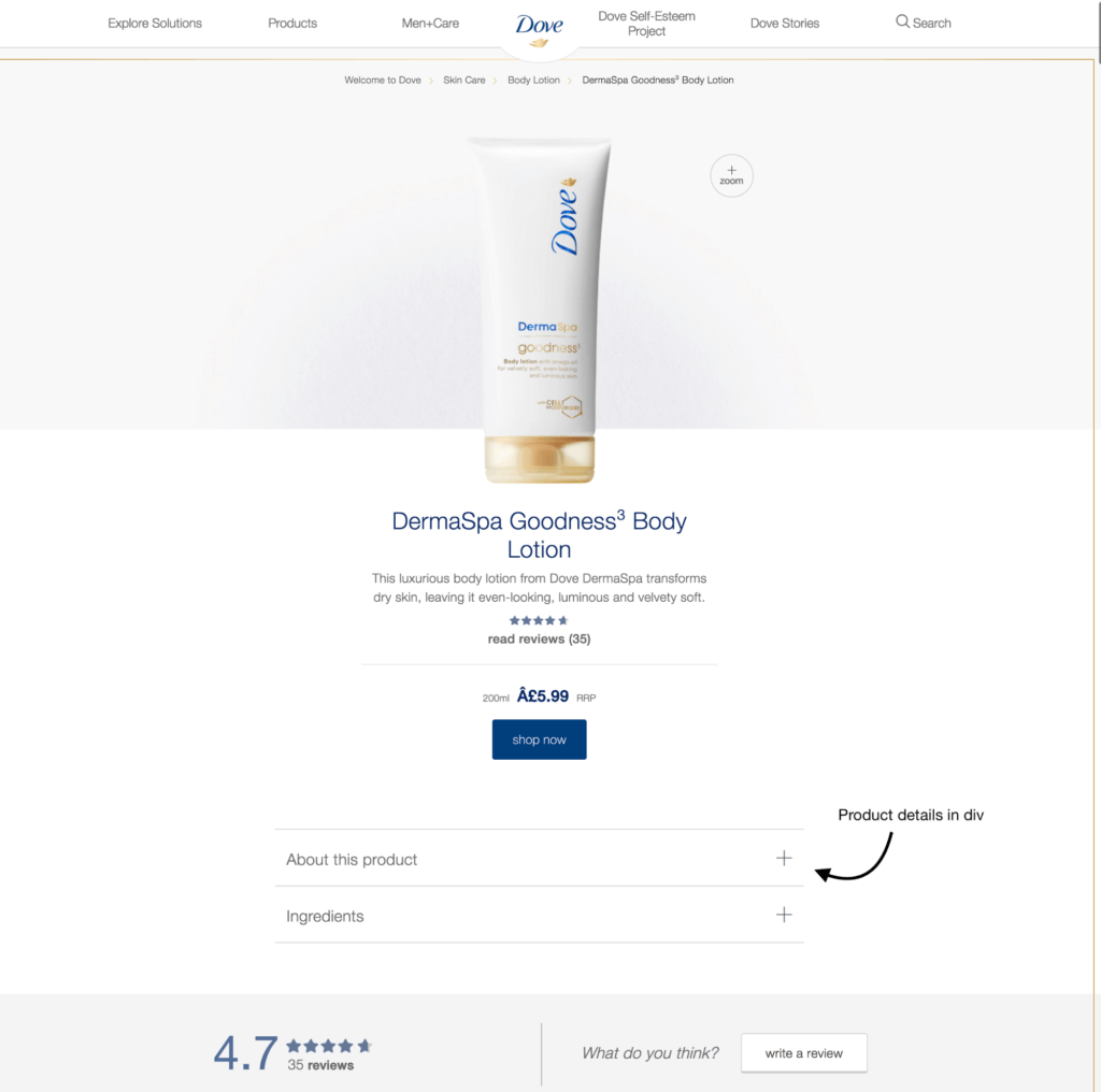
- Consider having the information in drop down menus, tabs or closed “div”s that allow you to write more content. This way you don’t crowd the page and people will only see the information when they click on it. Another option that will allow for easier consumption of the content is having it in bullet points rather than a paragraph of text which can be hard to take in as seen below by Dove:

#3 Optimizing size tables
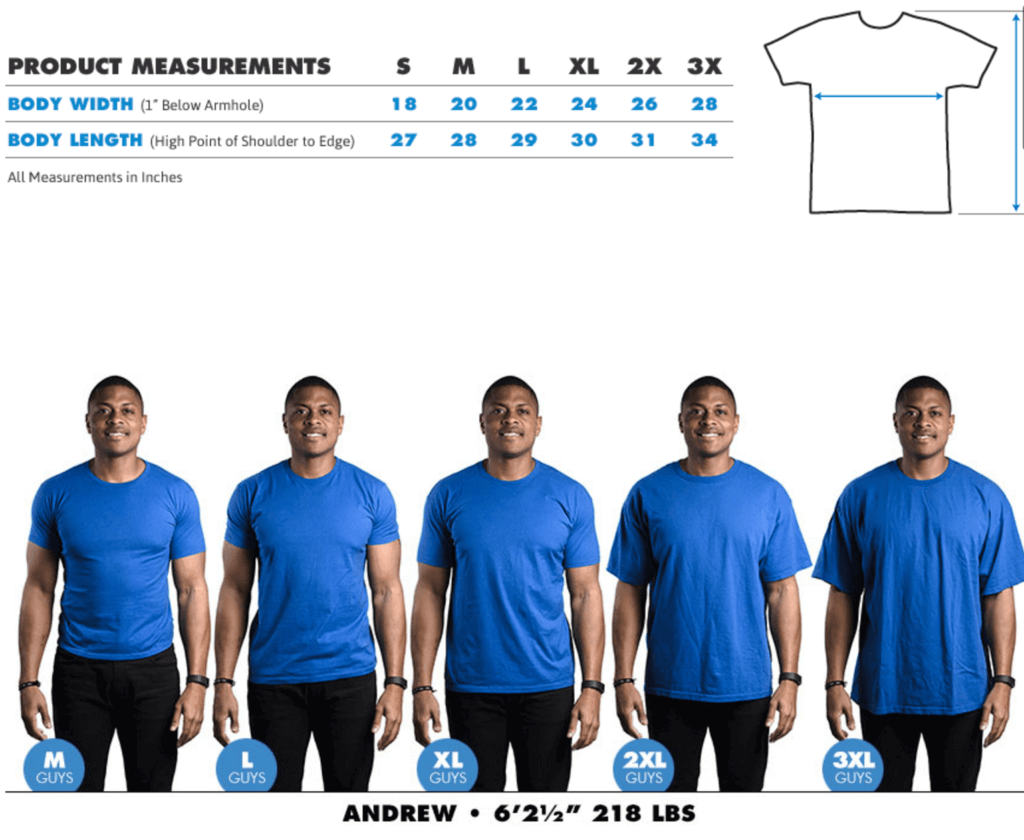
When it comes to purchasing products by size and a certain fit, many shoppers fear ordering the wrong size or in cases of fashion products, what it will look on them. One of the best ways to address this concern is by providing visual aids to your customers. A fantastic example can be seen by Bustedtees which allows you to find a person who has a similar body type to yours and visualize what it will look like on you.

*Important tip: Don’t forget to always have your size chart open in either a new tab or a pop up on the page.
#4 Personalization via Localization
Most Ecommerce sites have shoppers from around the world. These types of shoppers have not only the challenge of choosing a product, but are later bothered with additional choices they need to make before checking out, such as type of shipping and currency.
Since our brains are overloaded with information, our goal as optimizers is to reduce the amount of choices a shopper needs to make and eliminate as much friction and barriers as possible to help them make their way swiftly to the checkout page. Personalization in the form of localization is a great way to go:
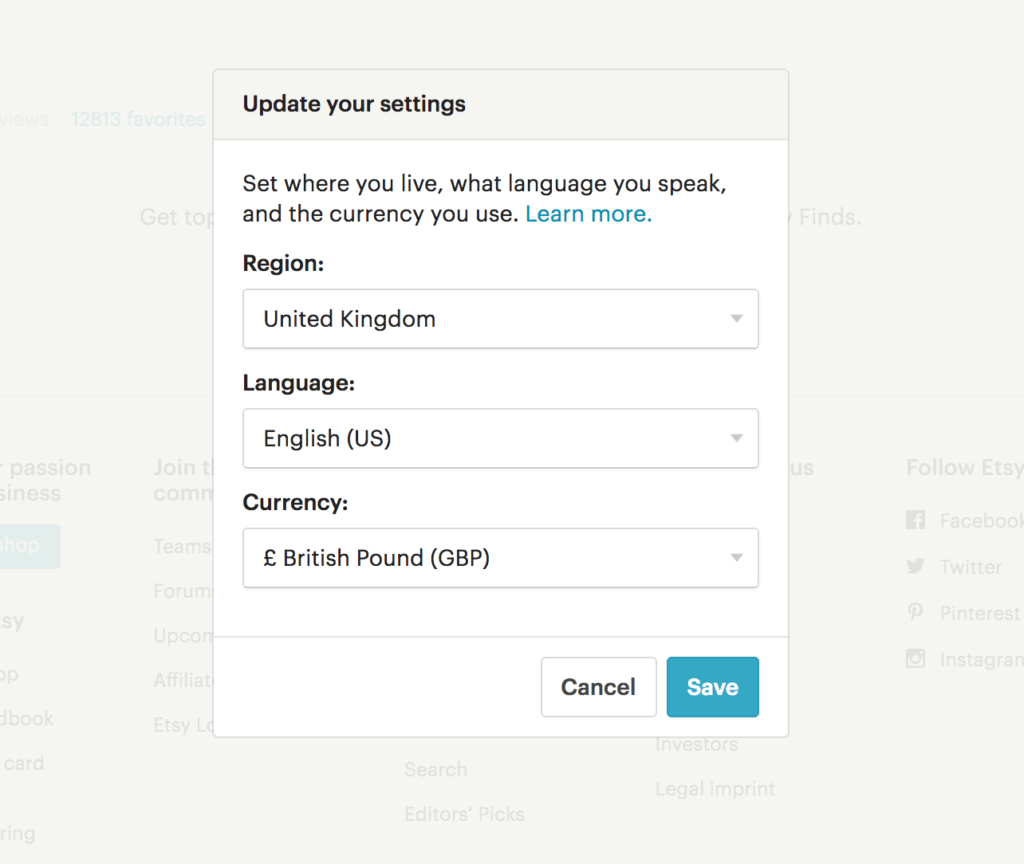
- Currency converter: Using the $ as your main currency may be good for you, but many shoppers may find it confusing and worrying as they won’t know the final price. A great way to tackle this is by adding a currency converter which allows shoppers to choose their preferable currency, or by adding a plugin on your shop that detects the shopper’s location and offers to switch currencies for them. Both Etsy and Macy’s do a great job with this:


#5 Optimizing Usability
There are many different tweaks and changes you can make to your product page that will improve usability, increase clarity and optimize the overall shopping experience. For example:
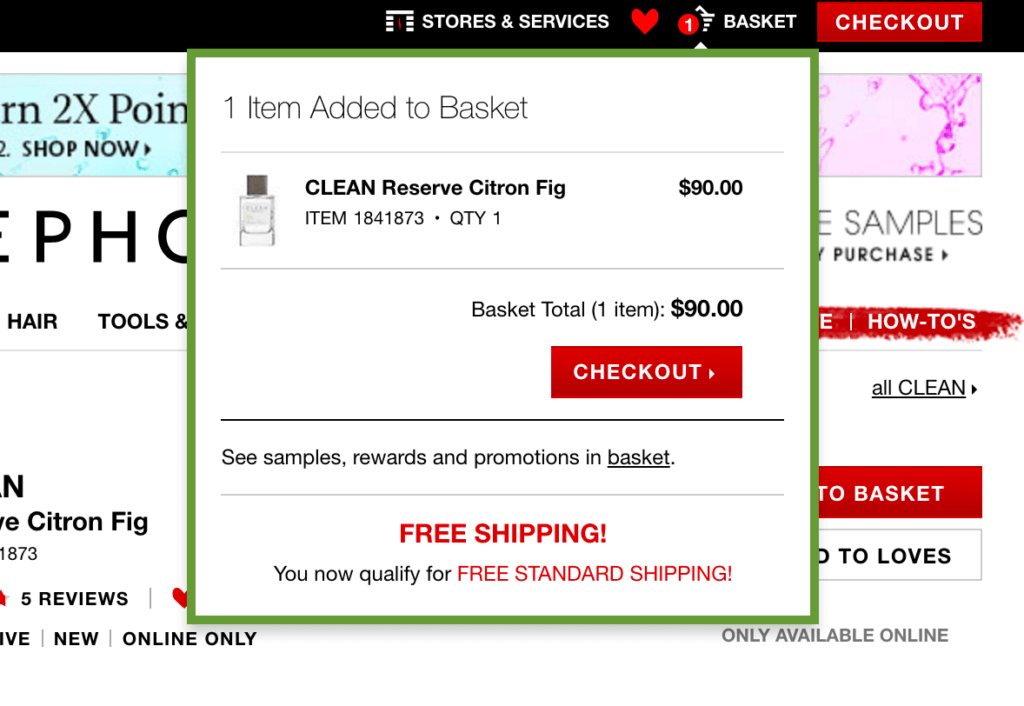
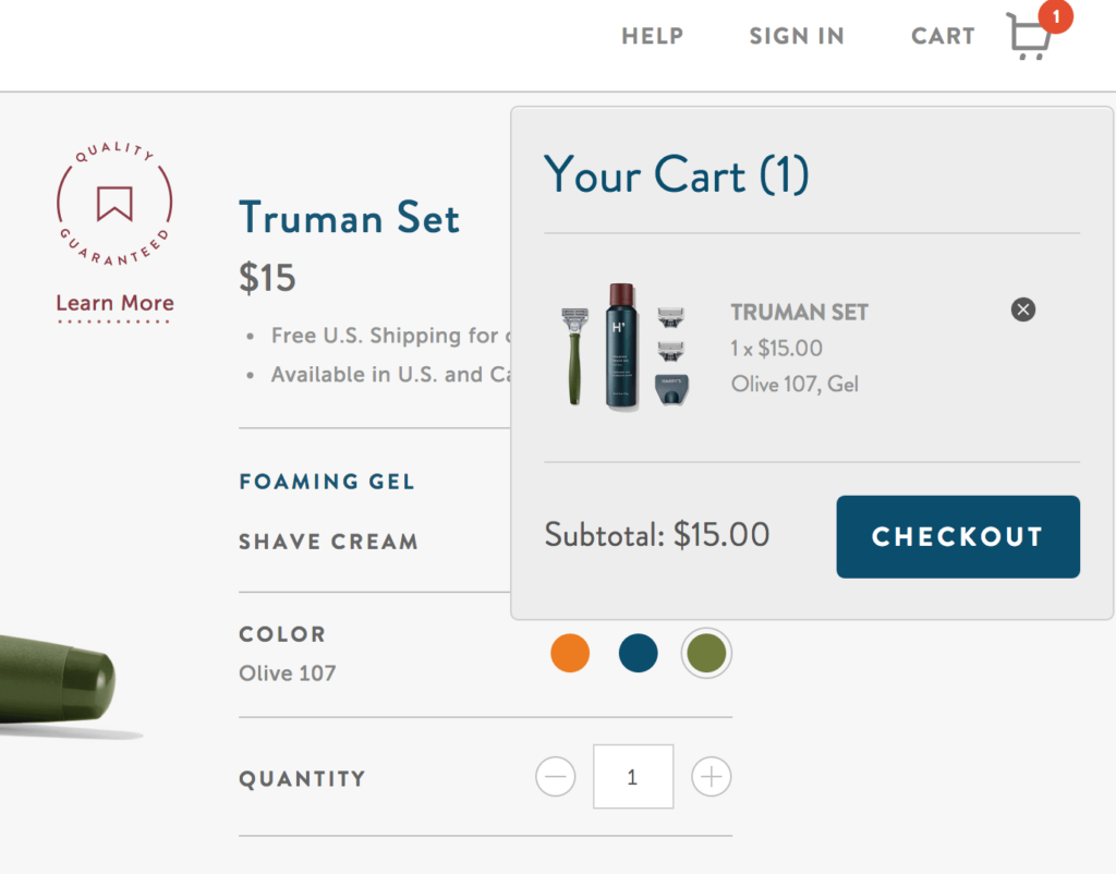
- For quick checkout, show an “added to cart” notification. This will give shoppers the opportunity to immediately check out and provide additional clarity as to what happened to the item they just chose. An example by Sephora can be seen below, a quick notification to let you know your item has been saved to your basket and a clear CTA inviting you to checkout immediately.


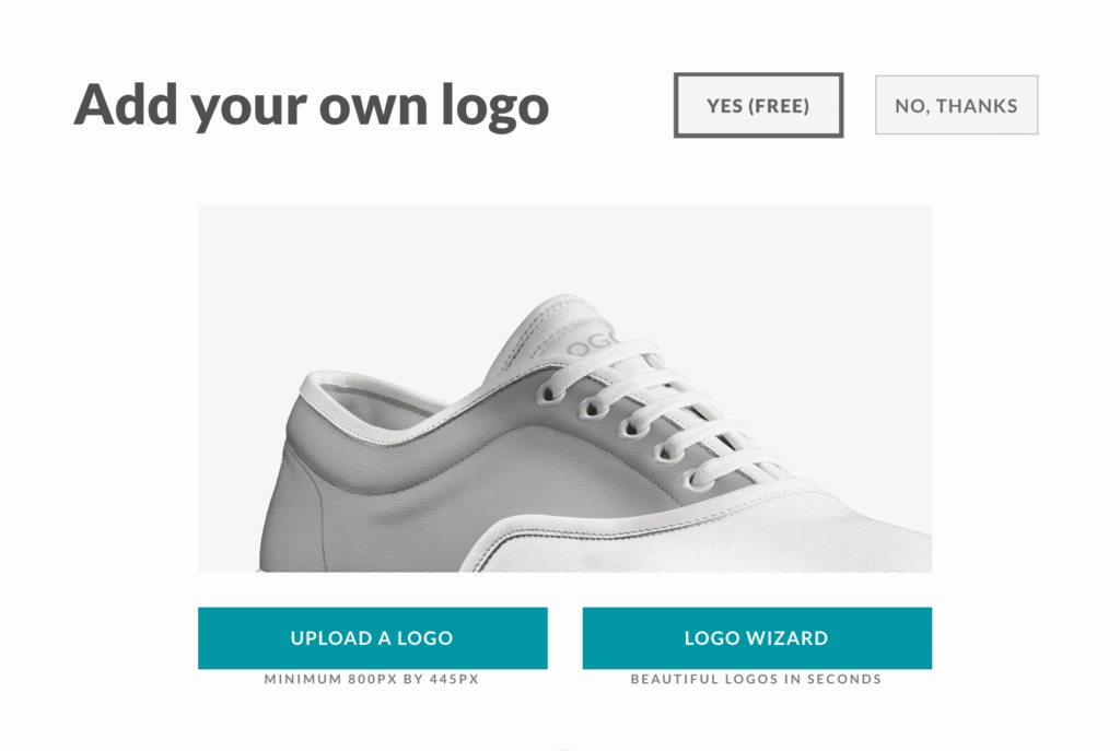

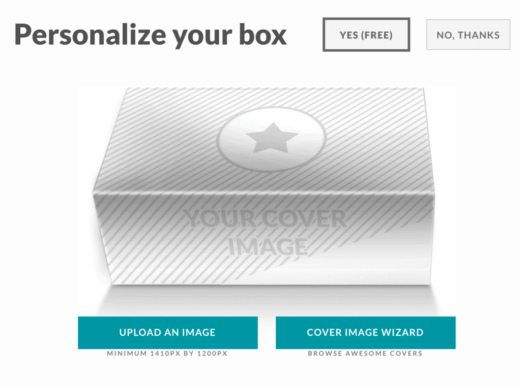
Or to personalize the box the shoes come in:


#6 Optimizing Call to Action Buttons
The call to action buttons on product pages have a large influence on the product’s success. This isn’t a matter of what color the button is but it’s location on the page and copy.
It’s important that the call to action button stands out, is in a prominent area and is the main focus of the page. You can make it the main focal point of the page and the first natural place the eye looks at by using lots of whitespace and using a color that stands out. The color of your CTA button should be the same throughout the entire site, making it easy for your visitor to immediately recognize the call to action button on every single page.
Words matter as well. While most online shops settle for a “buy now” or “add to cart” button, there are many other ways to trigger people into action.
4 Rules for Call to Action Buttons that Convert
- Have one goal → ask for one thing only (e.g – “add to cart” and not “add to cart and checkout”)
- Make them attention grabbing→ use color, size, whitespace and placement on the page.
- Make them actionable → driving people to take action.
- State the bottom line → Let people know exactly what will happen when they click (or tap on) that button.
Three Tested Formulas for Writing Call to Action Buttons:
#1 What + Why:
I’d like to what because I want to why:
I want to… “DONATE NOW TO SAVE A HUNGRY CHILD”
I want to… “BUY NOW AND SAVE 20%”
—–
#2 “I Want To”:
This is said by the customer about himself or herself:
“I want to… GET THIS DEAL”
“I want to… ADD THIS TO MY CART”
—–
#3 I Want You To:
This is said by the customer to the store. For example:
I want you to “SHOW ME THE LATEST DEALS”
I want you to… “TAKE ME TO CHECKOUT”
#7 Optimizing Trust
Simply put, in order to get people to spend money on your site they must feel safe and secure in doing so. There are many ways to increase trust on your product pages and put shoppers at ease:
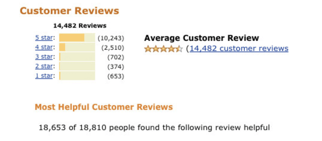
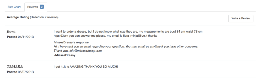
1. Optimizing Reviews – 88% of consumers say that they trust online reviews as much as personal recommendations (BrightLocal). Make sure to add a review section on each product page, if you don’t have one already, and to ask past customers to write reviews of your products. Don’t be afraid to feature reviews that also contain complaints as not all products can be perfect, and featuring reviews with minor complaints can increase trust even more.

Here’s an example of a review including a concern, displaying it allows the store to put the customer at ease and perhaps address a concern many other shoppers have but do not feel comfortable asking:

2. Trust Seals – Another very well known strategy is using trust seals and icons of well known brands on your product page. This can come in the form of payment solutions you support, any patents you have on a product or awards you’ve won.
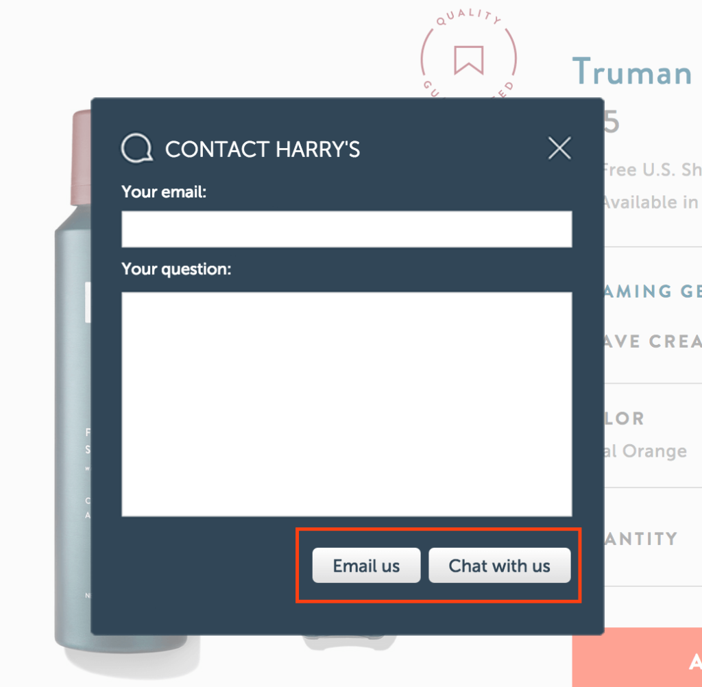
3. Chat – how helpful are you? Make sure to offer help your to your shoppers when they need it. Consider adding a chat plugin to your site or supplying an easy for people to contact you while shopping.
#8 Save For Later
While we want our customers to convert immediately, some just aren’t ready to do so on the first go (this also tends to happen when shoppers start their journey on their mobile device but prefer to purchase on a desktop or tablet). A great way to ensure they return later is by allowing them to save and purchase their items later. This will require them to subscribe so you can remember the products they save and allow you to send them personalized email reminders and other types of emails to remind them to come back.
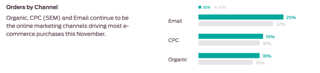
As you can see from Custora’s research, email marketing continues to be the largest channel for driving most e-commerce purchases.

#9 Optimizing Mobile
A recent study by NetElixir found that in 2016 purchases on mobile devices surpassed 30%. Though mobile activity in the 2016 holiday season caused conversions and impressions to increase fairly dramatically, people typically spend less on their mobile devices than on desktops. This happens because most websites today adopt the “out of the box” responsive design theme to address their mobile visitors. This means they design the desktop site first and then minimize all the content to fit in a mobile screen. While this is much better than the “pinch and zoom” approach, mobile visitors may arrive on Ecommerce sites and feel overwhelmed by the amount of content they see on it, have a hard time finding what they’re looking for, and leave the site. Most websites currently see over 50% of mobile traffic on their sites and in order to not miss out on all those visitors, you must start optimizing for a mobile experience. Here’s how:
- Start by analyzing mobile data. Within Google Analytics, segment your traffic to mobile only and identify who your mobile visitors are, what pages they look at, what search terms they use, what their conversion rates are, their favorite products and any other information you can collect to better understand what mobile visitors are looking for. Remember that the state of mind of a mobile shopper is very different to a desktop one as most mobile visitors are on the go or multitasking.
- Then, start prioritizing the information you need to highlight on the site for mobile visitors. Test different changes on your mobile version to see what optimizes their experience and provides them with the information they need. This may be a larger search bar, a “contact us” form, highlighted phone number people can call immediately or a highlighted address.
Once you identify what your mobile visitors need, it’s easier to supply a customer a journey that answers those needs.
#10 Using Persuasive Techniques
As mentioned, we’re overloaded with information on a daily basis which makes it very difficult for us to make decisions. The way things are presented to us has a huge affect on our decision making process which is why using different persuasive techniques can affect our customers’ purchasing decisions and increase our conversion rates. (Pssst, more on how shoppers make purchasing decisions in this article)
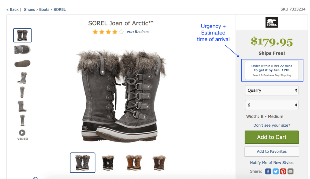
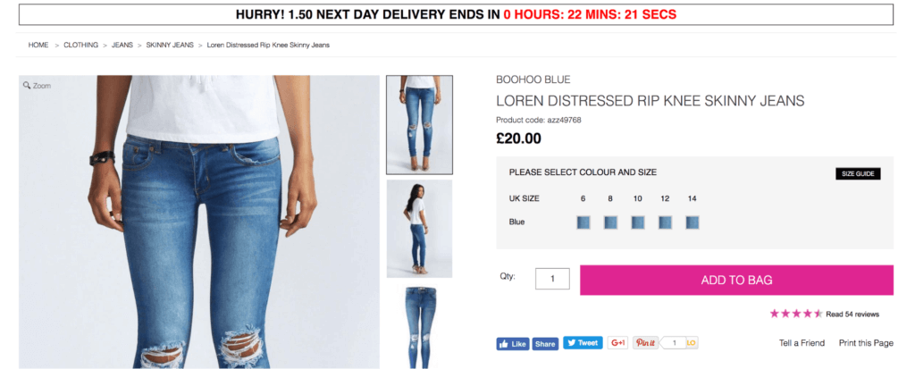
Two very well known techniques we’ve used many times on product pages are scarcity and urgency. An example for using these techniques would be to add time sensitive deals to a certain product. For example, “Sale ends tonight at midnight” or “Only 3 items left”. BustedTees, Bohoo and many other stores use a countdown timer to highlight their sales and increase urgency:

Ultimately, there are many unconscious psychological triggers that affect our decision making process. Though we love to think of ourselves as rational people who make wise decisions, most of the time our brains are affected by how things are presented to them and we later use logical explanations to rationalize our decisions. If you’d like to learn more about cognitive biases and how to use or avoid them, get your free cheat here.
5 Product Page Examples Critiqued
Two weeks ago I asked you guys to send me your favorite (and least favorite) product pages via Twitter, and as usual you did not disappoint with your great examples. Let’s take a look at some of the product pages you sent me to critique:
#1 Clarks
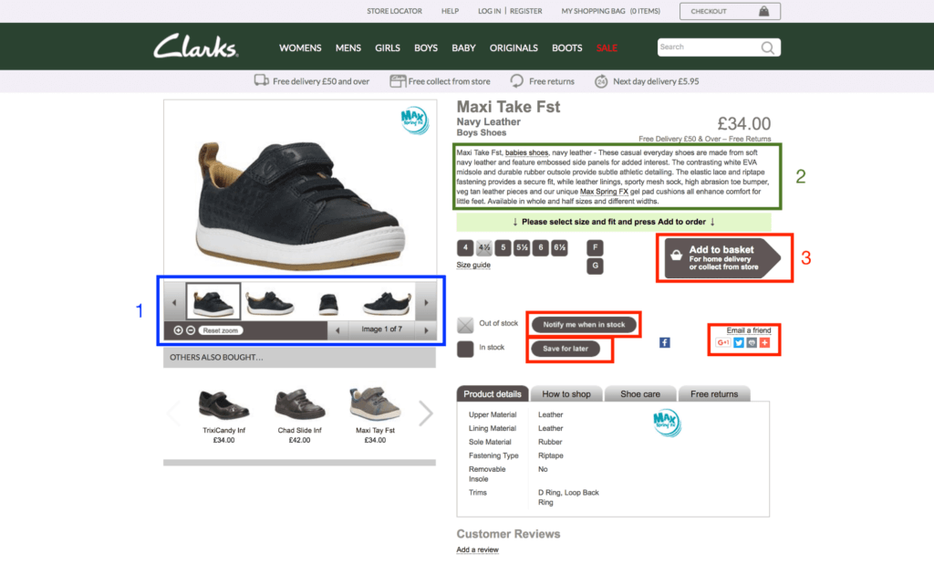

This product page is overwhelming, it has too much text, loads of icons, images and a lack of navigational cues which all make this page hard to take in and extremely hard to know what to do next. It’s incredibly important to guide our customer in a clean and clear way, so the next step is obvious. However, Clarks misses out on this in a big way, let’s discuss why:
- Product images –
- While Clarks shows photos of the shoe from every angle, there aren’t any images of people actually wearing the shoes. One of the core things we mentioned starting out is that shoppers like to see other people wearing or using the products so they can get a better understanding of how it will look and envision themselves using the product.
- In addition to this, clicking on the image itself does nothing (I expected it to open their image zoomed in) and the zoom feature doesn’t work at all.
- The most surprising element and biggest mistake, is that clicking on that blue icon (“MAX”) on the top right corner, which I’m sure many people do as it’s one of the only colors that stands out in the entire page, redirects you to a different page with a video about “MAX”. They’ve gone ahead and sent a high intent customer out of the product page to watch an irrelevant video.
- Other issues include – no whitespace, the images feel claustrophobic and they have a very heavy frame around the image section which makes it feel outdated.
- Product overview – Unfortunately Clarks has chosen to feature their entire product overview on the top right-hand corner of the page which completely overcrowds the page. The overview text is incredibly small and hard to read and they’re missing out on an opportunity to personalize the content with some suggestions or ideas for making the shoe work with the customer’s wardrobe or daily activities.
- Call to action button –
- Since they use the same colors throughout the whole product page the call to action button is practically invisible.
- The CTA itself doesn’t look like a button and has a lot of unnecessary text on it so other than adding it to your shopping cart, you’re also told you can have get home delivery or pick it up from the store. Talk about TMI!
- The product page contains many more calls to action, such as “Notify me when in stock” , “save for later” and “email a friend”. These icons stand out more than the CTA itself.
- No reviews – Not much to add here. The product page has no reviews, which could reduce trust. Though Clarks is a very well known brand, no reviews might indicate to others that this product has never been bought.
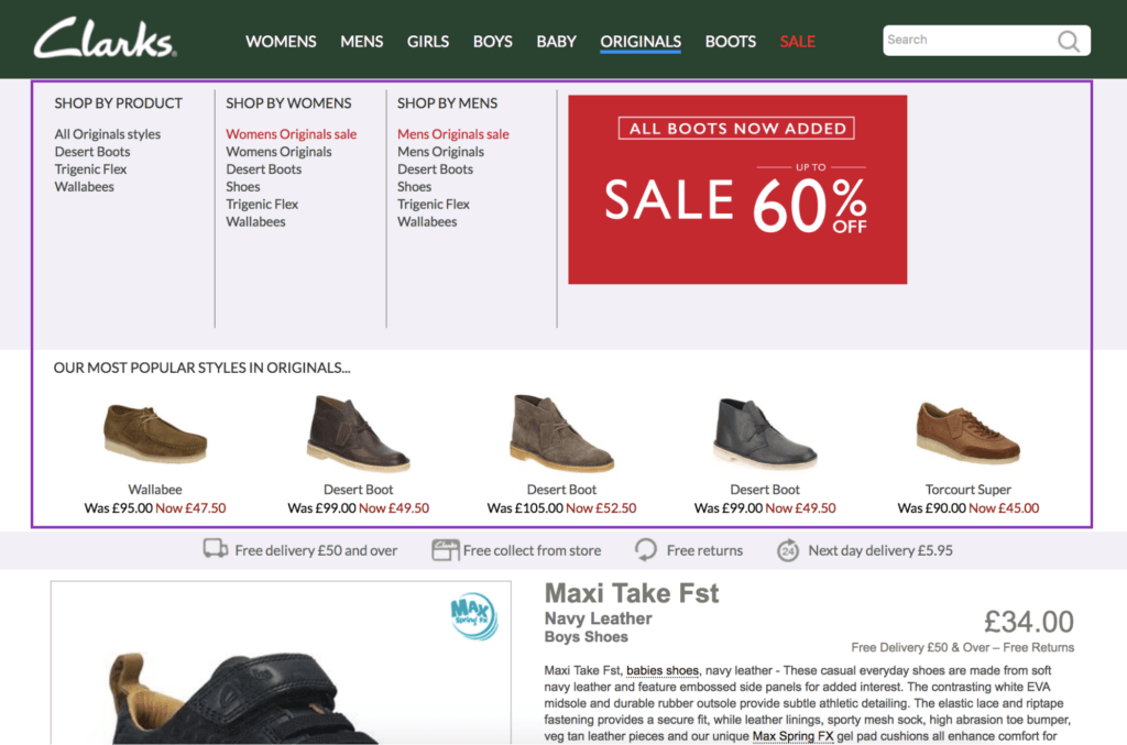
- Site navigation – every time your mouse unintentionally moves past the top nav bar, an entire colorful menu opens with sales banners and suggestions for additional products. It’s extremely distracting:

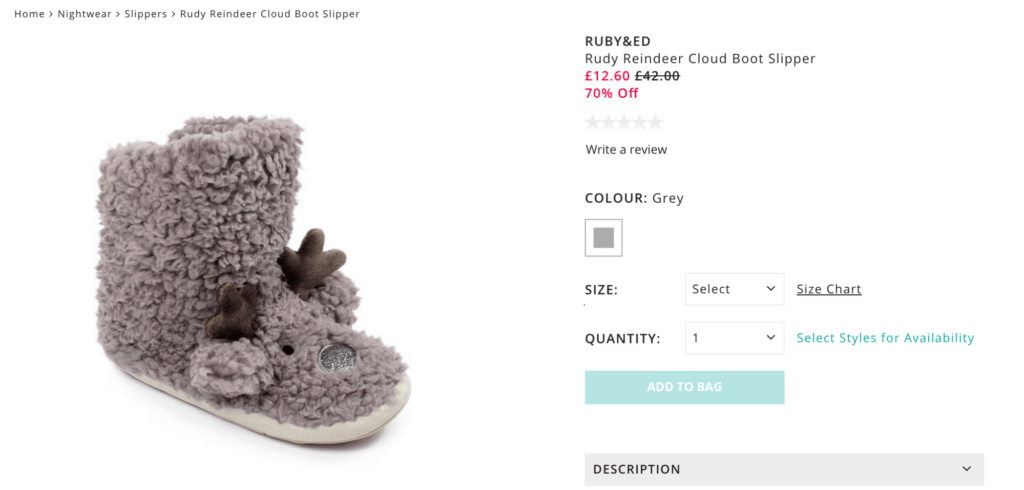
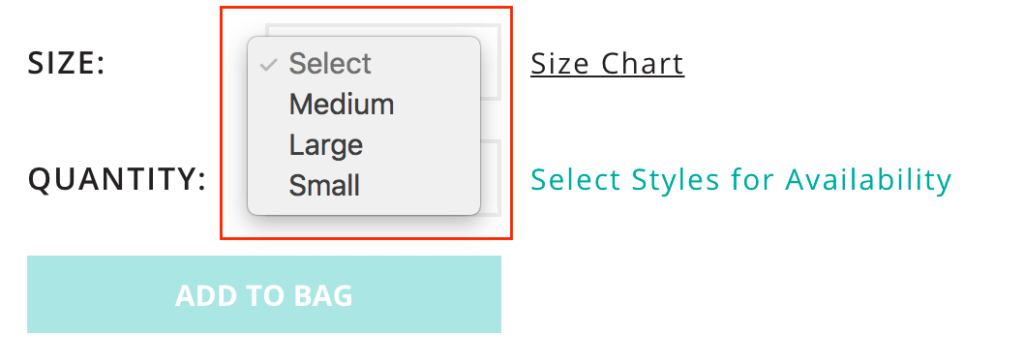
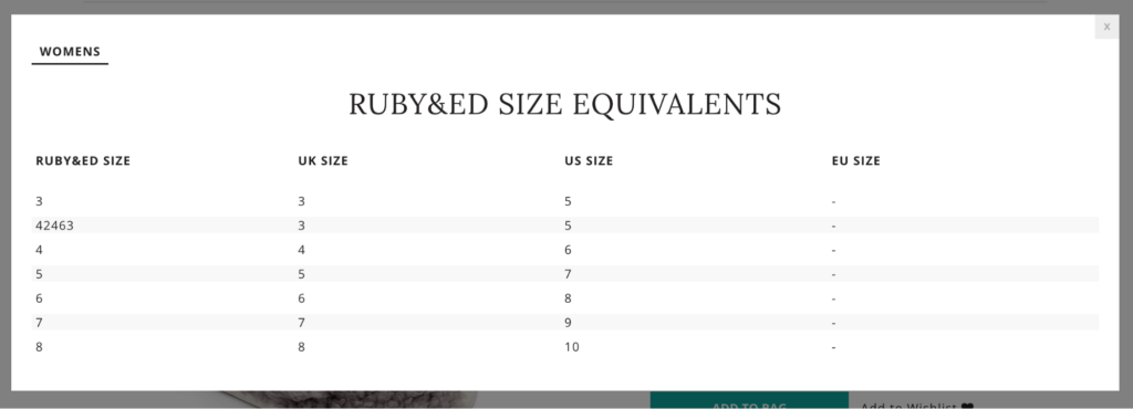
#2 Figleaves
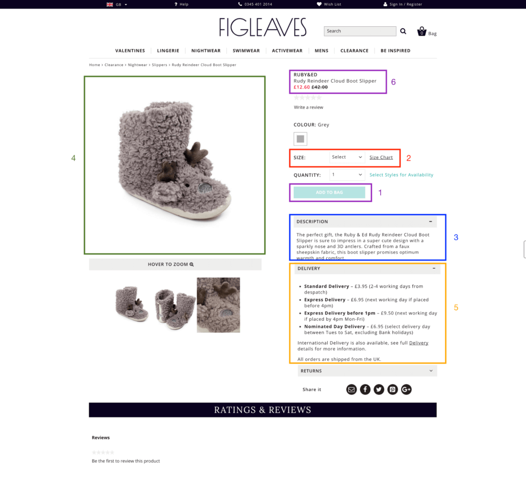

There’s lots to learn from this product page. The difference between this one and Clarks’ is pretty easy to see- you can actually take the different elements in, comprehend what’s going on the page and digest the next step quickly. Here’s a few things to note:
- CTA – The call to action is one of the first things you noticed on the page, it stands out and had one goal – “Add to Bag”. One thing I would consider is perhaps personalizing it by changing it to “Add to my bag”.
- Size Chart – This is an interesting situation. On one hand the sizes available for this product are small, medium and large, on the other hand when you click on the size chart to understand what those sizes mean, there’s no reference to those sizes at all.


#3 British Corner Shop
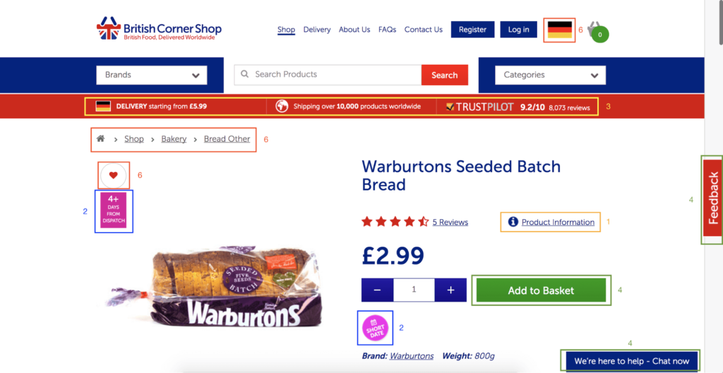

Let’s take a look at an online store that delivers British food worldwide. I found very interesting elements here:
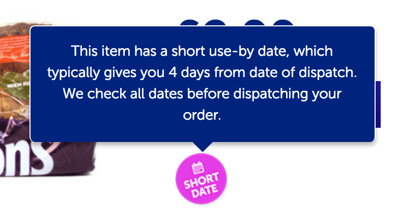
- Product Overview – One thing you’ll notice about this product page is there is no visible product overview. However, a simple click on “product information” link will scroll you all the way down to a detailed overview with all the information you need. Since this is an online grocery store, I like this idea a lot. Most people buy the same type of bread, milk or toilet paper every time and there’s no need to overcrowd the page with irrelevant information. However, one thing I would add to this detailed information section is an “Add to basket” call to action, allowing people to add the item without need to scroll all the way back to the top.
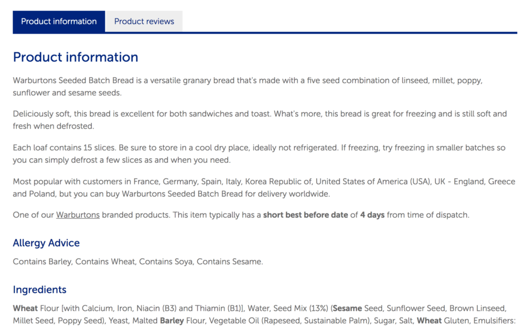


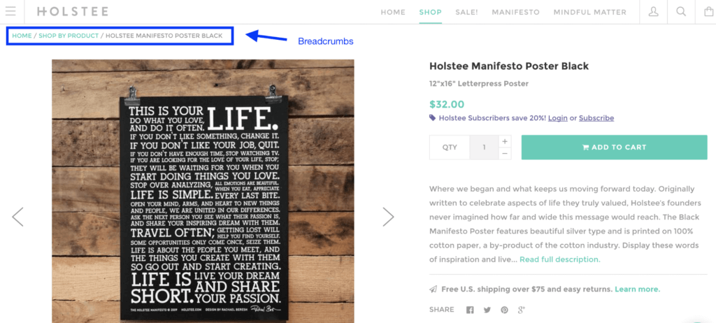
- The use of breadcrumbs, allowing you to go back to bakery goods if this type of bread isn’t what you’re looking for.
- The personalization of using your local country flag
- And the option to save items you frequently purchase by tapping the heart icon.
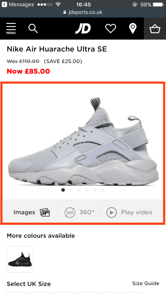
#4 JDSports
JD, one of the most popular sports retailers, offers great insights and opportunity to learn from. For this example, I’ve decided to review it on mobile:
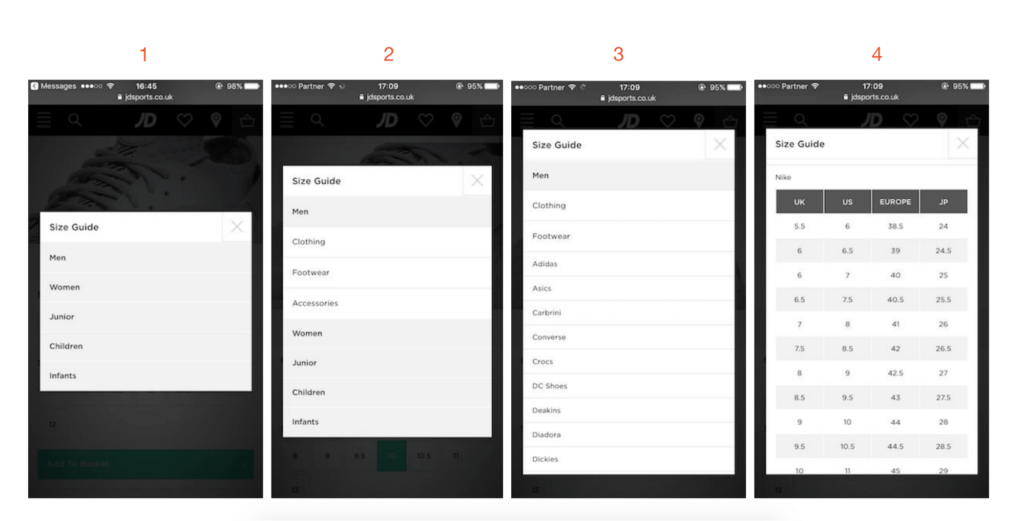
- Size guide – One of the most overwhelming surprises was their size guide. It actually requires multiple choice and navigation which is a huge barrier for shoppers. As seen below, once the customer clicks on the size guide link, there is an entire process of choosing gender, category and brand before the customer finds the relevant size chart. This is way too complicated for a shopper and appears to happen on both their desktop and mobile version. As we’ve seen in other cases, it’s pretty simple to identify the product the customer is looking at and offer the relevant chart.


- Returning visitors only
- A visitor who has spent a longer time on your site
- A visitor who’s viewed more pages than the average visitor
- Or visitors who’ve scrolled past the average scroll rate (you can find all this data in Google Analytics).
People who spend more time on your site are more likely to download the app and are less likely to remove it.
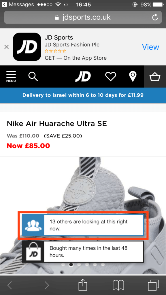
4. Persuasion techniques – One of the first things you see on the page is a notification on the product image about how many people are viewing this product in real time. While I’m never too sure if I should believe these numbers, I’ve seen it work wonders for many sites as an urgency influencer (warning shoppers they may run out of this item) and as social proof (“many people like this item and I should get it”).

5. Shipping – JD does a great job with localization, personalization and reducing any uncertainties about shipping price and expected time of delivery. The one thing I would consider is helping the shopper one step further and calculating the final price for them.
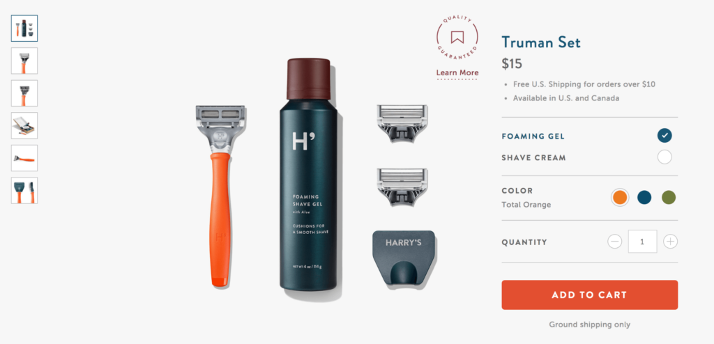
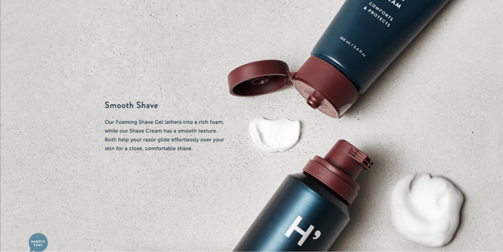
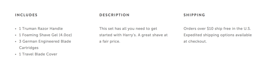
#5 Harry’s

This is probably one of my favorite product product pages yet as there are many small details they have taken into consideration which make the experience much more easy, fun and memorable:
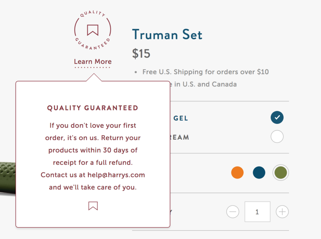
- Trust -One of the first things you’ll notice on their product page is the trust seal “Quality Guaranteed”. A quick click on it will show a small notification regarding the option to return the products within 30 days for a full refund. This is a brilliant way to reduce concerns for new shoppers and also highlight the quality of your customer service. The icon of a trust seal is something that works very well even without clicking on it, it increases trust and the credibility of your business.


#5 Pure Cycles
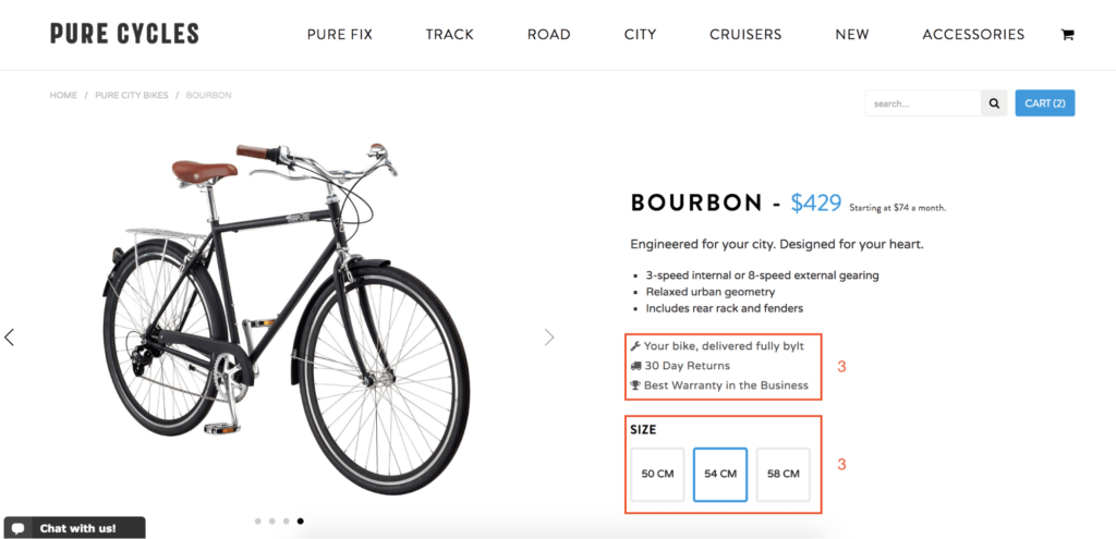

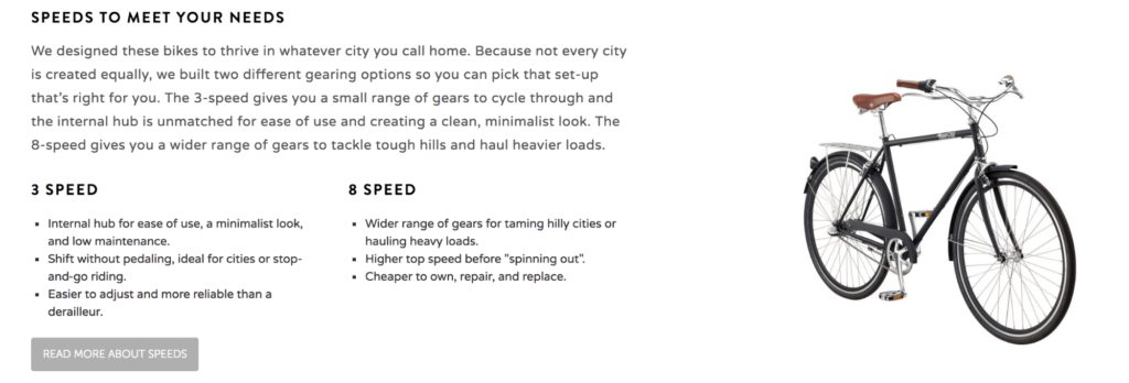
Selling a bicycle online is a greater challenge than selling everyday commodities such as clothes, cosmetics or accessories. While most products can be purchased quite easily online, bicycles require a great deal of customization, know-how, details and additional information. Pure Cycles are a great example for online retailers who have a very specific target audience in mind or complicated product and need to provide a lot more information:
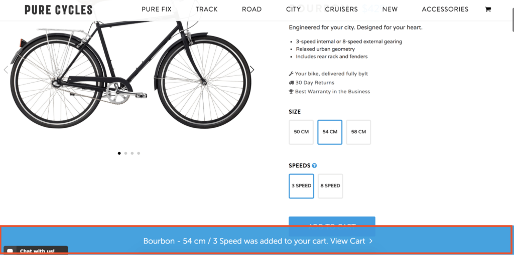
- Added to cart notification – Pure Cycles uses a “added to cart” notification too, however it isn’t as noticeable as the one at Harry’s. Since they’re using the same colors (blue and white) as the call to action button, the notification barely stand out and the “view cart” call to action gets drowned and is almost unnoticeable.


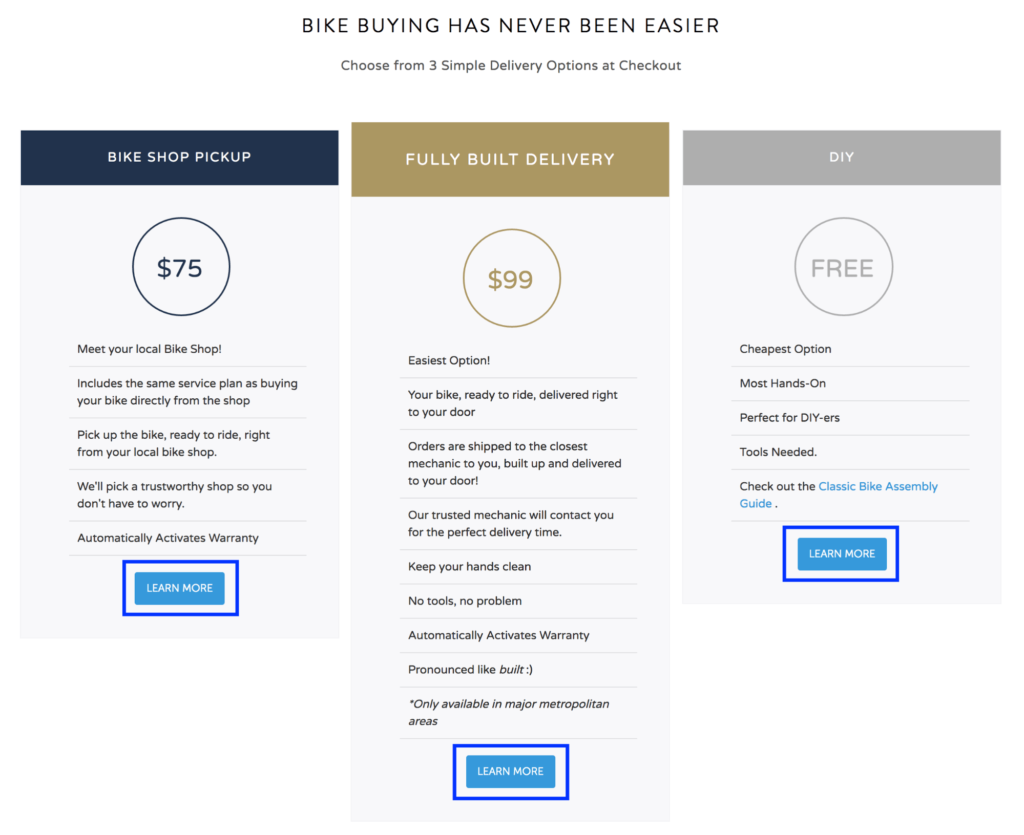

For this section I have two main comments:
1. Since this is probably a major concern for most shoppers, I’d add a direct link to this section around the main call to action or mention that there are various shipping options people can choose from at a later stage.
2. I’d remove the “Learn More” calls to action as they redirect you from the page.
Over to you
While there are lots of other product pages we can review and many elements we can critique, there simply is no replacement to doing your own research. Although many things mentioned here, as good or bad features, can be relevant for that specific store, this doesn’t mean it would be right (or wrong) for you. Before optimizing your product pages, take the time to analyze your customers’ behavior on it (using heatmaps, for example), speak to customers, find out what frustrates them, and take a look at all your reviews. This will teach you exactly what content people search for. All you need to do now, is supply it.