
The 5 Biggest Problems With Managing an Ecommerce Site with Lots of SKUs (And How to Solve Them)
Does your ecommerce company have a large number of SKU’s?
Are you a B2B company processing high volume wholesale orders?
A B2C company with a wide range of unique products?
If the number of products you have is in the thousands, you’re probably running into a lot of user experience issues and technical complexities on your site.
Some common issues associated with a large number of SKU’s include:
- Poor ecommerce platform performance
- A clunky site navigation experience
- Search capabilities that are not advanced enough
- Slow site speed, and
- Inadequate product SEO
With so many products, keeping your site navigation simple for your customers is challenging. If you don’t guide your customer through their shopping experience in a clear way, they’ll become overwhelmed by the abundance of information and will most likely just leave your site.
We’re going to show you how to avoid that in this article.
But before we look into the challenges posed by having a large SKU catalog, let’s look into some differences between B2B and B2C businesses with a large number of unique products.
The Difference Between B2B & B2C
Usually, a large product catalog is associated with B2B companies. They have very specific needs like
- Bulk ordering,
- Repeat bulk ordering,
- Order requests (not purchases)
- Wholesaler logins (which allow business buyers to log into your ecommerce website and place large and complex orders.)
This functionality is quite a bit different than what a customer requires from a B2C ecommerce website.
But a B2C ecommerce website with a large SKU catalog gets a bit tricky, too. For the most part, it has needs very similar to an ecommerce site with a smaller amount of products. What changes is the organization and delivery of the products to the shopper.
Now that you have an understanding of how the two types of sites can differ, we’ll look at some challenges associated with maintaining an ecommerce website with lots of products.
Regardless if you’re B2B or B2C, the challenges we’ll cover and the solutions we offer apply to both.
Problem 1: Your Platform Can’t Handle A Lot of Products
One of the most common problems in scaling is outgrowing your ecommerce platform. In order to keep your customer experience seamless, your platform has to be able to grow with and support your needs.
For example, if you’re expanding your product inventory and can’t easily manage variables (like size, color, and other product variants), you’re probably spending too much time updating products one-by-one.
Wouldn’t it be nice to do a more efficient “bulk” update?
Such functionality is possible with some enterprise-level platforms. You just have to decide which one suits your company best.
We’ve written multiple articles about platform choice, from how to decide between open source and “full-service” to comparing Magento with Spree Commerce.
But what we didn’t address in those articles is the number of products your store has. Let’s discuss that now:
Magento for Enterprise-Level Ecommerce Websites
A popular choice for scaling ecommerce companies is Magento. There are many pros to building your ecommerce site on Magento:
- It’s highly customizable,
- There’s a wide variety of extensions available to streamline business operations
- It has a long history of providing enterprise-level ecommerce solutions with a strong development community.
What are the cons?
Though Magento is a popular choice, it is becoming increasingly less user-friendly. Magento navigation management is very manual. So you can imagine how difficult organizing thousands of SKU’s could become – not to mention how much time it would take.
Additionally, Magento 2 has just been released, which was supposed to be an upgrade and improvement to previous versions.
But, the transition just isn’t going over that well. In fact, many Magento users are opting to stay on older versions just because of the headache that moving to Magento 2 would cause.
You can read more about that here: Is Magento Dead? The Pros & Cons of Magento 2
What about Shopify Plus for Enterprise-Level Ecommerce Sites?
The platform quickly rising to become an alternative to Magento is Shopify Plus.
Known for being much more user-friendly, Shopify Plus is striving to provide the same manageable interface that the regular Shopify platform provides, but for enterprise level companies. That’s why they don’t restrict the number of SKU’s you can add.
Shopify Plus has many pros:
- Probably is more cost-effective than other solutions that require lots of custom development
- More friendly admin interface for non-tech team members (i.e. marketers who need to use the platform)
- Hosted on Shopify servers so things like security are not your responsibility
There are some cons to Shopify Plus, too. Its difficulties with product bundling may not be great if you have a B2B ecommerce site. Though you can create a workaround, this is something that may be accomplished easier in Magento.
And, Shopify Plus is the new kid on the block. It doesn’t have as long of a history in the enterprise-level ecommerce space as Magento.
That being said, we’ve been watching Shopify’s progress in the smaller “solopreneur” space closely, and predict they’ll bring the same quality of product and user experience to the enterprise-level and B2B space.
Additionally, you can opt for other enterprise-level platforms, like Demandware, Oracle or IBM Websphere.
Pro tip: use Builtwith to check which platform large ecommerce sites (or your competitors) are using, and make your decision accordingly.
Problem 2: Your Site Navigation Design isn’t Optimized
It only takes .05 seconds for prospective customers to form an opinion about a website. So your navigation better be well-designed since it’s one of the first interactions your customer has with your website.
Because you have a large number of SKU’s, thinking through how you’re going to display them to your customer, if done well, can cause an uptick in conversions.
If you don’t optimize your navigation design, your customer is likely to become overwhelmed by choices and won’t make a purchase at all.
Optimize Category Pages for a Successful Navigation Experience
With a large number of products, it is crucial to nail your category page design.
How can you implement a category page design that balances ease of navigation with simplicity, while making sure you’re including all products your customer would find relevant?
One strategy is to implement filters.
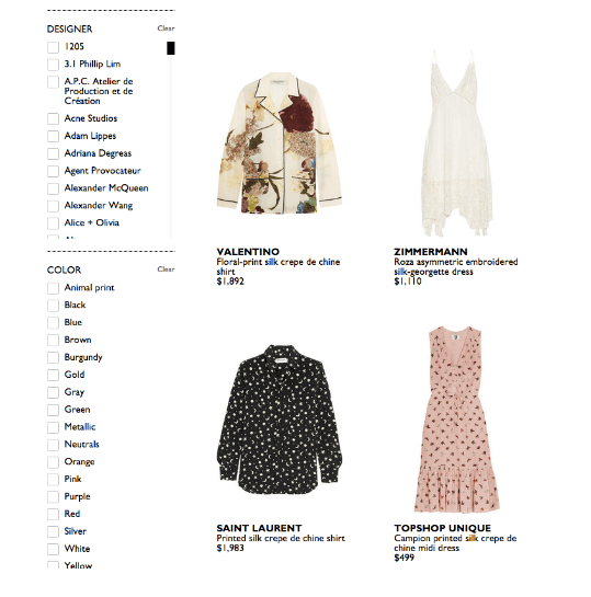
Check out the simplicity of categorization Net-A-Porter uses on their site. By allowing users to filter the products displayed by size, color and designer, they’re able to incorporate a large number of SKU’s without compromising on design.

Another strategy is showing subcategories.
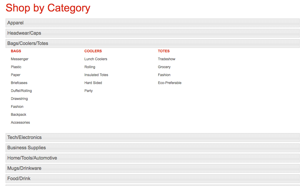
Staples does this: They organize products by type, then display subcategories below.
All of this shows before a user even views a product.
Their design strategy is to narrow down the user’s intent as much as possible, before displaying anything at all. That way, the user is seeing products he/she is more interested in and is therefore more likely to purchase.

Here’s a few tips for category design:
- Make parent product categories broad, allowing users to distill down to the right products. If you make parent categories too narrow, it might pigeonhole your users to an undesired section on your site.
- Include the same subcategory in multiple parent categories. This is because your users might be trying to find the same product in different parent categories. For instance, in the image above from the Staples site, a user could be looking for ‘Accessories’ under both the Bags and Business Supplies parent categories. Be sure to understand your user’s expectations and navigation behavior, in particular what they are searching for, so you can include the right subcategories under their respective parent categories.
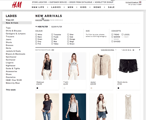
- If you introduce new products often, consider having a ‘New Arrivals’ category, allowing your users to jump straight into the newest arrivals and make purchases they are excited about. H&M does this well:

By understanding the goals of your product listing page, displaying what’s most relevant to users (while also allowing them to ‘browse’ openly with product grids), and having clear CTA’s, you can convert confused site visitors to well-guided and engaged customers.
Use a Heatmap Tool to Analyze User Behavior
Heatmaps are great for understanding how difficult users are finding it to navigate your site.
Many enterprise-level brands use tools like Hotjar to analyze where users are spending the most time on their site.
Are they stuck somewhere?
Do they leave the site after hitting specific roadblocks?
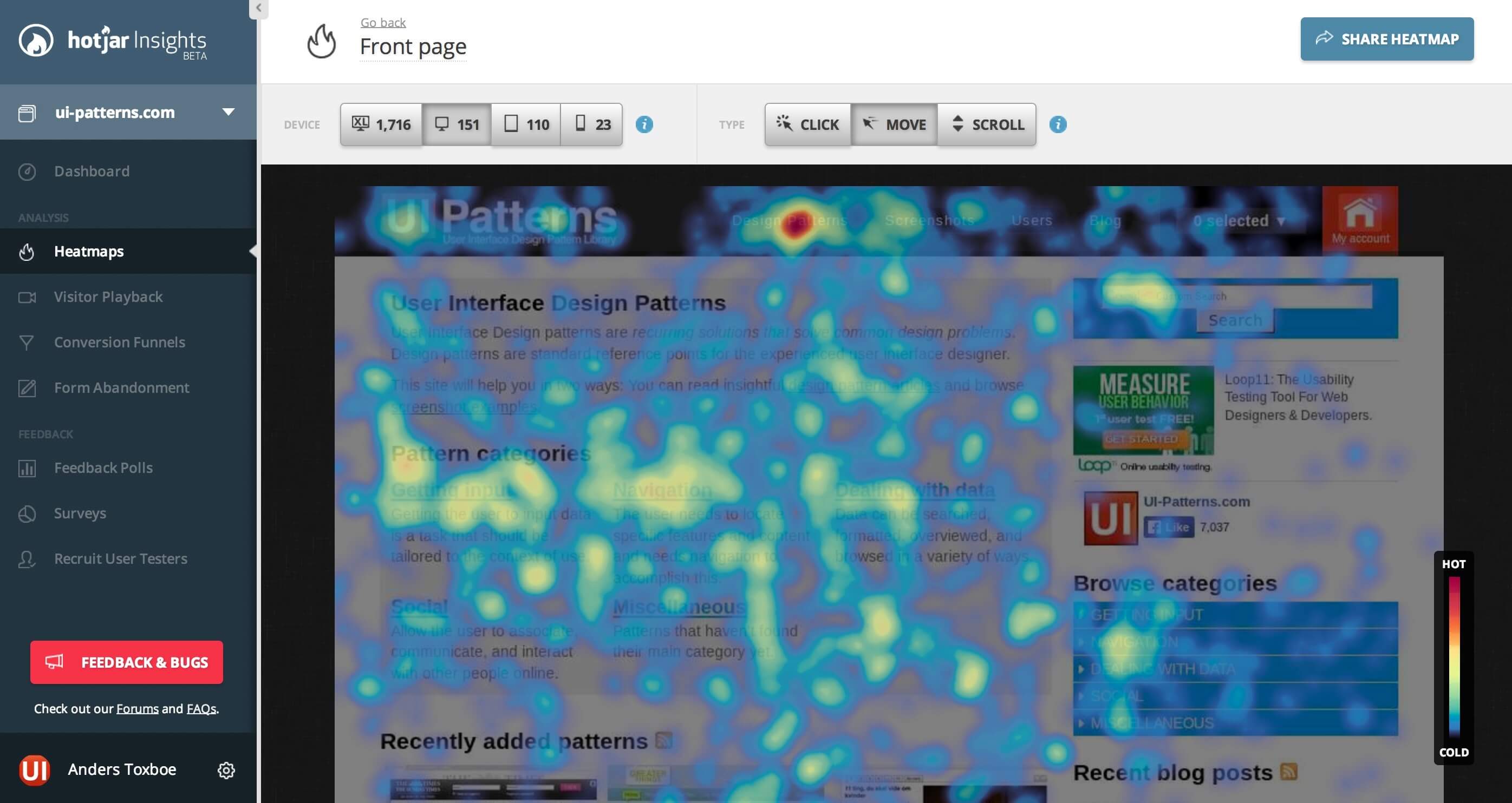

Of course, each specific site is unique and will have a different set of “roadblocks” in their navigation design. Gathering this data is the first step to understanding where you need to optimize.
Problem 3: Your Search is Working Against You
Because you have a lot of products, enabling your customer to search for the right products quickly and efficiently is the key to:
- Better user experience
- An increased average order value (AOV)
- Lower customer acquisition costs (CAC)
Why?
If your user can easily and quickly find what they’re looking for, they’re more likely to convert. That means they’ll have a better experience, will potentially purchase more, and will become cheaper to acquire (more on that below).
Grainger, an industrial supplies company, makes nearly $3 Billion in B2B ecommerce sales. Lots of that revenue is thanks to search.
Using features like ‘autofill’, which automatically populates the search bar with product suggestions based on the user’s keywords, they’re able to make website searches relevant and targeted.
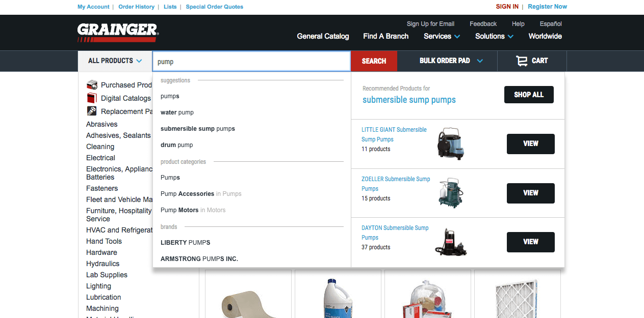

The item filters on the side help the user to further narrow down their search, and display the relevant products.
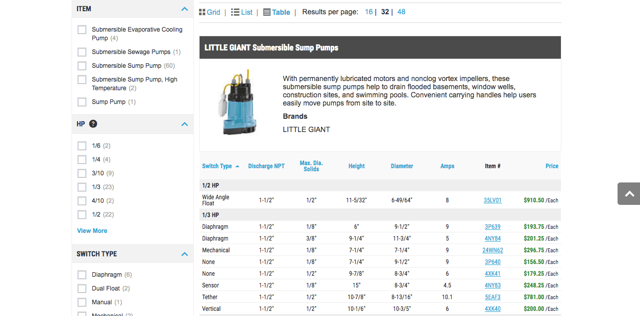

Clearly, this makes the search process a lot easier for customers and incentivizes them to purchase.
Here’s How Search Lowers your CAC
Once your customers have a seamless customer experience on your website, the hope is that your average order value (AOV) increases.
When customers buy more, your cost to acquire new customers goes down.
Why?
If your AOV is higher, this means you have to spend less money on customer acquisition, or require less people to be funneled into your conversion funnel.
Think of it this way: if you pay $100 for 100 people to come to your ecommerce site, and you converted 5% of them, your CAC was $20 per customer.
Now, if you are converting 10% of them after optimizing your search, your CAC is $10 per customer.
Make sense?
It pays off to invest in search design optimization. To learn more, check out this great guide from Practical Ecommerce about using site search to gain insight about your customers.
Problem 4: Your Site Doesn’t Load Fast Enough
Site speed becomes an issue when you have a large product catalog. Not only do every one of those products need multiple images, they need their own unique pages, descriptions, and other required code.
This can drastically slow your site down.
The longer it takes a page to load, the more likely a user will leave the site. So you need to take some action to ensure your site loads quickly.
For an ecommerce site that’s making around $100,000 per day, a 1 second delay in loading a webpage could potentially cost the company $2.5 million annually! (source)
Use the following tricks to enhance your site speed:
- Take advantage of GZIP compression: GZIP is a method of compressing data on servers without interfering with the display qualities of a website. Compress the information to make your website ‘lean’.
- Use a Content Delivery Network (CDNs): Large ecommerce sites with many SKU’s utilize CDNs. CDNs work by loading pages based on a user’s location. So if you’re selling specific product types to specific locations, a CDN can help your site display relevant product types only, which improves site speed and relevance.
- Limit the amount of products displayed on category pages: Listing too many products with large image sizes will increase your page load times, leading to frustrated visitors. Don’t test your visitor’s patience! Make sure you limit the number of products displayed on category pages.
Problem 5: Your Product Page Design
With a lot of SKU’s, it’s easy for the amount of products to overwhelm or bury a very important design standard: product page anatomy.
Having the best information hierarchy on your product pages benefits your customer’s overall shopping experience.
Here’s what you need to consider when it comes to your product page design:
Do Your Product Pages Look Good on Mobile?
We’ve said it a million times: mobile shopping is only growing (for both B2B & B2C ecommerce businesses) so it’s an absolute must that your website is responsive.
How you can create product pages that display relevant information on mobile devices?
Make Your “Add To Cart” Button Thumb-Friendly
Make elements easily “tappable” or accessible by thinking of designing for the “thumbs”. Many brands do this by making buttons pretty large.
Check out Grainger’s mobile site below:
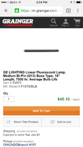

Though it’s not perfect, their “Add to Cart” button takes up the entire witch of the screen. Easy to click. Easy to convert.
We recently put together a case study on UK retailer Topshop. They made just a few tweaks to their mobile site and saw an 11% increase in conversions from their product pages!
They also made their “add to bag” button span the width of the mobile product page. You can learn more about all of the changes Topshop made by downloading the case study here.
Do Everything You Can To Speed Up Mobile Page Load Time
As we’ve already said, page load time is important.
But on mobile, it’s twice as important! Mobile shoppers should be able to see what they want to see when they want, because they actually spend more than desktop users. (source)
To get started, you can use a tool like Google Page Speed Insights and click the “mobile” results tab. The results will give you the beginnings of a roadmap to optimize your mobile site.
Additionally, you need to make sure you’re compressing all of your product images. If you have a lot of products and often upload images in bulk, their file size is an important detail that could become overlooked. A tool we recommend is Tinypng, which will compress without compromising quality.
You may want to also consider “hiding” some images on your mobile product pages if you have so many it is greatly affecting page load time. (This is a strategy that should be part of your responsive design plan.)
If you have multiple pages that target the same keyword, it’s quite likely that a page outranks the more relevant one. (This is called URL Cannibalization.)
With a large SKU catalog it’s not uncommon to see this happen, especially with some product category pages outranking product pages and vice versa.
Which pages are most relevant to the high volume keyword searches your customers use?
If you’re a B2B business, do you want your product category pages to outrank your product pages? This may help your website visitors navigate their search with a ‘top down’ approach, starting with a product category page and then narrowing down to detailed product pages.
On the other hand, if you’re a B2C business, you might want your product pages to outrank product category pages, especially for long tail keywords, so your prospects land straight on the page where they can make a purchase.
Do Your Product Pages Have an Optimized Structure?
The way your information is presented on your product pages – what we call their information hierarchy – is very important for two reasons:
- It enables people to find the information they actually want to see
- It tells search engines exactly what is on the page so they can display it correctly (and higher) in search engine results pages (SERPs)
A Good Product Page Information Hierarchy is Good User Experience Design
When customers land on your product pages, they want to see one thing first: images. (We just talked about optimizing images above, so go back and read that if you didn’t.)
Having multiple images and different views of a product will enhance your customer experience. So be sure that they can see your product right away.
The product title and description are the next pieces that your customer is looking for.
Make sure your product title is keyword optimized and your product description is unique. This is the part that gets tricky for ecommerce companies with lots of products.
Is it actually worth making all these unique product descriptions?
Yes. Here’s why:
Many large ecommerce companies don’t create unique product titles or descriptions at all. Instead, they use duplicate information.
This causes big problems when it comes to search.
It’s confusing for search engines. They see the same information for multiple pages – how can this be true? Which page should they rank?
When it comes to creating unique product titles for stores with lots of products, you can stick to this formula:
Brand – Model – Item Type.
And when it comes to unique product descriptions – if it really is too tedious of a task to have unique descriptions for each (perhaps you are selling lots of similar items), you can have duplicate text. You just need to tell search engines what to do with it:
- Use robots.txt to block areas that create duplicate content such as archives, tags and even category pages in some cases.
- Use the canonical tag to indicate which web pages are the pages you want indexed. For example, if your shopping cart creates new urls because of reviews or comments (meaning you have more than one page with the exact same content, except one has reviews or comments and the original does not), the canonical tag will tell the search engines which page they should be paying attention to.
- You can add nofollow attributes to links that point to areas of duplicate content. However, you have to be extremely thorough at making sure you find every single link that needs to be nofollowed (because Google will find them). (source)
If you follow all of those tips, you will eventually achieve a solid user experience!
When customers feel this, they’re more likely to convert. When search engines read and understand this from your site code, they will rank you higher in search results.
What can you do now?
OK, so what can you do now? Here’s a shortlist of steps:
- Select the best ecommerce platform for your company,
- Optimize your site navigation experience and speed to factor in large numbers of SKU’s
- Address your product page design
You’ll begin to see your large amount of products as an opportunity to strategically sell to customer segments, rather than seeing them as roadblocks to sales.
Turn Each SKU Into a Converting Product Page
Regardless of the amount of SKU’s you have, if your product pages are poorly designed your conversion rate has no hope.
We’re going to help you fix that.
We have a FREE conversion training “How to Grow Ecommerce Sales, Conversions and Profits WITHOUT Spending More on Marketing” to show you exact strategies to convert more with your existing website. In this training you’ll learn:
- How to get more conversions from your traffic, without having to overhaul your website.
A simple system for increasing your sales AND profit margins, without spending more money on ads or SEO. - A breakdown of the exact conversion mistakes you are making and how to fix them.
- Our strategy for PREDICTABLY growing your business WITHOUT investing outside capital.
- BONUS: A map of our top-performing “pre-purchase” funnel and an ROI Calculator from Referral Candy!


*This post was co-authored by our Director of Marketing, Jenna.