The Truth About Images, Copy & Buttons: 3 Product Page Design Myths Busted
All the “core truths” you’ve heard about ecommerce product page design are no longer gospel.
As best practices in web page design continue to change and evolve, so do product page design rules. We’re going to show you the truth behind 3 product page design “best practices” that are no longer necessarily true.
Myth #1: Product Images Should Be Bigger to Convert More
We’re used to hearing “bigger is better,” particularly when it comes to product page elements like product images. It’s the largest and most visually impactful thing on the page that grabs the eye and converts browsers to customers, right?
Not necessarily.
Size isn’t necessarily the thing that makes your product image POP. It may actually be the amount of white space around it. It’s always a good practice to test and measure the results of switching up your product page design elements, rather than relying on industry trends.
ConversionXL Institute extensively tested this theory, and found that “the experience- or design-driven product (men’s dress shirt) shows a pattern of decreased visual attention with increased image size.”
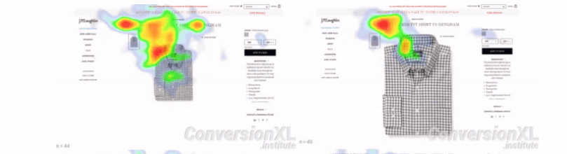

Sometimes a larger product photo (as with the men’s dress shirt example) actually creates a pattern of lower value perception. The opposite is true for a “search good” (like a hard drive) – larger product photos make people think the item is more valuable.
So what does white space do? It improves the scannability of a product, and helps guide the eye where you want it. This doesn’t just refer to the space around a product photo. It also includes things like margins, letter spacing, and the padding around text columns.
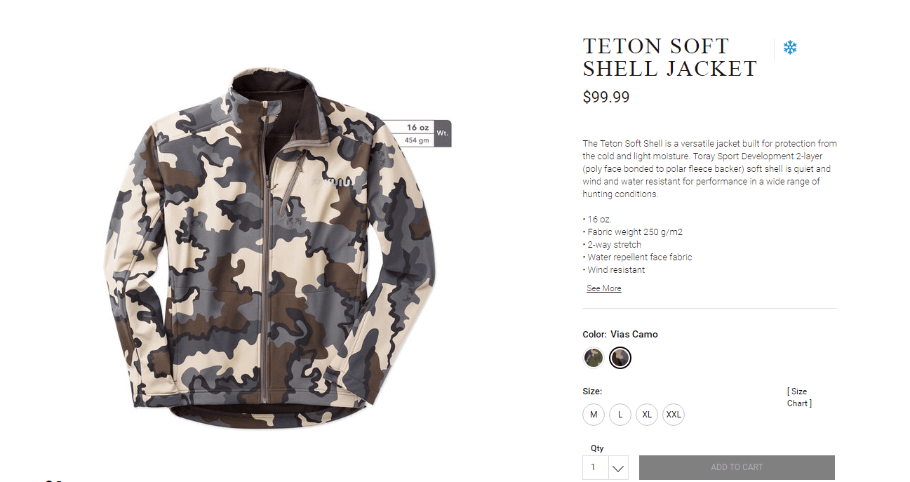
Hunting gear and clothing retailer Kuiu do a good job with white space. The product photo is both large and surrounded by plenty of space. The product title is also large and is separated from the product description, and the price and “add to bag” button both stand out.

Myth #2: Product Copy Should Always Be A Well Thought-Out Paragraph
Not everyone wants to read paragraphs of text while shopping. Though we see brands like Huckberry form tailored, more long-form paragraph descriptions, simple bullet-points could be more effective.
Bullet points are more scannable ,as well as more SEO-friendly. BigCommerce recommends using them for product specs (like dimensions) or short phrases (features).
While it’s true that you might be sacrificing the power of storytelling to create an emotional response in the shopper that makes them want to own the item, you’re also helping them avoid screen fatigue. TLDR (too long didn’t read) has heavy use as an acronym for a reason.
You can also combine the two for a winning formula: [Paragraphs of prose] + [Bulleted List of Specs or Features] = [Engaging Product Description]
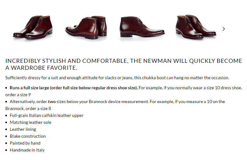
Men’s footwear company Paul Evans rightly assumes that reading a long story about each and every pair of shoes they sell would be tiresome. Instead, they rely on one powerfully descriptive line followed by a long bulleted list that covers material, fit, sizing and construction.

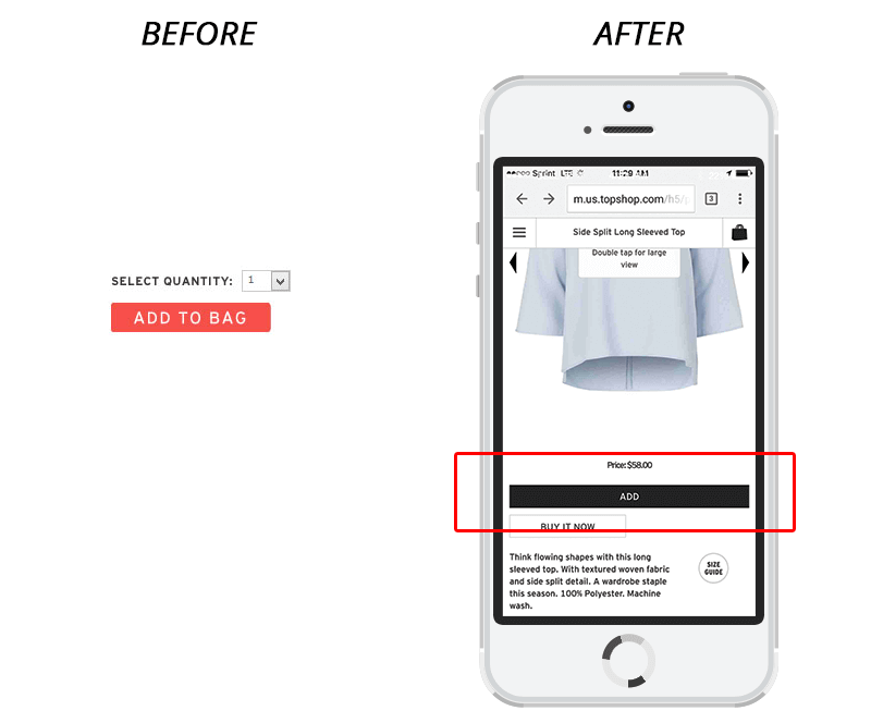
Myth #3: Add to Bag Buttons Should Be A Contrasting Color
We mentioned before how making the Add to Bag button orange was all the rage in product page design a couple of years ago.
There are still articles out there claiming that a contrasting color for your CTA button is THE most important thing: “Your button color matters. It matter a lot. In fact, if you’re going to take only one tiny single piece of advice from this post, it should be to give careful consideration to your button colors.”
Yet we know from our Topshop case study that what led to more conversions for them was the SIZE of the button, not the fact that it was orange. Changing it to a larger black button that took up almost the whole screen is what really moved the needle with their mobile shopping conversions.

How To Bust Your Own Product Pages for These Myths
ConversionXL Institute’s study concludes that they busted their own beliefs about product images needing to be larger to increase conversions. Take a look at the product images on your own pages and consider running an A/B test with smaller versions of the images to see how they do, or surround them with more white space.
Think about the type of product as well – try doing the opposite and swapping smaller images for larger for “spec-driven products” such as hard drives. For “experience-driven” items, make the photos larger but keep a balanced use of white space.
Also, take a look at your best-selling products. Are their product descriptions short or long? If they’re paragraphs, consider converting them to one descriptive line followed by a bulleted list of important features or details.
Finally, if you have a small “Add to Bag” button in a contrasting color, consider changing it to something neutral (like black or gray) and just making it larger. Ideally, it would take up most of the space on a mobile screen. Test to see if this converts more visitors to buyers.
Take note of your buyers’ purchasing behaviors after making each one of these changes.
Learn How Small Changes Can Make Big Wins for Your Ecommerce Company
To learn even more conversion tactics, we’ve created a FREE Ecommerce Conversion Workshop where you’ll learn:
- How to get more conversions from your traffic, without having to overhaul your website.
- A simple system for increasing your sales AND profit margins, without spending more money on ads or SEO.
- A breakdown of the exact conversion mistakes you are making and how to fix them.
- Our strategy for PREDICTABLY growing your business WITHOUT investing outside capital.
- BONUS: A map of our top-performing “pre-purchase” funnel and an ROI Calculator from Referral Candy!
Click below to register!