How Huckberry Perfected Ecommerce Product Page Design (And Every Tip & Tool You Need to Do the Same)
One of my favorite topics to write about for the blog is product page optimization.
If you prioritize creating a smooth shopping experience for your customer, they are more likely to purchase and more likely to return.
If you don’t prioritize it your customers will likely experience confusion or barriers in their visit, leaving your conversion rate to be a disappointing percentage.
Why will they purchase from you if it’s difficult?
A majority of our clients face conversion rate issues due to their product page design. And that’s what we’re going to tackle today.
In this article, I’m going to dissect one brand’s (Huckberry) product page design and show you:
- How storytelling on their product pages increases conversion rate
- What “extra” addition to your product page design you may think is unnecessary can actually increase your average order value by up to 50%
- How you can turn your own product pages into valuable information for your customers
Don’t Try and Reinvent the Wheel with Product Page Design
One of the things our CEO Allen always tells me when we’re discussing our own marketing strategy is: “We don’t need to reinvent the wheel – let’s use what’s already working for other people.”
This may seem like obvious advice, but to me it’s been helpful.
Why?
When your job is to sell something, it’s tempting to pursue an initiative you think will work because it’s a trend or because of a “gut feeling”.
While both of those instances hold true sometimes and brands can become “outliers” using a new strategy, more often than not the best approach for selling something on your ecommerce website (i.e. increasing conversions) is to take a more systematic approach.
What will serve you well is to look at data and systems of brands who are successfully scaling.
What are they doing well that you can apply to your own business?
[content_upgrade]LEARN HOW TO CONVERT MORE WITH YOUR EXISTING PRODUCT PAGES! Join our FREE online conversion workshop to see what mistakes you’re making and the exact strategies you need to fix them – all using your existing site and traffic! Register for free here >[/content_upgrade]
Let’s dig into product page optimization so you can learn what you can take from Huckberry, a brand who has perfected ecommerce product page design.
Why You Should Take Inspiration From Huckberry’s Design
Huckberry is one of our favorite ecommerce websites that features apparel and gear tailored toward the urban outdoorsman. It’s a members-only setup that sells curated apparel and gear.
I think Huckberry may be the J.Peterman for current-day thirty-somethings: selling adventurous products with their copy. They truly take the customer to a place, give them a certain emotional connection to that product and convince them that “yes, I do need this urban sombrero.” (If you get this Seinfeld reference, we can be friends.)
Huckberry has perfected storytelling to sell their product.
But is having a good story enough?
No.
The art of the story is no good without the science.
Let’s look at why the art is important, first.
How the Art of Storytelling On Your Product Pages Will Increase Conversions
People do not buy goods and services. They buy relations, stories and magic. – Seth Godin
I’ve written before about how good ecommerce user experience (UX) impacts search engine rank, mobile conversions and customer retention.
Optimizing your site so your customer can easily find products, navigate menus and purchase is the goal of UX design.
And the place most brands usually fall short with their UX design is the product page.
This page is your best chance to sell your product. Brands that do it well, like Huckberry, make it seem like an art. But there’s definitely a science to building a high-converting product page.
The art is the story.
Telling a great story sells a product because is can provide an emotional connection between your customer and the item they’re viewing.
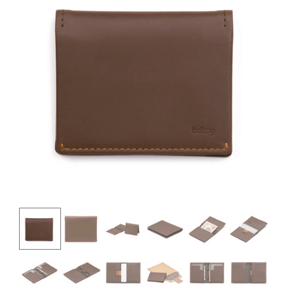
Let’s look at the story Huckberry uses to sell the Bellroy Slim Sleeve wallet:
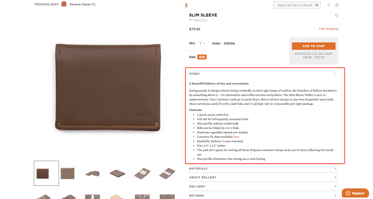

The product story reads:
“Seeing people in design school sitting crookedly on their ugly lumps of wallets, the founders of Bellroy decided to do something about it — for themselves and wallet carriers everywhere. The Slim Sleeve Wallet is easy to underestimate. Your 2 primary cards go in quick draw, then a tab lets you get to your less frequently used cards. Most currencies easily fit with a half fold, and it’s all kept tidy in a reasonably grit tight package.”
First off, this short story provides an immediate visual of people sitting uncomfortably on wallets. If you’re a guy: you’ve been there, felt that.
This text immediately connects the reader with a feeling derived from a common problem (butt/back hurting from a fat wallet). It sets up why your customer needs this wallet.
Secondly, the copy communicates the unique value proposition of the product without blatantly stating it: “Your 2 primary cards go in quick draw…” It feels less like a standard product description and more like your buddy telling you about the product.
The takeaway here is after reading this short paragraph of text, potential buyers can visualize how the Slim Sleeve can help solve their current problem.
The last part of the product story is the bullet-pointed feature section.
To complement the casual product description, Huckberry lists out several great features about the wallet for those people who are content scanners. This is a great way to ensure you don’t skip anything in the product description and also inform people who are quickly reviewing the page.
Here’s a quick review of how you can get started on the “art” of your product page copy:
- A casual, interesting story that immediately places the reader in a relatable context (highlight their problem/pain point)
- Show how their problem is solved with your product
- Highlight the best features in a quick-read format (list)
Now, let’s look at the science:
How the Science of Storytelling On Your Product Pages Will Increase Conversions
One thing is to be able to convince potential customers that your product is worth buying. But what about search engines?
How do you make Google think your product is valuable?
Good news: if you achieve the “art” piece of product page creation, the “science” piece will consequently follow. It’s a natural byproduct of successful storytelling.
Why?
User experience. Remember in the beginning of this article, I said that product page optimization strategy can greatly differ from brand to brand, but the one commonality in any brand’s attempt to increase conversions is their user experience (UX) design.
This is the science. Successful UX design ensures your customers have a pleasant experience on your ecommerce website. And on your ecommerce product pages, the science materializes in 4 main areas:
- URL structure
- Information hierarchy
- Trust elements
- Upsells / Cross-sells
Let’s take a deeper look at each area.
1. Your URL’s Better Sound Normal
Depending on what content management system (CMS) you’re using to manage your ecommerce website, the product pages you create may have search-optimized URL’s or they may have a string of auto-generated characters that don’t really make sense.
Making sure your URL’s read aloud like normal English is important for SEO.
When a human sees a URL in search engine results pages (SERPs) they are much more likely to click on a URL they can read aloud and understand.
Let’s look at a comparison:
This product page appears on page 10 of my SERP for “slim wallet”:
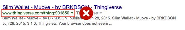

If you are a growing ecommerce company, page 10 of search is an absolute red flag. If you’re there, you need to immediately correct course. You need to get to page 1.
Here’s an ideal example of URL readability from page 1 SERPs for “slim wallet”:
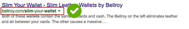

Which one looks better?
Which one reads better?
Both questions are important to ensure the best user experience. If your customer can understand what the product is directly from its URL, you’re good to go.
By making your URL’s look and sound normal, users are more likely to click on them, and Google sees this as a good sign. If your URL’s are readable, you have better chances of being on page 1 of SERPs instead of page 10.
2. Your Customer Needs the Most Important Info at First Glance
Once that user clicks on your product listing in from search – or from any channel for that matter – what do they immediately see?
They better see the product. After all, that’s why they’re there in the first place, right?
Immediately making a visual connection with your customer is crucial for successful product page UX design.
Your images are what make your product ‘come to life’. The more visually appealing and detailed your product images are, the more trust you’ll build with. And more trust means higher conversion rates.
It’s pretty standard for product pages to showcase product imagery on desktop resolution sizes, but many brands fall short when it comes to mobile. If your ecommerce website design doesn’t adapt to a mobile view, your product imagery may be getting lost.
Look at the mobile view comparison between a product page from Showmeyourmumu.com and Huckberry:
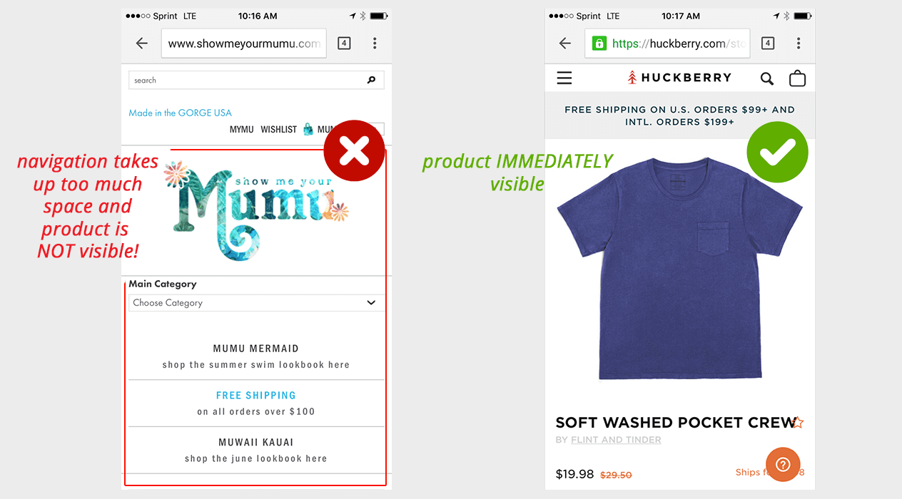

If you clicked on a URL expecting to see the product page, which one of these screens satisfies your intention?
Letting your product imagery take the stage gives your customer the information they want at first glance. They’re then more likely to scroll through more photos and explore the product page details.
Check out this article to learn more about how product images impact your conversion rate.
3. Your Product Page Should Squash Any Purchase Doubt
Another great thing that Huckberry has achieved in their product page design is trust. They’ve used several key tactics to establish a sense of trust from a visitor.
First, as we just discussed, they’ve used great product imagery. Not only is the imagery high-quality, but they provide multiple images. Look at the Bellroy Slim Sleeve page again – it features 12 images! Each different and several showing the actual application of the product.

The next trust-building element of their product page are the sections below the product description: materials, about the brand (in this case Bellroy), delivery, and returns.
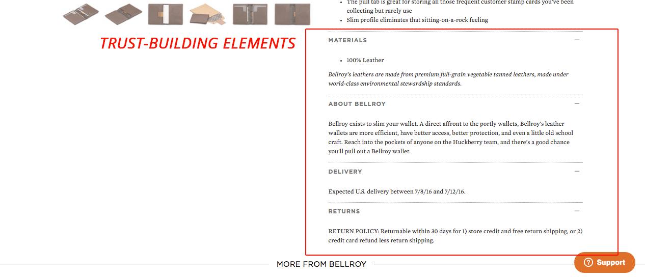

What’s important to note about this part of Huckberry’s product page design is that they are prioritizing information that a customer is looking for.
When a customer is looking to buy, they have many questions running through their head that may cause them to doubt their desire to purchase.
So while you may have done a great job of convincing them (the art), converting that user is a job done by trust elements.
Tell them about the product:
- What is it made of?
- How is it made?
- If it’s another brand’s product, what is special about that brand?
- When will it be delivered?
- What if they want to return it?
Answering these questions will help squash any doubt your customer may have and will move them one step closer to clicking the “add to cart” button.
4. Providing Other Product Suggestions is a UX Win
Another signal of successful user experience (UX) design is how well a user is able to navigate your site. Looking at how many pages a person views per visit is a metric that can help you gauge how friendly your site design is.
Are customers viewing more product pages? Or are they closing the window after they’ve seen the first product page?
A design element meant to encourage better user experience is a “related products” or “suggested products” module. Usually featured at the bottom of a product page, this element helps encourage users to browse more products that are similar to the current product they’re viewing.
Not only does this incentivize users to browse more products on your site, it also increases the chances of that user actually converting and even purchasing more.
Huckberry also does a great job of this in their product page design:
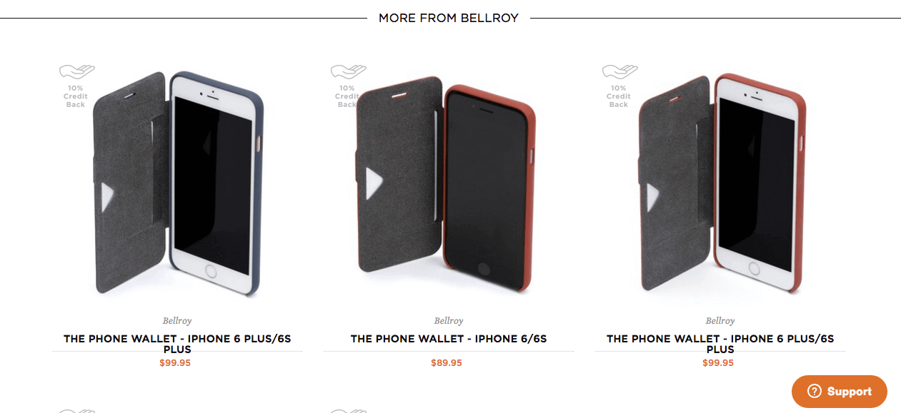

I recently wrote an article about how brands like Patagonia and Vineyard Vines implemented a “suggested products” module in their product page design to increase their AOV (average order value) 50%.
At the very least, by including this element on your product pages, you’re providing a more friendly shopping experience for your customer. Show them something else they may like rather than just leaving them with nowhere else to go.
How You Can Build Product Pages That Have Good User Experience (UX) Design
OK, so now you have all of this information about Huckberry and why they’re awesome at product page design. Now what do you do with it?
Your first step is to understand your product pages and where they fall short.
You can learn this first-hand in our FREE Workshop, “How to Grow Ecommerce Sales, Conversions and Profits WITHOUT Spending More on Marketing” where our CEO, Allen Burt, will teach you:
- How to get more conversions from your traffic, without having to overhaul your website.
A simple system for increasing your sales AND profit margins, without spending more money on ads or SEO. - A breakdown of the exact conversion mistakes you are making and how to fix them.
- Our strategy for PREDICTABLY growing your business WITHOUT investing outside capital.
- BONUS: A map of our top-performing “pre-purchase” funnel and an ROI Calculator from Referral Candy!