Ecommerce Product Pages: How to Improve Rank & Increase Sales Without Overhauling Your Site
The ‘make or break’ moment on your ecommerce website happens on the product page(s). It’s here where your customer makes the decision whether to ‘add to cart’ or abandon your website without buying.
With people now having an attention span of just 8 seconds (shorter than that of a goldfish), you need to make sure this page makes a great first impression.
This post will show you why focusing on creating great product pages can improve search engine rankings and generate more sales. Let’s start with “why”:
Turning Visitors into Customers Starts with Awesome Product Pages
A product page is your chance to showcase your product. By reducing distractions, keeping the page focused on the product, and organizing information well, you improve the chances of a visitor taking the desired action and becoming a customer.
40% of visitors abandon a web page if it takes more than 3 seconds to load (source).
40% of visitors abandon a web page if it takes 3+ seconds to load @truconversionThat’s how much time you’ve got, on an average, to hold your customer’s interest with a good product page. That’s not much time at all, so each page should be optimized to convert within the visitor’s first few glances.
Here’s how you can easily review your product page’s performance:
- Start with having a quick look at your product pages. Were you personally impressed with what you saw in under 3 seconds? (and be honest with yourself)
- Search keywords on Google that you think a consumer would use to look for your product(s). If you see your competitor’s product pages are outranking yours, that’s proof you need to work on your product page.
- Review your product page analytics. If your conversion rates are poor and the bounce rates are high, this is a red flag.
You can easily get on the path to reversing poor product page performance and improving your search engine rank. Here are 6 improvements we recommend:
1. Great Product Images Guarantee More Sales
Your images are what make your product ‘come to life’. Can your customers bank on the “what you see is what you get” rule? The more visually appealing and detailed your product images are, the more trust you will build with visitors, and the higher your conversion rates are going to be.
Larger images can also boost conversions up to 63%! (source) If you don’t have space for large images, use high resolution photos and allow visitors to zoom in so they get a true ‘feel’ of the product.
Larger images for your #ecommerce website can boost conversions up to 63%! @conversionXLThere’s no magic number of images it takes to assist visitors in making a purchase decision: the secret lies in the level of engagement you drive. Display different angles and multiple views of the product in the user interface. You want the shopper to feel you have nothing to hide and everything to flaunt about your product.
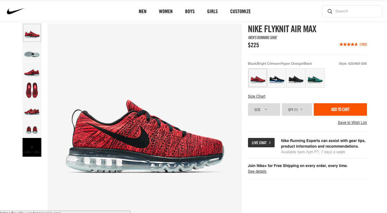
A great example of product images comes from the Nike website. They’ve won several awards, including the 2013 Webby Best Shopping experience award, outcompeting big brands like Gucci, Target, and Warby Parker on the user experience (UX) front:
[wide_image]

[/wide_image]
Let’s look at what Nike’s doing right:
- The page is clean and distraction-free: this allows the user to focus on the product
- The “add to cart” call to action is visually outstanding
- The product image occupies nearly 60% of real estate on the page
- There’s a “zoom” feature on the main image
- The navigation to see different color options is easy
Check out the intricate level of detail this page has with the “zoom” feature – it almost feels like you’re looking at it in-store!

The key take away here is the simplicity of the product page. The white background in all the images helps bring out the ‘real’ colors of the product. The images showcase the product from nearly all possible angles, which gives the viewer a 360 degree perspective on it.
If your customers find your images engaging, they will spend more time on your website, which in turn reduces bounce rates and improves your search engine ranking. Don’t forget to add meta tags to your images, so they show up in relevant image searches as well. (source)
To improve your product page’s ranking, ensure image file names describe the image accurately. Use dashes to separate the words in the name, and avoid using long names.
2. Great Product Descriptions Increase Conversions By Engaging Viewers
Great product descriptions can increase conversion rates by 30%. (source) A product description needs to highlight the benefits of the product, not just talk about it’s features. Don’t just copy a manufacturer’s version of the product description (if you source your products from a manufacturer), but put your own spin on it by making it interesting to read and based on real consumer experiences. (source)
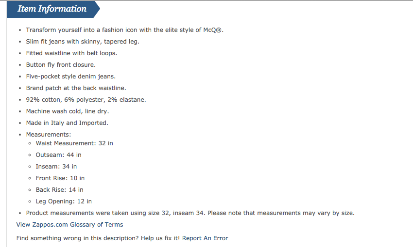
Ideally, you want to include both a long and short product description. The short description can cover the basics of the product to give the consumer a quick snapshot. The long one should be information-rich, addressing all the questions a consumer would have about your product. Avoid long sentences and just keep it simple. Zappos does a great job of keeping their product descriptions simple, yet engaging. Notice that they also give viewers the option of reporting any errors in the description, because even the best copywriters can go wrong.

To get the maximum value from your descriptions, you need to make sure they include relevant keywords. Conduct keyword research using tools like the Google Keyword Planner tool to figure out keyword competitiveness. Be sure to find & use these keywords in your descriptions, while not letting the overarching product message dissolve. The goal here is to outrank your competition while maintaining a benefit oriented description for consumers. (source)
You can refer to this Bigcommerce resource for more information on ecommerce copywriting. It gives plenty of insights and a structure to follow to sell more with great product descriptions.
3. Product Reviews Can Amplify Influence & Increase Sales
Product reviews act as ‘social proof’ for your product’s credibility. They win consumer confidence through their transparency. Customers can see what other buyers think, so they’re more confident in making a purchase when this information is visible.
A study by Forrester & Jupiter Research found that 77% of customers read reviews before buying something online. The research highlighted that products with reviews had a 12.5% higher chance of converting, and products with more reviews had even higher conversion rates, with an increase of 83.85% in conversions for products with more than 20 reviews. (source)
With those kind of stats, it’s obvious you need to have reviews on your product page(s). So, how do you get them? You could use a solution like Yotpo, which helps companies proactively collect reviews through a data driven approach. By installing customer review widgets on your product pages, inviting your customers to leave reviews via email, and integrating your customer reviews with social media platforms, you can amplify the power of influence product reviews carry, ultimately leading you to more sales.
4. People Who Watch a Product Video are 85% More Likely to Buy
Now that you know the basics of creating awesome product pages, I want you to consider product videos as icing on the cake. Videos are a great way of engaging customers online, and the best part is that both search engines and consumers love them.
“People who watch a video of your product are as much as 85% more likely to purchase”.
A marketing experiment conducted across three versions of sales pages, one with long form sales copy, one with a video and sales copy, and one with video only. They found that the one with video only had the highest conversion rate. (source)
People who watch a video of your product are 85% more likely to buy @crazyeggIt’s expensive and time consuming to make good videos, so you need to carefully choose which products you’ll create videos for. Where a video may be particularly useful is when your product is complex and demands a bit of explanation.
For example, Studio Neat (a company that makes an innovative products like the Glif, an adjustable tripod stand for iPods & iPhones) includes videos on their product pages to show people how their products can be used.
Have a look below at the estimated increase in conversion rates that were made possible with video across different industry verticals to get some insights for your own ecommerce company.

If you are cautious about devoting a lot of your budget towards video, you can start slow with video-based screen capturing softwares like Camtasia (for SaaS or eLearning products), or use Keynote to create great product presentations (physical products). (source)
5. Make’em Shareable
The most successful brands know that social is one of the best channels to drive customer engagement. Furthermore, these brands know that great product pages should absolutely be shareable. Including sharing icons to social media platforms can help in turning your customers into online brand advocates. More often than not, you’ll see product pages with social sharing icons present in a subtle manner at the bottom of the image, like how Rebecca Minkoff does it below.

Another great example of a company that’s using social sharing to their advantage is Johnny Cupcakes. Through strategically including a hashtag that’s unique to the product, they’ve capitalized on social media platforms that support hashtag links. Have a look at their hashtag product link in the image below:

Having a product hashtag could even be a part of a larger incentive like rewarding shoppers for sharing the product or reviewing it on a chosen social network. This helps you get much needed word-of-mouth marketing, which can be priceless for search engine rankings and your brand.
The more omnipresent your brand is on social media, the better your ranking will be. This is because search engines actively ‘crawl’ social media sites to determine rankings.
Rather than trying to be everywhere, focus on what platform is most effective for your brand. Analyze your target customers: do they like video? Consider YouTube. Are they intellectual and in a higher income-bracket? Consider Twitter.
Becoming socially active not only helps your SEO strategy, but helps you hone in on your ideal customer and converse directly with them.
6. Optimize for Mobile Devices and Get Them to Load….FAST
With mobile internet browsing having surpassed it’s desktop & tablet counterparts, you cannot ignore the importance of optimising your product pages for mobile devices. Moreover, If you’ve personally experienced the pain of long page load times, you’d realize it’s importance to the overall customer experience.
“Statistics show that 47% of people expect a webpage to load in 2 seconds or less. 40% of people will abandon a web page if it take longer than 3 seconds to load. So, a 1 second delay in page load times can cost you a 7% loss in conversion.” It’s no surprise that this needs to be taken seriously. (source)
Wrapping it Up
Better design, more engagement, and shareability are sure-fire ways to improve the percentage of your visitors that click “add to cart” and continue on to checkout. Search engines like conversions as much as you do, so optimizing pages for more purchases positions your ecommerce website for higher rank. The way search engines see it, if people are converting they must find the website easy to use and valuable, so it deserves a higher rank.
Get started on your own product pages by adopting some of the tips in this post. We’d love to hear more about your experience in optimizing product pages. What strategies did you employ? What tools did you use? Let us know in the comments below.


