
Customers are Drinking & Shopping Online: Is Your Ecommerce Checkout Ready?
Taking advantage of drunk people is easy.
We don’t advocate doing it in life, but in ecommerce sales… well, that’s a different story.
The report that there’s been an uptick in “late night drunk shopping” has been seen everywhere recently, from NBC to the Today Show and Buzzfeed.
Style and shopping authority, Racked, reported that ecommerce site Lyst shows 48% more orders are made at 2am on a Friday compared to a Monday. They also say that “the average order value at midnight is over 30% higher on a Friday night compared to a Monday night. Past 1am, the average order value increases to over 40%.” (source)
Those are some good numbers. But there’s one important thing they’re not mentioning:
Lyst’s checkout is easy! It’s so easy a drunk person can log in after a few too many, select the things their “sober self” can’t justify, quickly enter their card info, and finally buy what they’ve been thinking about!
This article isn’t about you taking advantage of your drunk customers (well…maybe a little) – it’s about learning what defines an “easy checkout” so that no matter what state your customers are in, they are able to experience a barrier-free checkout.
Don’t Drink and Prime
The study of the “sip and click” shoppers is interesting because these shoppers are motivated by an enhanced state (being “buzzed” or “drunk”). However, motivation should be thought of as any type of encouragement a customer receives to purchase a product from your brand.
Think well-timed email campaigns, targeted Facebook advertising with a discount or promotion, and appealing Instagram ads with a clear CTA. These are all examples of motivation. They make your customer want to do something.
Let’s look at a behavior model focused around “motivation”:
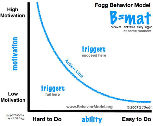

The area you ideally want to find your own ecommerce company in is the top right: high motivation, easy to use, and a trigger or CTA placed effectively. Any lower and you’ll just frustrate or annoy your users. (source)
Amazon succeeds in this because they’ve really grasped the idea of “motivation” when it comes to their customer base. Their email campaigns allow you to click through to the item directly from the email and purchase with less than 3 clicks!
If you have a motivated buyer, reducing the barriers or steps in your checkout process is the best strategy for more sales.
How to Design an Ecommerce Checkout that Converts
Three characteristics or user experience (UX) design considerations make a checkout easy for a customer to complete: visibility, simplicity and reassurance. Thinking through the purchase path with a tipsy person in mind will help you address each step and chop anything that complicates the completion of their purchase.
Visibility
Be So Obvious It’s Almost Painful
A checkout converts more when the customer is able to easily recognize what actions he/she is taking. If they add an item to the bag it should be obvious.
We recently did a case study on fashion retailer Topshop, and they have a great example of an obvious “added to bag” confirmation on their desktop AND mobile site (both of which are key to optimizing your checkout conversion rate).
Look at how big their “add to cart” button is in the desktop view below.
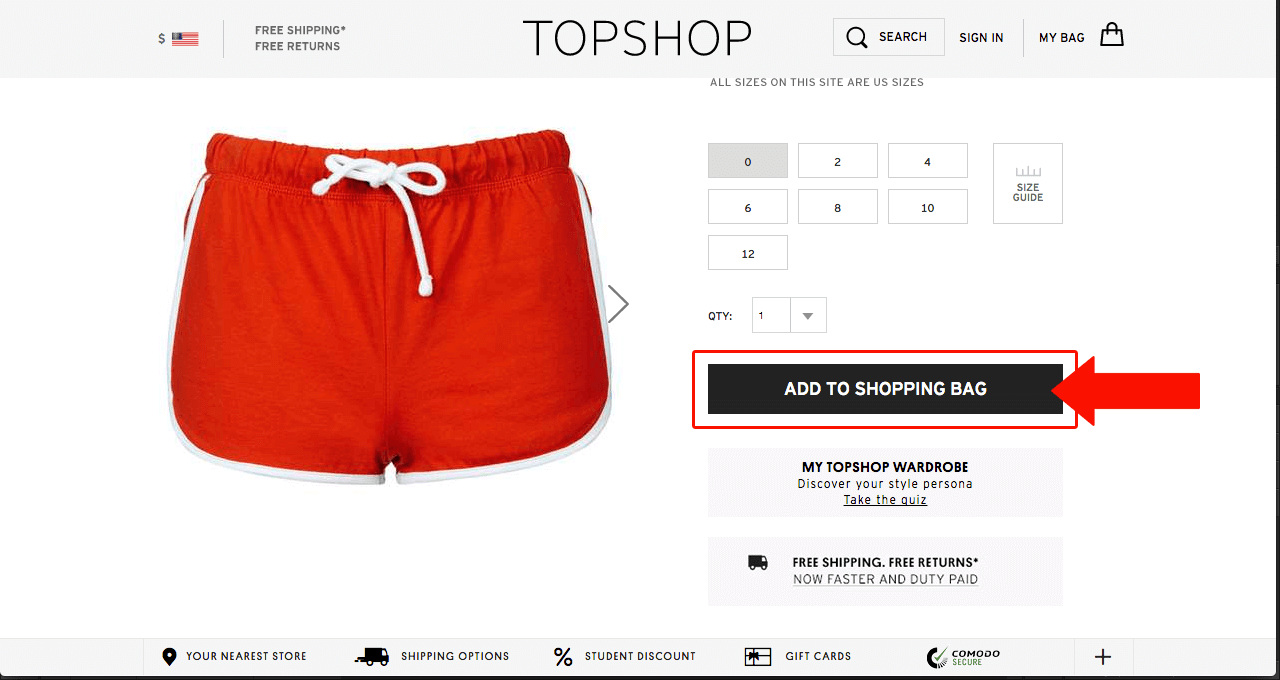

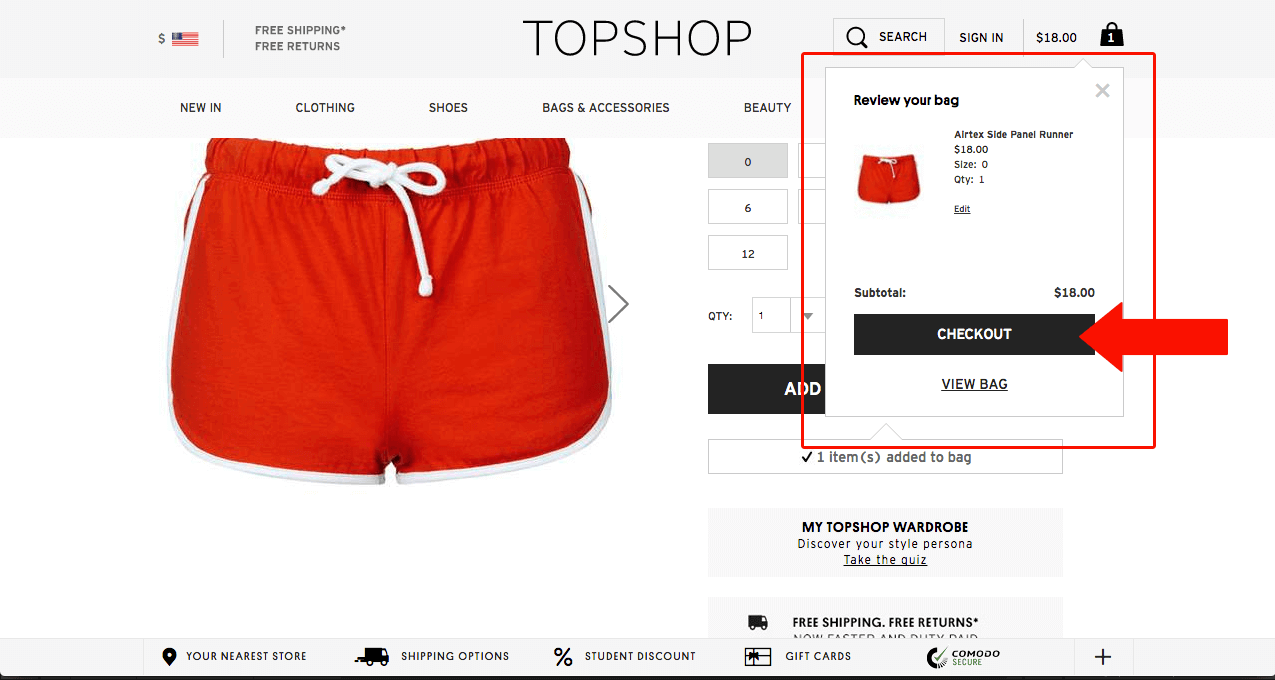
Next, after adding an item, they have a popup confirmation that allows you to edit within the popup without navigating away from the product page, or go directly to checkout. This visual element allows customers to progress through their purchase path much easier: if they’re ready to checkout all they have to do it click “Checkout”.

What’s really great about Topshop is that they’ve applied the same ease to their mobile shopping experience. Adding the same product to your bag via mobile is just as easy:
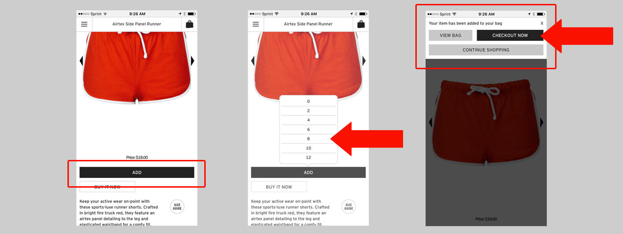

- The “Add to Bag” button is large and obvious
- The Size selector pops up from that button (no redirecting user or making them “check” a size box)
- A confirmation message appears once added to bag that requires action before continuing – again, allowing the user to check out directly from that screen.
Show People Where They Are & How Much They Have Left
A second way to introduce an “obvious” element in your checkout process is by utilizing progress indicators. Progress Indicators help people see where they are and how much work they have left to accomplish before the order is complete.
When introducing a progress indicator to your checkout process you should strive to make it include these key features:
- Clearly visible.
- Simple wording.
- Bold, stripped-down design.
- Visuals that fit your brand.
- Obvious which step user is on, which have been completed and how many are left to go. (source)
Bonobos, one of our favorite brands when it comes to user experience (UX) design, has created a checkout process that is next-to-Amazon quality in terms of ease of use.
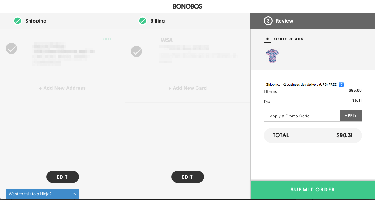

The “Shipping”, “Billing”, and “Review” sections appear with a green icon (mirroring their CTA color on site). By visually “calling out” that the user has only 3 steps to complete their order, the the user is encouraged and motivated to go through the process because he/she can see what work is required of them.
Now, let’s look at how they handle their progress indicator on mobile:
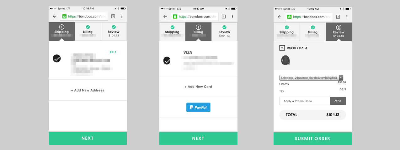

The progress indicator on mobile is just as strong: the three steps are very obvious and take up the top-most part of the screen, immediately allowing the user to understand how far they’ve got to go. (Bonobos is built on the Solidus ecommerce platform – you can read more about it here.)
Both Topshop and Bonobos exemplify what it means to be visible and obvious. You can begin your own visibility improvements by following these three steps:
- Test your own site as a customer. Walk through the purchase path. What was difficult? What was annoying? Take note of these items, then consider the “visibility” factor. How can your observations be improved by a “visual element”?
- Approach your internal development team or ecommerce development agency. Ask for a checkout assessment and be specific in requesting improvements in visual indicators. Make sure their recommendations are impactful, yet simple.
- Hire a drunk person to review your site. (Just kidding. But if you’re serious, you can.)
Simplicity
If you’ve ever had a user experience (UX) consultation with an agency or a conversation with your internal development team, “simplicity” is undoubtedly the crux of the discussion.
Simplicity is all about minimization. So when we talk about making things “simple”, put your head in a place to where you see your checkout through a less-cluttered lens.
Everyone Has ADD: Remove Distractions
Many ecommerce brands implement surveys, feedback, and other calls-to-action in the checkout process because they believe it’s the last chance they’ll have to interact with the customer. This is simply not true, and disabling this mindset will free you up to make some impactful changes to your checkout.
While feedback and additional CTA tactics are well-intentioned, it’s best to remove them from the checkout process. Any barrier that comes between your user and their purchase is a risk you’re taking at losing a sale.
Some common distractions present in ecommerce checkouts are:
- Like us on Facebook! (CTA)
- Sign up for our newsletter! (CTA)
- Go to Home (navigational distraction)
- Site feedback (popup distraction)
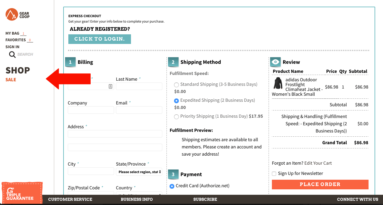
For example, Gear Coop’s navigation is still present during the checkout process. Having a full navigation present allows the user to navigate away from their purchase, and this increases their chances of abandoning their purchase.

In contrast, Bush Smarts, an artisan outdoor gear brand from NYC, has a checkout page with a very clear and focused goal: the purchase. There are no chances for the user to navigate away from this page:
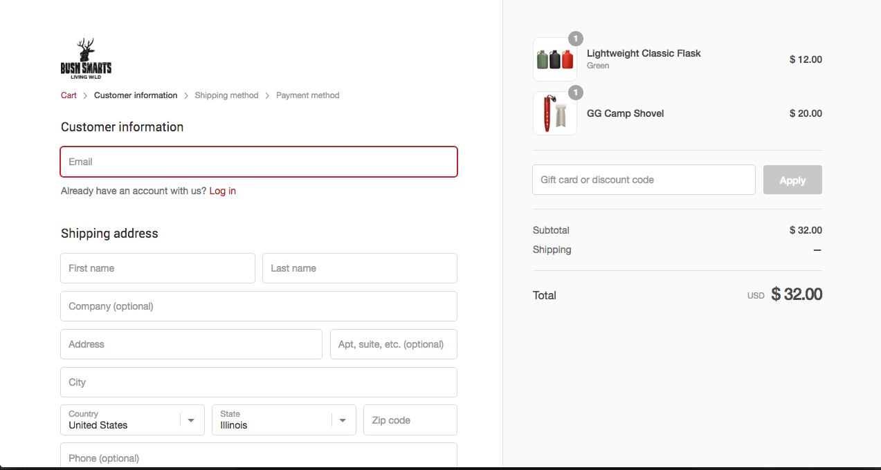

Bush Smarts is built on the Shopify ecommerce platform, which has a reputation for having an easy checkout process.
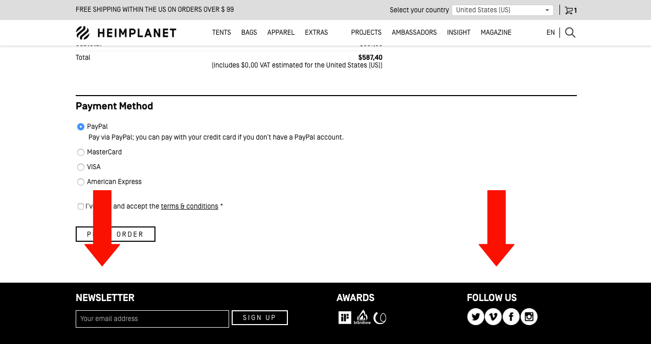
HEIMPLANET, an outdoors gear company specializing in innovative tent design, has great variety of cool adventure gear. However, their checkout page allows for users to get distracted easily by displaying the full navigation, and including newsletter and social CTA’s on the page.

While additional engagement is valuable for your company, there are other ways of achieving it. Your checkout is not the place. Use a solution like VWO or Optimizely to do some A/B testing of your checkout process to test a minimal variation of your checkout page versus the original.
Don’t Force Your User to Do Anything!
Account creation is one of the steps in a checkout process that you can eliminate.
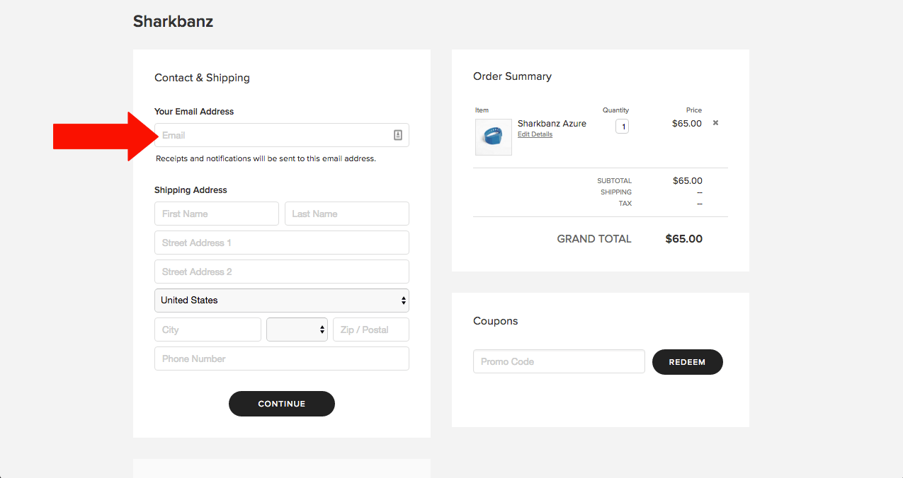
Sharkbanz, an ecommerce company which sells a shark-repelling wristband for water sports, also subtly collects the user’s email address as part of their checkout process. They have it as a field in regards to notification and shipment. This is double-purposed for marketing initiatives after the information of the purchase (digital receipt) is delivered.

If you can avoid the account creation process, offering a “guest checkout” is the optimal way to funnel your visitor through their purchase path.
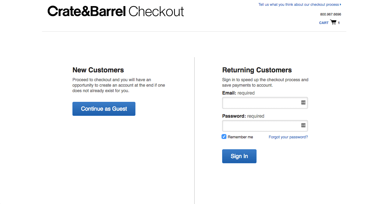

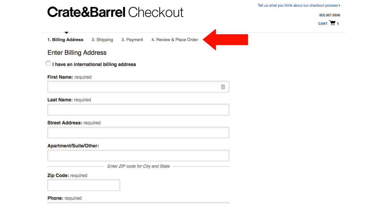
Crate & Barrel offers an easy-to-use Guest Checkout option. Once the user clicks “Guest Checkout” they are directed through a checkout process which exhibits the requirements we’ve discussed above: progress indicators and minimized distractions (there’s no navigating away from this page or extra CTAs).

Now that you know how a few companies are doing account creation and offering guest checkouts, it’s time to analyze your own. Here’s what to do:
- Set up “event tracking” in your analytics account. Whether you’re using a solution like Mixpanel or Google Analytics, you can set up event tracking in your checkout process to see where exactly users are dropping off. If you’re on Magento and using Kissmetrics, here’s a link to the exact steps to set up your funnel. If you are using Google Analytics for your tracking, here’s a guide from the Shopify blog on setting up goals and funnels.
- Based on the data you see, determine where in the checkout process your users are falling off. When you can see exactly where your users are leaving their checkout, you can begin to make observations about the trends you see. Is there a high abandonment rate on the first step of the checkout? Are users leaving on the very last step?
- Analyze and create a test. After you make observations, create a hypothesis around the change you want to make and to which step. Then, create a test to test your hypothesis. If you’re unsure how to begin with an A/B test or if it seems a bit complex, you can contact an ecommerce development agency to help guide you.
Reassurance
The last characteristic of an easy checkout is one that makes the customer feel “safe” in their purchase. When a user feels secure, he/she is more likely to continue with their purchase.
Show Visitors Money-Related Symbols
Believe it or not, adding secure payment symbols highly impact how a user feels about buying from you. In a study from UXMatters, analysts discovered that “icons such as PayPal, VeriSign, Visa” were one of the highest rated trust elements on a website for first-time visitors to a site. (source)
![[image via CrazyEgg]](https://bluestout.com/wp-content/uploads/2016/04/trust-elements-checkout-that-converts.png)
![[image via CrazyEgg]](http://bluestout.com/wp-content/uploads/2016/04/trust-elements-checkout-that-converts.png)
Most ecommerce payment processors offer “badges” or graphics that online retailers can use on their site. Check with yours to see what they offer.
Offer Free Returns
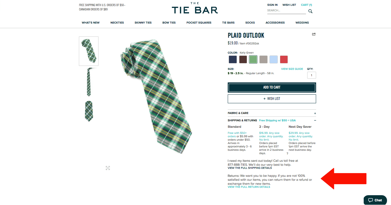

Offering free returns offers an incentive and a reassurance to your online visitor. Online tie retailer The Tie Bar advertises their “Free Return” policy right on their product page. Though it’s not as obvious as it should be, seeing “Free Return” on the product page makes your customer feel better about their choice to add your product to their shopping cart.
Offer Free Shipping, Too
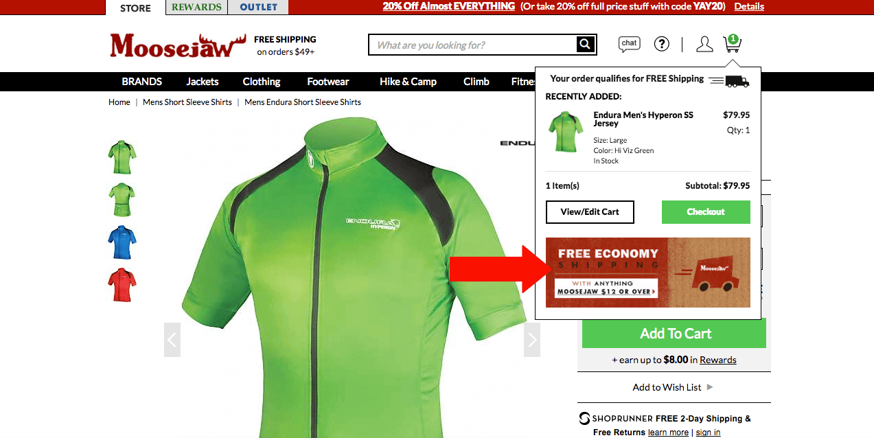
An additional incentive to include in your checkout process is offering free shipping. We’ve written before about why free shipping is a marketing tactic that online retailers should double-down on. Doing this can incentivize and make your visitor feel more “secure” in their purchase. Check out how Moosejaw does it: they advertise their free shipping right in the popup shopping cart that appears when users add something to their bag.

If you’re unsure if you can implement a Free Shipping policy without losing money, here are some tips from Crazy Egg that will guide you to success:
- Determine how much you need to sell in order to be able to provide free shipping. Factor the shipping cost into your cost of the product, and find out if it’s realistic.
- Set a minimum purchase threshold. In order for your customers to qualify for free shipping, make sure they purchase $50-100 worth of merchandise. By structuring your shipping under this model, you can ensure that your profit margin on each order will remain high, while still providing “free shipping”.
- Use free shipping as an incentive during a short marketing campaign.Try this out during the holidays or a special offer. It’s incentivizing and you can better manage the cost to your business in a short timeframe.
- Free shipping on certain items. Also known as “order-level shipping” you can offer free shipping on certain, specific products. Try to select products with a higher profit margin on this one.
- Membership, loyalty programs, or email signups. In order to qualify for free shipping, you can have shoppers join your loyalty program, sign up for a membership, or (at the easiest level) sign up for your newsletter.
- Free shipping on returns. We just wrote about this. If you didn’t read it, go back to the section above!
Now Go Take Advantage of Drunk Shoppers Everywhere
You now have all the strategy you need to make sure that anyone, no matter if they’re drunk or sober, can easily buy a product from your site. The checkout conversion funnel is one of the most common struggles for growing ecommerce companies and deserves constant iteration based on your customer behavior.
What challenges are you facing in your checkout conversion? What tools are you using? Let us know in the comments section below!
[rad_rapidology_inline optin_id=optin_12]