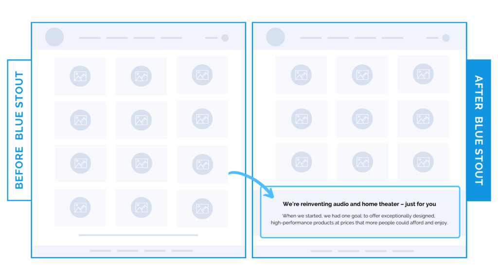
Got a powerful brand statement? Put it where they shop for a 17.2% conversion lift.
Let’s get into another recent CRO win.
In a recent test, we added verbiage from a client’s About page into the Collection page footer. As a result of the test, the conversion rate climbed 14% on desktop and 17.2% on mobile, and revenue per user increased by 37%.
Cool, huh? And strategically simple.
But, first, we have to make sure you have a killer value-driven brand statement and differentiating factors that sum up what you provide your customers. If you don’t already have one (and even if you do) – think about these questions:
- What makes you different from the competition?
- What will inspire your audience to keep scrolling?
- How can you communicate this in the least amount of words?
There’s your winning statement. Use it well.

Here’s Why it Worked
The major goal of this test was to keep customers on-site and shopping the catalog.
This test worked because a lot of this client’s customers were coming directly to the Collections page from Google and social media. We don’t want them to jump off this page to the About page to learn about what they do. Your customer is quickly glancing, and not there long.
Put your power statement in close proximity to the products for the ultimate conversion lift and customer clarity.
Don’t make them guess why they should stick around. Make this copy catchy, benefits-driven, and emotionally resonant, and test putting it on your Collections page. Chances are, they’ll be inspired and want to join in.
What Most Brands Do Wrong
Most brands forget how important it is to reiterate what sets them apart from the competition.
Use your powerful brand statements intentionally & more often than you think.
It could just be the thing that tips the conversion scale in your favor.
Try it out:
Surf through your About page content. Do you have a powerful statement that differentiates you from the competition? Add it to your Collections page footer. Test, review, repeat.


