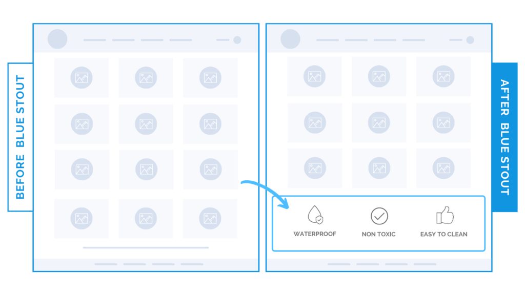
Put your brand values HERE for a 10% conversion boost.
Recently. we tested adding unique value proposition icons (that display on the homepage) to the bottom of the collection pages.
It boosted the conversion rate by 9.7%.
Not all customers start their journey on the homepage. In fact, we like to refer to the collection page as your “side door”.

Here’s Why it Worked
Our findings showed that customers who reached the end of the product list on the collection page were left with a dead end. They either had to…
- Revisit the items in the collection they just browsed.
- OR, go back to the top level navigation, which starts their search for the right product all over again.
Stop them in their tracks instead.
The value proposition icons for, “Waterproof, Non-toxic, and Easy to Clean” WORKED because the more you remind your customers what sets you apart, the more reasons they have to keep shopping.
What Most Brands Do Wrong
Most brands overlook the end of the collection pages (and only focus on homepage or product pages). Use this space to show your brand values right after they browse.
Try it Out
Test adding your icons to the bottom of your collection pages, and watch those conversions rise.


