For large catalogs, these 3 tests draw attention to products and increase conversions on collection pages.
For large catalogs, draw attention to your products on the collection page with badges, color, and price savings.
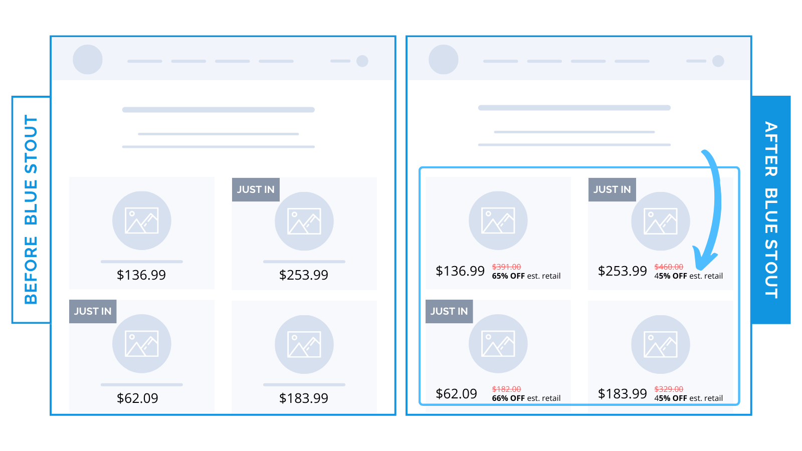
#1: We added “Compare at” pricing to a luxury resale brand’s listings. It led to a 16.8% increase in revenue per visitor (and a 4.8% bump in conversions).

Current pricing as compared to retail shows buyers how much of a deal they’re getting on just-added products.
✨ Takeaway: Drive urgency and communicate value in one quick glance with ‘Compare At’ pricing.
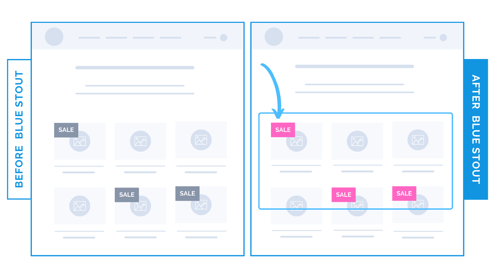
#2: A brightly-colored background on sale badges increased revenue per visitor by 33% and conversions by 12.8% for an apparel brand.

Collections pages allow visitors to scan through your whole catalog at once.
Brightly colored badges draw attention to sale items while eliminating an extra step (clicking to a full sales page).
✨ Takeaway: Appeal to those shopping based on price with a bright background on sale badges. Pick colors that align with the brand BUT don’t blend in.
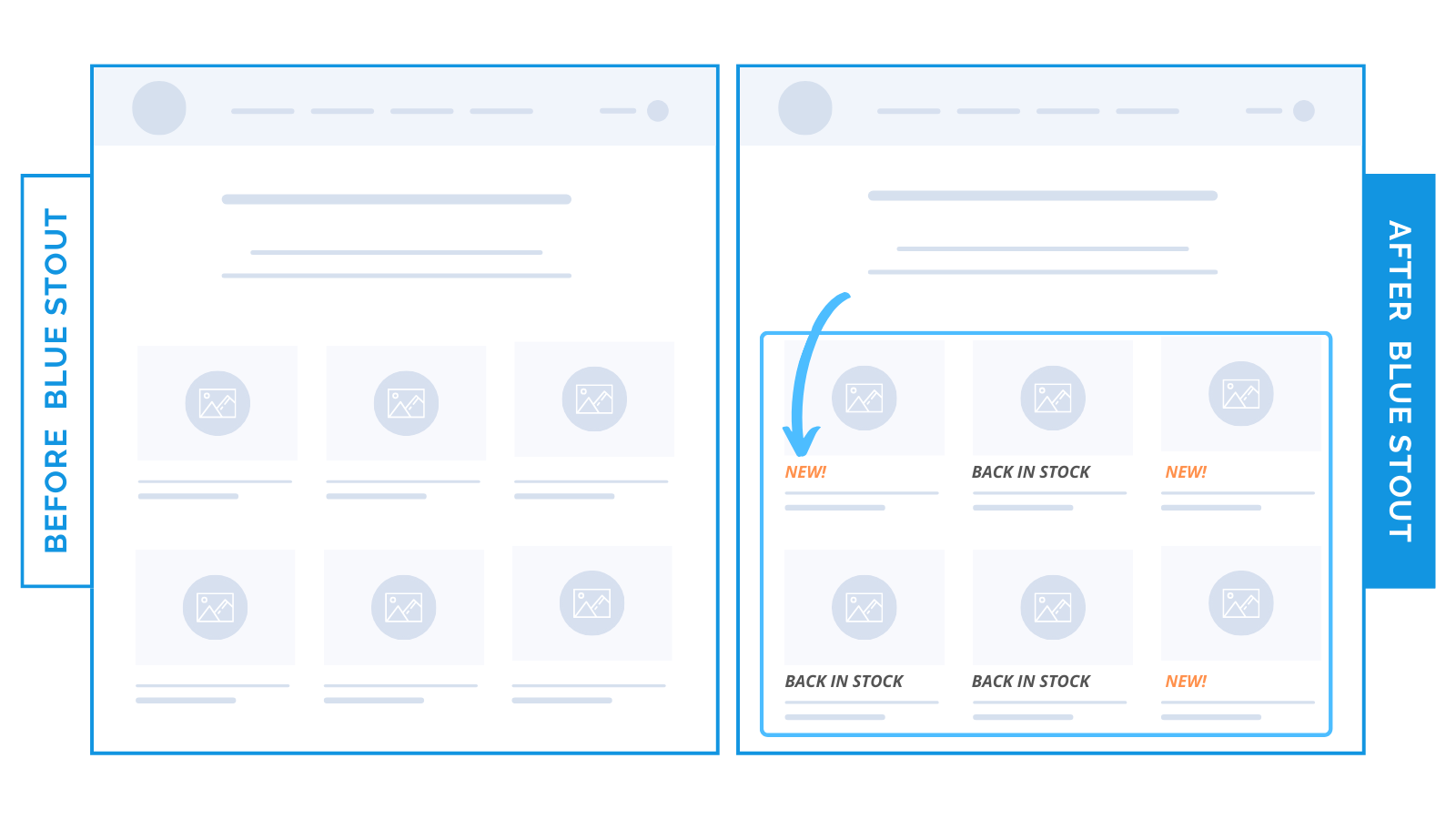
#3: We added “New” and “Back in Stock” text in color to collections listing for a large-catalog apparel brand. Conversions boosted by 10%.

Get buyers to the right product faster with subtle, lightly colored text below your product images.


