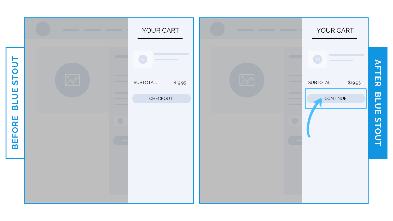
Here’s how to use tone to increase conversions at checkout.
Encourage a natural checkout experience vs. transactional with softer, brand-aligned button copy.
The words you use are critical.
The right tone in your button copy can make buying feel like a next step, not a cold transaction.
Check this out:
For a health supplements brand, adjusting button copy led to a 4.5% increase in conversion rates on desktop and a 2.6% boost on mobile.

Before: “Checkout”
After: “Continue”
Language that feels less like a command and more like an invitation is the goal.
Consider another example: “Pay Now” vs. “Place Order”
Feel the difference?
Customers are in control as they complete their purchase – not the other way around.
Keep in mind: a softer, smoother tone is great for some products and audiences, but not for others.
Here, more relaxed button text matches what buyers feel most comfortable with, especially when purchasing items like health supplements that carry a higher perceived risk.
Voice and tone consistency sitewide builds trust and reduces the hesitation that spikes at checkout.
When in doubt, test!
Experiment with different approaches to button copy. It’s the only way you’ll know what resonates with your audience.
 Takeaway: Soften your checkout button copy to transform the purchase experience from a harsh transaction to a natural invitation.
Try it out!


