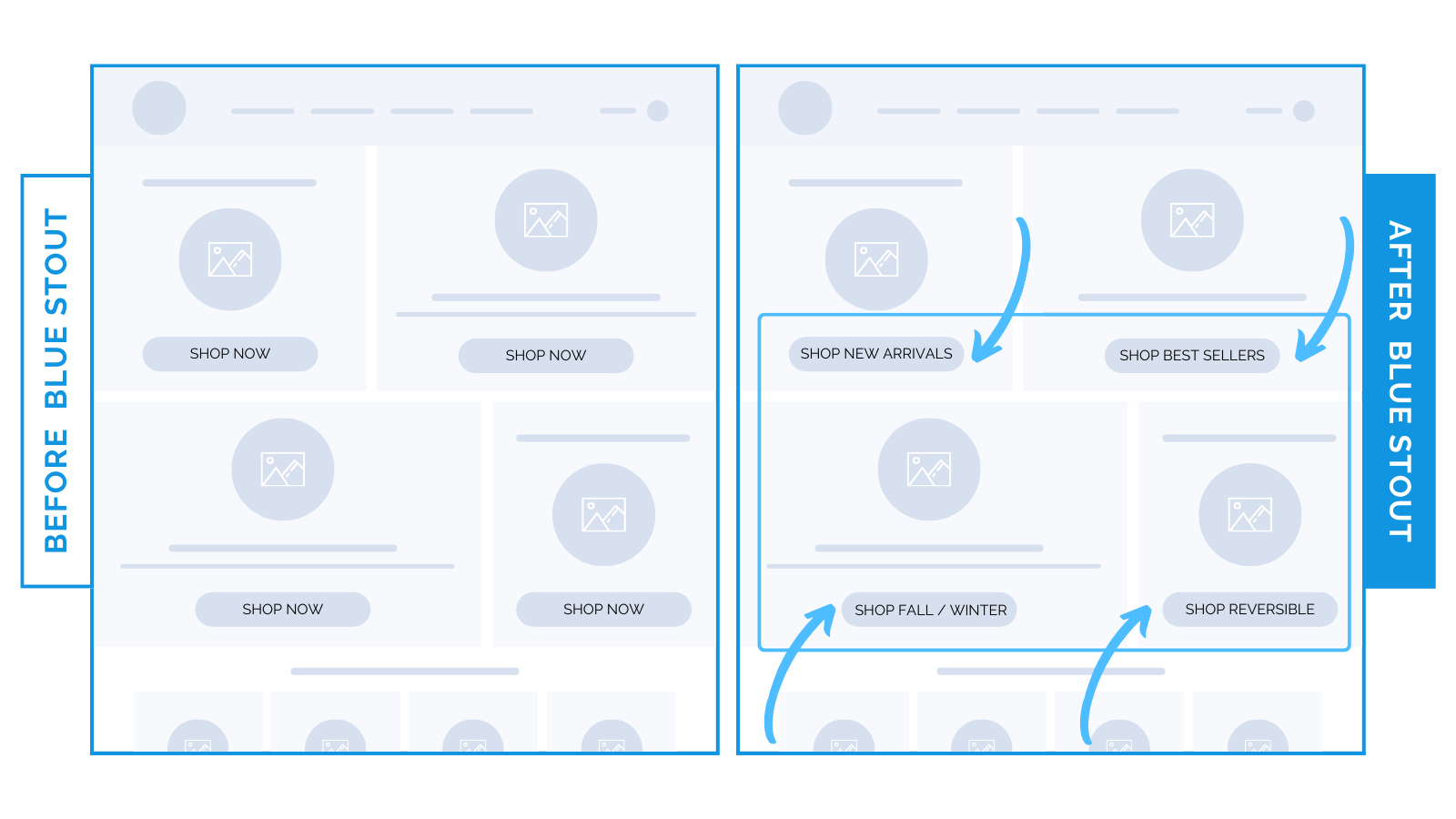
3 words that boosted mobile conversions 7.2% for a luxury brand.
Make button text specific to the collection you’re featuring.
If you ask them to take action, be specific.
On a luxury clothing brand’s homepage, we edited CTA text to align with the featured category. A general ‘Shop Now’ was changed to ‘Shop New Arrivals.’
This specificity lifted overall conversion by 4.6%, increased engagement by 31%, and mobile conversions by 7.2%.

Most shoppers prefer quick, easy navigation.
And specific CTAs make shopping intuitive and straightforward.
Don’t make customers wonder where a button will lead. It adds friction, and creates hesitation.
By telling them exactly what to expect, you eliminate ambiguity.
Here’s why specific CTA’s convert:
- Faster purchases: Each button explicitly guides visitors to the collection featured,
- Easy mobile navigation: Clear and concise CTAs cater especially to mobile visitors who favor straightforward navigation.
Specific call-to-actions streamline the path to purchase.
Refine yours to match their expectations.
As always, test to find the best approach for your audience.


 Takeaway: Use specific CTA buttons tailored to your featured collections to get customers shopping faster.


