
Are You Losing A Full Day of Revenue With Your Mobile Ecommerce Design?
Not optimizing your site for mobile is the equivalent of having your physical store closed one day a week.
If you’re a business owner and have an ecommerce website, you can no longer afford to ignore the user experience of those customers visiting from a mobile phone or tablet.
Imagine that a customer walks into your physical retail store and can’t find what they’re looking for on the shelf.
As a store owner, you ensure there is someone there to help guide them to the right product.
The same standard should hold true online.
You must guide the customer through their time on the site to ensure they have the best experience. If they can’t find what they’re looking for, or experience errors in their checkout process, they will simply close the window or abandon their shopping cart.
Sale lost.
Poor user experience (UX) is possibly the highest driver of shopping cart abandonment on mobile devices.
“The temptation to adapt a desktop strategy to fit mobile can be strong, but should be avoided.” -The Mobile Playbook, Google
So you’ve perhaps been influenced by all the “buzz” about responsive design and want to optimize your website for mobile.
Most of our clients, by default, are tempted to utilize a desktop strategy in approaching your adaptation to mobile technology. I can’t blame them – it’s what feels most natural to most of us who operate using a desktop for the majority of our internet access.
But, remember you are not the majority.
We’re now starting to see the desktop vs. mobile usage flip-flop.

50% of the average global mobile web users now use mobile as either their primary or exclusive means of going online.
That’s huge!
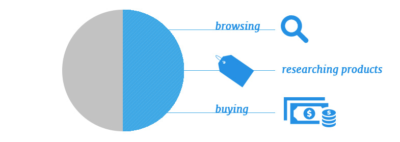
Half of the people who own smartphones are using their devices to access the internet where they are browsing, researching, and making purchases. So, people are not using their smartphones just to browse – they are taking action.
Mobile sales are consuming the online ecommerce industry.
Comparing the performance of Q3 2015 to last year, mobile ecommerce saw a significant boost in visits (+35.0%), orders (+69.5%), and revenue (+97.9%).
For Shopify, the number of mobile visitors has already surpassed 50% for their network of over 100,000 online stores.
Let that resonate for a minute: Shopify sites now see more mobile visitors than desktop visitors.
You’re Losing Potential Revenue
“The abandonment rate for mobile shopping carts is 97%, compared to 70-75% for desktop carts.”

People aren’t patient. They aren’t going to repeat steps, refresh pages, or re-enter information. Almost seven in 10 smartphone and tablet owners (68%) have attempted to make purchases on their device.
However, problems during the payment process have forced two-thirds (66%) of that group to abandon their transactions.
Don’t Fall Behind The Competition
Customers are fickle and move fast. A single poor experience on mobile might cost you that customer FOREVER.
In a mobile responsive ecommerce survey conducted by Google, they reported that “40% [of mobile customers] have turned to a competitor’s site after a bad mobile experience.”
Today, it is very easy for a customer to find an alternative product since they can shop from their mobile device. It’s important that you consider the threat of your competition when deciding whether or not you want to invest in improving your mobile UX.
So What Can You Do About Your Mobile Ecommerce Design?
Start by taking a look at your ecommerce site on a mobile phone or tablet to understand what your customer is seeing.
When you try to purchase something, where are you getting frustrated? Your customer is most likely feeling the same.
If you have analytics set up (if you don’t, do it now), take a look at both the percentage of mobile visitors (those arriving to your site using a phone or tablet) and the bounce rate of those visitors.
If you have funnel tracking set up, look at your shopping cart abandonment rate for mobile users.
These are your lost customers.
The good news is you can learn how to get them back! We’ve created a FREE Conversion Workshop to guide you through the exact formula that the fastest-growing ecommerce brands use to convert users to customers.
And, that includes mobile conversions, too!
Grab a spot now and see the exact tactics you need to improve.

