Quick Conversion Hacks from 7 Ecommerce Case Studies
You’ve heard it before – always be testing.
But if you’re running an ecommerce business then the tasks of analyzing your site data and identifying leaks in the funnel usually get pushed to the bottom of your to-do list. Let’s face it, you’ve got 97 other things you SHOULD be doing today.
So with that in mind, we’ve pulled together the following 7 real world ecommerce lessons to help you cut straight to the chase in implementing some simple solutions to increase your online sales.
Case study #1: Envelopes.com achieved 40% more conversions by following up
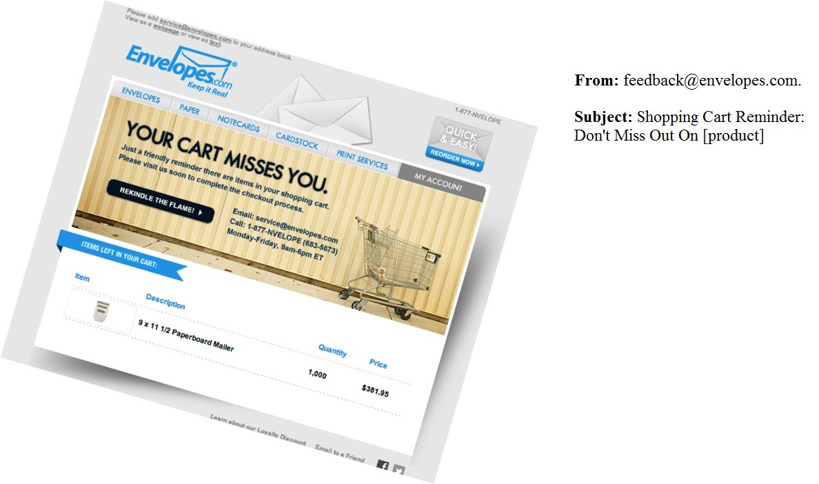
A common ecommerce problem is prospects exiting the page before completing their order. As consumers, we’ve all done it before. So the team at Envelopes.com wanted to see if they could “rekindle the flame” and land some sales from hot leads using target followups. These are visitors who created an account and put an item in their shopping cart, so we can see some real intent to purchase at some stage down the track.
The Envelopes.com team were confident that sending targeted follow-up emails generally resulted in sales but weren’t sure of the best timeframe to send them. So they tested out email sends at two alternate time lapses post cart abandonment; the first group sent the following morning at 11am and the second group 48 hours post cart abandonment.
The emails sent at 11 a.m. the following day delivered:
- an open rate of 38.63%
- a click-through rate of 19.54% and
- a conversion rate to a sale of 27.66%
The emails sent after 48 hours delivered:
- an open rate of 38.01%
- a click-through rate of 24.71% and
- a conversion rate of 40.00%
Although sending these emails on the following day post cart abandonment had a slightly higher open rate, the most important figure, conversion to sale was significantly lower.
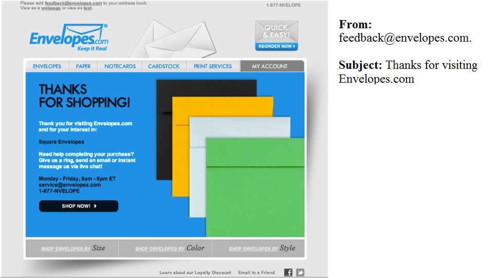
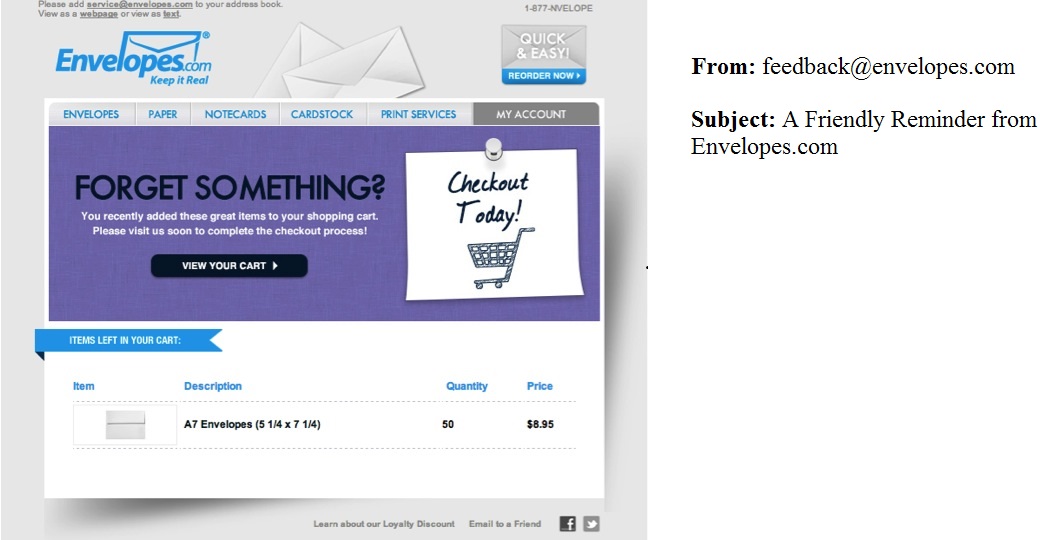
Take home message: Send a follow-up email to people who abandon their carts, if you’re not already doing it. Though Envelopes.com found that 48hrs later was the best performing time, a different cadence and time lag may work better with your customer base, so test out multiple alternatives. If you’re looking for some assistance on the creative messaging front, we have included the exact email creative used by Enevelopes.com here:
Case study #2: Edible Arrangements boosted same day sales by 8% with one simple messaging change
Edible Arrangements had a fairly typical marketing challenge. They offer customers a same-day delivery option (and have done so for years) but people weren’t taking advantage of the offer because they didn’t know about it.
To educate customers about this option they significantly increased visibility with a large banner in an extremely prominent position on the homepage, just below the navigation bar. This created urgency around the offer by featuring a countdown timer to the deadline for same day delivery. It was impossible to miss or misunderstand.
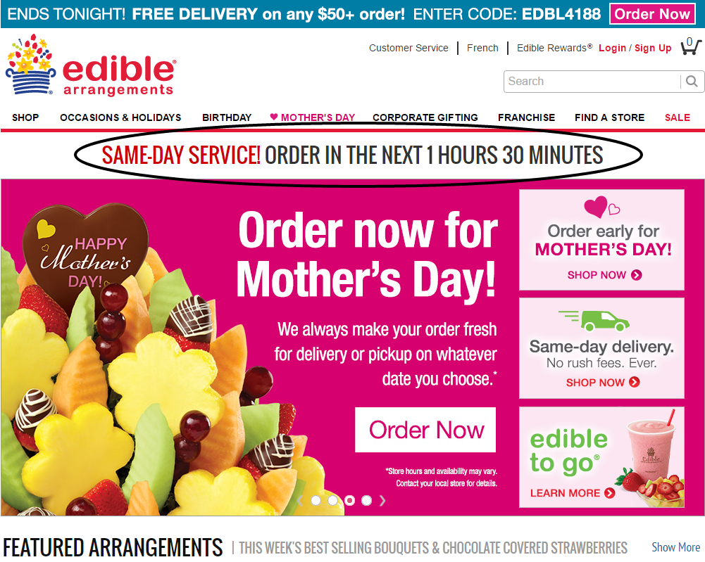
The result of this simple countdown feature? An increase in same-day sales by 8%!
Take home message: You don’t need a new product to promote something. People might not know about a product or service you already have in play, so by increasing visibility to your existing audience, you may be able to snap up some quick wins. As a side note on this particular example, creating some urgency is always a good sales strategy. Encourage your audience to act now, instead of later (or never)
Case study #3: Company Folders streamlined their quote page to increase conversion by 68%
Company Folders is an established business but had a website that their CEO admitted was “obviously last year”, which is putting it gently.
The main problem they wanted to remedy was their online quote function. This is a vital step in their marketing funnel, so making the process as smooth as possible was essential to ultimately driving more sales for the business.
This sounds a simple task but with over 15 million product combinations, the current quoting system was highly complex. Further to this, there was a very high rate of prospects dropping out of the form partially completed.
Intuitively they assumed that getting the form onto a single page would help get prospects through the process, but after surveying their best customers, they realized that a redesign was necessary.
They took a cumbersome single step process with lots of options and broke it up into a multi-step bite size process (pictured below). Doing this resulted in a 67.68% increase in total quotes.
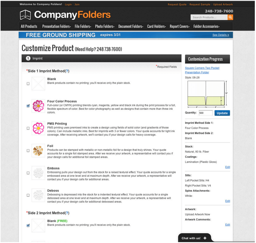
Take home message: Breaking down a complicated system into manageable smaller steps can help keep people focused and increase conversion. Though additional clicks can often be seen as new opportunities to lose customers, the Company Folders experience tells us that streamlining to shorter stepped forms is the way to go right now.
Case study #4: Taloon.com ditched social buttons to boost sales by 12%
Taloon.com got caught up in the trend towards social proof, with “Like” and “Share“ icons on their product pages. However, they noticed unusually low conversions on pages with those social sharing buttons.
To test what was going on they created two variants of the same page with and without the social share icons.
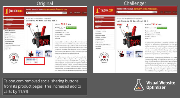
They assumed that by de-cluttering the page, it would keep customers focused on the task at hand – checking out.
The results? Pages without social share icons saw an improved “add to cart” click-through by 12%.
Take home message: Just because everyone else is doing it doesn’t make it right. Always put yourself in the mindset of your customer, and keep them focused on the main task you want them to complete. Declutter pages with unnecessary actions to focus on making the sale.
Case Study #5: Express Watches debated Price vs Authenticity…with shocking results!
This is a classic problem for online stores; Do you boast the lowest price or the most authentic products?
The team at Express Watches were debating whether to communicate a lowest price guarantee versus a stamp of authenticity on their website. They tested variants with both, each telling a different story about the clientele: bargain hunters vs aficionados. The results were pretty surprising.

By labeling the site with a badge of authenticity, Express Watches saw an increase in online sales of 107%. A huge differential from the price based messaging, simply from a little seal of authenticity.
Take away message: You may think you know what your audience wants, but testing out some alternate value proposition could surprise you.
Case Study #6: Underwater Audio remove charts to bump sales by 41%
Underwater Audio had a problem with visitors who were in the middle of their sales funnel, researching specific products but then dropping off at the comparison page. When they noticed this leak they decided to get to the bottom of it.
Here are the old and new versions of the page. At first glance, they don’t look too different, but the devil is in the detail.
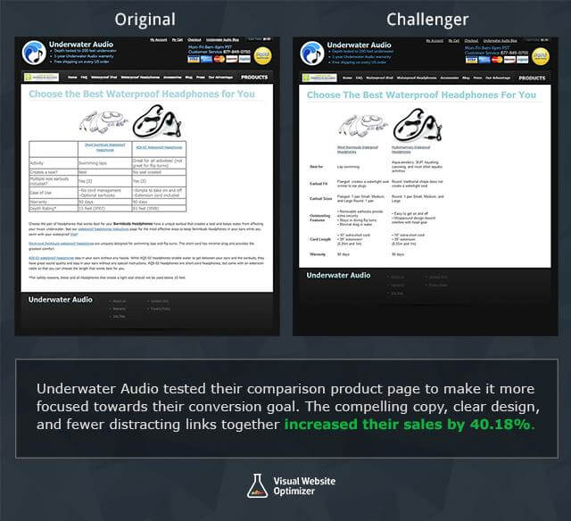
The original one, was a bit more cluttered with the table formatting breaking up the flow of information. To test what the problem was, they redesigned the comparison page to make it simpler and more streamlined.
As their CEO said:
“The (rather) unattractive table had information in terse phrases organized in no particular fashion (activity, seal, size, features, warranty, depth). The paragraphs continued below the fold and essentially repeated the table, with only a few unique additions hidden in the text. In short, it was not the most engaging page!”
The new version did away with the data tables, streamlined the text, and put everything above the fold.
The result? The redesigned page had an increase in online sales of 40.81%.
Take away message: To quote Occam’s Razor, “the simplest solution is often the best” and the simpler flow worked wonders for Underwater Audio. Find pages in your pipeline where users are dropping off and see how you can simplify them to focus your customers.
Case Study #7: Paperstone took out their competition with a simple comparison table
Paperstone is a small paper company that competes with large brand big box stores like Staples and Viking. With most people defaulting to the brands they know best, Paperstone needed to find a way to leverage their strengths against the competition; lower prices.
Rather than paying top dollar to compete for advertising attention, they simply included a comparison table on their homepage showing their pricing against that of their competitors.
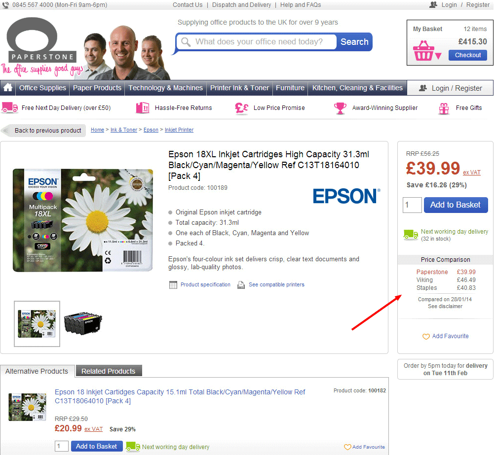
This simple table increased online sales by 10.67%! Just think about how much revenue that would mean for your business, without running any new promotion or campaign.
Take away message: Assess your competition and identify your strengths. Then showcase these against your competitors’ weaknesses to make your business look like the obvious choice when compared.


