
6 Important CRO Takeaways from Analyzing 14 Popular Ecommerce Websites
Ecommerce stores live and die by their conversion rate.
As Square puts it in their article on ecommerce metrics you need to know:
“Your conversion rate is the number of people who have visited your site and then converted into actual buyers or taken another action, like signing up for a newsletter. To determine your conversion rate, you divide the above total number of conversions by the number of visitors to your site.”
You can also track conversions for things like email opt-ins to your marketing list. CRO, or conversion rate optimization, is the practice of improving your conversion rate over time. Ideally, you’re doing this in a scientific manner — carefully testing two variations against each other and tracking metrics throughout, rather than just throwing a change at the wall to see if it seems like it helps your conversions.
Once you start tracking your conversion rates, you might be disappointed in how low they are, but the average ecommerce conversion rate is around 2-3%. And improving your conversion rates can feel like something of a catch-22 — data analyzed by Receiptful showed that bigger ecommerce stores tended to have better conversion rates. The theory: bigger companies have more money and more resources (plus more experience) that lets them test what works and what doesn’t.
But that doesn’t have to be the case. Today, we’re going to cover six takeaways that can give you an edge in improving your conversion rates — even if you don’t do half a million in sales every year:
1. Simpler is better
One rule of thumb that holds true across any medium: confused people don’t buy.
Whether it’s your copy, your design, or your calls to action, your website visitors must know what’s going on. They need to know how to navigate to the product, how to buy, what it is they’re buying, and what the benefits of the product are. If your design or copy is too dense or confusing, it’s going to tank your conversion rate.
Gazelle does this brilliantly with their homepage:
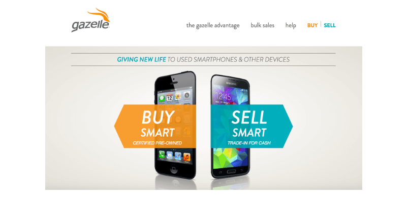

There’s no confusion about what they sell, or where you need to click to take what action.
In this case study, streamlining the signup page for the Sims 3 by removing extraneous options and highlighting one clear call to action increased game registrations by 128%. In another case study, removing banners from the top of the category landing pages on the VeggieTales shop improved their revenue per visitor by over 17%.
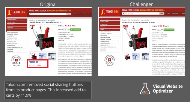
This is also a reason to reconsider your social sharing buttons — hardware site Taloon experienced a nearly 12% boost in conversions by removing their social share icons:

Tests to run:
- Simpler versions of copy (smaller words, more scannable due to bullet points and bolding, shorter copy)
- Removing social share buttons
- Removing large graphics that aren’t specifically related to the product(s) being sold
- Simpler versions of the homepage
2. Create a uniform experience
This also relates to rule number one (that confused people don’t buy). If people are expecting a certain design layout or a certain type of copy, based on the way the rest of your site is set up, and then find something different, they’re less likely to take the action you want them to take because they’ll be disoriented, even if momentarily.
For example, SmartWool found that when all product images were the same size, revenue per customer went up:
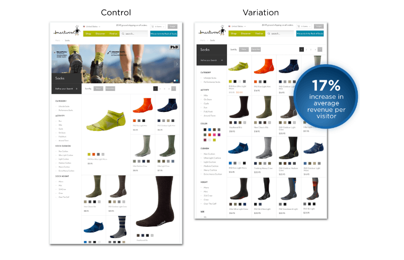

They found that using repetitive image attributes (in other words, having images all the same size with the same information in the same spots) created better eye tracking, making it easier for people to skim and find the products they wanted.
In another example of a uniform experience boosting conversions, Secret Escapes changed their landing page copy to match their PPC ad campaign and increased signups by 26%. (Read more on that case study and get more CRO tips here.)
Tests to run:
- Match your landing pages (or ad-campaign specific landing pages) to any language used in the ad campaign and test the results
- Have another person look at your site and point out any places where the design was different than they expected,
3. Give people an action to take
In general, giving people an action to take works better than labeling a button with a noun. When working with Lifeproof, Optimizely found that in a three-way test between “Store,” “Shop Now,” and “Shop,” as button text, using the “Shop Now” text resulted in a 16% increase in monthly revenue. They found something similar with Insound — that using “Review Order” as text performed better than “Continue,” “Submit,” or “Almost Done.”
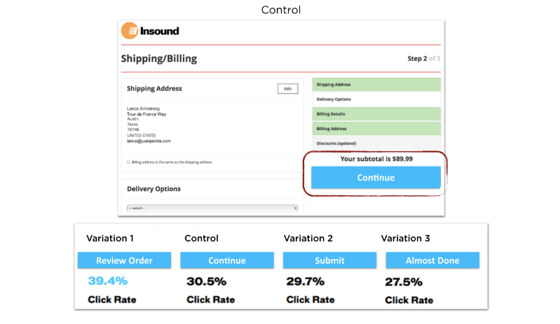

In both of these cases, the text that was worded in an active and urgent way performed the best, with the least active (“Almost Done,” “Store”) performing the worst.
Once you’re focusing on action-oriented language, you can refine even further. Black & Decker’s DeWalt brand found that “Buy Now” performed 17% better than “Shop Now,” for example.
To test:
- Test variations of all clickable links and call to action buttons that have verbs instead of nouns (and, if you already have a verb on the button, try adding urgency by using words like “now”)
- Even if you already have action-oriented buttons, test a few different versions to refine them, like Black and Decker did
4. Give customers visuals (and test them)
Visuals (whether it’s audio, video, or 360-degree views) on product pages are crucial. They let visitors know exactly what it is they’re buying, and also break up the text and make it more skimmable. And they don’t always have to be images of the product at hand: in one case study, Highrise increased signups by 102.5% by including a smiling customer on their homepage. ModCloth uses a similar tactic, featuring images sent in by customers on each of the product pages.
Aside from adding in visuals, you should also be testing different types of visuals against each other. ZAGG, the phone case retailer, found that setting video as the default visual on product pages increased revenue per visitor by 27%. Then, in a follow-up test, they found that switching the default visual to a 360º view of the product increased RPV by an additional 12%, for a total increase of 39% over the original image-first product page.
To test:
- Test a version with no images or less images compared to a version with more visual elements
- Test versions of the product page with different default visuals (video vs. image, for example, or video vs. 360 view)
5. Test different shipping offers
There’s no doubt that free shipping works, especially with ecommerce giants like Amazon popularizing it. Of course, for a smaller business, free shipping can be tricky — you want that boost in orders, but you don’t want to take a huge cut in profit margins to go with it. NuFace, a cosmetics company, went around this by giving a $75 threshold to free shipping and adding a note above the Shop button that said so (“Free shipping for orders over $75”). As a result, new orders increased by 90% and the average order value also rose went up just over 7%.
You can also target specific customer segments who have a higher-than-average rate of cart abandonment with free shipping offers, like Sheplers did for customers in Texas — and was rewarded with a 48% increase in new customer acquisition in just four days.
For more ideas on how to make free shipping work for you, head to this post at KISSmetrics.
And last but not least…
6. There isn’t a “one size fits all” when it comes to CRO
There are some general rules of thumb — like the ones covered above — but for every single example, there’s a counterexample. You can’t say long form landing pages are always the bomb dot com because sometimes short pages outperform them. Sometimes video is better than images, and sometimes images perform better.
For more ideas on what to test in order to boost conversions, head over to this post on the Sellbrite blog.
In short, you need to test everything. If it can be tested, you can be testing it. Even if each test only results in improvements of 5-10%, that adds up over time — and goes into your bottom line.