How to Deal with Temporarily Out-of-Stock Pages (and Actually Win Sales)
Running an ecommerce store is hard work.
From shipping woes to monitoring your site for smooth operation, you also have to keep track of your inventory, and ensure products don’t become unavailable.
Yet, every ecommerce store has to deal with the challenges that come with a product being “out of stock” from time to time.
How you choose to communicate this information to your customers is critical. With the right strategy, you can actually use “out of stock” items to win and drive sales.
In this article, we’ll share some strategies you can use to do just that.
What NOT to do
Before jumping straight into what you need to do with your out of stock pages, it’s important to realize what you should not do.
Here are a few things you should completely avoid when dealing with out of stock products:
1. Remove the item completely
Removing an item completely from your site disorients your customer.
If someone has saved your product in their cart or bookmarked your product page, removing your item leads to assumptions that your product is indefinitely unavailable (or perhaps the shopper didn’t save the right page, leading to futile searches).
This leads shoppers to look for the product elsewhere (like your competitor or Amazon!)
Furthermore, removing product pages from your site requires organizational effort.
Every time you add or remove a product page, you waste precious time and resources of your development team to complete this repetitive task.
Most importantly, there are SEO repercussions to product removal. Removing an item from your store doesn’t mean it’s gone from Google’s index. As a result, when customers try to visit this page, they will be greeted by a 404 error.
Take a look at this example from Modcloth:
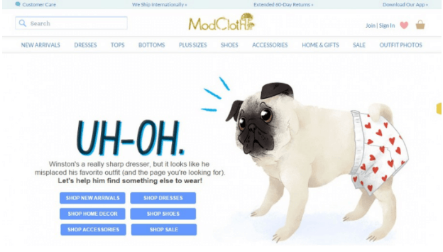

Such pages diminish user experience and lead to a phenomenon known as ‘pogo-sticking’. This is when customers land on a page and immediately hit the back button because they couldn’t find what they were looking for.
This impacts ‘dwell time’, an important metric in search engine algorithms. Here’s what Larry Kim had to say regarding the impact of dwell time in Search Engine Ranking Positions (SERPs) post RankBrain; an artificial intelligence (AI) aka machine learning program that is used by Google to help process Google search queries.
“It seems that Google’s machine learning algorithms have seen through all those pages that used to rank well in 2015, but really didn’t deserve to be ranking well. And, to me, it certainly looks like Google is rewarding higher dwell time with more prominent search positions.”
Only consider removing the product if it is unavailable for a long time or if you don’t plan to sell it anymore.
2. Redirect users to homepage
Most online stores redirect users to their homepage when they click on an out of stock product.
This is a poor way to let customers know a product is unavailable. This technique disrupts user flow and disorients your customer leading them to get lost on your site.
For example, consider a customer who searches for ‘blue jeans’ and finds your product page in the Google organic or paid listings. However, since the product isn’t available, you redirect the customer back to the home page.
A redirect back to your homepage means they have to start the search all over again.
The more specific the product is, the longer their navigational path will be.
For example, they may have to click on clothes > men’s clothes > jeans to return where they left off.
Also, consider how people behave on the web.
They tend to open more than one tab at a time. In other words, after clicking on your product, they are likely to do something else (while the product page loads) and return later.
If they come back to not find the product they’re looking for – say goodbye to your sales.
3. Be unclear about product availability
A lack of information about product availability leads to shopper frustration. A customer might hit the ‘Add to Cart’ button, fill up the purchase/checkout form, only to see that the product is not available on the order confirmation page.
This creates a poor user-experience, causing shoppers to abandon your site.
Therefore, make information about your product availability abundantly clear. Customers should be able to discern in a single glance if your product is available.
Don’t write “out of stock” in tiny font below the fold. Instead, make this information obvious and easy to discern (more on this below).
For example, take a look at this poorly designed “out of stock” notification on a product page from Adidas:
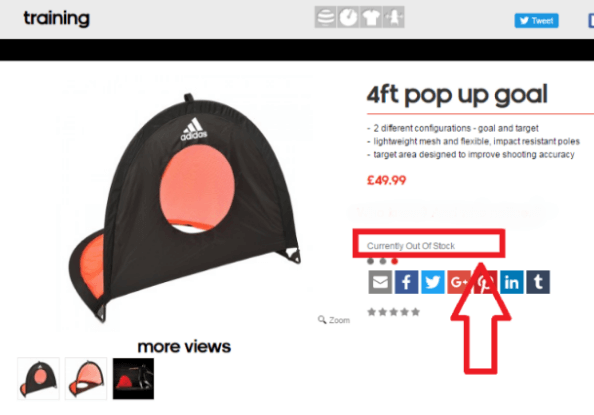

Most shoppers will skip over the out of stock warning since the text is tiny and in a light gray color. Instead, they will search for the ‘Add to Cart’ button and get frustrated when they can’t find it.
Make sure your “out of stock” message stands out. We’ll look at some ways to do this below.
What to do
When dealing with out of stock pages, you should have two primary objectives.
- Reduce SEO impact. Out of stock pages tend to have high bounce rates and a large number of such pages can negatively affect your rankings.
- Drive customers to relevant products to win sales. An out of stock product shouldn’t be a dead end to the sales process. Your objective should be to direct customers to additional products that might lead to a sale.
Here’s how you can use out of stock pages to win over customers:
1. Identify the root cause of out of stock
Saying that a product is “out of stock” is rather vague. It doesn’t give either you or your customers enough information about the nature of the unavailability issue.
Your first step in dealing with out an out of stock issue is to figure out how long the product will be unavailable.
Generally, there are four common out of stock scenarios:
- Temporary unavailability: These are products that are unavailable for a short period of time (1-4 weeks). For example, a brand of shoes may be temporarily unavailable due to a machine malfunction at its manufacturing facility halting production.
- Seasonal unavailability: Most seasonal unavailability is a business decision. For example, Starbuck’s pumpkin latte is only sold every fall. A clothing store might choose to sell its warm jackets only during winters.
- Discontinued products: Unfortunately, there are times when a product is no longer profitable to sell. In such cases, these products are discontinued and no longer manufactured for sale.
- Indefinitely out of stock: This scenario is reserved for products that are unavailable and you are unsure when they will be back on sale.
Each of these four scenarios needs to be tackled differently. If a product is temporarily or seasonally unavailable, you can keep the product page up and communicate unavailability to customers.
However, in case of discontinued products, you need to communicate so to buyers and redirect them to a more relevant page after a sufficient amount of time has elapsed.
2. Display out of stock status clearly
If your product is unavailable, be clear about it.
You don’t want to confuse customers with conflicting messages that leave them wondering about the product status.
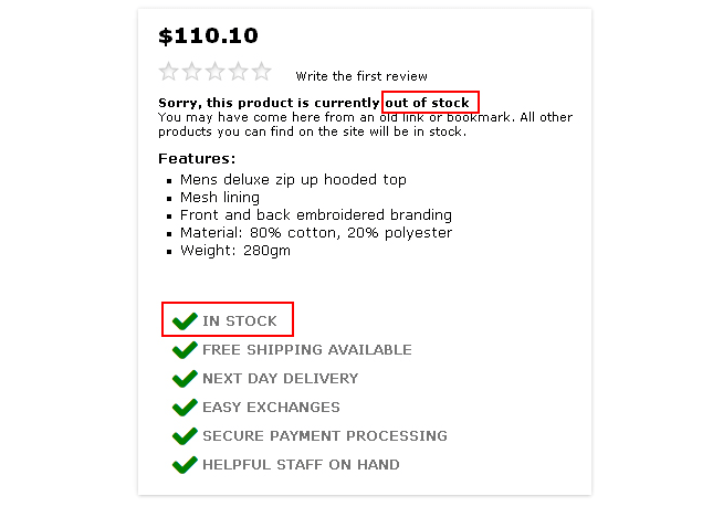
For example, don’t baffle customers like this:

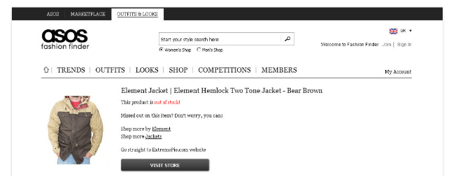
Instead, clearly draw attention to unavailability like ASOS does:

Another trick you can use is to grey out your add-to-cart option.
This lets your customers know that something is amiss (especially those who directly proceed to checkout)
Also, make sure to indicate whether the entire product is out of stock or only a subset of it.
For example, T-shirts come in various sizes and colors. And if only a few combinations are unavailable you don’t want to mark the whole item out of stock.
Check out this example from Black Milk Clothing:
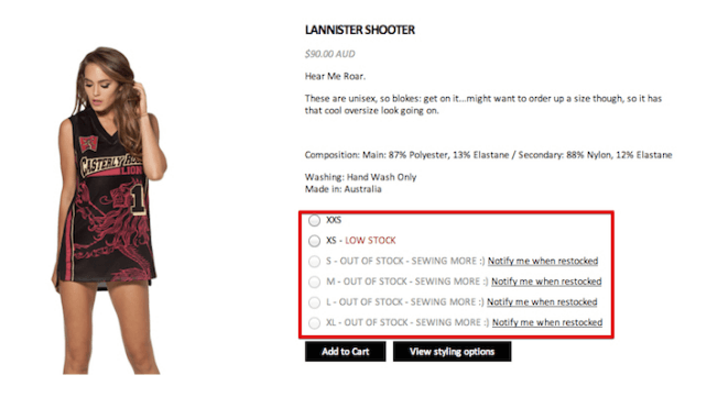

They clearly differentiate which versions of their product are in stock.
3. Visualize unavailability in category pages and search results
Saying that a product is unavailable in the product description isn’t good enough. It still means that a customer would click through to a product, read the ‘out of stock’ message, then hit the back button.
The result? A bad user-experience.
Customers should know in category pages/search results whether your product is available or not. This way you can prevent customers from clicking-through to out of stock items unless they want to find out more information.
There are several tactics to do this:
A. Gray out product image
The most popular tactic is to gray out the product image to imply unavailability. Some stores also add an ‘out of stock’ banner. The grayed-out image visualizes the out of stock issue when contrasted against the regular product image.
For example, Flipkart uses this tactic for its out of stock products:
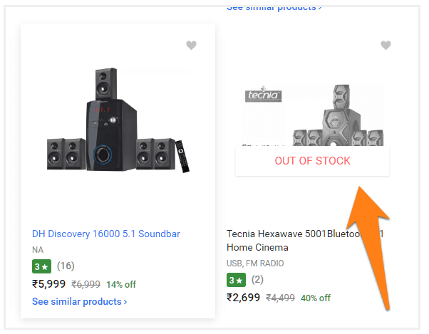

The challenge in using this tactic is that it requires modifying the product image. This is additional step can add to your work – not recommended for temporarily out of stock products.
B. Use ‘out of stock’ message
Another tactic is to use a temporary ‘out of stock’ message below the product image. Eloquii uses this tactic:
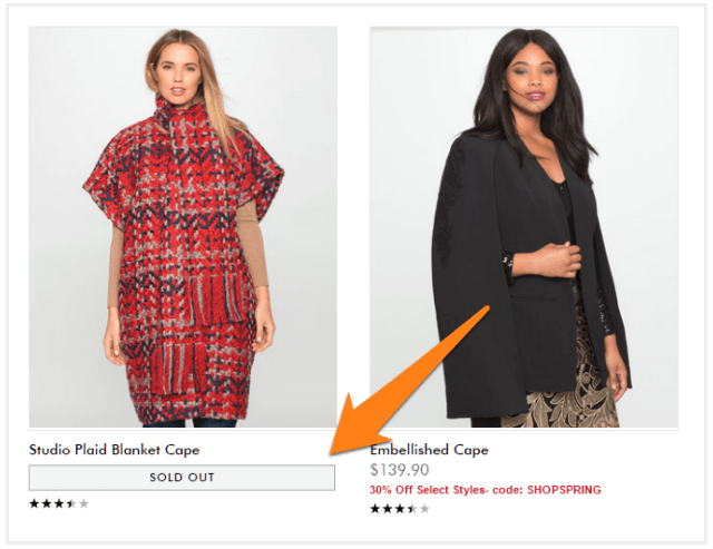

It’s important to make this message easy to spot. Choose a large font and bold colors to visualize unavailability.
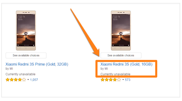
Amazon, for instance, keeps this message too small and easy to miss – not a good practice:

C. Use visual indicators to show availability
You can use visual indicators to show unavailability. For example, on Good as Gold, out of stock products feature a small ‘X’ instead of a green light next to the product image:
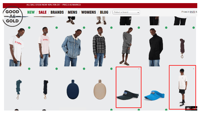

This is easy to miss, however, and can throw users off. A clear ‘out of stock’ message would be more helpful, , though it might not fit your design direction. In such cases, a visual indicator is better than no indicator at all.
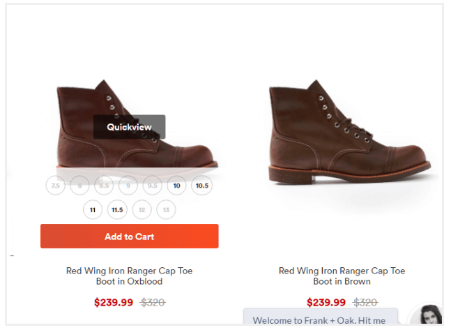
D. Show availability for different sizes
What about products in different sizes?
In such cases, you can show size availability when users hover over the product image. On Frank and Oak, for instance, unavailable shoe sizes are grayed out.

The easiest option would be to simply show an out of stock message on category/search pages. The best course of action, however, would be to gray out the product picture and use other visual indicators to imply unavailability.
To summarize:
- Whenever possible, use a grayed out product image and an “out of stock” message.
- If a grayed out image is not available, add an “out of stock” message only.
- If an “out of stock” message is not feasible due to design considerations, use visual indicators (such as a red/green circle) to show availability.
- If the product is available in multiple sizes, try to show what product sizes are available.
4. Display the time frame of your product availability
Some items are only profitable to sell during a specific time period.
For example, stocking your inventory with Christmas-related items during the peak summer months serves little purpose for your bottom line and wastes precious space.
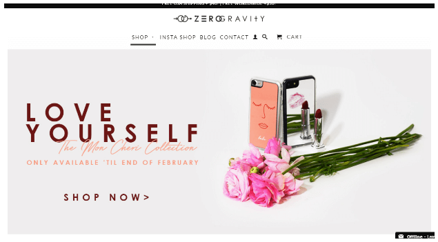
If you have such seasonal products, display the time frame your product is available for.
You can even accept pre-orders for such products to maximize sales in the off-season. Since customers won’t expect their product until a predefined time period, you can ship products later without having to store them.
Check out this example from Zero Gravity:

Hershey’s collects its seasonal products in a separate category and shows them only when they are in-season. For example, take a look at this page for the York candy bar:
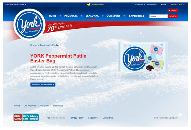

Notice how the breadcrumb navigation points to the seasonal nature of the product (‘Easter’ to be more specific)?
5. Show related items
With visitors on your site looking to buy, your objective should remain to push customers towards completing a purchase.
If a selected product is unavailable, show customers related products on the same page.
This prevents customers from leaving your store and lets them continue with their shopping experience.
Follow this guideline for what to recommend in terms of priority:
A. Top priority
The most effective recommendations are those which display the same product (in a different color) or similar products from the same brand.
Check out this example from Last Call:
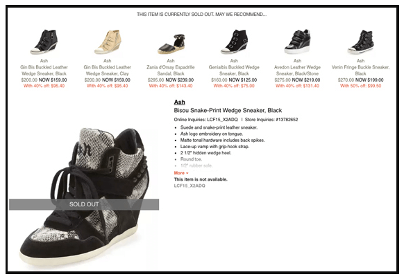

You see the same product in different colors. You also see similar products from the same brand at the top of the ‘recommendations’ row.
B. Second priority
Alternatively, you can direct customers to newly launched products from the same product category.
A new product is attractive to customers as it elicits a sense of ‘exclusiveness’.
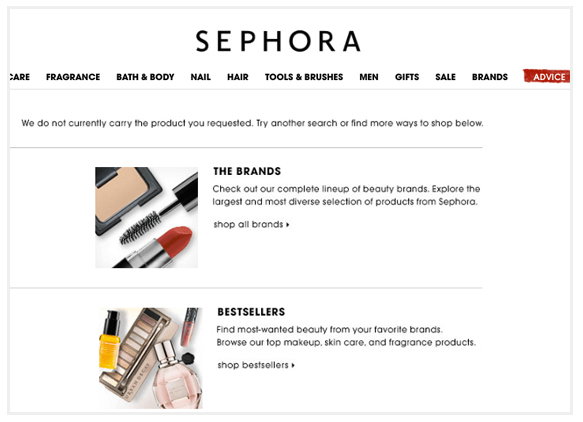
You can also show customers the best selling products from your lineup. Ideally, you want these to be from the same category as the product they were browsing.
For example, Sephora gives customers an option to browse its best selling products when they land on an out of stock page:

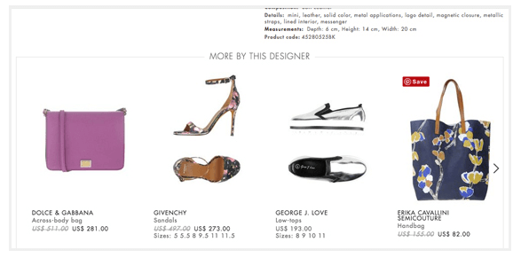
You can also try showing products from the same designer/brand even if they are from a different category. Yoox does this pretty well:

C. Third priority
If you can’t show customers an alternative to the same product from the same brand/designer, consider suggesting best-selling alternatives from the same category.
For example, if customers are looking at a jacket from one brand, recommend them similar jackets from different brands in the market.
Check out this example from Luis Avia Roma:
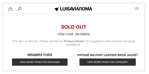

Customers have the option to browse similar items from either the same designer or from the same product category.
6. Capture emails to remind customers of product availability
Not every customer bookmarks an out of stock product.
And those that do eventually become frustrated to check its status every day. It’s much easier to go to a competitor site than wait to around in the dark for a product.
Therefore, remind customers through email when your product returns in stock.
Check out this example from Bellroy:
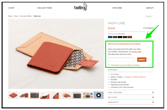

They ask customers to provide their email so that they can be promptly reminded when the product is available again.
This works particularly well for products that are temporarily out of stock as they will remain relatively fresh in the mind of customers.
For maximum impact, incentivize customers with discount to provide their emails to you.
For example, you may say “We’re sorry for the unavailability. As a gesture of thanks, get 10% off when the product returns to stock. Enter your email below to receive the coupon”.
Another tactic is to create a sense of urgency on out of stock pages. This works well for products where one or more variants are out of stock.
For example, if you offer four sizes in a product and two are out of stock, you could tell customers that the other two available sizes are going out of stock soon.
On Amazon, for instance, you see a limited stock message on product pages. You also see a message stating whether a related product is available in the selected size.
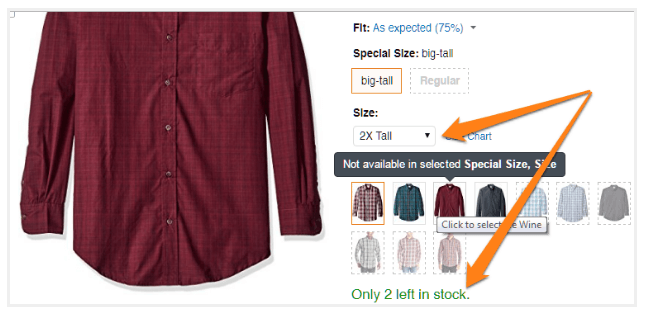

This creates a greater sense of urgency than simply stating that a product has limited stock left. When customers see that specific sizes are going out of stock, they will have a greater incentive to act. After all, if one size is going out of stock, another might follow suit too.
There are plenty of other ways you can create a sense of urgency.
7. Extend shipping and handling time
Unlike in-store shopping, customers don’t expect their product right away.
After placing an order, customers must wait for shipping before getting their hands on your product and you can take this delay to your advantage.
Instead of stating your product is unavailable, you increase your stated shipping time.
For example, if you know your product is unavailable for a very short time frame (for example, 2-4 days), you can use this trick to hide product unavailability.
This keeps your sales flowing without breaking customer trust.
However, be careful not to extend shipping time by too much. A lengthy shipping and handling time can discourage customers from purchasing your product altogether.
8. Push your unavailable product to the bottom of your product category page
Shoppers rarely land directly on your product page.
Instead, they follow one of two navigational paths to find what they are looking for. The first involves them following your site’s pre-defined navigation menu.
For example, to shop for men’s jacket a customer may click on Clothing > Men’s Clothing > Top Wear > Jackets to see a list of results.
And in the second path, a customer can utilize your site’s search engine.
For example, a customer searches for “Men’s Jackets” to see their options.
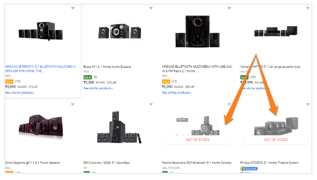
Whichever path customers decide to take, make your results don’t list out of stock items among the first few items. Instead, push them to the bottom of the product list.
For example, on Flipkart, unavailable products crowd the bottom half of the listings:

Conclusion
You’re undoubtedly going to have to deal with out of stock items while running a successful ecommerce store.
Instead of hiding the issue, announce the information clearly to your customers.
Remember that great user experience isn’t only beneficial for SEO but also helps customers purchase items that you currently don’t have.
To learn more about how to leverage Out of Stock pages for your ecommerce company, book a Strategy Session with Blue Stout CEO, Allen Burt.