Why Your Product Pages Aren’t Getting the Job Done (And an Exact Guide to Fix Them)
We’ve written a lot about strategies for growing ecommerce companies to increase conversions from website optimizations.
And there’s one particular place on your ecommerce website that has hands down the most potential to make a difference in conversions if you pay attention to it:
The product page design.
If you put effort into optimizing your product pages they can:
- Show up in higher in search results for specific keywords / keyword phrases
- Increase your customer average order value (AOV)
- (Which in turn can reduce your customer acquisition cost)
- And really improve your customer experience.
Focusing on product pages is the one optimization that will give you a visible and almost-immediate ROI.
[content_upgrade]WHAT’S WRONG WITH YOUR OWN PRODUCT PAGES? Watch our FREE Video Workshop “You Don’t Need MORE Traffic! How to Grow Ecommerce Sales, Conversions and Profits WITHOUT Spending More on Marketing” to show you exactly how to fix your ecommerce conversion rate without overhauling your website OR spending a ton of money on marketing and ads.[/content_upgrade]
In this post, we’ll share:
- How fixing your product page URLs and information hierarchy can increase conversions up to 76%
- How the addition of rich media to your product pages is a move that can make you over 60% more per transaction
- How tweaking your mobile site design can increase product page conversions up to 11%
Before we get into the specifics of what you should be doing to get your product pages to perform, I want to share this analogy with you. It’ll help you understand the theory behind what we’re actually teaching. Then below, I’ll give real examples of things that top-performing ecommerce companies do to convert more from their product pages.
Why You Need to Treat Your Product Pages Like Cardio
Anyone who’s done 5+ minutes of intense cardio knows that it sucks. Or at least it sucks until it’s over.
In order for your body to get the most out of your workout, you need to get your heart rate up. It’s the only way to challenge your heart and lungs to perform better.
Optimizing your product pages is no different than doing some good cardio.
At the end of the day, your product pages aren’t something you want to tackle and that you are “getting along just fine” with. But putting just a small amount of effort into them can instantly boost your conversion rate.
And just like our bodies, time can do a number on your ecommerce site. If you’re not seeing enough sales from your product pages, it’s time to take a look in the mirror:
Are you using an old, out of shape product page structure?
Are you dedicating enough time and resources to building the best product pages you can?
Are you trying to be the best ecommerce site you can be?
Or, are you just “getting by” with what you’ve got?
Here’s what you can do differently to challenge your product page performance and be an overall higher-converting brand:
Reboot Your Product Page Structure
Improving your conversion rate from your product pages begins at the foundation: their actual structure.
By structure, I’m referring to the URL and the hierarchy of information presented on your product pages. First, let’s look at the URL:
Make Your Product Page URLs Easily Scannable and Readable
Chances are you use a content management system (CMS) that will auto-generate URLs for you when you create your product pages. Good for saving time, but potentially bad for search engine rank, depending on the logic your system uses.
Product page rule of thumb: if your URLs don’t read like normal English when you read them out loud, you need to make a change.
This ensures that users will be able to:
- Visually connect the product page URL with the actual product
- Easily scan a search result and decide if the link looks relevant to their search
Here’s an example of a poor URL structure that is actually working against conversions:


And here’s a good example of the different types of URLs that exist – you want to strive to be in the blue category:
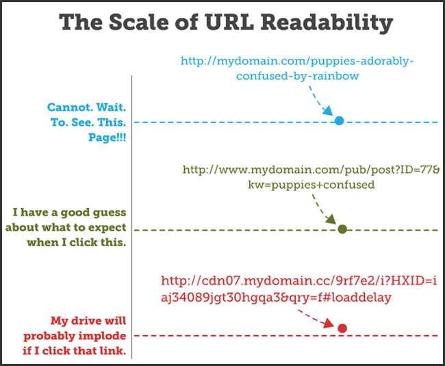

The blue URL example is very straightforward, easy to read, and your eye just naturally flows to it because you mentally understand the information presented.
The other two examples, however, start to complicate things.
And there’s one thing that internet users don’t like doing much and that’s thinking. You need to do as much thinking for your user as possible. And believe it or not, that actually starts in your product page URL.
Step one in rebooting your product page structure is to optimize your actual URLs.
Present Your Information in a User-Friendly Hierarchy
When you build product pages that convert, your pages present the customer with the information they are looking for in a user-friendly order.
The majority of people buying a product want to see an image first. Actually including larger, high-quality images can increase your conversions up to 9%. And don’t let that number fool you. 9% can translate into 7 figures, depending on your company’s current annual revenue.
Next, users want to see the product description and sizing information. This is another area where it’s important to override anything automated by your content management system (CMS).
The product title should include target keywords and the product description should be unique.
And if your sizing information isn’t immediately visible, you risk losing your viewer’s interest the longer they have to search for necessary product information.
Let’s look at a brand who’s got their product page almost perfect. This example comes from Show Me Your Mumu:
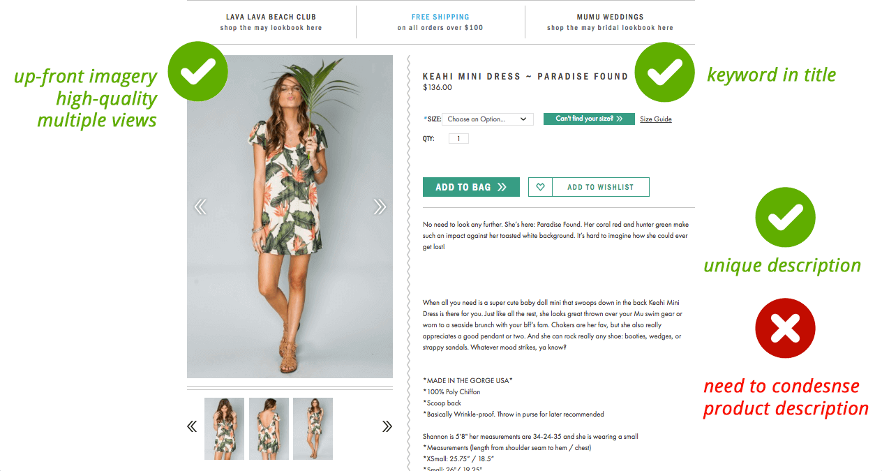

They’ve done a good job of giving their visitor exactly what they want to see first: product images, a title with keyword in description (“mini dress”), sizing information, and a unique product description.
My only negative critique of this product page is that their product description. While it is unique, it could be condensed a bit to make room for another missing element: reviews.
Reviews can do wonders for conversions because people really do actually care what others think about an item they’re interested in.
Why do you think Amazon is so adamant about acquiring reviews after a customer makes a purchase? Their sales hinge on their community providing feedback.
Likewise, your customers care about reviews: they can impact your conversion rate up to 76%. So, why are they still missing from your product pages?
Here’s a brand who’s got their product reviews implemented very well:
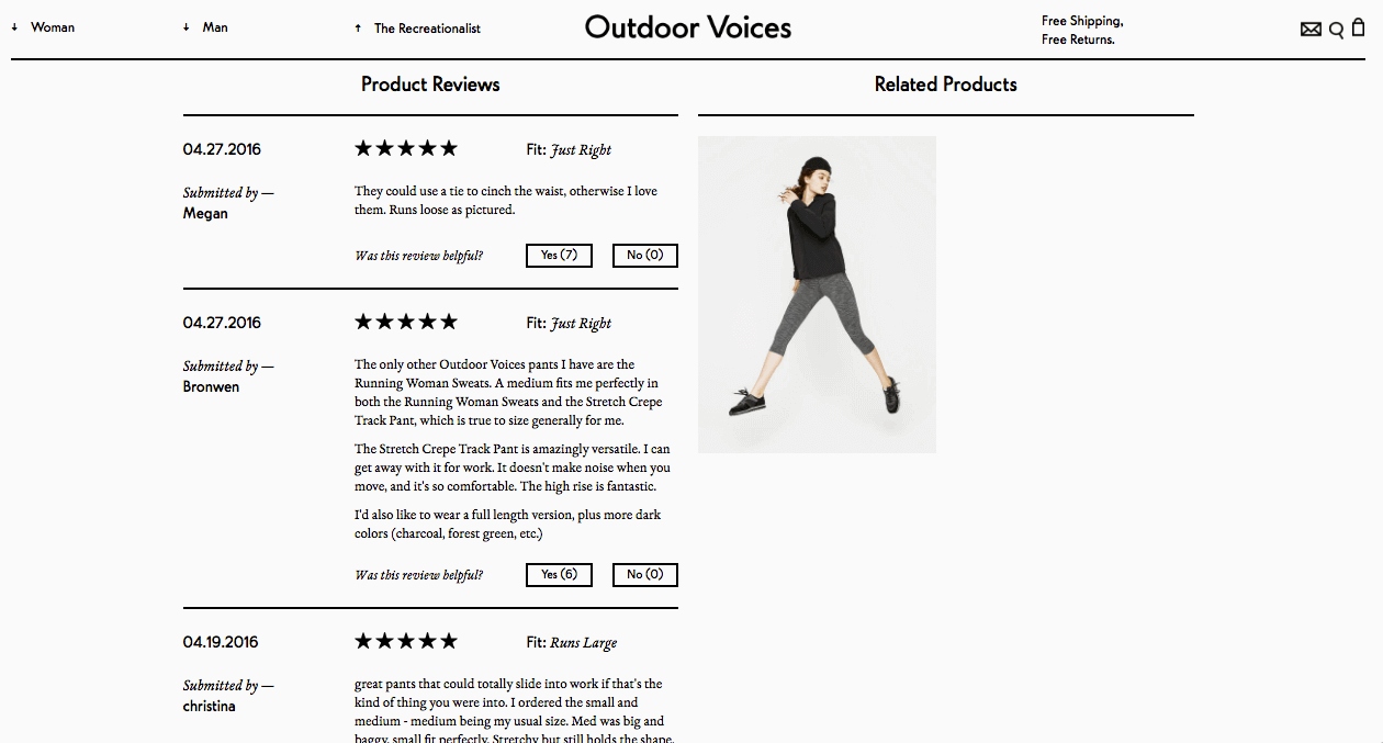

Austin-born startup Outdoor Voices has done many things right. They’re now giving giants like lululemon and Under Armour a run for their money.
The way they’ve implemented product reviews on their product pages helps other customers judge if the product is worth it. In the above example, you can see that these product reviews give details like what size works best and if you can wear these track pants to work and get away with it.
Shoppers can also select if they found that particular review helpful, which is a good way for the Outdoor Voices team to monitor feedback they’re receiving.
Now you have two steps to rebooting your product page structure, so let’s move on to the next optimization that can boost conversions: rich media.
Engage with Rich Media, Convert More
If you really want to convert more sales from your product pages, you’ll need to go the extra mile and find something that engages your customer.
Rich media – a video, something interactive, an animated short, gifs, etc – gets the attention of your customer in a non-traditional way. Rather than relying on copy or product photos, using what we call “rich media” can cast a new light on your product that a static image and title just can’t.
These types of optimizations really encourage your customer to engage more with your ecommerce website.
An easy example is just getting your visitor to “Click to watch this product video!” Their click is a sign of engagement.
And a more engaged customer is much more likely to purchase.
A recent white paper by Rosetta Consulting show just how valuable an engaged customer is:
“[…]highly engaged customers buy 90% more frequently, spend 60% more per transaction, and have 3x the annual value compared to non-highly engaged customers.”
Warby Parker is known for their ability to successfully interact and engage with their customer, yet they are always innovating new ways to accomplish this via their website.
Check out their latest example – an interactive product photo that follows the user’s mouse trail so show a full-scope view of the selected frames:


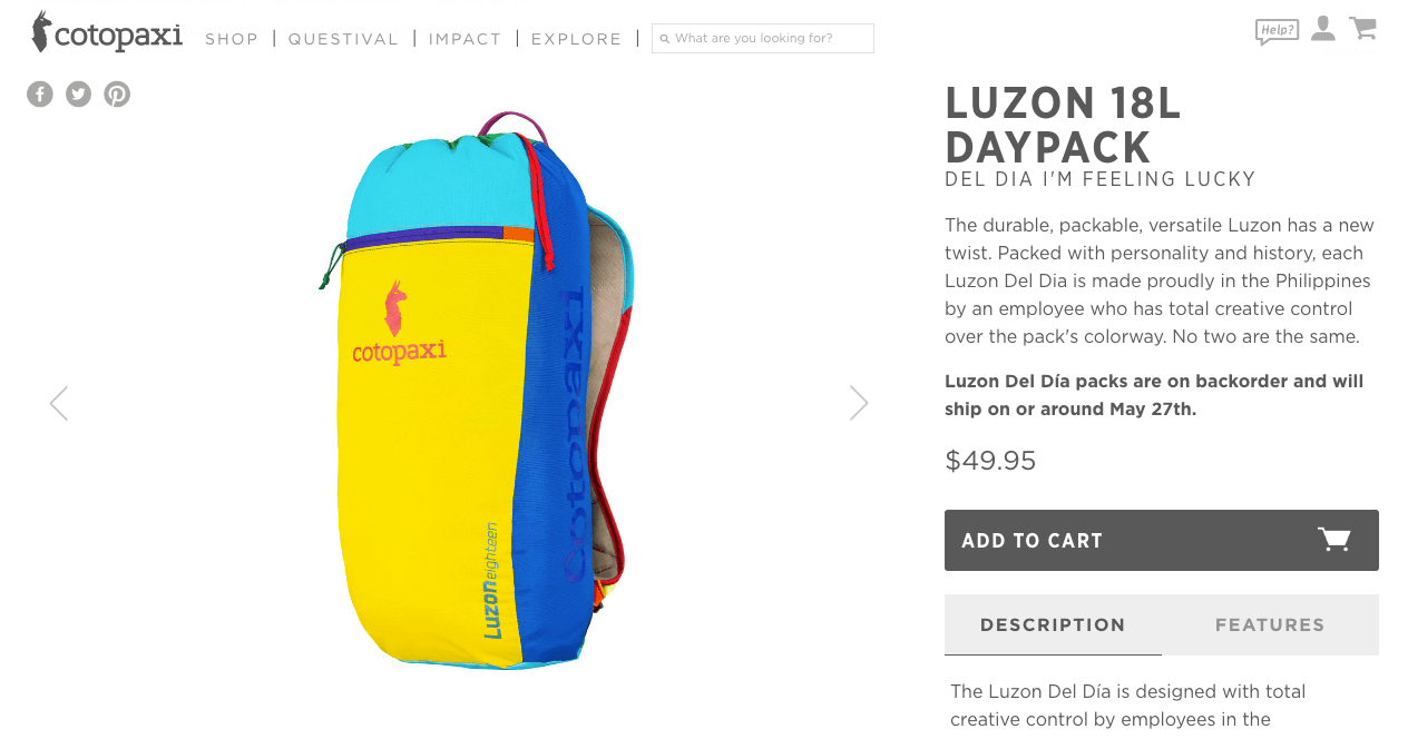
Another brand flexing their engagement muscle is Cotopaxi. On their product page for their Luzon 18L Daypack, they feature a video that gives a history just about the creation of that backpack.

Both of these brands approach their product page as an opportunity to further engage with the visitor.
Can I make them move their mouse?
Can I make them watch a video?
Both of these examples are what we would consider “micro conversions” – you got them to take an action. Try to think of a way that makes sense for your brand to push your visitors to interact with you further on the product page.
Bolstering customer engagement, however, will do you absolutely no good if it can’t be achieved on any device.
Which brings me to my next and final point:
Clean Up Your Mobile Design
A recent mobile ecommerce performance report published by Marketlive shows (among other things) that comparing the performance of Q3 2015 to Q3 2014, mobile ecommerce saw a significant boost in visits (+35.0%), orders (+69.5%), and revenue (+97.9%).
That’s an almost 100% growth in mobile ecommerce revenue!
So that means if your product pages suck on mobile, there’s no chance you’ll be getting in on any of that mobile market growth.
The important things to remember about your mobile product page design are:
- People aren’t patient on mobile, so it better load fast
- Imagery is what they want to see first, so your design should respond accordingly
- Real estate is limited, so the hierarchy design (discussed above) should optimize for mobile view
- Make your links and especially your “add to bag” button fat-finger friendly
Here’s Your Immediate Action Steps to See How Mobile-Friendly Your Product Pages Are
Check your page load time on mobile. You can use a tool like Google Page Speed Insights and review the “mobile” results tab.
Make sure your product images are compressed so they will load quicker. An accessible tool is Tinypng which will compress without compromising quality. Additionally, you may want to consider “hiding” some images on your mobile product pages if you have so many it is greatly affecting page load time.
Since mobile real estate is limited, consider condensing some information on mobile view. For example, if your product description is quite long, your mobile product page design could implement a rule to display only a certain number of lines, then show a “Read more” link, allowing you extra space to place important elements like your sizing selector and the “add to cart” button.
Consider making your “add to cart” button uncomfortably large. Designing for “fat fingers” is a practice of UX designers, and taking this into account assures that all sizes of fingers can easily tap to buy your product!
We recently did a case study on UK retailer Topshop. They made just a few tweaks to their mobile site and saw an 11% increase in conversions from their product pages!
For a retailer their size, the 11% increase translates into a lot of revenue.
Here’s one element they changed that had a huge impact: their “add to bag” button.
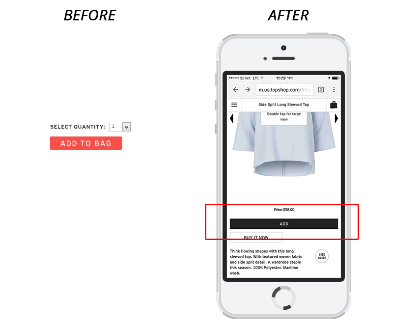

Before, this button was small and a red-orange color, because everyone used to say that a “contrasting color converts more”.
Don’t believe everything you hear.
Topshop changed their “add to bag” button to a large, black rectangle that takes up almost the entire width of my iPhone screen. Remember the “designing for fat fingers rule”? Case and point.
You can learn more about all of the changes Topshop made in our case study download.
We have written so much about why mobile is important now more than ever, but hopefully this above example makes it clear just what impact even the smallest mobile tweaks can have on your bottom line.
The (Not So) Secret Strategy Behind It All…Customer Experience
To simplify the underlying concept to this entire post: make your website visitor’s experience something that is valuable from beginning to end.
That means make it easy to find. Make it easy to understand. Make it interesting and engaging. And make it look good on a mobile device.
It’s really not too much to ask for. And just like doing that damned cardio, you’ll be in better shape afterward (and feel better, too!).
How Product Page Design Fits Into Your Conversion Strategy
If you’re still trying to directly connect how your product page design fits into your conversion funnel, think of it this way:
Positive product page experience → Add to Bag → Conversion → Potential Returning Customer
A good product page is an opportunity for you to set the tone of your user’s overall experience with your brand.
Every single one of our clients has seen a boost in revenue from applying one or more of these product page changes.
Want to see exactly how you can optimize your own product pages?
We have an awesome video workshop you can access FOR FREE that will teach you:
- How to get more conversions from your traffic, without having to overhaul your website.
A simple system for increasing your sales AND profit margins, without spending more money on ads or SEO. - A breakdown of the exact conversion mistakes you are making and how to fix them.
- Our strategy for PREDICTABLY growing your business WITHOUT investing outside capital.
- BONUS: A map of our top-performing “pre-purchase” funnel and an ROI Calculator from Referral Candy!
We’ve helped hundreds of clients improve their businesses through their current site design. This is your chance to see how we do it – for FREE.