
How To Reduce Mobile Ecommerce Bounce Rate & Capitalize on the 100% Mobile Market Growth
Marketlive just released their most recent quarterly report of mobile ecommerce performance, and we found the contents to be incredibly insightful for ecommerce owners who have yet to take mobile ecommerce seriously.
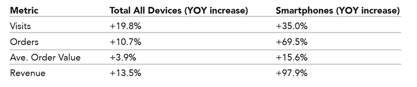
The report shows (among other things) that comparing the performance of Q3 2015 to last year, mobile ecommerce saw a significant boost in visits (+35.0%), orders (+69.5%), and revenue (+97.9%). (source)


The mobile growth momentum is accelerating, and it’s only going to grow faster.
You’ve got to keep up with your mobile customers and your competition who have a solid mobile ecommerce performance to keep scaling in today’s near-mobile-first world.
Your first step is addressing your mobile ecommerce bounce rate. You know, when someone visits your site without spending any money? They simply land and exit without doing anything?
Those types of visits are your fault. Are you ready to change that?
In this article we’ll discuss:
[block_bg bg=”1292dd”]
- Mobile UX: Is it “Good Enough” or Effective?
- Mobile Bounce Rate
- Page Load Time
- Relevant Content
- Mobile-Friendly Design
[/block_bg]
Your Mobile Ecommerce UX Design Is Just “Good Enough” If You’re Not Converting
“Always assume you are wrong.”
Have you ever heard that advice? Though I don’t think it is best for all business decisions, in terms of testing your mobile website, I 100% agree.
Most ecommerce companies that have poorly designed mobile sites err on the side of “good enough” versus “effective” mobile designs, because they don’t think “good enough” is wrong.
The proof is in the data.

But how can you know if your site is just “good enough”?
Easy: look at your data.
Take a look into whatever analytics solution you are using. For the sake of this article, we’ll use Google Analytics as the platform example, but if you use a different one the metrics we recommend are the same.
Once you’re viewing your data, the two metrics that are most indicative of a poor mobile UX are your mobile bounce rate and mobile cart abandonment rate.
Mobile Bounce Rate Can Solve Your Conversion Problem
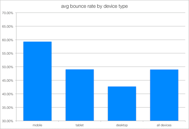

Once logged into your analytics, segment your traffic by device type and review your ‘mobile’ stats.
It’s a general rule of thumb to assume that your mobile bounce rate will be about 10-20% higher than that of desktop. (source)
If your bounce rate is more than 10-20% higher, that’s a clear sign that something’s wrong with how your website is appearing on smartphones. Some common culprits of high bounce rate are:
- Slow load time
- Missing relevant content
- No mobile-friendly design
Slow Load Time Impacts Mobile Ecommerce Cart Abandonment
You really don’t expect someone to wait around while your page takes an extremely long time to load, do you?
When your customers are looking to buy, they want to see the product. If they don’t see it immediately, they won’t wait.
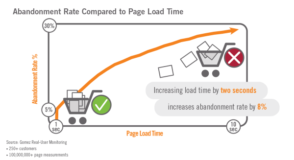

When experiencing just a 1 second delay in load time, an online store earning $50,000 a day can lose more than $1 million in sales each year because of that delay. (source)
An online store can lose more than $1M in sales because of slow page load time @BigcommerceIn other words, there is a direct correlation between lost revenue (abandoned carts) and page load time, as the illustration above shows.
You can use online tools like Pingdom or Google’s PageSpeed Insights to test your page load time. Find out what’s causing such a delay and you’re armed with information to put your internal development team to work, or to hire an ecommerce design agency to help sort out your UX problem.
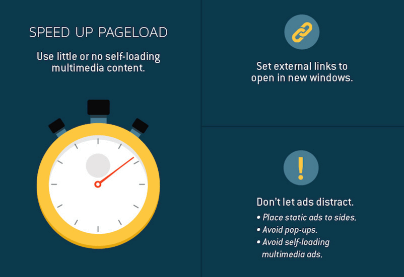

Overall, you can speed up your page load time by:
- Using little to no self-loading multimedia content
- Setting external links to open in new windows
- No ads
Traffic Sources & Missing Relevant Content Causes Bounced Visits
Another reason for a high bounce rate is that the user didn’t find what they were looking for. In this case, you can dive in deeper to your mobile bounce rate analytics.
What pages had the highest bounce rate? Examine these pages and analyze the main traffic source for the visitors: organic? Paid?

If your organic search traffic has a high bounce rate on mobile, you’ve got a problem with how search engines are indexing your site, or more likely, your individual product pages.
Each of your product pages should be keyword optimized in the title, any headlines, description, and even the “alt” text on the image. This will help the search engines crawl and index the page according to the actual product, in turn helping a user find it more easily by searching keywords.
If you have a high bounce rate on paid ads, there’s obviously a problem with your keyword strategy on ads. Oftentimes, if you’ve avoided creating a thorough ‘negative keywords’ list, you can be bringing in a lot of unqualified traffic.
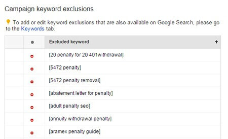

To get your ads as targeted as possible, brainstorm a list of “negative keywords” or search terms that could bring customers that you don’t want to your site. If you’re unsure of where to start with this, here’s a list of 75 essential negative keyword terms to get you started.
Related: The Ecommerce SEO Stack: 7 Must-Have Tools to Increase Your Ecommerce Rankings
No Mobile-Friendly Design Highly Impacts Ecommerce Bounce Rate
We’ll save the most obvious for last.
It’s very possible that you have a high mobile bounce rate because your website looks terrible on mobile.
If a user isn’t pleased by the website experience you offer them on their device, they’re out. That’s why elements like hamburger menus, sticky navs and animated shopping cart notifications are becoming standard in mobile ecommerce UX design.
Makes sense, doesn’t it?
British apparel brand Topshop recently completed a mobile UX redesign and found they were losing many customers on their product pages. By making several tests and changing a few elements, they were able to increase conversions by 11%!
One of those changes was their “item added” confirmation message. On mobile, they previously had a single message that was not very obvious to the user.
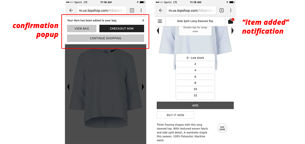

Now, when an item is added a popup appears with a confirmation message, and the user also can see a red notification bubble in their shopping cart (which remains sticky) as they continue to browse and shop.
Just making these simple tweaks dropped their mobile bounce rate significantly.
To determine if your ecommerce website is mobile-friendly in a way other than opening your own site on your smartphone, you can use Google Developer’s Mobile-Friendly Test tool which allows you to insert any URL and determine if it is mobile-friendly or not. In addition, it will suggest resources and provide more detail into the errors found.
Related: 3 Ways You’re Losing Money from Your Mobile Ecommerce
2016’s Your Year to Get it Right
As we head into the new year, there’s no doubt in my mind that mobile will again be an aggressively growing channel for customers to do their shopping. By focusing on one metric – your mobile bounce rate – you can ensure that your ecommerce website is performing its best across all devices, and capture more users who are now mobile-first or mobile-only.
When your site’s at its best, your numbers will reflect that.
Have you seen your revenue grow after implementing changes to reduce bounce rate? Why or why not? Let me know in the comments below – I’m looking forward to hearing some personal stories on this one.
[rad_rapidology_inline optin_id=”optin_1″]