
5 Ways To Boost Conversions On Your Mobile Ecommerce Store
Your mobile site is not just a smaller version of your website. It’s completely different in the user experience it needs to provide. The key is to remain 100% focused on converting visitors to buyers through a simple conversion process, also known as mobile ecommerce conversion rate optimization. An industry term, yes. But we’ll explain exactly what that means and how to do it in this article.
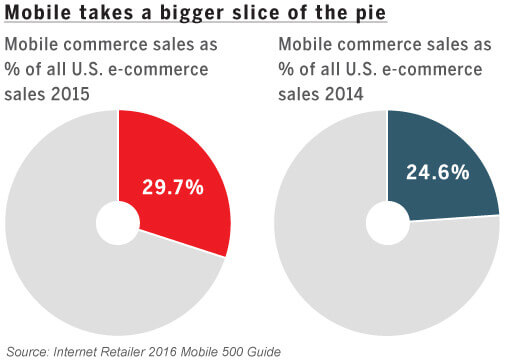
Mobile commerce now accounts for 30% of all US ecommerce sales, and is projected to grow three times faster than website sales to a total of $626 Billion in 2018. That’s an astronomical volume of business on mobile, which is why you need to realize it’s time to take mobile optimization seriously.

[content_upgrade]Do you take optimization seriously? Get access to a list of the Conversion Tools (7 are FREE) that Top Online Retailers are using to turn their website visitors into paying customers!
[/content_upgrade]
Here are 5 proven ways of boosting mobile ecommerce store conversions:
1. Bigger Is Better
Mobile screens are small. Making text and images bigger, combined with “fat-finger friendly” clickable action directives are the keys to ensuring your mobile visitors have a friendly user experience (UX) while browsing the site from their smartphone or tablet.
To make it easier for the consumer to take action, we recommend including only 1 call to action per page view as a rule of thumb. For instance, on your product detail page, the most appropriate call to action is the “add to cart” button, while on your homepage it could be the “call now” button.
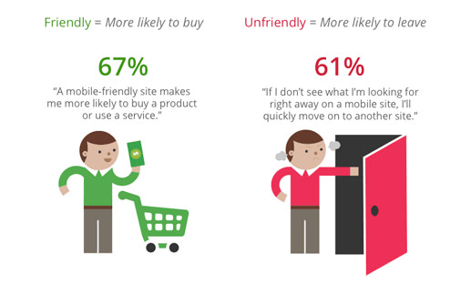
Having a mobile-friendly website increases the chances of purchase by 67%! @hongkiatHaving a mobile-friendly website increases the chances of a visitor making a purchase on your store by 67%. On the other hand, not having a mobile friendly site can have a disastrous effect on your brand’s image and, in turn, drive customers away (oftentimes to competitors). (source)

Be sure to compress the image files to maintain good site speed. Having larger images and text should never detract from a speedy website browsing experience, given the short attention spans consumers have. You can have high quality images and a reasonable load time. They just need to be correctly compressed!
We recommend a site like TinyPNG to do quick, quality image compression.
2. Smooth Navigation Counts Big Time
A mobile website is very different from a traditional website. Inevitably, the content and overall user/navigation experience for mobile needs to be customized strategically.
The mobile home page should quickly communicate who you are, what you offer, and why your visitors should care. The usual ‘best-practice’ approach is to include a company name, a hamburger menu (3 line navigation menu icon), a text search option, and information on your value proposition (or featured product), just like Nau does it below:


Frank Body Scrub takes their mobile homepage experience to a new level by presenting special offers as users scroll down on the top navigation bar. The demonstration below shows the offer pop up on scroll with the option to “add to bag”:


Clearly this makes it easier for users to ‘add to cart’ while browsing, and increases conversions by bringing relevant options in front of the consumer’s eyes at the right time. Consider this a subtle user experience upsell and an effective mobile ecommerce conversion rate optimization tactic.
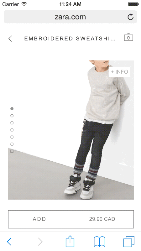
By including product images at the forefront of the home page, you’ll capture your audience’s attention faster. By minimizing text to display products and including just 3 pieces of information (product image, price, and an “add to cart” button) you can boost conversions with simplicity.
Zara does a phenomenal job of making the most of this simple yet effective approach. They also allow users to read more info on the product via an expandable info tap option.

Simplifying product category pages and reducing the amount of ‘work’ a user needs to do on your mobile site go a long way in contributing to higher conversions through a better navigation experience.
Related: Ecommerce Product Pages: How to Improve Rank & Increase Sales Without Overhauling Your Site
3. Mobile Landing Pages For Mobile Email
With 67.2% of consumers using mobile to check their email, it’s vital to have landing pages designed specifically for mobile to boost conversions from your email marketing initiatives.
67% of consumers check email on their mobile device! Are you selling to them?More than 20% of all mobile sales are initiated by email marketing, so you’re losing potential revenue if you don’t optimize campaigns for mobile!

The critical elements of a successful mobile landing page include:
- A really brief heading,
- No navigation bar,
- A clear and immediate Call To Action that’s clickable without having to scroll down,
- An appealing product image relevant to the email sent,
- A clickable phone number to win trust and invite customer enquiries,
- No zooming required,
- Compatibility with both landscape & portrait modes, and
- A minimalistic approach to design. (source)
It’s possible to build and A/B test mobile landing pages with Optimizely. Using their free 30 day trial, you can test various aspects of the landing page and how your users interact with it to maximize your mobile ecommerce conversions.
4. Prioritize Your Search Results
Consumers usually come to your mobile website with the intention of either buying a product or browsing your products (source). So, you’ve got no choice but to cater to both needs! A layout like the one below from Nemo Equipment certainly allows this to happen by featuring a prominent search function in the top navigation followed immediately with product images right below it. Both browsers and buyers are satisfied.


Consumers usually use mobile devices to make purchases while being ‘on the go’. So it’s really important to prioritize results of their searched keywords as accurately as possible. The key is to keep on top of keyword trends and organize content accordingly. By knowing which product categories are in demand depending on search volumes, it’s possible to tailor your search results to those specific keywords.
We recently interviewed one entrepreneur who claims his unique value proposition lies in his custom-built search function (his ecommerce website is built with Spree Commerce). You can read that interview here.
Websites that use ‘Semantic Search’ (the ability to put searches into context) are well equipped to handle this challenge. By attempting to understand user intent through understanding how keywords relate to the user, they reduce cart abandonment rates to as low as 2% (compared to 40% on websites with no Semantic Search functionality). (source)
As a hypothetical example, if a user wants to buy a striped or polka-dotted umbrella on your mobile store, the search functionality should present the options “polka-dotted umbrella” or “striped umbrella” just on typing the keyword “umbrella”.
In this context, the user is a design-conscious consumer with a specific need in mind. Suggesting keywords to the user based on your available stock, the user’s search history and interests, you dramatically increase the probability of a user buying from your store.
A non-semantic search on the other hand is entirely ‘mechanical’ only producing search results based on typed keywords, which may not necessarily match a user’s intent.
Frequently searched terms as well as the filtration criteria consumers use while looking for products present great opportunities for mobile ecommerce conversion rate optimization.
5. Don’t Ask For Irrelevant Information At Checkout
Allow users to log in to make a purchase on your mobile site using cross platform log-ins through Facebook or LinkedIn. Include minimal clicks only to ensure a faster checkout process and never frustrate your users.
Go through an exercise where you calculate the number of clicks or taps required to checkout. Are there any steps in the process you can eliminate? Assess this with your team and then remove them.
Here’s an example from Oru Kayak of only including relevant information fields at the checkout process:
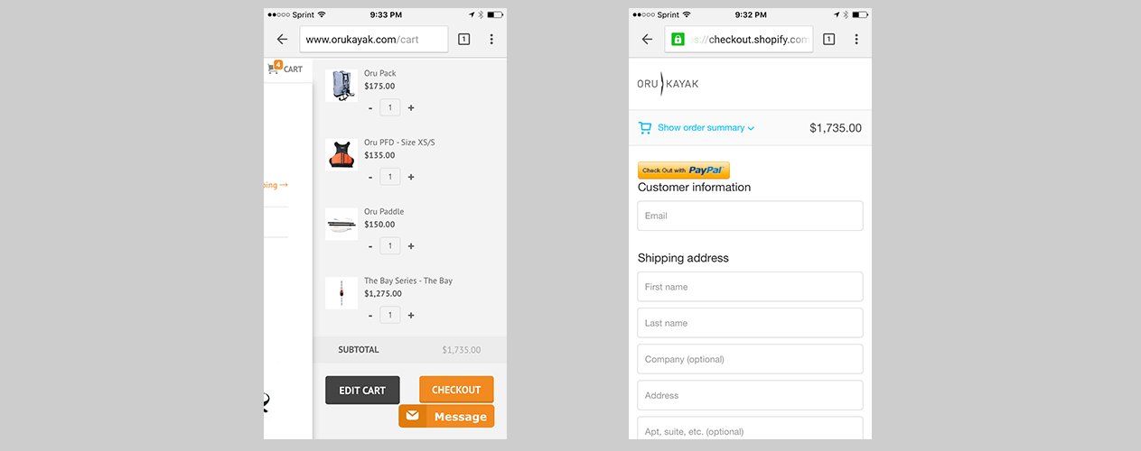

They are also leveraging Paypal as an addition that can speed up checkout by auto-filling some necessary information.
You can also leverage UI design elements (like the quantity selector) to speed up the checkout process. By allowing users to update quantities using a ‘touch’ approach versus a drop down menu, it’s a walk in the park to buy anything! That’s a good user experience.

Remove all content that’s unrelated to the purchase at checkout. It’s important to keep the focus entirely on the purchase, especially when the consumer is in the frame of mind to buy.
Mobile Ecommerce Conversion Rate Optimization
An invaluable insight you can draw from this post is to create a customized, minimalistic, yet comprehensive shopping experience specially for mobile users. View both mobile and desktop experiences as separate channels, so you can tailor your approach with the right journey specific to that channel.
It’s these small experiential details that can make all the difference to converting your mobile ecommerce website into a high converting sales channel.
[blue_bg]Do You Want to Double Your Conversion Rate?[/blue_bg]
[rad_rapidology_inline optin_id=optin_8]