
Case Study: How Walmart’s Mobile Ecommerce Site Design & Optimization Increased Mobile Sales 98%
So, you want more conversions?
You keep looking at your ad strategy, thinking that finding more ways to get people to click on your ads will solve all your conversion problems.
Well, I’ve got news for you: ads aren’t going to get you anywhere without conversion optimization.
Don’t get me wrong, investing in ads is part of a viable growth strategy. But, you must understand why something like mobile design optimization complements and enhances all your other marketing initiatives.
It gives you a higher ROI because it goes for the long run.
Walmart Canada realized their mobile site needed optimization, so they did something about it.
And now they’re reaping in the dough.
After launching a responsive design, Walmart.ca saw a 20% boost in conversions and a 98% increase in mobile orders! Now that’s a good response to a conversion problem, don’t you think?
[content_upgrade]WANT TO KNOW WHAT’S WRONG WITH YOUR MOBILE CONVERSIONS? Chances are, you’re making one of the 3 very common mistakes most ecommerce business make… Check out our FREE training to learn what these mistakes are and how you can fix them! Click here to register for FREE >[/content_upgrade]
In this article I’m going to share with you:
- What Walmart.ca (that’s Canadian Walmart!) accomplished with a responsive website design
- Why responsive design is good, but mobile design optimization is better
- What you need to do to get the same results
But first, we need to talk about a little acronym you may have seen floating around: CRO.
Why Mobile Design Optimization = Conversion Rate Optimization
Mobile ecommerce site design optimization falls under a category that us “industry folk” call conversion rate optimization (CRO).
CRO happens when you take a hypothesis about your site and test it against a variation. Your hypothesis could be considered “version A”, and you test it against “version B”. Whatever version has the higher conversion rate wins.
Here’s an easy example:
Hypothesis: more customers would purchase products if the “add to bag” button was larger on mobile.
Test: A/B test directing 50% of site traffic to the old button design (version A) and 50% to the new button design (version B).
Result: Version B created 12% more conversions.
Conclusion: Version B (big button) won.
Action: Change designs of your website buttons to be bigger.
Now, your business will continue to see the results of this button design change positively affect your conversions for months (or even years)!
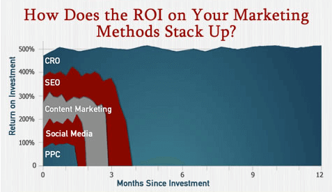

As you can see from the graph above, CRO has a higher ROI in comparison to PPC and other types of marketing.
So, let’s see how Canadian Walmart kicked off their conversion optimization strategy by deploying a responsive website design.
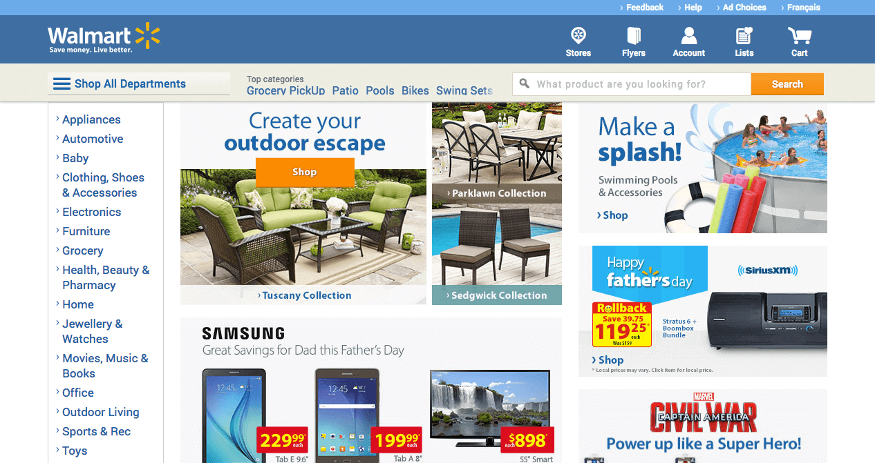
Walmart.ca Decided to Put Mobile First & Now They’re Raking In Sales
After doing some review of their analytics reports, Walmart.ca found that they were receiving a lot of traffic from tablets.
Their team realized this made sense: their target demographic is made up primarily of moms, and studies show that moms are one of the largest groups of tablet owners. In fact, 47% of mothers said they own a tablet. (source)
This posed a big problem for Walmart, because their site looked terrible on a tablet.
Here’s What Walmart Did To Fix Their Ugly Mobile Ecommerce Website
In order to re-capture conversions from their core customer, Walmart needed a plan. The first step they needed to take was to address the look of their website on a mobile device.
Establish a Mobile-First Plan to Lay a Framework for Desktop & Smartphone Optimizations
Walmart’s team decided to adapt a touch-centric, tablet-first approach to their responsive redesign.
What does “touch-centric” mean?
It means their team had to put a new lens on their redesign process and look at their website elements as “touchable” as well as “clickable”.
For example, on a desktop you use the mouse to click and change the quantity of an item.
On a tablet, you touch a selector or use a scroll selector to adjust how many items you want.
Designing for tablet-first meant that the team needed to discern how they were going to “collapse” information in order to present everything in a friendly way on a smaller screen size.
This is a point where using a tablet-first approach is great: it lays the groundwork for an even smaller screen size, the smartphone.
By learning where to condense information and where to hide information, the team was able to quickly adapt the site to look good on a smartphone, too.
Deploy a Responsive Design
The goal of a responsive design is to make an ecommerce website look good across a variety of screen sizes.
The code “responds” to the breaking points of the user’s detected screen size.
Let’s look at Walmart’s example: see how their site condenses the content from desktop to fit on a smartphone?

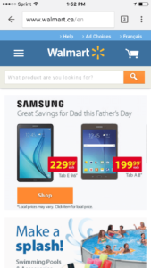

The design allows for the right content to be prioritized. In this particular example, notice how the electronics product takes priority in the smartphone view?
This shows that the Walmart team knows their mobile users’ purchase patterns. If their core customer is a mom shopping from a tablet, they’ve prioritized showing her electronics and summer pool items over outdoor furniture.
So, is this the “big” change that increased their conversion rate 20% and increased mobile sales by 98%?
No. It wasn’t just the responsive ecommerce mobile design.
It was something we touched on briefly in the beginning: mobile design optimization.
Responsive Design is Good, but Mobile Design Optimization is Better
Responsive design is all about how a website looks on various sizes of devices.
Mobile design optimization is about improving how a website performs on mobile.
“Responsive design doesn’t equal great UX [user experience]. You can’t make your design responsive and declare that your mobile site is optimized. That just doesn’t make sense.” – Shanelle Mullin, ConversionXL
It’s important to keep in mind that responsive design doesn’t solve all of the problems of converting users from mobile.
Mobile users not only have different views, but they have different behaviors.
Walmart.ca recognized this. So, they bolstered their responsive design with mobile optimizations, too.
Optimize Product Category Pages
Category pages are usually designed to display minimal products because the more products you display on category pages, the heavier the code becomes for that page… meaning it’s probably going to load reallllllly slow.
However, Walmart’s team did extensive testing around their category pages and found that showing 60 products was just enough to maintain site speed and reduce the amount of “taps” a user had to make to view more products.

Walmart’s team chose to test showing a high number of products when many user experience designers would discourage this due to slow page load time.
Bottom line: data trumps assumptions!
Always test, because data doesn’t lie.
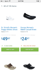
Increase Mobile Purchases by Displaying What’s In Stock
Another test Walmart’s team ran was to differentiate how they were displaying items’ stock from the “shelf level”, or category page.
Originally, there were two buttons: a green “add to cart” button, and a gray “view details” button for items that were out of stock.
By nixing the “details” button and only having one clear CTA, Walmart was able to display a clear inventory status message right on top of their green “add to cart” button.
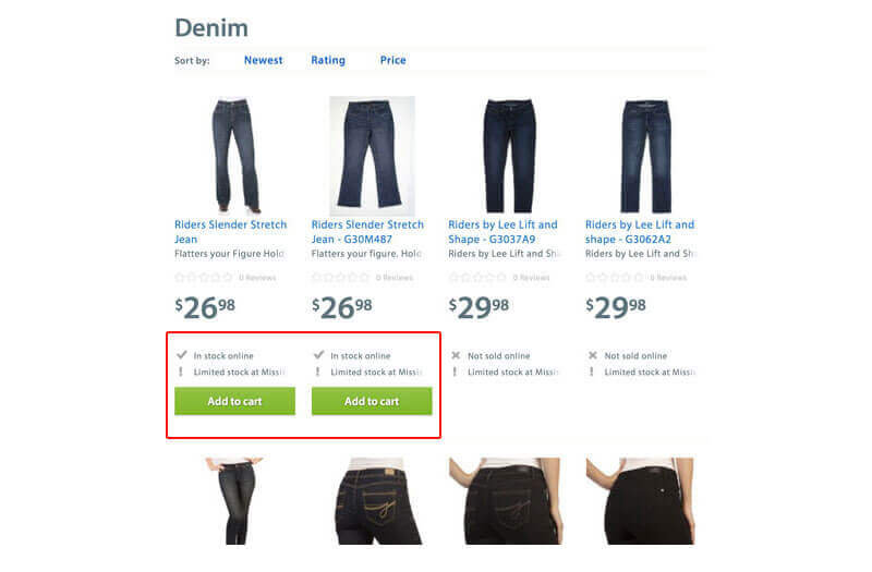

This increased conversions because the inventory message tells the customer that the item is available online, providing more incentive to purchase.
What To Do If You’re Sold on Mobile Optimization but Your Team Isn’t
First, you need to understand one thing: No one really cares if you have a dedicated mobile site or a responsive design. Your customers just want a good experience.
Secondly, you need to prove to your team that your customers are demanding a better experience. Here’s how to do it:
Look Around: How Many People Do You See on a Smartphone?
At any given point in your normal life (i.e. not when you’re at work), look around you and take note of how many people you see staring down at a smartphone.
As I’m writing this article, I see 5 people around me glued to their smartphone screens and there’s probably only 15 people here.
So, if anyone on your team is still in denial about mobile usage here’s a quick shortlist of stats you can deliver:
- Mobile ecommerce saw a significant boost in visits from Q3 of 2014 to Q3 of 2015: (+35.0%), orders (+69.5%), and revenue (+97.9%) – almost a 100% growth in revenue!
- More people used Google search on mobile versus desktop last year
- Mobile commerce now makes up 30% of all U.S. ecommerce sales
- 44% of retail Internet minutes are spent on mobile phones
- 11% of retail Internet minutes are spent on tablets (source)
This should be enough to convince any growing retailer that optimizing mobile design is in their best interest.
Dig Into Analytics and Focus on Mobile Segment
Once you’ve laid the foundation of why ecommerce mobile design and optimization is necessary, you need some of your own data to back it up.
Time to dig into your analytics.
Run some analytics reports on your online store to see:
- What % of visits are coming from mobile?
- What device type has the best conversion?
- What % of abandoned carts occur on mobile?
You may be using another ecommerce analytics software, but for this example’s sake let’s look at how to gather that information from Google Analytics.
How to set up a Mobile Performance Report in Google Analytics
- Log in to your account and select the correct view
- Navigate to Audience > Mobile > Devices
- Select Goal Set or Ecommerce (under the Explorer tab, upper left of report)
- Select the Data view (at top right of table) if not already selected.
- Look at Conversion Rates for your individual micro goals (or the Ecommerce Conversion Rate on the Ecommerce tab).

What can this report show you?
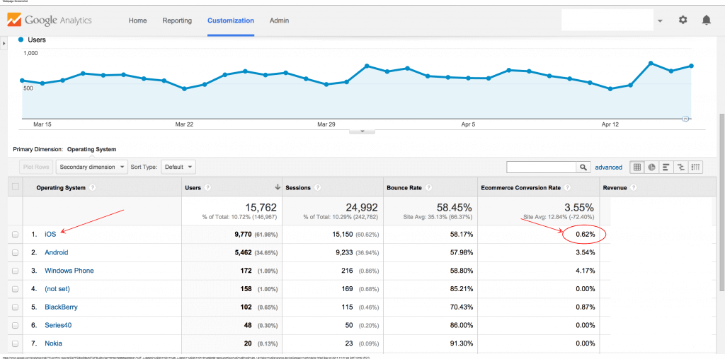
First, you can see if you have an unusually high bounce rate from a certain device type – or as in the above example – operating system.
If your android bounce rate is higher than iOS, then you can assume that something’s off in your mobile design for Android.
So, if your Android users have a high conversion rate, you’d definitely want your team to focus on improving this experience to increase mobile sales on this specific device.
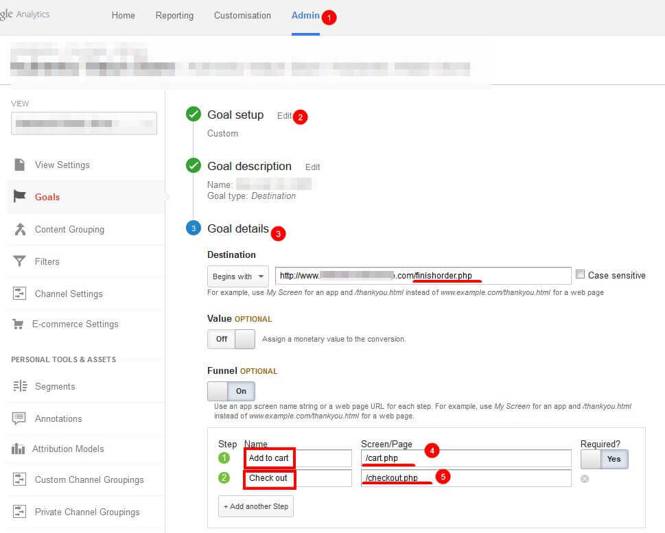
How to Set Up A Funnel Visualization in Google Analytics
Additionally, you should have a few goals set up for your ecommerce website, including but not limited to:
- How many times users completed the “add to cart” action
- How many times users successfully checked out
This setup looks something like this:

Once these goals are set you’ll have the ability to view your funnel and the steps where users drop off, like in this image below:
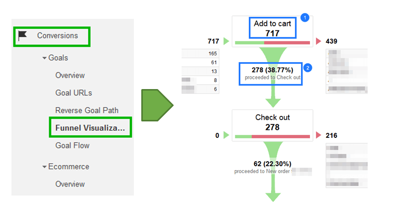

Now, segment by mobile and you’ll have a clear idea of just where your hiccups are in the conversion process.
If you set up these reports and show your actual ecommerce website mobile data to your team, they’ll be convinced.
Illustrate the Potential ROI
Lastly, you have everything you need to make the strong case that mobile design optimization has a great return on investment.
By taking steps to optimize your mobile website, you’re making a bet that you’re going to get some of the mobile market revenue growth (remember, almost 100% in 2015!).
Mobile’s not going away, it’s just getting stronger. Illustrating the ROI should be quite easy, but if not, here’s a valid point to bring it home:
Once your mobile website design is optimized, all your future investments in SEO, PPC, or even social media will be more profitable.
That’s because your overall customer experience will be much better.
For example, let’s say that you’ve been running ads from Facebook to a specific product landing page. But after diving into analytics, you see that the bounce rate on this page – from mobile devices – is extremely high.
We all know when a visitor bounces from an ad, it’s wasted money.
If you invest in optimizing this page, the chances of your user NOT bouncing because they have a GOOD mobile experience are much higher, thus lowering the cost of your ads and customer acquisition through social altogether.
Make sense?
How Can You Learn What Mobile Optimizations You Need?
Easy. We’ll show you – for FREE. It’s what we do for clients, but in our 1-hour Conversion Training, “How to Grow Ecommerce Sales, Conversions and Profits WITHOUT Spending More on Marketing”, we’re going to share with you exactly how you can optimize your own site!
Here’s what you’ll learn:
- How to get more conversions from your traffic, without having to overhaul your website.
A simple system for increasing your sales AND profit margins, without spending more money on ads or SEO. - A breakdown of the exact conversion mistakes you are making and how to fix them.
- Our strategy for PREDICTABLY growing your business WITHOUT investing outside capital.
- BONUS: A map of our top-performing “pre-purchase” funnel and an ROI Calculator from Referral Candy!

