
2 Powerful Product Page Conversion Tactics Used By the Fastest Growing Brands in Ecommerce (And How You Can Use Them, Too)
The fastest-growing ecommerce companies like Huckberry ($15 million in revenue in under 5 years with ZERO outside financing) and Chubbies (raised $4.1 million and had 50% revenue growth in 2015) use two very specific conversion tactics to rapidly grow sales.
That’s great news for you because that means the secret behind their success is not a bigger budget or more employees!
In fact, these two tactics are just a small part of a specific funnel that Huckberry and Chubbies apply to their entire website design and functionality to speed up growth. And it’s a funnel that you can use too.
[content_upgrade]Get a copy of this exact funnel in this FREE video training, “How to Grow Ecommerce Sales, Conversions and Profits WITHOUT Spending More on Marketing” You’ll see the specific steps you need to take to convert more with your existing traffic![/content_upgrade]
But in this article, we’re going to zero-in and analyze how a few companies have applied just two specific tactics to their product page design.
Because focusing on product page conversions is one of the fastest website optimizations to see a visible and almost-immediate ROI.
If your product pages aren’t optimized, you are – no doubt – losing sales.
Before you roll your eyes and think “Not another article about losing sales” – this isn’t that article.
This article is going to get specific.
We’re going to peel back the layers of your product page design and examine them so you can understand exactly how Huckberry, Chubbies, and other fast-growing companies convert users to customers.
So, what are these two tactics?
2 Tactics That Drive Product Page Conversions
Urgency and Trust.
I’m sure you’ve probably heard a little about both of these as separate conversion tactics, and that’s good.
But when they’re used together they’ll transform your product page design into a growth engine.
And guess what? Very few brands actually combine both of them in their product page design.
That’s because pulling it off effectively takes some deep understanding of your design and how your customer journeys through it.
To convert a user from your product page, you’ve got to really make them want it.
That’s where the first tactic comes into play: urgency makes people want things NOW.
(These are two of the many conversion tactics the fastest-growing companies use as part of their overall conversion formula. See how the whole formula works.)
Visually Display the Scarcity of Your Product
Can you think of any ecommerce brands currently using this tactic well?
Maybe one or two come to mind, but the truth is you don’t see a lot of ecommerce brands using this tactic.
That’s because to pull off urgency on a product page, you’ve got to be authentic.
Customers can smell the sleaze of a inauthentic marketing ploy miles away.
Don’t just tack on urgency to your product page design – really address the concept by asking these questions:
- Why should it be urgent that your customer purchase this?
- It is a limited edition?
- Is it a low-stock product?
- Is it a seasonal item only?
- It is a featured brand or designer?
- How can I convey that to them through parts of the product page?
Making your customer buy into the urgency you create will only happen if they actually feel something.
Once a visitor emotionally connects with your product, the urgency will be that extra “push” for them to buy the item.
So what does urgency look like on a product page? Let’s look at a couple of examples:
Dot & Bo
Dot & Bo is a home decor ecommerce company that launched in 2013 with the mission to combine content and commerce to sell furniture and home decor. They wanted to become the “QVC for millennials” by providing a curated shopping experience centered around content.
If you’re a Pinterest user, no doubt you’ve seen their products there. Recently jumping on board the “promotable pins” offered by Pinterest, they increased clicks to their website by 18,000%!
That’s why it’s crucial that their product page convert. Let’s check out their product page design below:
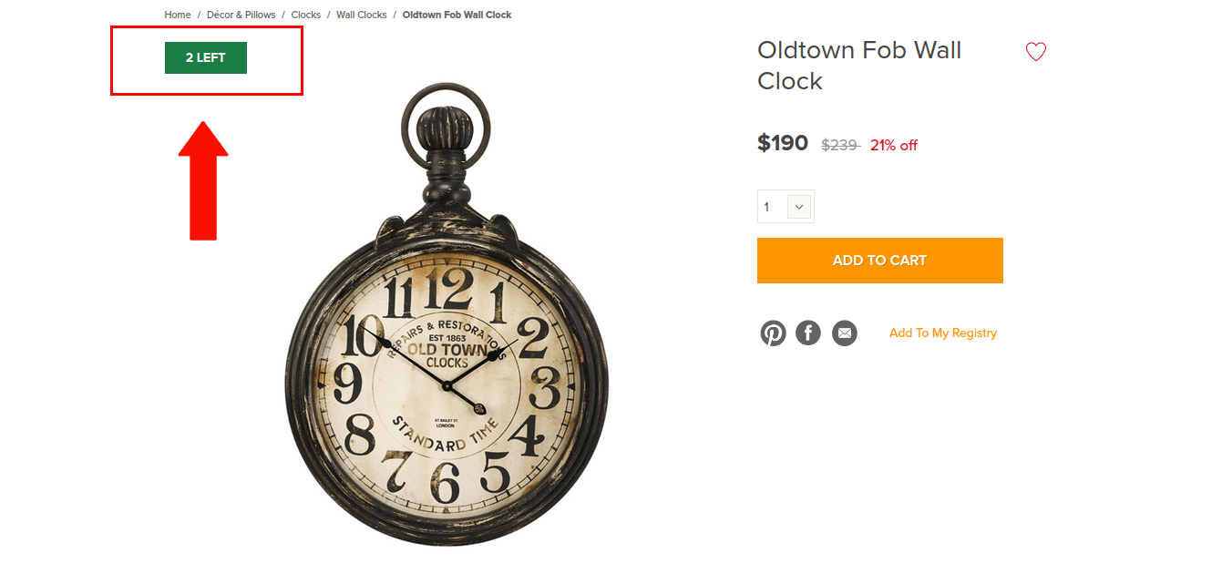

Their design features an “urgency” element. The small, green box in the upper left corner floats just near enough to a strong product image and shows the quantity remaining. In this case: only two clocks left. Not many! Better purchase now.
And that’s the way urgency in design works.
Subtly give your users a sense of scarcity to encourage them to buy now. Present it in a way that’s not overbearing, but rather an important piece of information about the product availability they should consider.
Additionally, the color of this box is green. Since this is a box related to information about purchasing a product, it makes sense that it is green. That signifies to the visitor the intended meaning of the number displayed here.
Green also makes a nice contrast with their current design. As the page is a very clean one and mostly white, it allows their orange branding color to pop, and it absolutely makes this green “urgency” box stand out.
Let’s look at a different way to display urgency in your product page design. This one comes from the men’s clothing and gear ecommerce brand: Huckberry.
Huckberry
Huckberry’s brand has cultivated somewhat of a cult-like following. Their customers are those raving, faithful brand advocates that are true and genuine.
The main way they’ve achieved such success in building their strong fan base is through storytelling.
Huckberry curates products on their site – think of it like a magazine – and many of the brands they feature aren’t very well-known but have great, high-quality products.
Oftentimes, Huckberry features a brand in a collection or on their homepage and they introduce it to their faithful fans with a compelling story.
That sets the stage for what I’m about to show you.
Check out their landing page for a running apparel brand, Tracksmith:
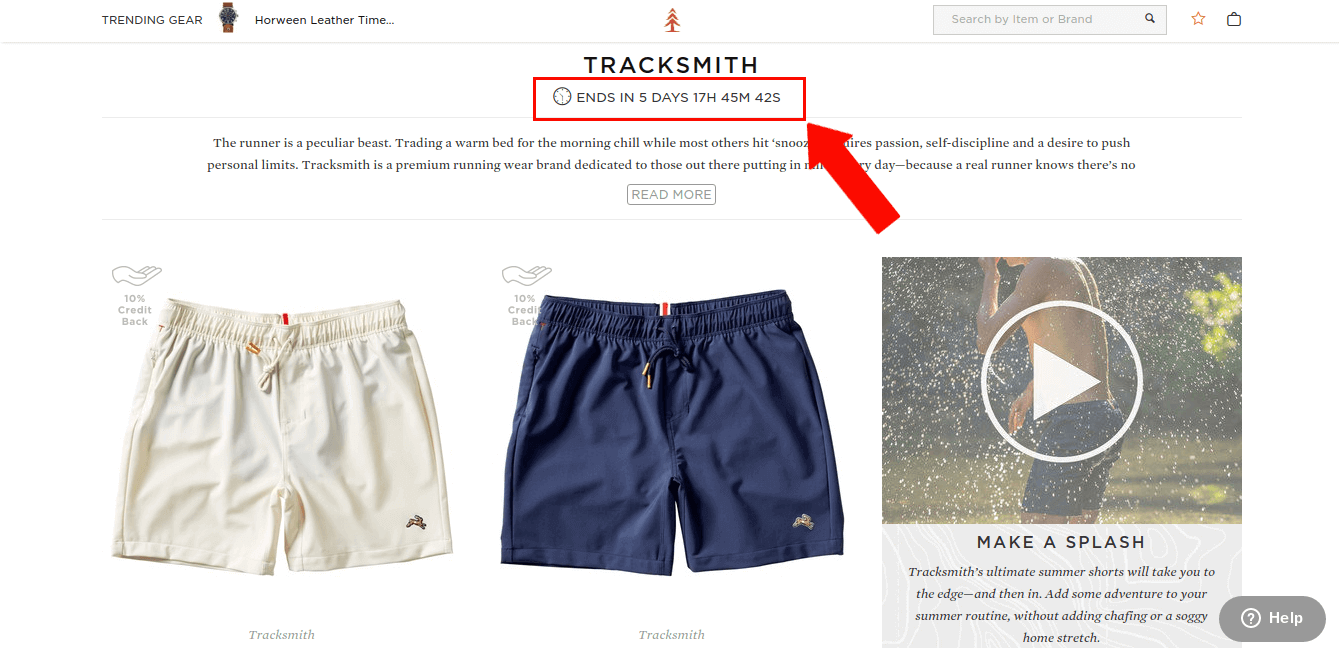

This is how they introduce the brand to their audience – with a story – and… what’s that?
An urgency element!
They have an actual countdown timer on this page. But since this is a collection page, that’s not what we’re focusing on here.
I wanted to show you that example, though, because this is the most likely journey a user would take to land on the actual product page.
So we know that Huckberry’s done two things prior to their customer viewing the product page:
- Set the stage with a compelling story (remember, making an emotional connection?)
- Shown an urgency element to give users a sense of how little time they have
Now let’s look at the actual product page design:
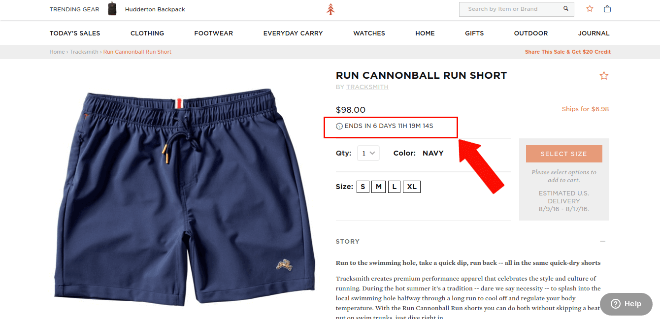

See the line just under the price?
That’s right – they have an actual countdown timer here, too.
Huckberry actually doubles-up on their urgency by placing countdown timers on both their collections pages and their product pages. This creates a “buy it or lose it” impulse for their customers.
Notice that their timer isn’t a blaring cheesy graphic. It’s a subtle, well-designed, strategically-placed incentive.
Do Urgency Right
So how can you implement urgency into your own product pages and keep it subtle, yet effective?
It all starts with a test. Collaborate with your ecommerce design team to come up with a variation of a product page design which includes an urgency element. Maybe it’s an inventory display. Maybe it’s a countdown.
Either way, make sure you take time to consider how this element should fit in with your design aesthetic, but also stand out just enough to get your customer’s attention.
It’s a fine balance. But the good news is, the second tactic in our conversion formula is going to help you succeed in urgency.
Let’s talk about trust.
Trust
What does “trust” in ecommerce site design mean?
Sometimes it means security badges on payment pages, sometimes is means repetition of logo and branding elements throughout your site, and sometimes it means good copy.
But for the purposes of this article, “trust” in product page design includes elements like:
- A thorough & unique product description
- Interactive elements
- Fit guides
- Product reviews
All of these fit under the umbrella of earning your customer’s trust.
Why?
Each of these sections provides your customer with specific information about the product they’re considering to purchase.
The more information they have about it, the more confident they are in the product itself and are much more likely to purchase.
Here’s a few examples of brands who understand how to show trust elements on their product pages:
Chubbies Uses Social Proof & Free Shipping/Returns Cues
Chubbies, an online shorts brand, wins their customers over in many ways just due to the nature of their messaging and brand personality.
But they do know what they’re doing in terms of building trust.
First, this brand – like Huckberry – has a raving fan base. That means they’re ripe for leveraging social proof to build trust.
People like to see how many other people like a brand and its products. That’s why social media has become such an important channel for brands seeking to optimize their customer acquisition.
People like to buy what their friends recommend. People like brands their friends like. So showing evidence that lots of people like your brand can do lots in terms of building trust with a first-time website visitor.
Let’s take a look at how Chubbies includes this in their product page design:
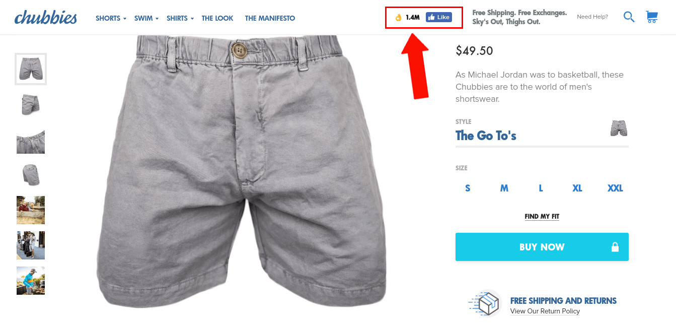

They’ve implemented a subtle “Likes” counter in their navigation bar.
Why is that powerful? Because it shows that 1.4M like this brand.
Just to compare, Huckberry (whom also touts a raving fan base) has only 135,000 Likes (they also probably do not focus on this channel as much as Chubbies.)
The point here is that showing a bit of social proof absolutely builds trust with people who aren’t familiar with your brand or products.
But Chubbies’ trust-building in design doesn’t stop there. They also address one of the biggest barriers to purchase through the addition of a simple graphic.
That big barrier is shipping.
Charging for shipping is something that ecommerce brands notoriously struggle with. But offering free shipping can actually be a secret weapon in lighting a fire under conversions. (That’s an entire blog post on it’s own so we won’t get into the logistics of incorporating free shipping into your business model today…)
If you do offer free shipping and/or free returns, it better be obvious to your users!
Call it out in your design!
Let’s have a look at how Chubbies does this in a well-designed graphic:
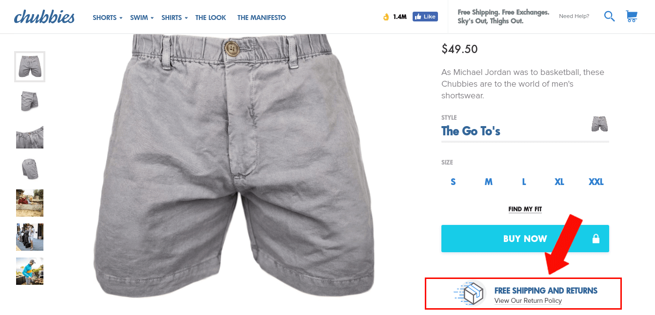

Their “free shipping and returns” graphic is well-designed, includes a useful link to their return policy, and is strategically placed just under the “Buy Now” button.
The Chubbies product page design really is a good example of building trust. It counteracts many doubts a customer may have about purchasing, their social proof and free shipping/returns being very strong examples.
Mizzen + Main Shows A Fit Guide & Interactive Informative Icons
You can also build trust in your website visitors by educating them.
The more information you provide about your product, the more confident a user will feel in spending their money with you.
Mizzen + Main, a dress shirts brand made out of performance material, does a good job of educating their customer. Let’s take a look at their product page design to see how they do it:
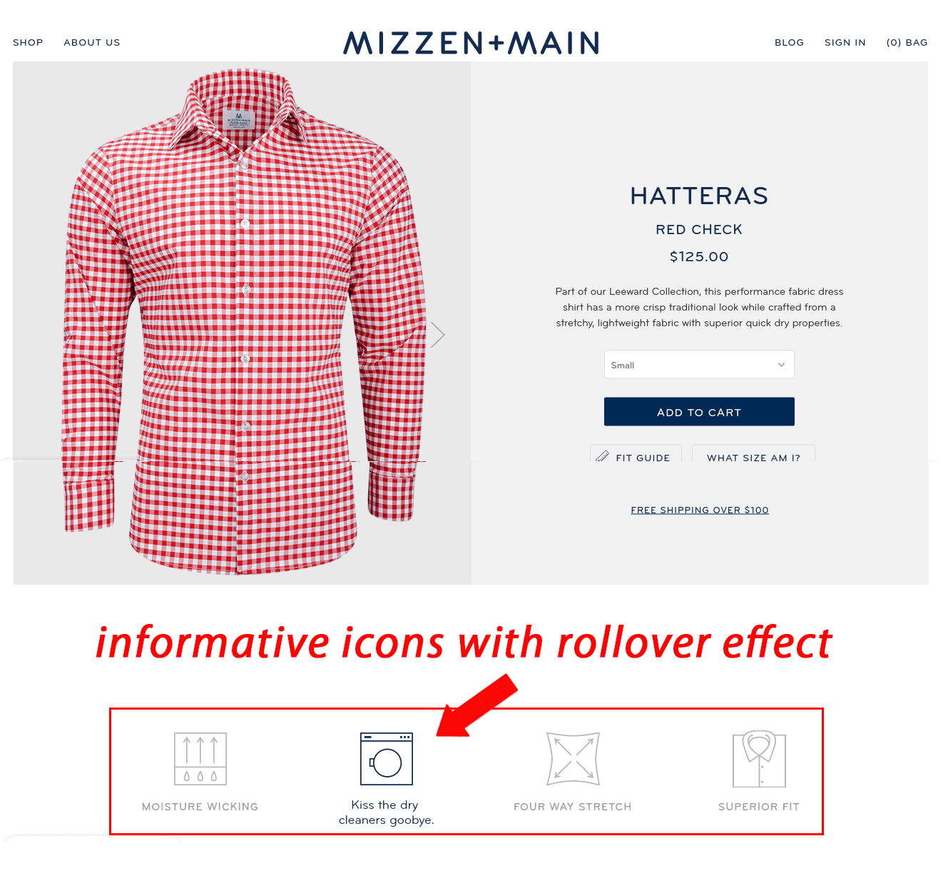

Buying clothes online is risky because of fit issues – especially when it comes to dress shirts. Of course a first-time customer is going to have some doubts in buying a dress shirt online without trying it on!
How does Mizzen + Main address this doubt? They provide a fit guide that shows visitors all the measurements they may be doubting.
Secondly, they have a visually appealing section of interactive icons. These icons serve as bite-size information about the product and encourage interaction with a rollover effect.
Now, Mizzen + Main’s first-time visitor understands not only what the product is made of, how it holds up in laundry, but also how it will fit. There are really no excuses left not to buy.
Learn more about how Mizzen + Main has succeeded with this in their design >
Now It’s Your Turn. How You Can Implement A Conversion Formula:
Remember, the two tactics we covered today are just a part over the overall conversion formula used by the fastest growing ecommerce companies.
You can walk away today and implement what we discussed today, but you will see FAR better results if you do so within an overall conversion framework for your entire website.
Fortunately for you, we’re going to teach you the exact formula the fastest growing ecommerce sites use to turn their websites into growth engines.
We’ve created a free conversion workshop: “How to Grow Ecommerce Sales, Conversions and Profits WITHOUT Spending More on Marketing” that walks you through the exact conversion funnel behind many successful website designs. You’ll also see critiques of ecommerce websites from some of the leading brands in the industry and the actionable tactics you can use today in your own business.

Our goal with this workshop is to teach you a formula and tactics that you can being to apply TODAY.
Hope to see you there!