
Custom redesign turned a complex product line into a high-converting site.

In a crowded category, the fastest way to scale is to show proof before doubt sets in.
Functional mushrooms are no longer niche.
But for most shoppers, the benefits still feel vague.
What does lion’s mane actually do? Is this brand credible? Can I trust the product will work?
OM Mushroom had the goods: science-backed, doctor-founded, USDA Organic, clinically studied.
The problem: A broad catalog left buyers unsure where to start.
The fix? Lead with benefits and back them up with proof.
Here’s how:
1. HOMEPAGE
Lead with outcomes, not products
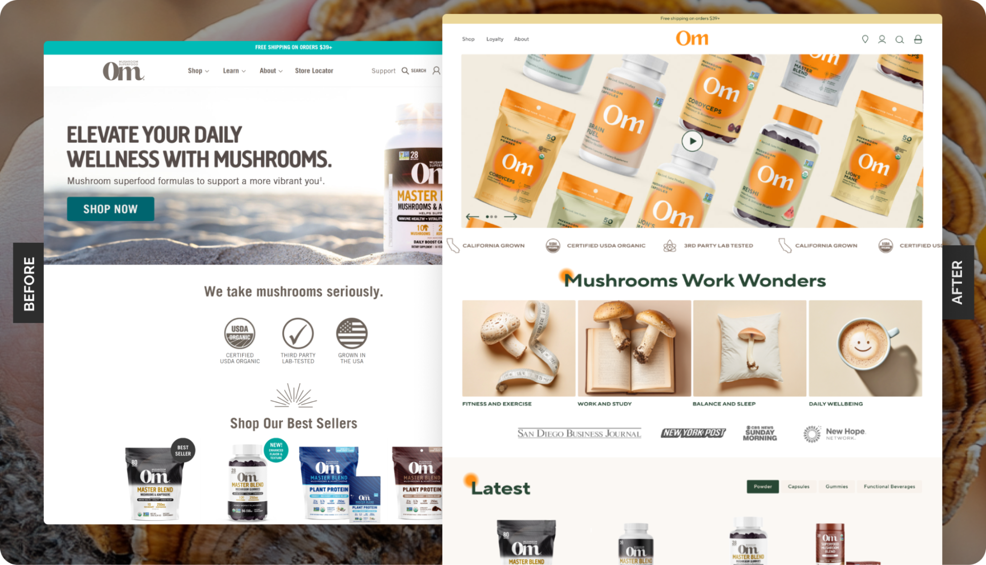
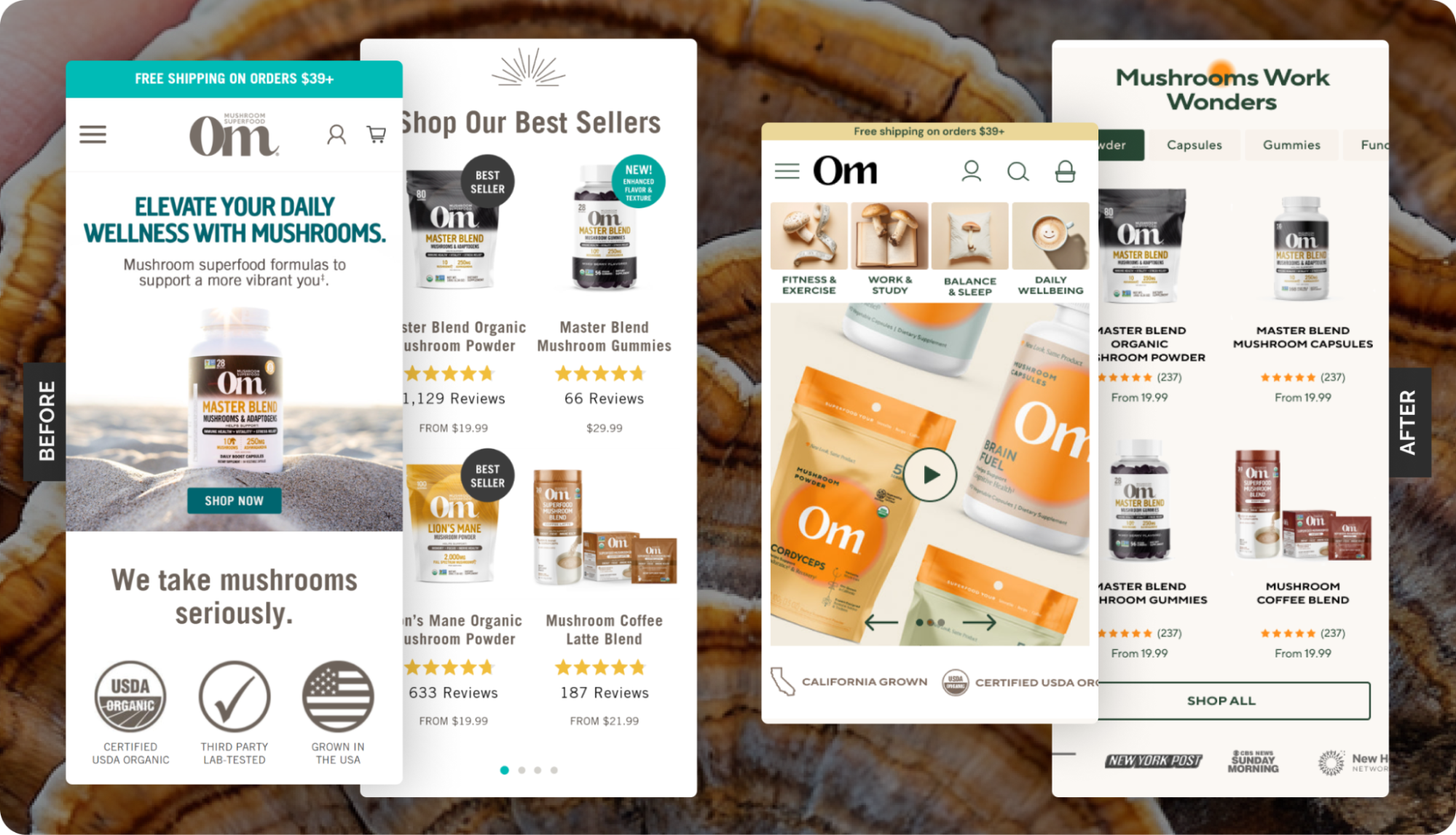
The old homepage led with seasonal releases. Good for returning buyers, not so helpful for first-timers.
We shifted the focus. A new hero section educates newcomers by tying products to tangible outcomes (focus, energy, immunity) and links directly to best-selling blends.
Below, we simplified the icon row. Instead of a cluttered spread, OM highlights only three credibility markers: Organic, 3rd party tested, California-grown.
First-time visitors instantly see benefits and trust signals, then browse on their own terms.
2. COLLECTIONS PAGE
Make it obvious where to start
With a broad catalog, OM’s challenge was helping shoppers know where to start.
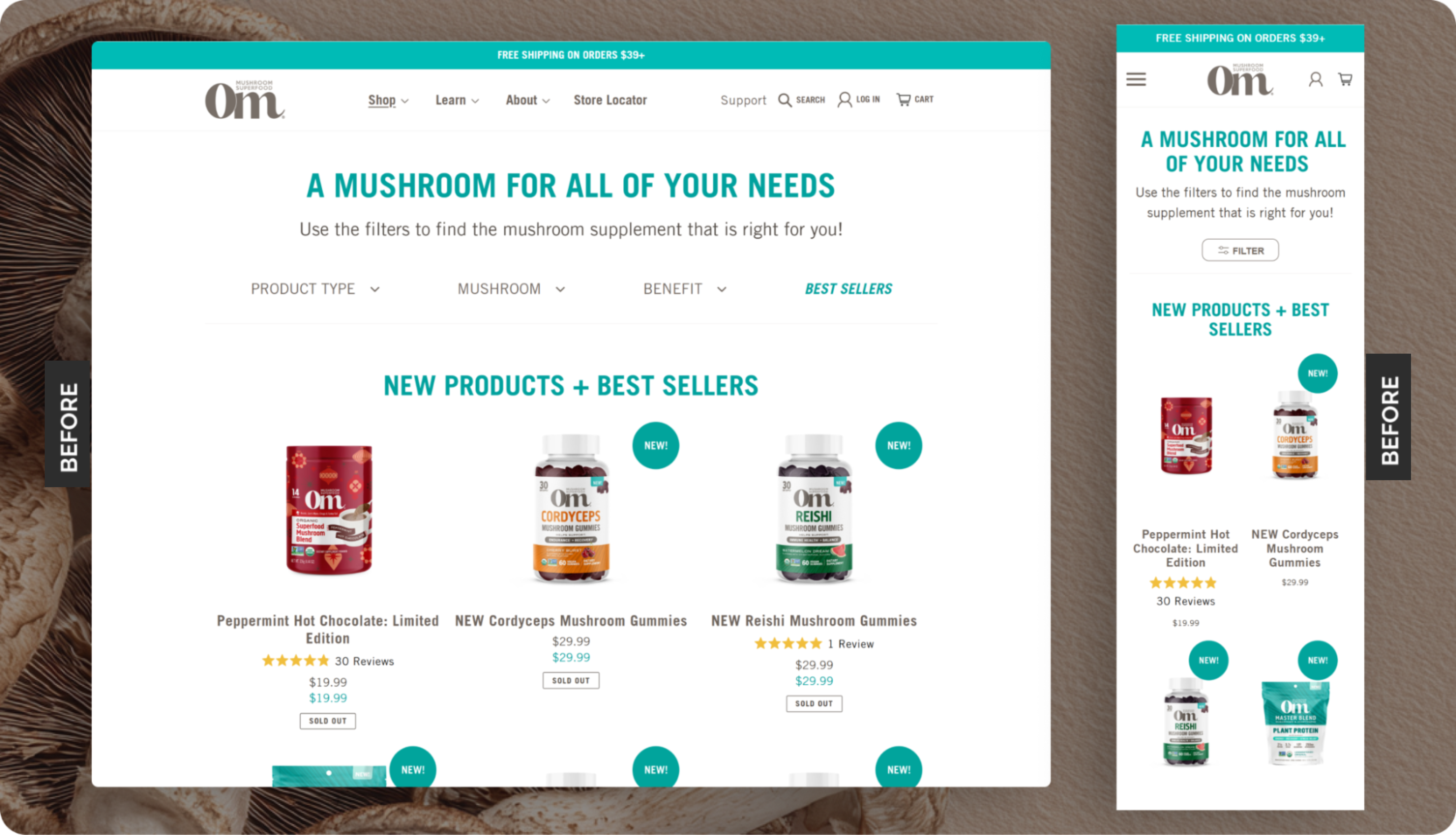

A wall of powders, capsules, and blends can overwhelm first-time buyers.
The fix: simplify choice and surface credibility earlier.
Here’s what changed:
- Benefit-led categories up top: Instead of listing formats (powder, capsules, etc.), OM organized by customer goals: Endurance, Focus, Balance, Immunity. This gave new buyers a clear entry point.
- Badges to guide decisions: “Best Seller” and “New Arrival” badges flagged products quickly, reducing the need to click and compare across the entire catalog.
- Cleaner collection headers: Subhead copy was removed, cutting clutter and getting shoppers to products faster (especially on mobile).
Now, the shopping flow points customers toward trust and outcomes before they even hit a product page.
III. PRODUCT PAGE
Put proof and benefits above the fold

On PDPs, customers don’t want to dig for value.
We moved bullet-point benefits above the fold so shoppers see key outcomes (immune support, clinically studied dosage, expert-backed) without having to expand long copy.
Then we layered in a human voice – a short testimonial snippet right below the star rating in the buy box. Instead of generic stars alone, customers immediately saw another buyer’s experience in their own words.
This mix of clarity + proof up front lets the product benefits (and happy customers) do the heavy lifting.
IV. CART + CHECKOUT
Make the cart work harder

We replaced an outdated cart page with a modern cart drawer powered by Rebuy.
The new flow included in-cart recommendations and a free-shipping bar, boosting order value.
✨ Takeaway: When your brand is growing (especially in an emerging category), focus on a reliable framework: show proof, show value, and make buying easy.
With every page rebuilt for clarity and speed, OM now has a site to scale as fast as the category itself.
After their successful redesign, OM transitioned into continued A/B testing and optimization to keep the momentum going.
Speaking of momentum: curious how this could work for your brand? Give us a shout.