
How Mountain House Built a Store Specifically for Outdoor Enthusiasts

High-intent shoppers need faster paths to the right products, not more inspiration.
Mountain House serves outdoor enthusiasts who prepare in advance for trips.
These shoppers don’t browse casually.
They arrive asking:
- How many days does this cover?
- Is this better for backpacking or emergency storage?
- What format fits my trip?
- What’s actually included?
When those answers are buried, buyers have to work.
And when buyers have to work, they hesitate.
Their site didn’t make planning easy enough.
So we built tools that matched how they buy.
Here’s what that looked like.
1. The homepage kept the brand story – but made product paths easier to act on.
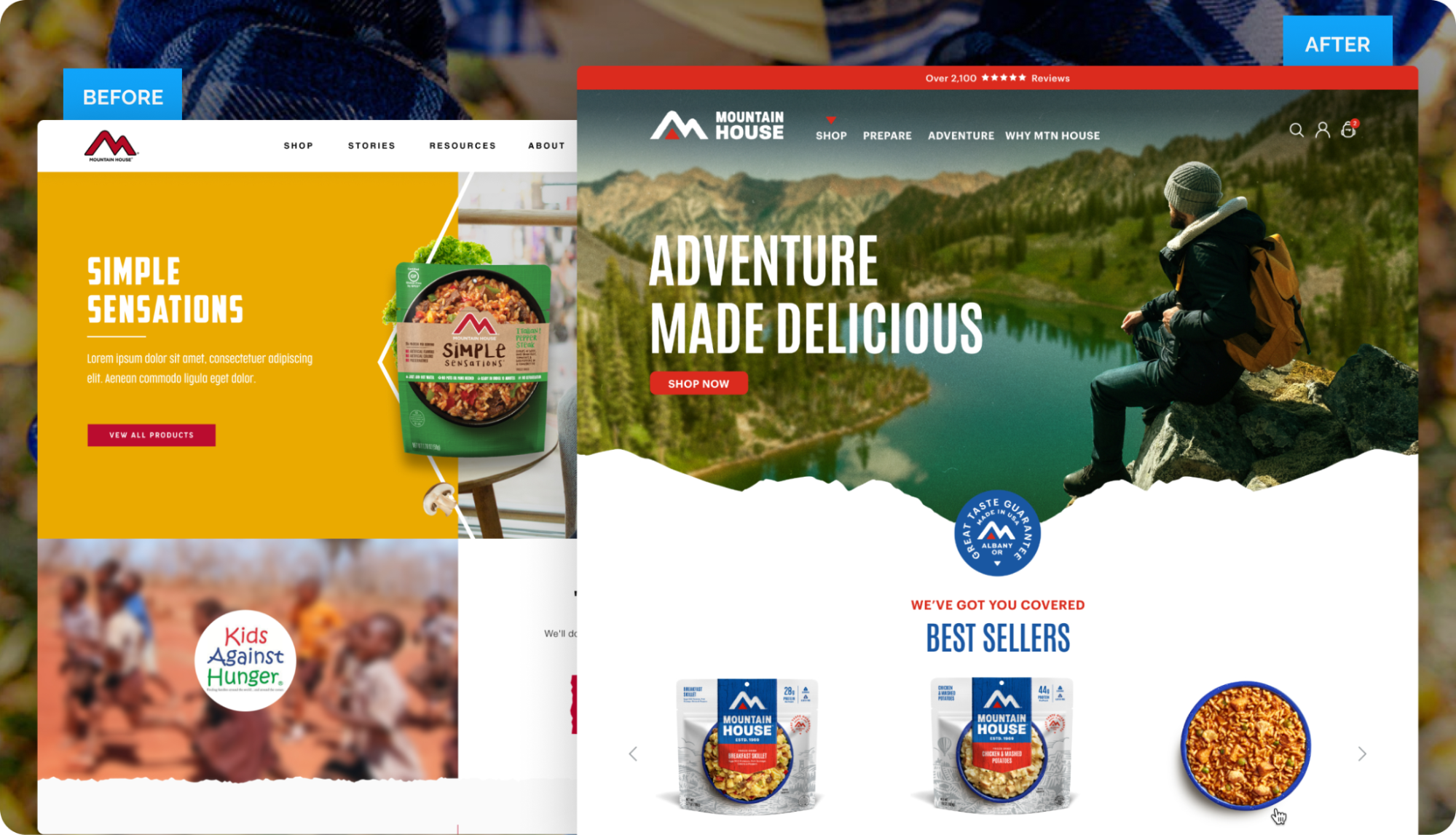
The homepage became a decision entry point.
We reorganized it around how customers actually shop:
- Best sellers surfaced immediately
- Product format front and center (pouches, cans, kits)
- Activity-based paths (backpacking, military, emergency)
Planners don’t want to scroll. What they want is direction.
The homepage now shortens the path to the right inventory.
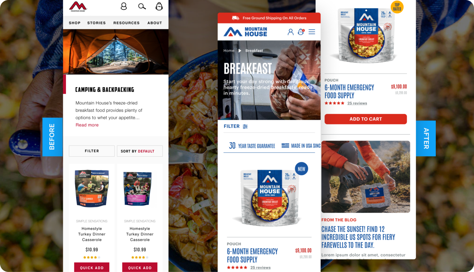
2. Product pages surfaced the information planners look for first.
Mountain House has strong brand equity in the space.
The opportunity was to make planning details easier to act on.
So we brought key decision factors forward:
- Clear badges like “Top Rated” and “Best Seller”
- Visual benefit icons near the buy box
- Transparent ingredients and nutrition
- Straightforward prep instructions
Instead of digging for answers, buyers could see what they needed right away.
That made comparison faster and decisions easier.

3. Collections were rebuilt around planning decisions.
A customer preparing for a 5-day backpacking adventure doesn’t think in categories.
They think:
“How many meals do I need?”
“What keeps weight low?”
“How much protein does this provide?”
An emergency planner thinks:
“How long will this feed my family?”
“Are these meals gluten-free?”
“What’s included in this kit?”
So we reorganized collections to mirror those decisions.
Buyers can now filter by:
- Meal Type
- Activity
- Package Type
- Dietary constraints
Now, the site answers the question behind the click.
That reduces comparison fatigue and supports larger orders.
4. A “Build Your Own Kit” feature turned the catalog into a trip tool.
Our custom kit builder lets customers assemble meals based on trip duration (3-7 days) and dietary needs.
This directly supports preparation over browsing (or overthinking).

✨Takeaway: When your buyer arrives with a plan, your storefront should help them execute it.
Design for how your customers think, not how you want them to browse.
That’s how Mountain House built a better path for planners, with features that felt less like a catalog and more like a tool.
When a site reflects how customers actually buy, performance follows.