
4 design changes for your buy box that improve conversions.
Optimize your product page for quicker purchases with these 4 changes.
#1: Try out an intuitive, traditional “buy box” layout.
Even luxury brands require a traditional product page layout.
With little space and room on mobile, it’s tempting to hide important info inside a cool design.
But – this brand’s product page was tough to navigate: descriptions were hidden and the design was overly complex.
Instead, we switched it to a traditional layout with the “Add to Cart” button higher up, and sales copy visible in the buy box (where products are added to cart).
It led to a 23.4% increase in conversions for their top-selling product.
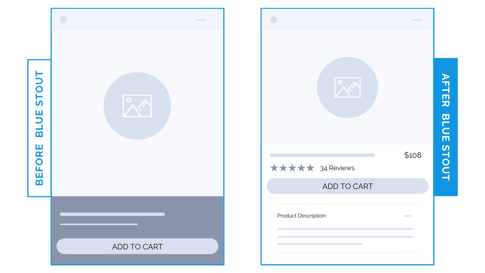
If they can’t easily consume it, a complex design is not worth it.
✨ Takeaway: You can have a luxury design and an intuitive buying experience. When in doubt, choose the layout that’s easy to navigate.
#2: Add a short customer review before “Add to Cart” on mobile.
Most people will ignore reviews stars. Here’s a better way to intrigue buyers:
Add a short customer testimonial to your buy box that addresses concerns head on.
We integrated a snippet of a great review directly into the buy box for an outdoor brand – a subtle shift resulting in a 4.3% uplift in mobile conversions.
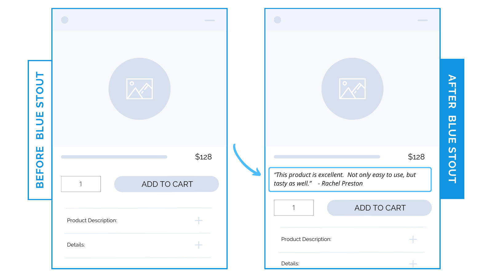
A testimonial that addresses a specific benefit or pain point is more targeted than review stars or scrolling through 100+ reviews.
✨ Takeaway: On mobile, position powerful social proof at the point of decision-making: right in the buy box.
#3: Put product or brand benefit icons below the “Add to Cart” button.
Your benefits sell, but only if visitors see them. Use icons for easy scanning.
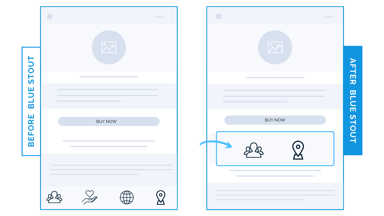
In one test example, we added 2 product benefit icons below the “Add-to-Cart” button. It led to a 24% boost in mobile conversions.
Product benefits next to “Add-to-Cart” eliminates scrolling.
In another test, 3 brand benefits in a product page buy box boosted conversions by 11%.
Adding your brand’s top benefit icons here reminds customers at the point of purchase WHY they should buy from you.
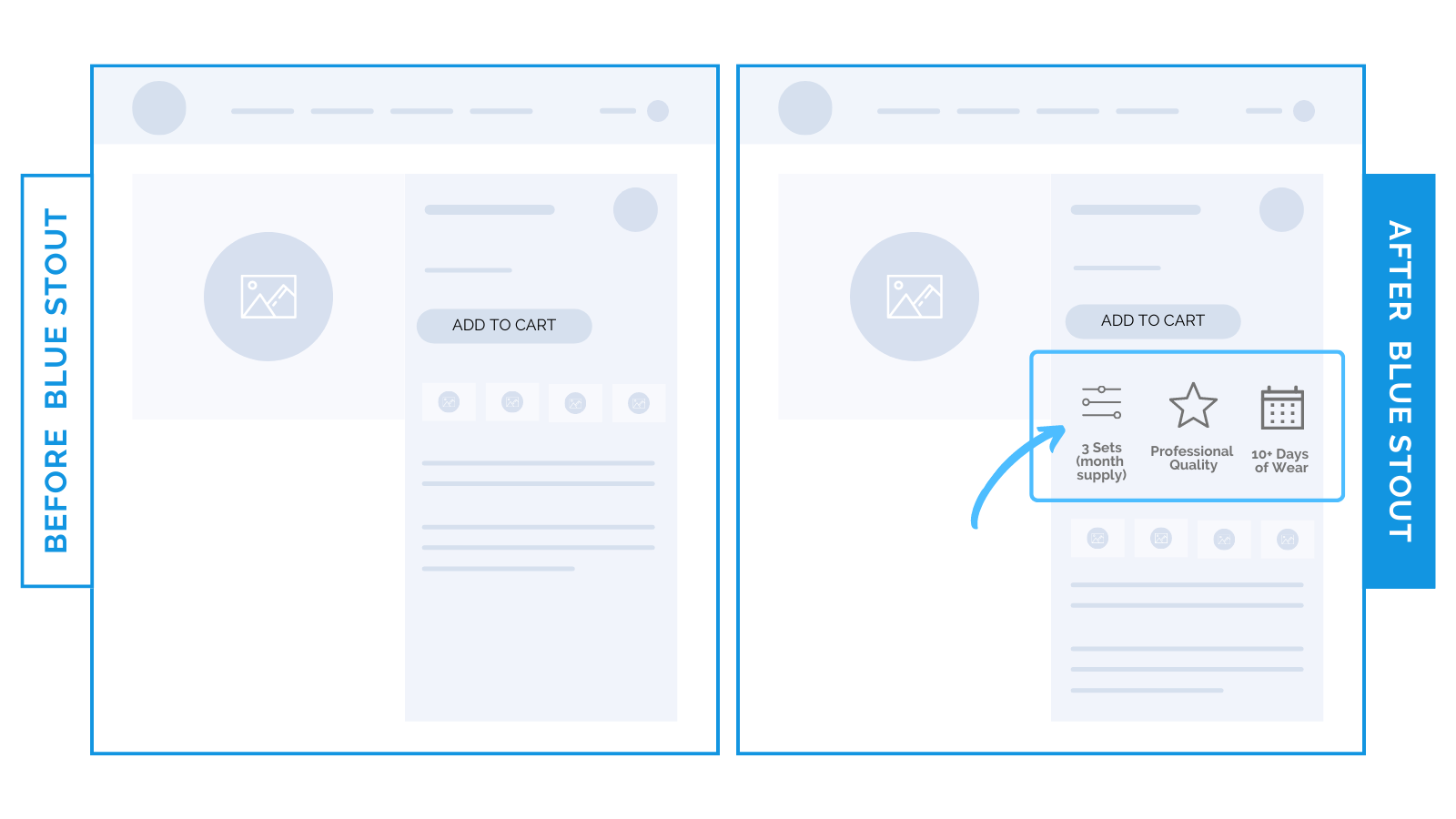
Put your key info where they decide!
✨ Takeaway: Try adding scannable benefits and brand icons close to the decision making point to reassure buyers.
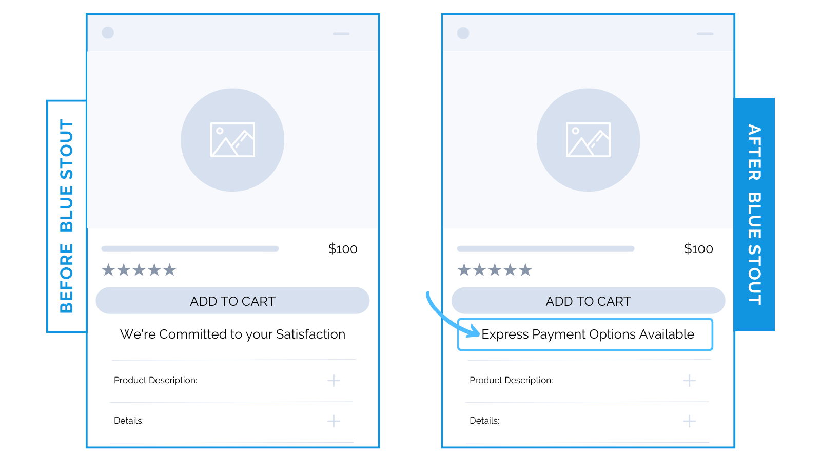
#4: Include an “Express Payment Options” message in the buy box.
Messaging near your add-to-cart button is critical. Make it persuasive.
Before, “We’re Committed to your Satisfaction” was listed by the add-to-cart button on a jewelry brand’s product page.
Instead, we tested two NEW variations:
- “Express Payment Options Available”
- “Free Shipping For Orders $150+”
Each contributed to a higher Average Order Value (AOV), but mobile traffic saw the highest conversion increase with the first option under the add-to-cart button.
Convenience is bliss. Use it to your advantage!
A satisfaction guarantee is a great sentiment. But it’s not a reason to purchase.
Offer them speed and ease instead.
With express payment, there is zero friction. If it’s easy to checkout, it’s easy to follow through on their emotional decision.