
Clean out the clutter in your cart drawer. It’s hurting conversions.
Cart drawer hurting conversions? Clean out the clutter!
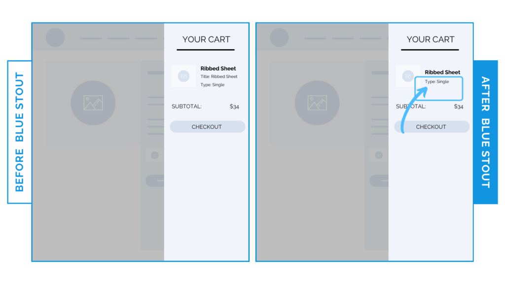
In a recent test, we eliminated the title fields in our apparel client’s cart drawer to reduce confusion & clutter. It resulted in a 7.8% increase in carts completing checkout.
Your slide-out cart experience is not to be overlooked. This pop-out window conveniently folds in & out from the page’s edge every time your customer adds a product to the cart.
So, we want to make sure the info here will lead them to a streamlined, easy checkout.
Here’s Why it Worked
Removing this distracting element that didn’t provide any new information in favor of purchase allows your customer to take a QUICK glance at your product & its price to confirm their decision.
This spot should sport only clear copy that celebrates the purchase.
All good stuff. No fluff.
What Most Brands Do Wrong
Tons of brands overstuff their slide-out carts, even though the customer already has their foot in the door. Don’t be like them.
Trust the flow & eliminate any distracting info.
The fewer elements you have here, the better.
Try it out:
Have any extra copy in your slide-out carts? Ask yourself if it’s absolutely necessary. If not – delete it! Test, review, repeat.