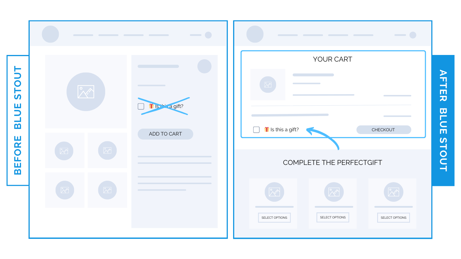
Checkbox removed from luxury brand’s product page lifts conversions 6%.
Relocate non-essential features on your product page to later in the buying process.
Don’t ask customers to make a decision other than what to add to their cart before they’re ready to buy.
Previously, our luxury home goods brand incorporated a “Is this a gift?” checkbox right on the product page.
Too early.
We moved it exclusively to later in the journey. On the cart page.
This elimination resulted in a 6% boost in conversion rates and a 5% increase in AOV.
Bonus: in doing this, the add-to-cart button was moved higher up on the product page.

The “Is this a gift?” checkbox on the product page (although well-intentioned) diverted the buyer’s attention from the main objective —
Purchasing the product.
By removing this distraction, we ensured a straightforward journey from product to cart.
Simplify the process. Make it intuitive. Avoid unnecessary sidetracks.
Here’s why most brands fail at this.
Many brands incorporate features they think will enhance user experience.
But they end up complicating the purchase process.
Adding too many options or questions on the product page creates fatigue and distraction.
Main goal of your product page: inspire a purchase.
Make every element on that page laser-focused on achieving this.
✨Takeaway: Do you have messages on your product page meant for later in the buyer journey?
Here’s how to streamline:
- Ask, “Could this be adding friction to their purchase decision?”
- Remove non-essential elements to later stages in the buying process.
Try it out and test!


