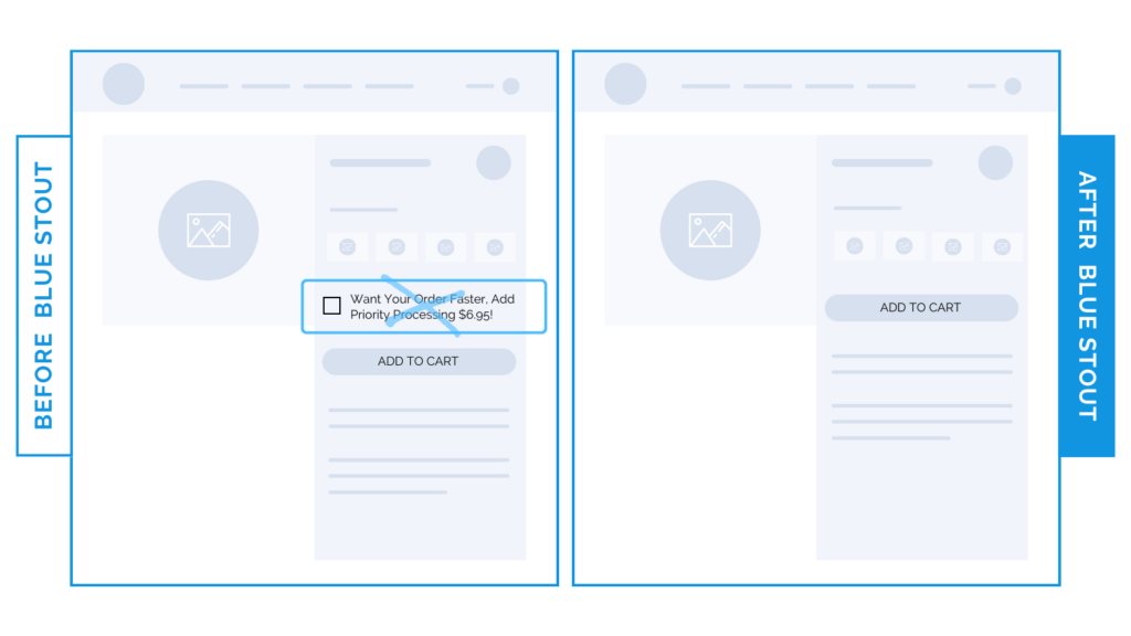
Could your upsell be causing confusion? Try this.
In a recent test, we removed a “Priority Processing” option from above the ATC button on a brand’s product detail page. This brought a 9% conversion increase.
Cue the surprising squeals.
While an easy upsell in theory should work, location matters. They are always important to test.

Here’s Why it Worked
We found that when this upsell option was on the product page:
“Want your order faster? Add priority processing for $6.95!”
…it could have been creating doubt.
Customers who DON’T select it may wonder how long it will take to get their items.
However, it is still an option that generates revenue.
So, keep it. But – consider placing the upsell in your cart if it applies to the entire order, not in a location where it could sway their decision to purchase.
What Most Brands Do Wrong
Most brands don’t consider the location of an upsell message. If not properly placed, it could cause the audience confusion, and make some jump ship entirely.
The goal is to ELIMINATE decision-making as much as possible around the ATC button.
Try it out:
Do you have a priority processing message or other upsell on the product page? Consider removing it and placing it elsewhere, like the cart. Then, test, review, repeat.


