Engage new visitors with specific collections on the homepage.
Prioritize clear collections on the homepage to streamline the path to purchase.
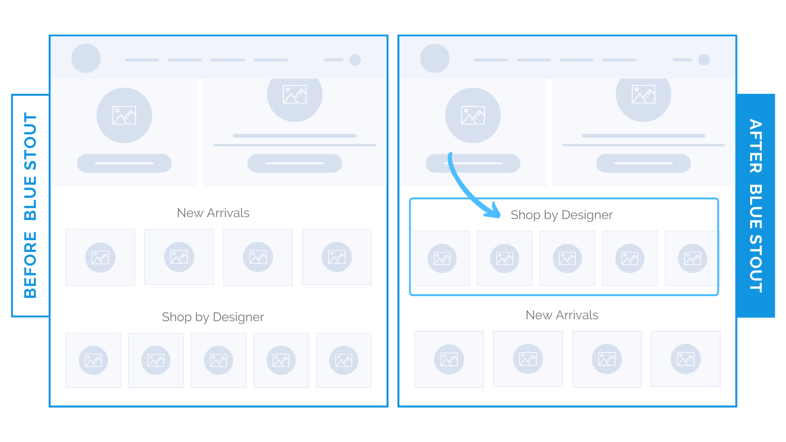
A luxury apparel brand initially featured “New Arrivals” at the top of their homepage.
The problem: new products appeal to returning buyers — vital for apparel brands — but for new visitors, it’s less engaging.
We shifted the focus to specific collections:
Replacing “New Arrivals” with “Shop by Designer” increased conversions by 8.7%.

Why?
Specific collections instantly meet buyer needs by offering multiple paths to products. This minimizes browsing time and reduces friction.
For growing brands, most buyers are new visitors.
If your brand has a broad catalog, new customers need a direct way to find the right product.
Providing hyper specific collections simplifies their journey.
Make it easy for buyers to engage with what interests them immediately.
✨Takeaway: Be specific. Clearly defined collections on the homepage showcase your catalog and help customers quickly find what they want.
Review your homepage: does it lead customers where they need to go?
As always, test to see what works best!


