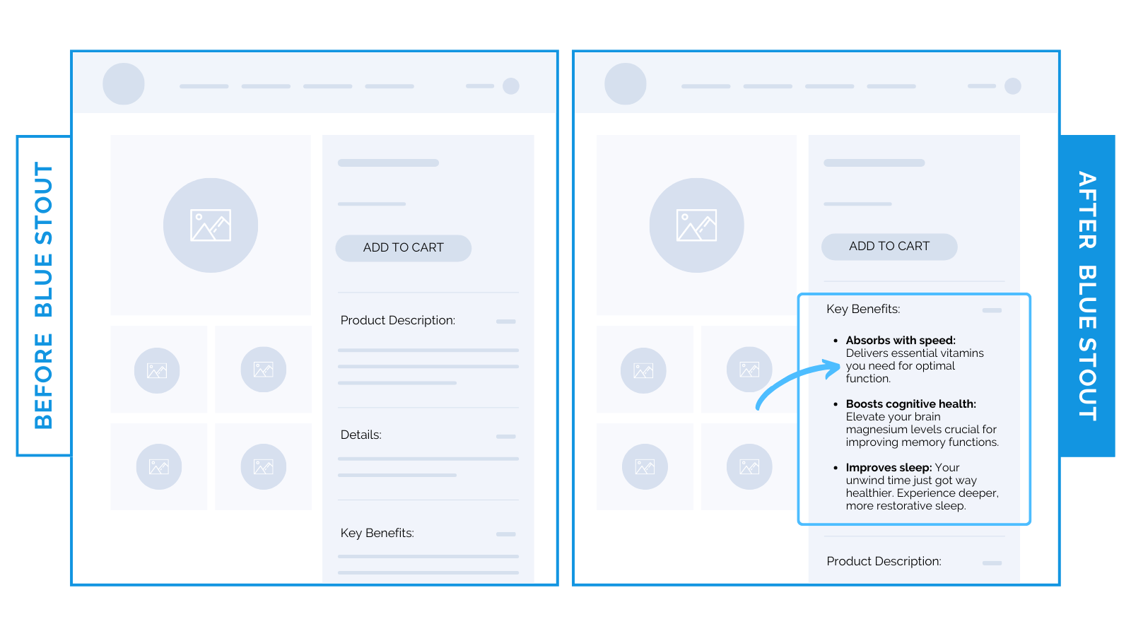
Health brands: how a simple design shift hiked up conversions 12%.
Add 3 product benefits high on the page with the “you” rule for a conversion boost.
For a health supplements brand, we moved 3 product benefits from below the buy box to above the product description.
This shift spiked conversions by 12% with a 7.3% increase in ARPU.

Don’t hide product benefits. Customers need to know why they should buy. What’s in it for them?
Speak to practical and emotional outcomes in a way buyers can see for themselves.
Do this EARLY to guarantee views.
Then, get really specific: personalize these benefits by adding “you” and “yours” to each bullet.
It strengthens the message by focusing on the customer, not the product.
Here’s an example →
- Absorbs with speed: This magnesium goes straight to the source: and fast. Designed to cross the blood-brain barrier, it delivers essential vitamins you need for optimal function.
- Boosts cognitive health: Feeling forgetful? Elevate your brain magnesium levels crucial for improving memory and cognitive functions.
- Improves sleep: Skip the alcohol. Your unwind time just got way healthier. Experience deeper, more restorative sleep and relax with ease (without stimulants).
Especially for supplements where the stakes are high and competition is stiff, try to hit on three specific benefits that save them time, money, and stress.
Put your benefits high on the page so they’re easy to see & scan before checkout.


 Takeaway: Isolate 3 product benefits to the top and use the “you” rule to lock in an emotional connection.


