How category sliders can make your homepage convert 15% more.
Use category sliders at the top of the homepage to enhance visibility of collections and get buyers shopping quicker.
Navigating a large catalog can be daunting.
Collection sliders help by directing customers to products they’re most likely to buy.
Before introducing featured products on the homepage, create entry points to thematic and category-driven collections instead.
This improves customer experience by helping to narrow the scope of the catalog.
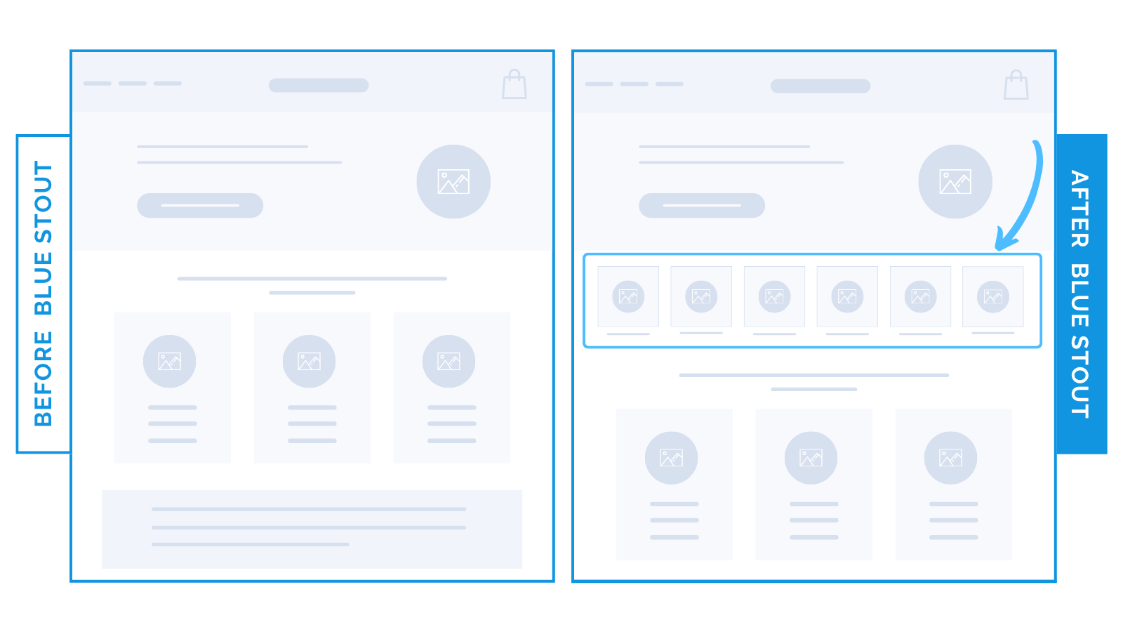
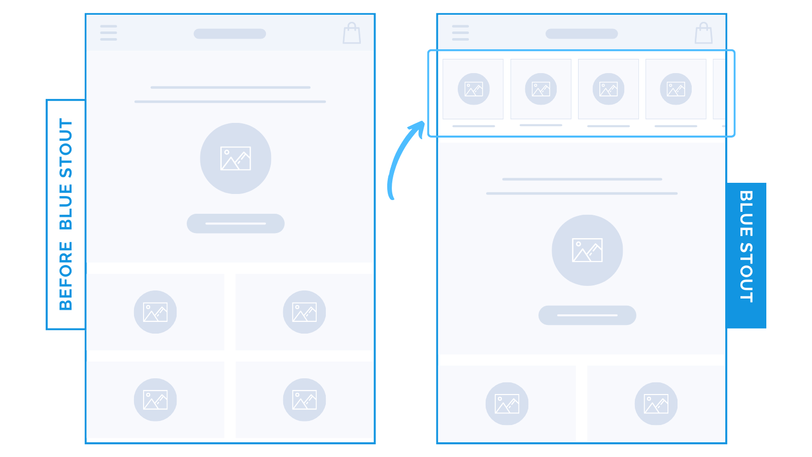
To reduce scroll time, we put category sliders high on the page: under the hero section on desktop and directly under navigation on mobile.
This led to a 14.5% increase in category clicks and a 6.5% conversion boost.
Good rule of thumb: Highlight your best-selling collections before your customer can even scroll the page.
DESKTOP:

These structured entry points work best on desktop, as buyers can see every collection on a single screen and choose which one to explore.
MOBILE:
On mobile, category sliders even higher (under the navigation bar) allow customers to see the brand’s top-performing collections and make moves from there.
The less time they spend on the homepage, the better.
Your goal is to get them to product pages to learn more, add to cart, and checkout with ease. With large catalogs, this can be challenging.
Category sliders show MORE in LESS space, and make it easier to navigate on mobile.


