
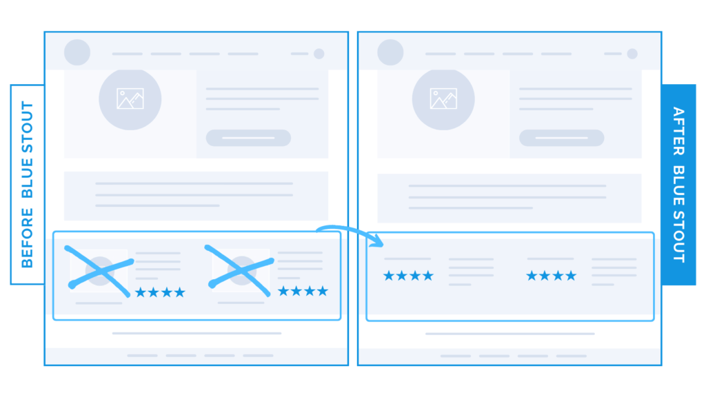
We CUT images from this section and conversions hiked up 13%.
In a recent test, we removed distracting photos next to the social proof on the homepage. It boosted conversions by 13%.
While the images looked great, they competed for attention with the valuable testimonials also displayed on that section of the page. And, they didn’t contribute to the brand narrative.
On your homepage, make sure every asset delivers clear value. You can’t afford to add fluff.
Here’s Why it Worked
Removing these lovely but distracting images keeps visitors focused on the brand narrative, told through social proof testimonials.
If you have great social proof, don’t distract from it. Let the testimonials speak for themselves, and make them easy to read.
What Most Brands Do Wrong
Most brands design for design’s sake, and don’t aggressively trim and simplify to keep the user experience clean and focused.
Buyers get distracted easily. Don’t add images just to fill a space.
Try it out:
Are your testimonials overpowered by other elements on the site? Remove them and keep the words separate. Then, test, review, repeat.