Lead with value. 2 design shifts for a high-converting product page.
2 buy box design shifts to improve Add-to-Cart and conversions.
Above-the-fold is undeniably the most important part of the product page.
It determines whether visitors will keep scrolling.
Your benefits sell the product.
Your details make it stand out.
Both help buyers visualize and believe in your product.
Try these two high-impact (yet simple) design shifts to increase conversions ⤵️
Test #1: Add benefit icons next to your Add-to-Cart button
Your benefits sell, but only if visitors see them.
Use ICONS to make benefits easy to consume.
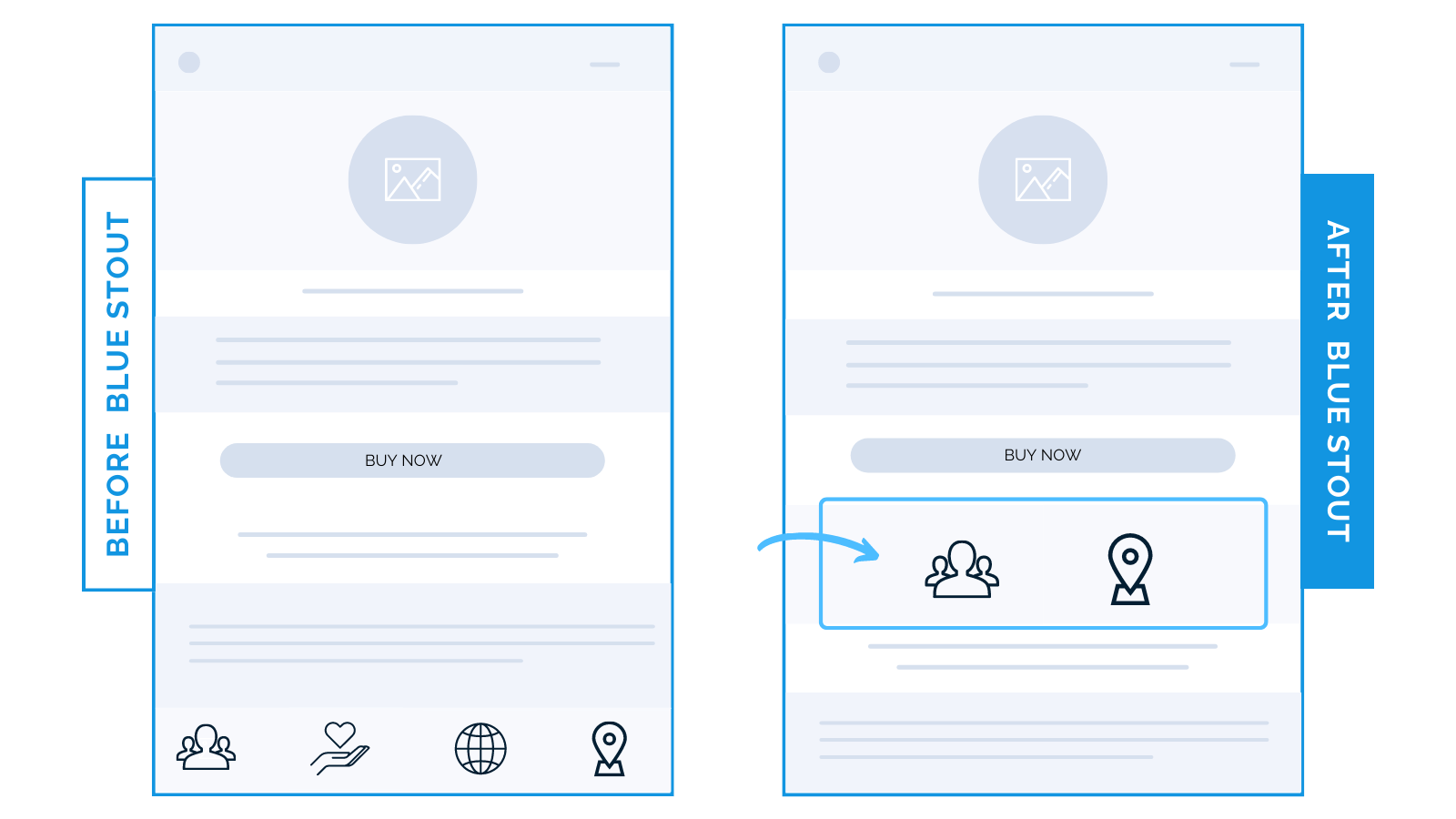
For an outdoor CPG brand, we moved benefit icons from low on the page to up in the buy box below the “Add to Cart” button.
It led to a 24% boost in mobile conversions.
When product benefits are short, easy to scan, and next to a call to action, confident purchases result.

Test #2: Put the product description immediately under the title
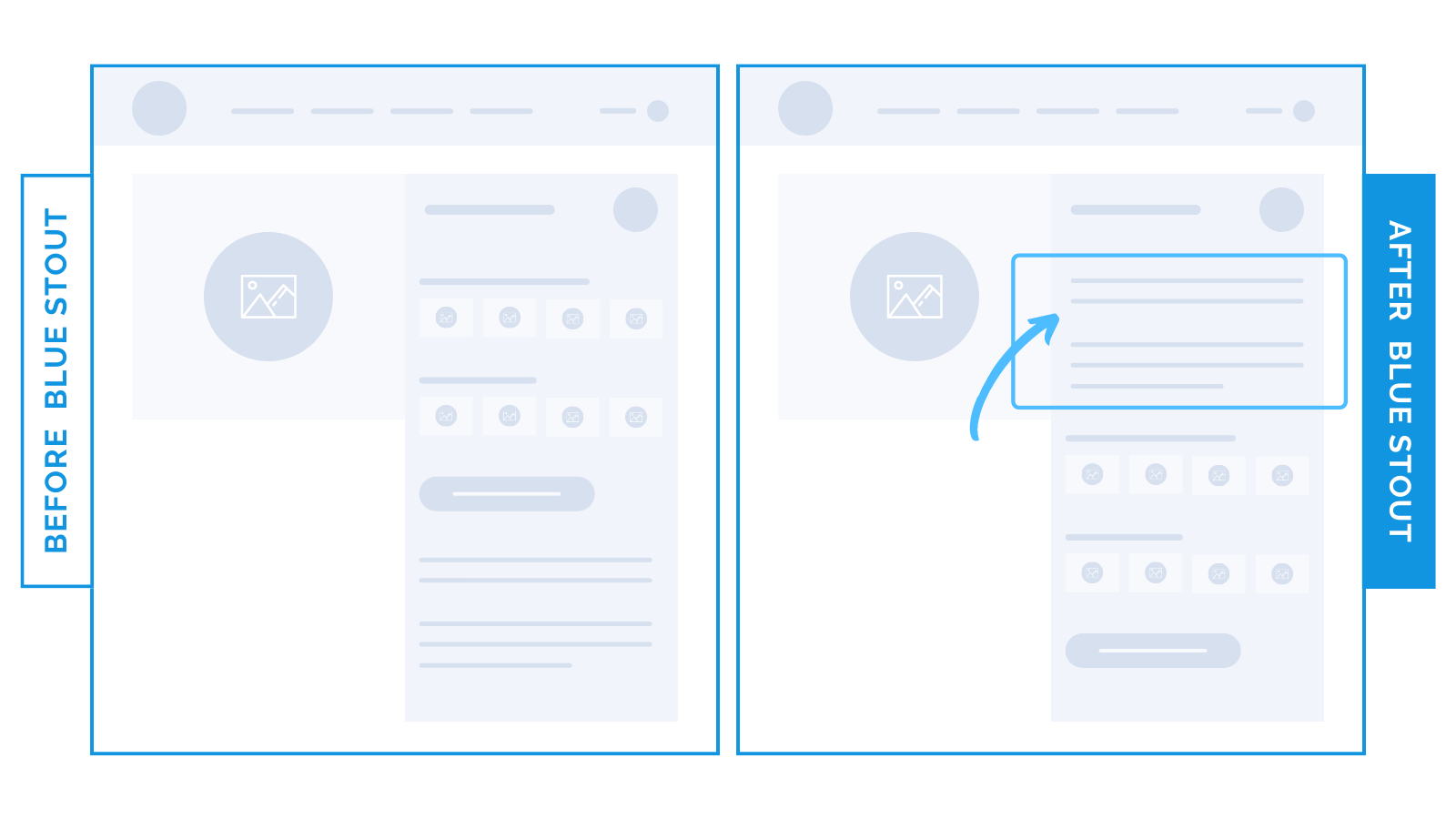
For a brand that sells custom products, conversions lifted by 19% when we moved product details up the page directly next to the product title.
Customizations mean an overload of decisions.
Product details HIGH on the page eliminate confusion and answer questions right where they’ll be asking them.
Highlight what your product delivers first, to keep buyers engaged.

Here’s Why It Works
Don’t make your customer dig for the gold.
- Benefit icons next to the “Add to Cart” button are easy to see. The layout is less cluttered and more inviting, which facilitates quicker decision-making – especially on mobile.
- Descriptions high in the buy box address pain points and answer key questions right where they ask. Confident purchases result.
What Most Brands Do Wrong
Most brands underestimate the impact of placement.
Ensure benefits and product information are front and center in the buy box.
Steps to Try Today
- Establish an emotional connection with benefit icons next to the Add to Cart button.
- Place product details high & visible below the title to distinguish and intrigue.


