
CRO WINS
The conversion leak hiding on your collection pages
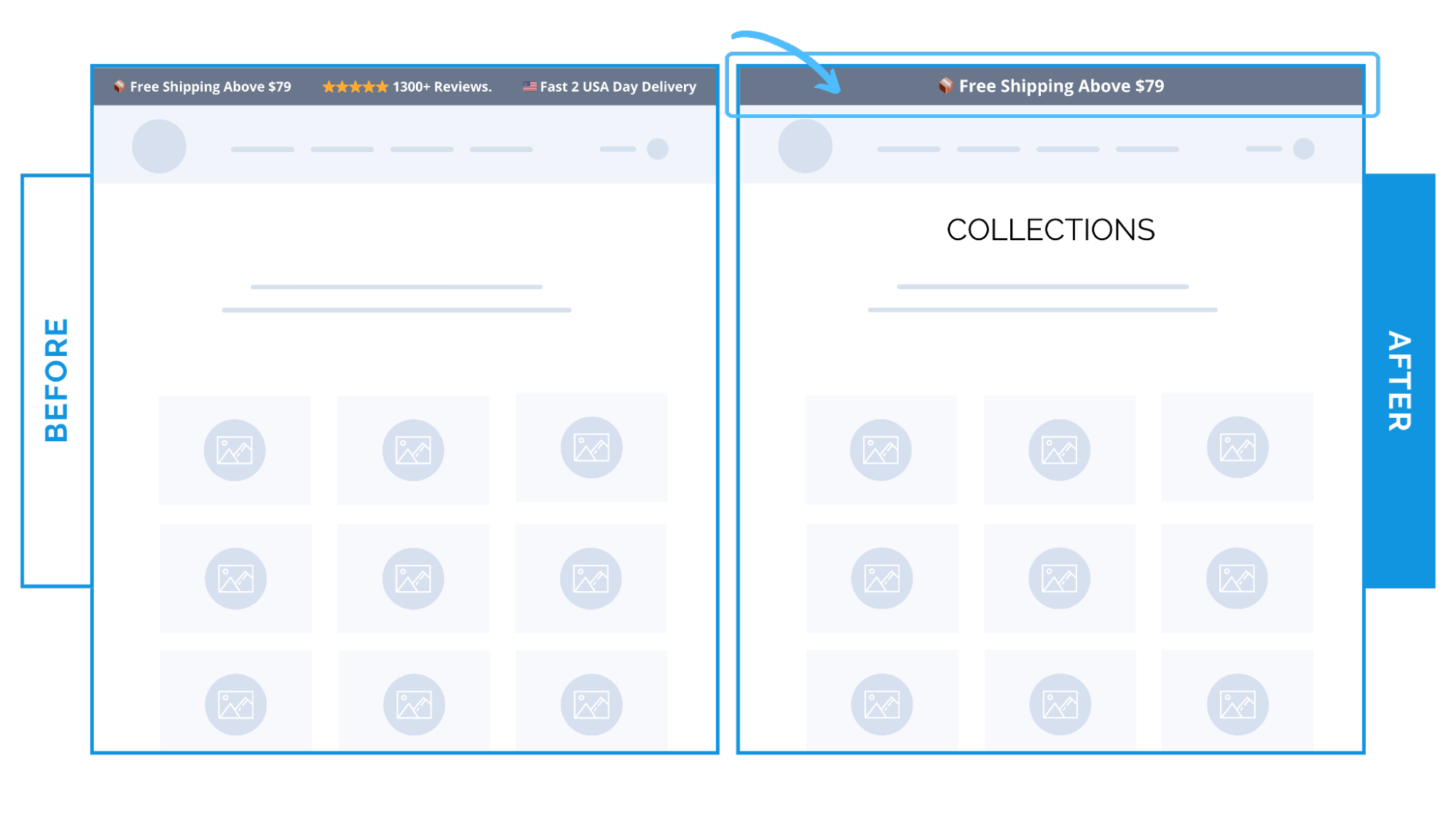
On collection pages, one clear message beats several competing ones.
An announcement bar is often the first thing shoppers see.
For a lifestyle brand, several messages were fighting for attention here:
- A free shipping message
- Fast delivery details
- Review stars / testimonials
On desktop, they stacked.
On mobile, they rotated in a scrolling marquee.
When packed in the same space, they dilute focus right before the shopper decides to keep browsing.
We removed the rotation and tested one message.
These performed best on their own:
- Free shipping threshold – gave shoppers a clear reason to continue browsing
- Review star count – provided instant reassurance at a glance
The result:
- Free shipping message → +5.4% lift in CVR
- Review stars → +3.9% lift in CVR
Why this worked
Shoppers make a stay-or-leave decision in seconds.
When many messages compete at the top of the page, none of them register.
But a single relevant line does two things:
- Reduces visual and cognitive noise
- Gives shoppers ONE clear reason to keep going
✨ Takeaway: On collection pages, your announcement bar should answer one question – not make several promises.
Choose the message that helps shoppers decide to keep browsing, and remove the rest.
Then, test!