
Top high-impact placements to test reviews.
Reviews work best where decisions are made.
Not buried in the product page, but placed where hesitation is highest.
That’s where reviews remove doubt, build trust, answer questions, and validate the next step.
Here are 4 spots worth testing on your site.
1) At the bottom of the collection page
For this apparel brand with a broad catalog, shoppers who reached the bottom of collections often bounced.
To keep their attention, we added reviews after the last row of products.
Instead of exiting, shoppers looped back up to keep browsing high-value products.
Result: More products viewed and more carts filled.
👉 Lesson: Reviews can nudge buyers to keep exploring when interest dips.

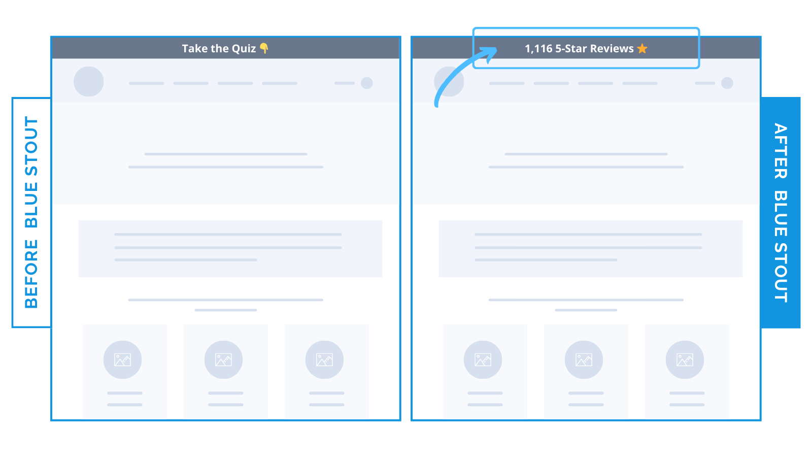
2) In the announcement bar above navigation
For a beauty brand, the top of the site had a bar that said: “Take the quiz.”
We swapped it for: “1,116 5-Star Reviews.”
Result: 26.8% lift in conversions.
Why? Because trust beats tasks. The proof of happy customers landed harder than another step.
👉 Lesson: First impressions set the tone. Don’t give them a chore, lead with credibility.
3) Near the top of the homepage
For a nutrition brand selling supplements, we wanted to address customer hesitation early (key for higher-priced brands).
So we pulled detailed reviews to the top. They were originally buried down the page, likely to reduce clutter.
Moving them higher drove a 13.7% lift in conversions.
Sometimes your best sales pitch is a review.
👉 Lesson: Reviews work hardest when they meet hesitation head-on.

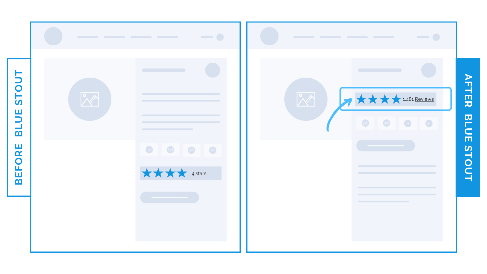
4) Right next to call-to-action buttons
For an 8-figure apparel brand, we knew that hesitation spikes right before Add-to-Cart.
To lower objections, we dropped clickable reviews right under the product name.
Result? Conversions lifted 40%.
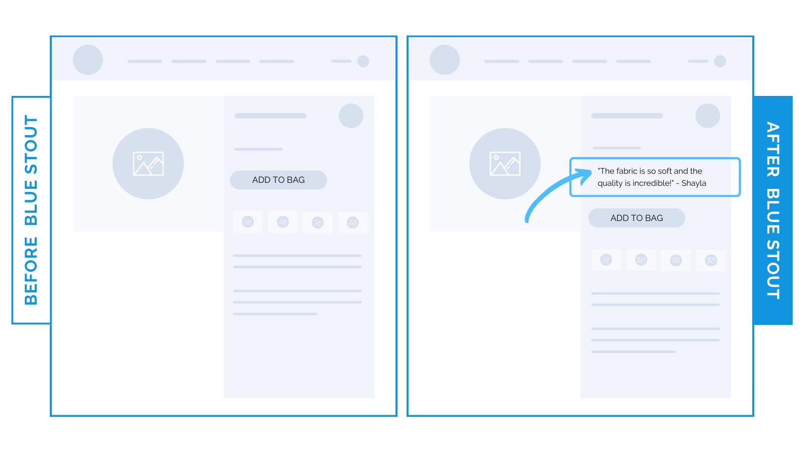
Then, for a home goods brand, we swapped stars for a real testimonial.
Above the Add-to-Cart button, that one change lifted conversions 11%.
Different format, same win: proof kills doubt when it sits at the moment of choice.
✨Takeaway: The closer reviews sit to the decision, the harder they work. Place them where hesitation is highest to see your conversions jump.
Try it out!