
Two actionable ways to fill your site’s dead ends on collections pages
At the end of your collections pages, add links and social proof to keep them shopping.
If your customer does not find what they need by the time they scroll to the bottom of your collections page, they will leave.
Here’s 2 ways to keep their attention and encourage further browsing.
#1 – Design a banner to offramp to other collections.
When in doubt, be a tour guide.
Show them exactly where to go next. Especially if you have a large catalog.
For a health brand that sells supplements, we designed a banner that links to 3 separate collections in one. This led to a 6.8% lift in conversions on desktop.
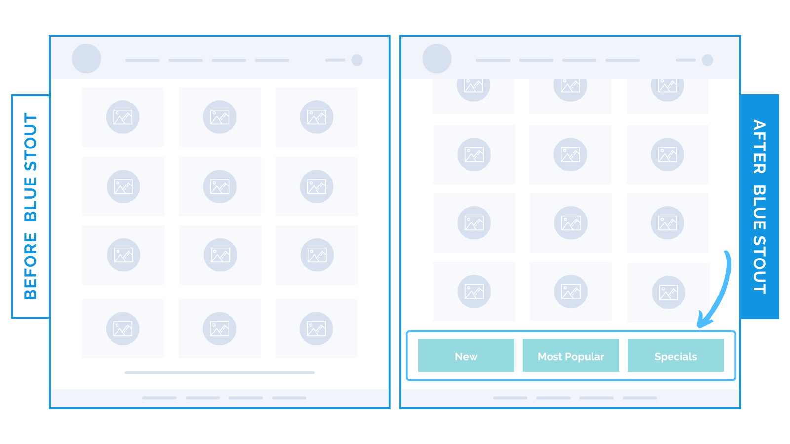
Keep visitors engaged and help them find what they’re looking for.
Instead of reaching a “dead-end” footer navigation or exiting the site altogether, buyers can view other collections right away.
#2 – Add testimonials to build trust and encourage browsing.
Your best reviews have the power to keep people on site.
Social proof validates your products and increases desire.
For one apparel brand, conversions lifted by 7% when we added a social proof section at the bottom of collections pages.
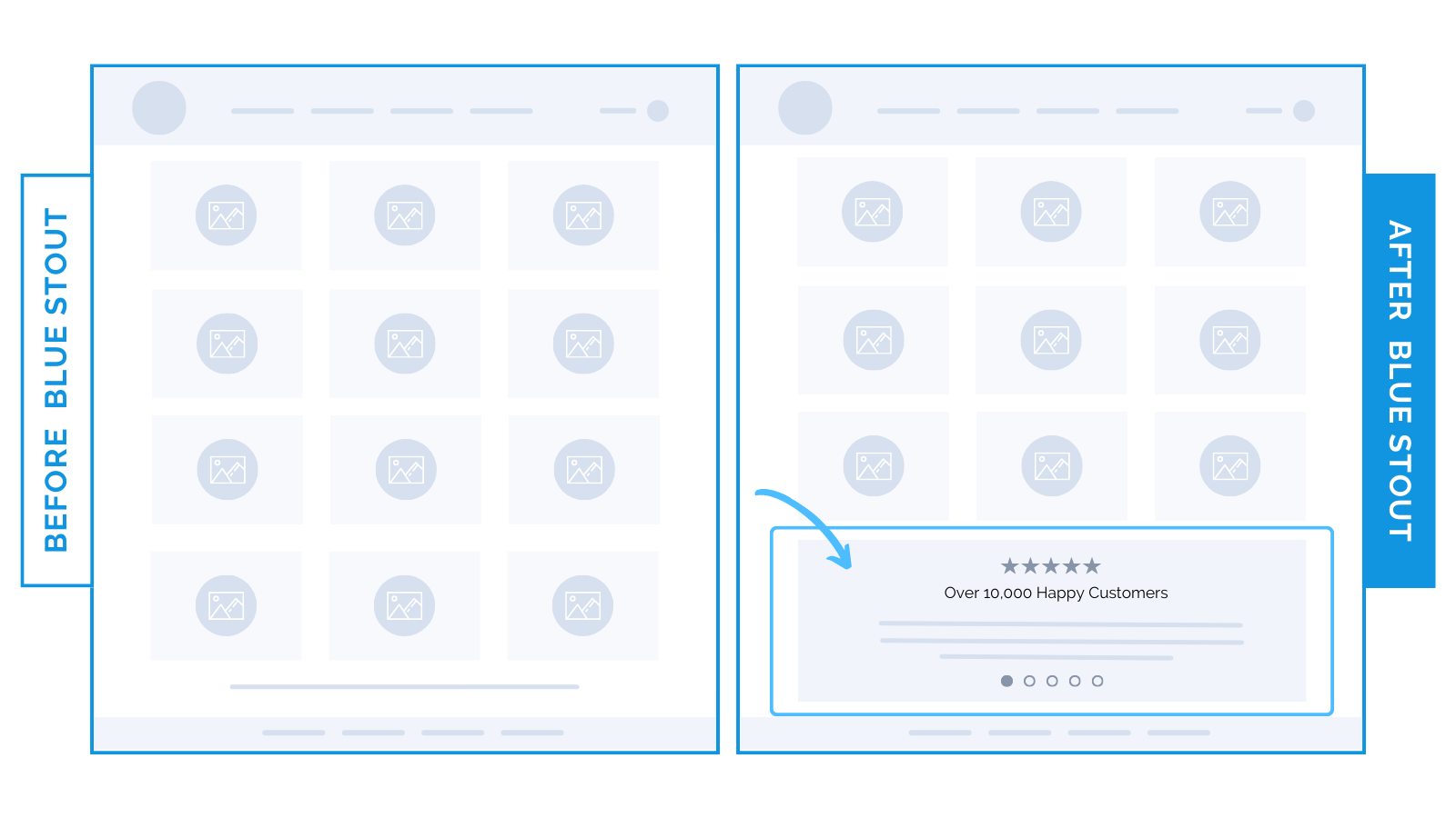
Use great testimonials to grab their attention. Real customer insights could even inspire visitors to swing back up the page for another look!