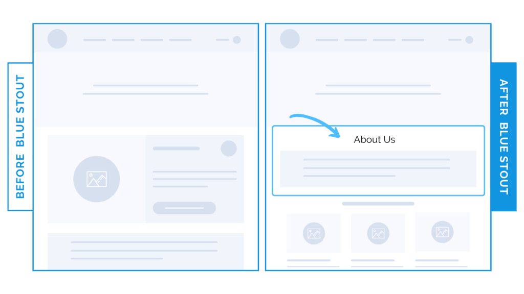
We moved an ‘About Us’ section higher on THIS page & conversions improved by 18%
In a recent test, we moved an About section on a homepage HIGHER UP and it boosted conversions by 18% on desktop.
This particular brand sells high-end electronics. In this competitive audio market, we know that most consumers will fall in the category of competitive and methodical shoppers who want to know what sets the brand apart.
However, we have to ALSO cater to humanistic shoppers, who will seek out who is BEHIND the product, and why they should buy from you.

Here’s Why it Worked
The increase in conversion from moving the About Us section HIGHER was likely the result of this segment of customers learning that the brand is a US-based company run by audiophiles just like them!
By strategically placing the About Us section in the middle of the homepage, we put a face to the brand. The result? Emotional connection.
What Most Brands Do Wrong
Most brands think you should place info about the company lower on the homepage, or leave it out altogether.
Try it out:
Have an about us section on your site? Move it up. Test, review, repeat.


