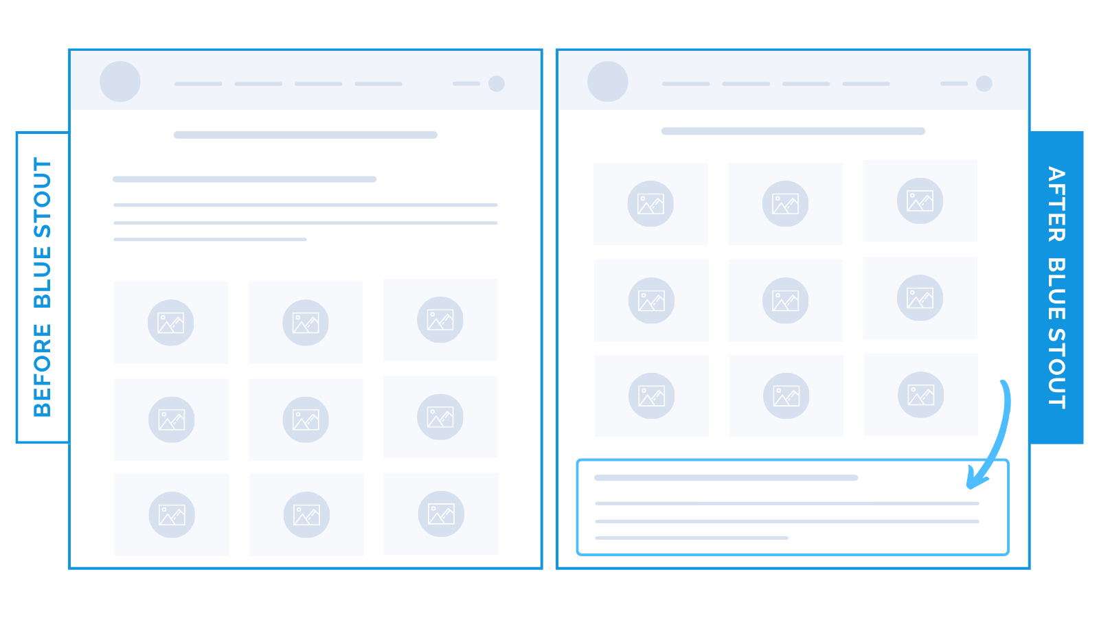
Wellness brand moves descriptive copy below supplements products for a boost in conversions on the collections page.
Move your collection descriptions down to get products into view faster on the collections page.
One of our clients, a health supplements brand, had lines of copy describing the contents of a collection at the top of the page – mainly for SEO.
We tested moving copy below the product listings grid to get customers to product pages faster, and conversions lifted by 6.3%.

Here’s Why it Worked
Customers navigating to the product page is the #1 priority of the collections page.
Descriptive copy above the fold is a barrier to this step.
For returning buyers, products high on the page allow for faster purchases with no barriers.
Moving general copy down the page for new customers puts products into view quickly.
This allows them to explore at leisure with no preconceptions set by the collection description.
What Most Brands Do Wrong
Many brands think they need to describe the collection for visitors.
Or, they feel the content higher on the page will help with their SEO ranking.
While informative, customers who are ready to purchase don’t need a description.
Let the products speak for themselves (especially health products with specific benefits).
Steps to Try Today
Want to make it easy for buyers to purchase? Consider moving descriptive content lower on the page so it doesn’t hinder browsing and buying.


