Apple Pay for Shopify Plus Will Make Your Mobile Checkout A One-Click Dream
Remember the last time you bought something on Amazon with their one-click feature?
So fast. So easy.
Imagine what that type of simplicity could do for your own cart conversion rate.
Apple Pay is going to make it happen for you on mobile.
Apple made the announcement earlier this year that its Amazon-esque one-click checkout system for mobile, Apple Pay, will now be coming to the web in the Fall of 2016.
Previously, the functionality had been offered in apps for purchasing. Now, it’s rolling out to actual websites which will have a HUGE effect on mobile checkout: your customer’s checkout experience can essentially be reduced down to one click of a button.
But only some ecommerce websites will be able to benefit from this announcement. IBM, Demandware and Shopify Plus are among the first ecommerce platforms to support Apple Pay for the web.
In this post, I’m going to
- dig into the mechanics of Apple Pay so you understand how it works
- explore how it dramatically reduces friction in the mobile checkout process
- and discuss why I think Shopify Plus is the platform to run on when it comes to integrating new technology like Apple Pay.
So let’s look first at how it works.
How Apple Pay Works
The reason Apple Pay is so fast and easy is because the user’s information does not need to be entered. They click, confirm, and are good to go.
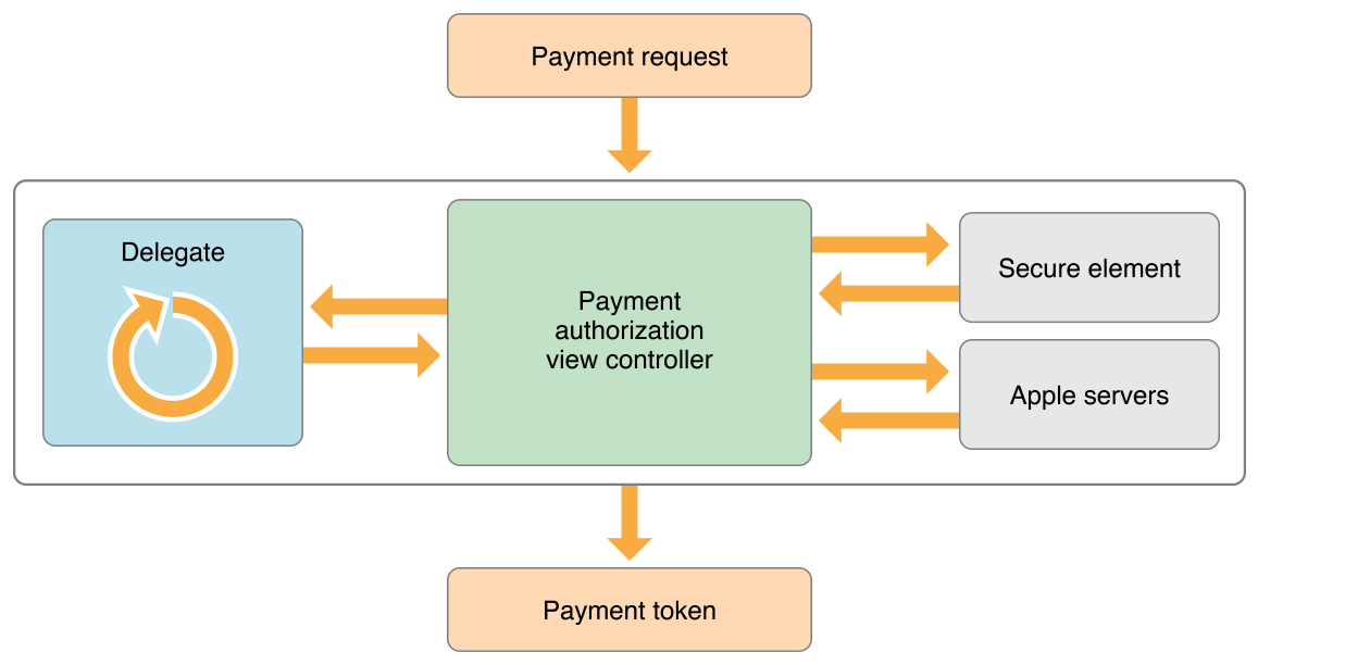
When a customer makes a transaction, Apple beams over a special ID number and an encrypted token with purchase-specific information, so Apple Pay never sends their card number or name to merchants. Apple doesn’t store their purchase information or credit card data, making your customer’s information with Apple much harder to hack. (source)

Making its debut on mobile devices in 2014, Apple Pay for mobile was slow to adopt and, as of today, only 6% of people (that have a compatible iPhone) use Apple Pay each month.
So Apple is obviously wanting to grow that usage. They’ve offered special discounts with specific retailers when a customer uses Apple Pay, but just aren’t seeing a huge adoption of the service.
This could be due to the fact that Apple Pay, as I said above, rolled out only for in-app purchases. Now that they’re rolling it out to the web, they have the potential of growing their usage and tapping into the mobile users who DO shop on mobile, but not in apps.
Apple Pay will Reduce Friction in Mobile Checkouts
The average rate at which the average consumer abandons their shopping cart before making a purchase is 81%. One of the main culprits of cart abandonment, is friction in the checkout. You know, WAY too many steps for your customer before they can actually buy something.
This is especially true on mobile. Who actually has the patience to use their tiny mobile keyboard to type in their credit card info?
And if an error occurs in data entry…it’s almost guaranteed that user is NOT going to try and re-enter all that info on mobile twice.
Sale lost.
To optimize and reduce friction, the typical recommendations from ecommerce optimization experts are something along the lines of:
- Ask as little as possible from the user
- Limit options (simplify!)
- Use excellent design
- Put yourself in the shoes of the user
While all of that is good and sound advice (we also have echoed this advice to clients), mobile checkout is really just a different beast altogether.
Even if you simplify, even if you limit options – getting the user to complete data entry is a huge barrier.
Apple Pay aims to completely eliminate this barrier.
Allowing users to have the ease-of use of a one-click purchase during their checkout can transform your ecommerce website checkout into an Amazon-like experience for your customer.
Normally, three steps is the “ideal” number to have in your checkout to keep a user moving along without abandoning their purchase because they’re overwhelmed with too many steps.
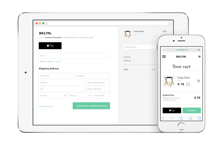
But with Apple Pay, you will have the ability to reduce your checkout steps even further. Here’s an example of what the new integration will look like on a Shopify site:

With the addition of Apple Pay, you can eliminate the “billing” and “shipping” steps altogether. No need for your customer to enter their card information or address because – in the backend – the Apple Pay payment sheet (code) already has this information stored. (source)
The user just needs to confirm that the selected cart and address is the one they’d like to use and complete their purchase.
Developers that have implemented Apple Pay in the recommended way have doubled their checkout conversation rates, substantially reduced checkout time, increased customer loyalty, and increased purchase frequency after integrating Apple Pay. (source)
Integrating Apple Pay into your mobile site initially eliminates friction in the checkout, but the benefits have a trickle-down effect:
Once the checkout experience becomes so pain-free and actually enjoyable, conversion rates rise, customer loyalty increases (think word-of-mouth marketing, too), and your repeat purchase rate will increase.
Apple Pay for Shopify Plus (and Other Ecommerce Platforms)
If you want to integrate Apple Pay on your ecommerce website, the ecommerce platforms that support it on your behalf are:
- Demandware
- Shopify (including Shopify Plus)
- IBM
Each of these platforms are officially “partnered” with Apple, meaning if you want to integrate Apple Pay on your ecommerce site, you don’t (necessarily) have to have a developer account if you’re using one of the above platforms.
In short, it’s a lot easier to set up if you’re on one of the above platforms.
If you’re not running on any of the partner ecommerce platform solutions, you can still use Apple Pay. The three main, requirements to be able to use Apple Pay are:
- Have a developer account
- A secure website (https)
- Site is compliant with Apple Pay guidelines
Here at Blue Stout, we’re seeing so many brands migrate to Shopify Plus, that we think combining the power of Shopify Plus and Apple Pay would be a very smart move for an enterprise-level ecommerce company. (Listen to what the CEO of Mizzen + Main thinks about Apple Pay here.)
Since Shopify Plus is aggressively pushing the envelope in terms of being a platform solution that prioritizes delivering a great user experience (UX), it just seems logical to implement another service that only improves the customer experience like Apple Pay.
Jason Normore, Director of Engineering for Shopify says, “Shopify’s mission has always been to enable our merchants to offer their customers the best experience, this is why we’re helping to lead the way towards a better checkout experience with technologies like Apple Pay, that help increase cart conversion rates.”
What’s more, Apple is recommending for ecommerce retailers to try implementing the Apple Pay button directly in their product page design. This kind of turns traditional ecommerce design on its head.
The payment button usually goes in the checkout design!
Apple believes by implementing the Apple Pay button directly on the product page it will heighten user engagement, and have a greater chance of being used because the shopper will know that they can instantly purchase the item without moving into a checkout sequence. (source)
Placing the button on the product page, Apple says, will increase conversions.
This makes a lot of sense given the stats we’ve already talked about when it comes to customers actually completing the checkout process.
So a complete new perspective on “checking out” could actually be the conversion push your mobile site’s been waiting on.
How to Get Started with Apple Pay for Your Ecommerce Site
To get started with implementation on your site, make sure your team reads over the Apple Pay for web guidelines, and watch the video about it (or read the transcript) here.
Additionally, if your team is anxious to begin experimentation, you can play around with Apple Pay for your ecommerce site in the Apple Pay Sandbox environment. Build in a safe environment and test out the process.
Bottom line, the minimum requirements to integrate Apple Pay on your site are:
- A partnered platform (see above) OR a developer account
- A secure website (https)
- Compliance with Apple Pay guidelines
- A strategy of where you’re going to implement into your website design
Learn More About Using Design Tactics to Increase Conversions
Expediting your checkout is one of many conversion tactics you can use to increase your conversion rate.
We’ve created a one-hour Ecommerce Conversion Workshop to help you understand how just a few simple thought shifts can lead to increased sales. Click below to sign up now!


