Over 1,000 Customers Prove That These 3 Mistakes Are Killing Your Checkout Conversion Rate
Did you know that the average cart abandonment rate for online shoppers is currently at 68.8%?
That’s a big, scary number, but luckily we have some cart abandonment solutions to help you turn those gun-shy shoppers back into the consumers that CONVERT.
So, what would make a person spend time browsing through dozens of product photos and descriptions, find one they like, select size and color, add it to their cart… and then bounce? That 68.8% means that two out of three people currently do this – what gives?
To answer this, we’re going to examine the actions and customer psychology behind the Top 3 Cart Abandonment issues and detail out the cart abandonment solutions you can use on your own ecommerce site.
Problem #1: Unexpected Charges.
Cart Abandonemnt Solution #1: Reduce or Eliminate Extra Costs
No one likes to be surprised by extra costs right after they hit the Checkout button. Usually, this comes in the form of shipping and delivery fees. According to this Baymard study, extra costs are one of the top reasons people abandon their carts (61% of 1000+ surveyed chose this as their #1).
Doubling down on free shipping is an easy way to make your customers happy and remove hidden fees.
Americans love to work, and they also love getting the most for their money. So give them deals! They’ve also come to expect free shipping, since most online retailers already offer it. The customer philosophy at work here is a simple tit for tat: “I”m spending a bunch of money at your store, can’t you do something for me in return?”
Not having to pay shipping costs triggers something else in consumer psychology – they’ll often add extra items to their carts because they think “Yay, I’m getting something for free!”
We realize that offering free shipping won’t be feasible for everyone. But 80% of shoppers say it’s a major influencer for buying from a certain brand over another.
So what are some alternatives?
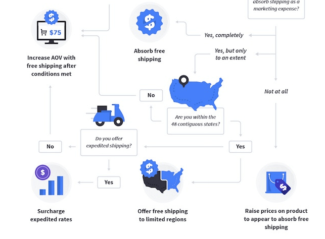
Hubspot’s infographic suggests either raising product prices slightly to offset free shipping, only offering it to limited regions, or increasing customers’ AOV so that they earn free shipping only after certain conditions are met (like after spending $50).

Problem #2: Account Creation.
Cart Abandonment Solution #2: Allow Guest Check-outs, Don’t Force It
When someone is ready to buy, forcing them to first take the many extra steps it requires to set up an account (entering name, address, credit card info, shipping/delivery preferences) is a great way to make them throw up their hands, yell “forget it” and close their phone or computer.
This is one issue that can be fixed through design changes.
Make sure your checkout flow is simple: Baymard suggests no more than 12 form elements (7 form fields, 2 checkboxes, 2 drop-downs, and 1 radio button). The average US store checkout contains 23.48 form elements. So a 20-60% reduction in the default number of form elements is needed.
What elements can you nix? Simplification through minimization is the goal here.
Also, remove anything that will distract shoppers from completing the checkout process. Don’t treat it as a “captive audience” and throw in extras like surveys, CTAs to follow your social channels, or pop-up feedback requests just because you think it’s your last chance to interact with your customer. It’s not, and chances are you’ll scare them off.
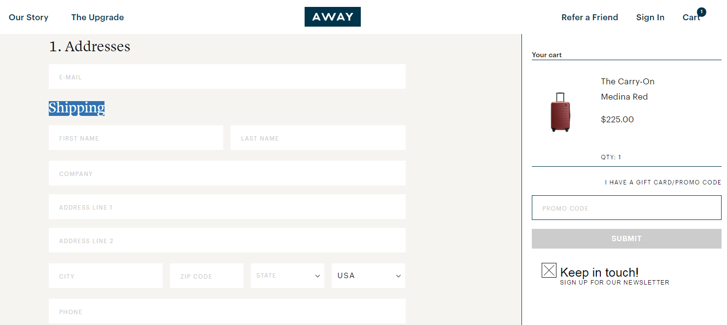
All you really need from a shopper is their email address. You can add this field in as the first field under Addresses, like luxury luggage retailer, Away (they get bonus points for adding a default checked box to subscribe to their newsletter).

Once you’ve captured emails, use email subscription lists to convert one-time buyers to repeat buyers.
Some of the most successful retail emails are ones that make it possible to get from the email to checkout of the wanted items in 3 clicks or less. Amazon does great with this, with their “Buy all items with 1-click” check-out option. Of course, this DOES require that you’re already a customer of theirs, but having the option available is smart. I’ll get into more details on this below…
Problem #3: Checkout is Too Long.
Cart Abandonement Solution #3: Condense & Optimize
The Baymard study says that after 7 years of testing they have found that a complex checkout is one of the top 3 causes of abandonment.
Too many checkout form elements is one common cause of this, and so is a multi-page checkout process. Your customers don’t necessarily have to be drunk shopping to have a short attention span… they could still get annoyed if they have to scroll through 3 different pages while checking out.
Ideally, the checkout begins with a big, bold “Checkout” or “Add to Cart” button next to the desired item, and then clicks through to a single page to complete the purchase.
Make sure there’s no extra clutter on the screen – even keeping your navigation bar somewhere can be a tempting distraction and cause customers to bounce off to another page.
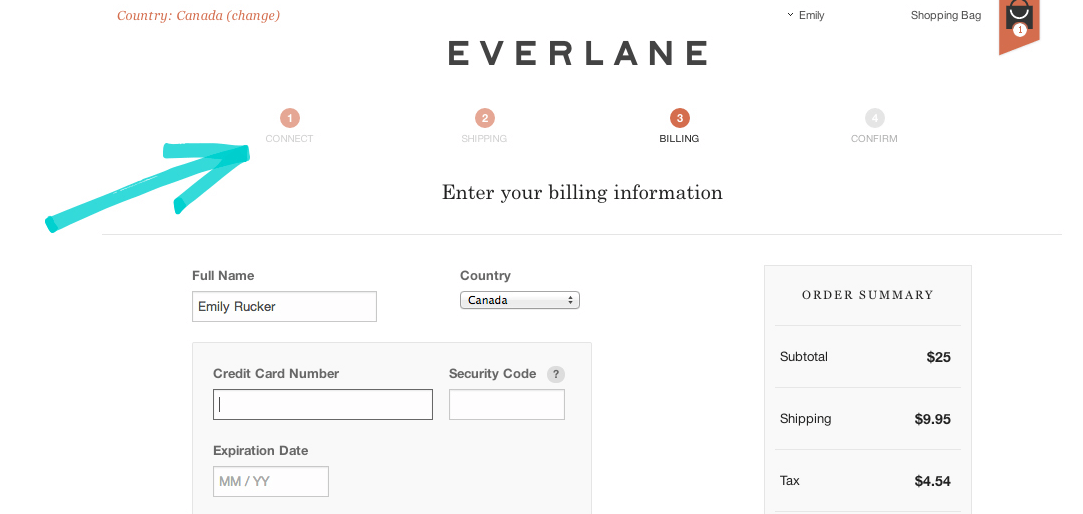
Next, keep the process streamlined so it can be finished in as few steps as possible. Tabs or a progress indicator at the top (like the Everlane example below) can let buyers know where they are in the process.

Finally, it’s crucial to present a streamlined and simple checkout process on mobile. In another post, we talk about how using Apple Pay makes your mobile checkout a one-click dream.
Apple Pay works so well because it doesn’t require buyers to submit their personal info EVERY time. Instead, since they already have an Apple ID, Apple sends over a special ID number and an encrypted token with purchase-specific information. Whether they’re shopping in-store or online, they’ll never have to pull out their credit card or ID – they’re automatically and securely verified.
It also eliminates the need to enter shipping information – Apple Pay stores it, along with payment information. You can imagine how this completely changes the game for mobile – a platform that’s notoriously difficult to foster a quick checkout experience.
Learn How Small Changes Can Make Big Wins for Your Ecommerce Company
To learn even more checkout and other conversion tactics, we’ve created a FREE Ecommerce Conversion Workshop where you’ll learn the BEST tactics used by the fastest-growing ecommerce brands, and the THREE thought shifts you need to make to start converting more from your existing traffic!
Click below to register:


