The Top 10 Ecommerce Product Page Design Elements and Where to Place Them
Companies that design with conversion optimization in mind are 2x as likely to see a huge increase in sales.
But, 96% of people that come to your website aren’t ready to buy. (source)
It’s YOUR job to convince them, and this usually starts with the product page. A well-designed product page is your first and best hook for converting website visitors to buyers, and then converting those buyers to repeat buyers.
A high-converting product page usually has the Top 10 Design Elements I’m going to cover here.
In order for these elements to produce maximum conversion results, they need to be placed in the right spot. So, let’s look at what these elements are and exactly where you need to place them:
Top 10 Design Elements
1. Product Image
This has to be #1. Shoppers are looking for product, so you MUST show them a product image as soon as they land on your product page. That’s why they’re there in the first place!
Make your product images visually appealing and compelling. Don’t forget to make them zoomable, too. Given the state of mobile ecommerce, you should make your product images as detailed as possible for people browsing from their mobile device.
Product image size affects the value perception of the product. If there’s less white space in a photo, shoppers perceive it as being valued at least $1 less than larger photos with more white space.
Quality product imagery does a lot to reduce purchase anxiety and build trust, since your shoppers can’t try the item on or touch it before buying.
UK-based retailer Topshop, is a great example of an ecommerce company with product imagery done well. They do a good job of implementing more “white space” so that the product photos really pop.
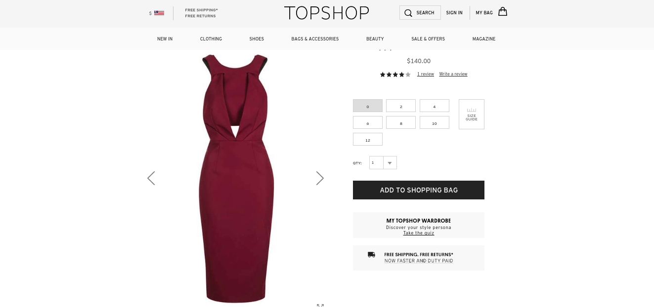

Where to put it: place your images front-and-center! This is what customers want to see, so put it in a place where they see it first, no matter from what device they’re viewing from.
2. Product Title
What you name your product is almost as important as how you show it. It’s a good practice to be transparent and straightforward when creating your product titles.
There is some debate over where to place the product title, and we’ve seen examples of different placements. Some companies like to follow the rule of eye-tracking studies, which say that the eye naturally tracks from the top left to right on a page.
Men’s custom suit company and V-commerce brand Indochino, follows this rule:
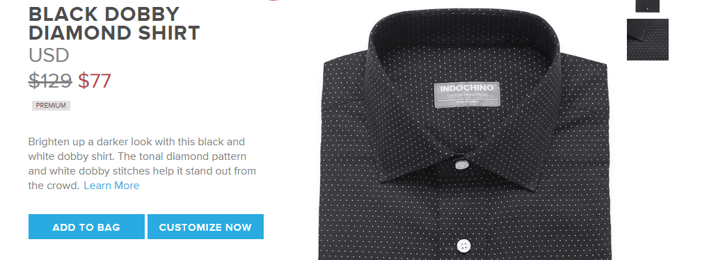

By placing the product title to the top, left of the page, the eye naturally flows top-down.
Alternatively, many brands place their product titles on the top-right.
Another V-commerce brand, Floyd, makers of furniture and products for the home, opt to put their product title on the top-right corner:
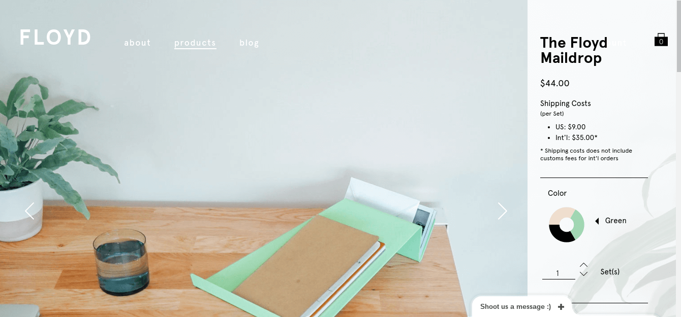

Floyd does a good job of balancing the product imagery with the important information. Their product title is bold, strong, and stands out.
Where to put it: the overwhelming majority of brands have their product title placed in the top right corner. Of course, it’s up to you and the strategy you work out with your ecommerce development team. But if it’s working for other brands, why try and reinvent the wheel?
3. Product Description
This is the fun part, where you get to play around, be clever, or just get into a lot of detail about how your product will solve your consumer’s problem(s).
Don’t approach your product description by thinking that people don’t like too much text on a page. Your product description is your chance to build trust, create desire, and make an emotional connection with your user.
It’s also where you give consumers really clear information on what they’re buying. If customers still have doubts after reading your product description, they are much less likely to convert.
In fact, a study by Nielsen research says that 20% of abandoned transactions are due to incomplete or unclear product information.
So when writing product descriptions, remember to:
- Answer all potential product questions
- Include details like size, dimensions, care of item, fabric type, etc.
- Make it enticing – this copy mimics the feeling of an in-store conversation with a sales associate (see how Huckberry NAILS their product descriptions to squash customer doubt in this article)
- Use the tone and language of your target market
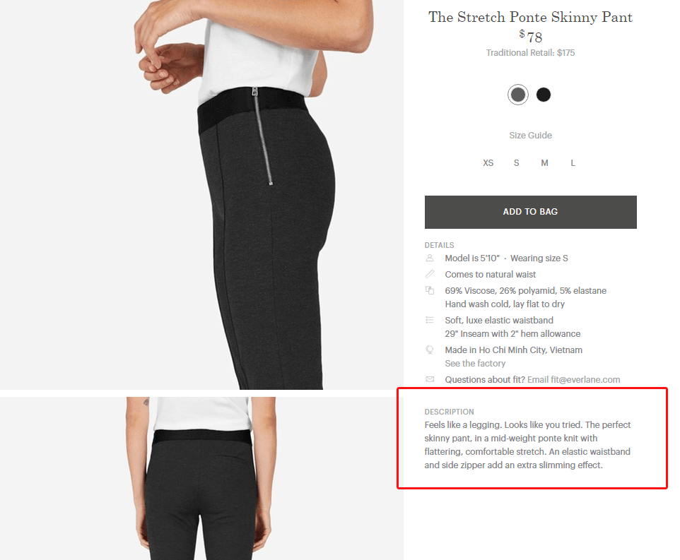
Positioning is important too if we’re following the left to right eye-tracking rule: placing the description to the right of the image, at the same level, is ideal.
Clothing retailer Everlane does a good job with detail, description, and placement. They list all the key details of this item first, use a clever one-liner (“Feels like a legging. Looks like you tried”), and is to the right of the product photo, right under the large product title.

Where to put it: Your product description should be placed directly under your product title so the user can flow from “what it is” to “how it solves their problem”. Also placing it under the product title – which is usually an <h1> element, will help search engine crawlers determine if your product page “flows well.”
Google likes product pages that provide a smooth user experience (UX), so placing your description under the title fits the ideal hierarchy of design for users and search engines.
4. Fit Guide
Following the product description, integrating a fit guide is one of the main ways to build trust with consumers before they buy. Your customers don’t want to risk ending up with an item that doesn’t fit, especially since this varies greatly across brands.
Men’s dress shirt V-commerce brand Mizzen & Main understand this well, as they sell a product that necessitates a great fit.
Since most men physically try on dress shirts before buying, integrating a fit guide into the Mizzen + Main product page design helps and encourages the customer to mitigate risk.
In addition to the standard measurements for neck, sleeve, weight and height, their fit guides show a large product photo with call-outs to different parts of the shirt.
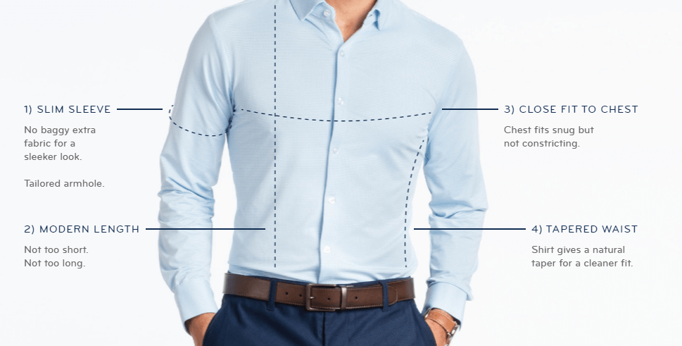

Below this, they list all the standard measurements.
You can hear the CEO and founder of Mizzen + Main talk about this very issue (men needing to try on the product in-person) on our very first episode of Ecommerce CEO’s & Executives podcast. Click here to listen to the full episode.
Where to put it: your fit guide should be placed near your sizing selector. Obviously, when the customer is selecting a size they may have questions about measurements. Placing it near your size selector is natural and logical.
5. Size Selector
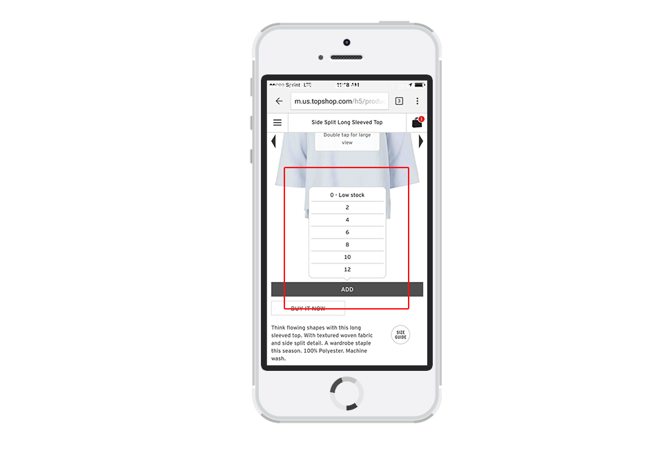
Making a simple change in the design of your size selector can have a huge impact on your conversions (especially on mobile). UK-based retailer Topshop made this change and saw an 11% increase in conversions! You can download the full case study on Topshop here.
Individual size buttons (S, M, L) are hard for users to navigate on mobile (people have fat fingers!) AND take up too much space. It’s much easier to use a pop-up selector, which has the added benefit of taking up far less of that precious limited mobile real estate.

Where to put it: On desktop, placement of the Size Selector works best right underneath the product name and description, and above the last step in the buyer conversion process – the “Add to Bag” button.
6. Add to Bag
This is the money button!
From our Topshop example, we know that making this button BIG helps with conversions. For a while, it was considered trendy in user design to make the Add to Bag button orange, but using loud colors isn’t what makes shoppers convert more.
It IS helpful, however, if you make the button a different color than the rest of your site, so it stands out more. Making it big, clear, and central (especially on mobile) is the key.
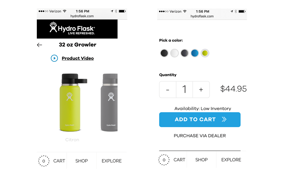
Hydro Flask does a great job of hitting all best practices on their mobile shopping site. The “add to cart” button is large, in a contrasting blue color to the rest of the site’s black text., They’re doubling up on including “scarcity” to help give an extra push for users to convert by displaying a low inventory.

Where to put it: your “add to bag” or “add to cart” button should appear where it is logical in the hierarchy of information about your product. Users should first be able to see the image, understand what they’re purchasing and how it solves their problem, then be visually prompted to purchase the product.
7. Free Shipping and Returns Messaging
For increased customer satisfaction it’s important to clearly communicate what your shipping and returns/refunds policies are.
If you can offer free shipping, do it. Unexpected shipping costs are the main reason for cart abandonment, according to VWO’s report.
If you do have to charge for shipping, be upfront about it. Customers don’t like feeling like this has been “snuck in” during the checkout process.
The returns policy should also be clearly stated, preferably right on the product detail page. This makes the purchase feel less risky and also significantly cuts down on cart abandonment.
Spell out how much time they have to make a return (90 days is pretty standard), the process (how a customer actually can begin the process, if needed), and what it costs (hint: free is best).
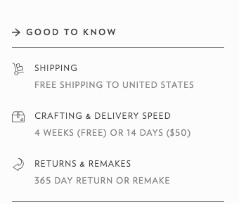
Custom shoemakers Shoes of Prey spell this out clearly on their product page. They even go one better and list crafting/delivery time in addition to how long they accept returns and that they offer free shipping.

Being transparent about shipping and returns not only heightens customer satisfaction, but can actually incentivize your users to complete a purchase.
Where to put it: your “free shipping / free returns” messaging is best in multiple places. Lots of brands have a simple text display in their navigation and pop-up or cart previews. But, since we’re talking about product page design here, this type of messaging is best displayed near the “add to bag” button. Customers need that visual reassurance before they click “buy” – so keep it as close to your call-to-action as possible.
8. Product Reviews
Getting customers to review your products and listing those reviews right on the product detail page is an effective conversion tactic. They’ll also boost your search engine rank – WIN-WIN.
Going back to millennials trusting peer reviews more and the added benefits of social proof, leveraging customer reviews is a change you can implement to fulfill both of those criteria. It’s one thing for a company to make claims about their product quality, it’s another thing entirely to have satisfied customers back it up with a personal review.
Beauty sample subscription service Birchbox, takes a tip from Amazon and lists the Most Helpful Customer Reviews first, has a 5 star rating system, and allows other shoppers to rate the usefulness of the review:
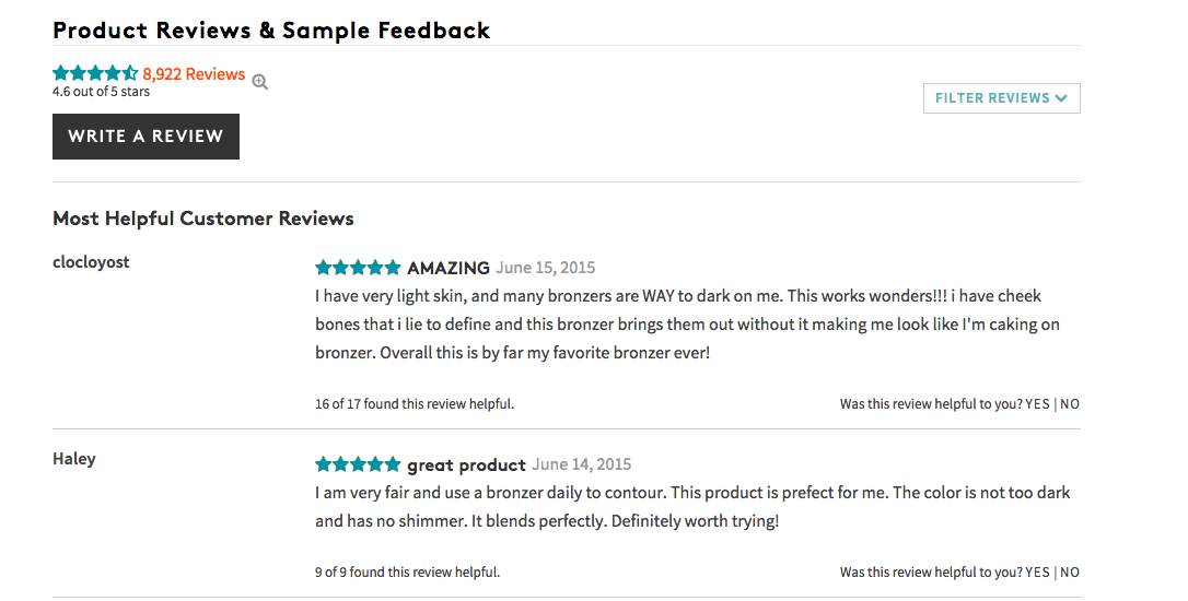

This is helpful because even if they review isn’t 100% positive, seeing if other users found it helpful is a signal for you – as a business owner – to understand what products are performing well (or not), and why.
Customer reviews are a gold mine for brands to understand true customer feedback and leverage that feedback to build trust and convert new users directly from the product page.
Where to put it: Ideally, customer reviews are placed below all the product photos, descriptive information, sizes, colors, and checkout buttons. You want to provide this information, but not distract from the main goal which is to “add to bag”. If customers truly want to seek out this information, they will scroll down to get it.
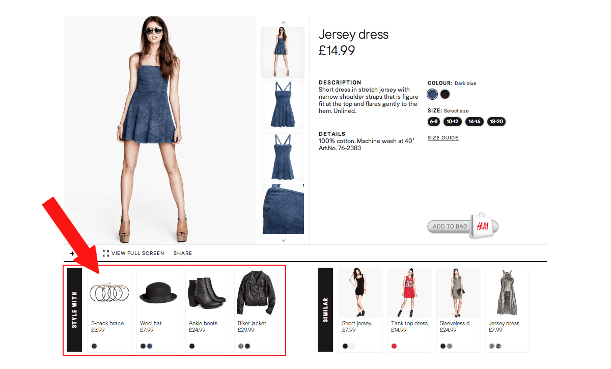
9. Suggested Products
Suggested products are product recommendations based on the items your customer has browsed or previously purchased. These are qualified based on your existing customers’ shopping behavior, so there’s a good chance they’ll make the additional purchase.
For example, online retailers like ASOS gives shoppers the option to “Style With”, which is just a strategic way of incentivizing users to buy complementary items to your purchase to make up a complete outfit.

Children’s retailer and V-commerce brand Tea Collection does this by taking a popular basic, like girls’ floral leggings, and batching together products that would look good with the item:
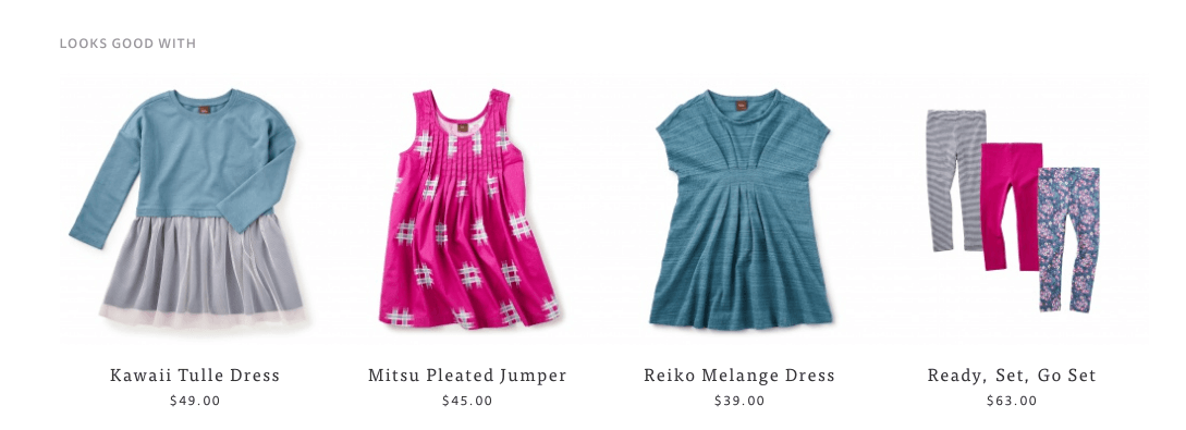

Visually displaying other products that “look good with” the current product your customer is viewing can help increase your average order value. It did just that for Vineyard Vines – they saw an 8% lift in new customer conversions.
Where to put it: product suggestions are best placed below the necessary information on the product page. Let your user understand what they’re buying and why, then show them additional items that would work well with that product.
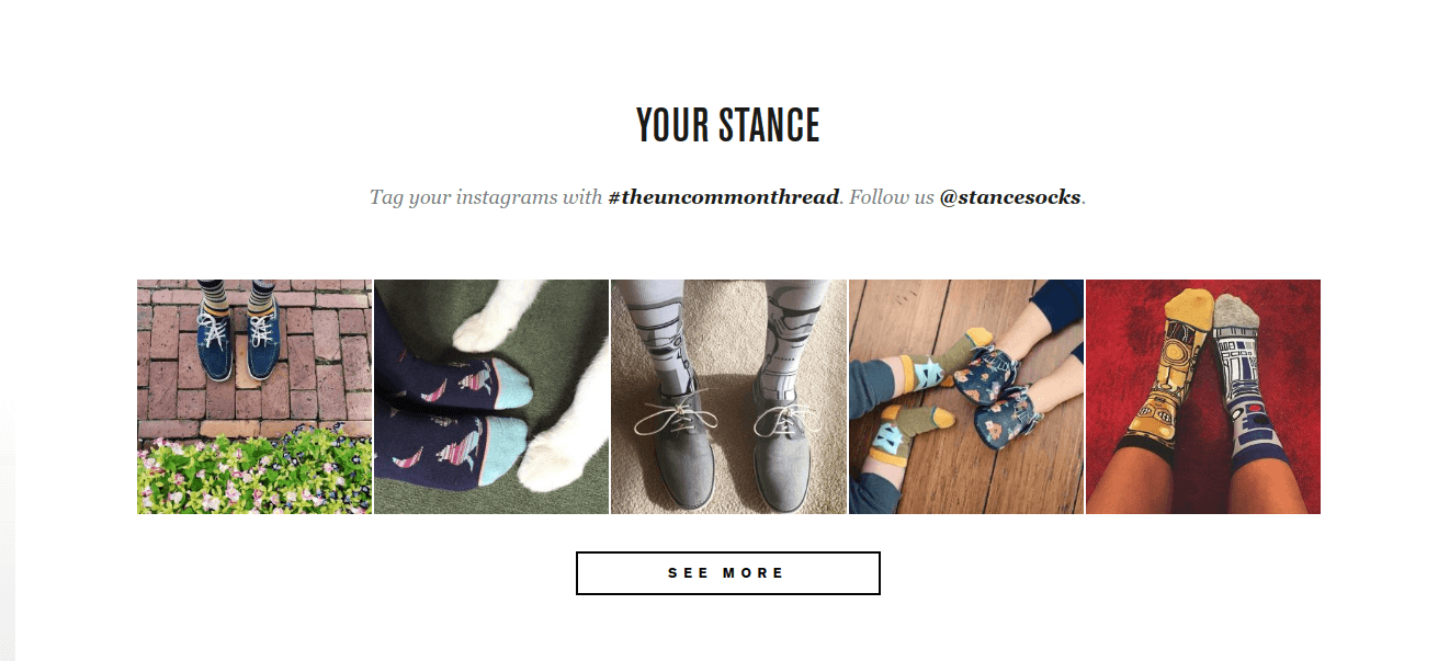
10. Social Proof
There are many other creative ways to give social validation to product purchases besides customer reviews. Some of these include allowing users to “like” or favorite items, listing how many people have bought them, and creating a “Most Popular” or “Best-Selling” product category.
A newer way to demonstrate product popularity is to import photos of customers wearing or using your products directly from Instagram.
Yotpo recently released a case study showing how implementing Instagram photos on one brand’s product page increased their checkouts by 24%!
Another V-commerce brand, Stance, uses Instagram to add social proof to their socks. It doesn’t hurt that they’ve had influential celebrities like Rihanna and Bulls Guard, Dwayne Wade, design sock collections for them and show them off on Instagram.
They invite users to post their own Instagram pics with the hashtag #theuncommonthread and display that directly on a product page. This allows users to see what real people look like in the product:

Where to put it: adding user generated content (UGC) like Instagram images to your product pages should be done with an approach that makes sense for creating the best user-flow and encouraging conversions. For example, if you have a product that is quite complex, it may be better for you to include Instagram imagery higher up on the page, near your call to action to give an extra boost to a product that may produce more purchase anxiety.
If not, including Instagram imagery should be done below the product title, description, sizing info, and “add to cart” button. It should also be preceded with a description of the image feed so it is clear to the user what they are viewing (include relevant hashtag if necessary).
How To Put These Top 10 Elements On Your Own Site
Are you eager to try out these Top 10 Ecommerce Product Design Page Elements? To recap, here are the best elements to encourage conversions from your product page:
- Product Image: Bigger is better, and use your white space!
- Product Title: Use a name that is descriptive and transparent.
- Product Description: Make them unique, but also detailed enough to inspire buyer trust.
- Fit Guide: Since they can’t try it on, be very clear about how your sizing works.
- Size Selector: Add user-friendly pop-outs so shoppers can easily hit the buttons on mobile.
- Add to Bag/Cart: Make this unmissable to lock down those conversions.
- Free Shipping and Returns Messaging: Be transparent – don’t sneak this in at the end of checkout.
- Product Reviews: Remember – customer reviews = social proof.
- Suggested Products: Give personalized recommendations for other items you sell based on that consumer’s online shopping behavior.
- Social Proof: Likes, Instagram photos showing off your products, a ratings system, customer reviews – lots of ways to show this!
Implement these and put them in the right place, and see your conversion rates lift by up to 100%!
To learn more about best practices to convert more from your product pages, sign up for our FREE Conversion Workshop: “How to Grow Ecommerce Sales, Conversions and Profits WITHOUT Spending More on Marketing“. In one hour, you’ll learn the most effective tactics used by the fastest-growing brands to convert visitors into repeat customers. Click below to sign up!