How to Build Product Pages that Convert
What style of ecommerce product pages have the highest conversion?
The product pages that have the highest conversion are those that do one thing well: engage your visitor. Let’s look at 5 ways to engage visitors on your product pages that can turn them into a customer!
Use great product images.
Your images are what make your product come to life. The more visually appealing and detailed your product images are, the more trust you will build with visitors, and the higher your conversion rates are going to be.

Gear Coop does a good job of showing multiple product images, and the rollover zoom allows the customer to see the detail as if it were right in front of them.
Additionally, you may want to experiment with the size of your product image.
New research from Conversion XL shows that adding more white space around your product image actually increases a user’s value perception. Check out this example below:

In this study, they found that the smaller image actually produced a higher perceived value.
Check out the full study to see the conclusions for other tests run on image size but this test, in particular, flips the normal assumption that “larger images convert better” on its head.
Click here to read the full study.
Answer All Your Users’ Questions.
Pages that perform the best can answer all the questions a visitor might have about your product. If they’re looking at a shirt, make sure you have a user-friendly sizing guide that’s unique to the product.
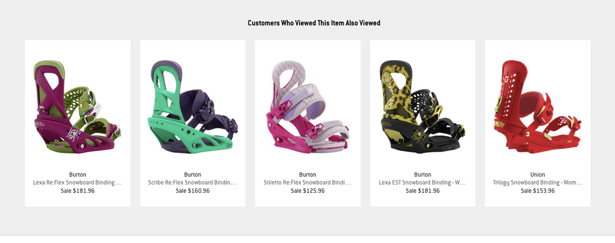
Check out how Backcountry displays their sizing guide for this pair of snowboard bindings: comprehensive and unique to the product. Additionally, you can sell more on your product pages by suggesting similar or complementary items that the user may also be interested in.
Both The Clymb and Backcountry do a great job of presenting their potential customers with more products they may want to buy.


Add videos.
Did you know that people who watch a video of your product are as much as 85% more likely to make a purchase? It can be expensive to create a product video, so if you are on a tight budget be sure to carefully select which products you want to make a video for.
JetBoil does a great job of featuring a video on their product page, as the product itself necessitates a visual. For example, their video for the Jetboil Flash Java kit shows a comprehensive detail of each component of the innovative coffee maker, and leaves the viewer with all their potential questions answered.
Social Justification.
Social justification like product reviews act as ‘social proof’ of your product’s credibility. When customers can see what other buyers think, they’re more confident in making a purchase. It’s been proven that products with reviews have a 12.5% greater chance of converting.
Another form of social justification you can implement is user generated content (UGC). This could be Instagram photos, tweets, videos, and more.

You can feature images of your product that your customers have taken and posted on Instagram like Oiselle does on their website. See how they encourage customers to “share their #flystyle”? Showing your product in real life adds “social proof”, shows how you product looks on different people, and is easy to include on your site.
Ready for Mobile.
Your mobile site should offer a completely different experience than your desktop site. So how can you optimize for mobile?
Addressing things like hierarchy of information are crucial to conversion rate optimization. Since you’re dealing with limited real estate on mobile, it’s very important the user sees the most important information immediately. Check out how BassPro’s product pages prioritize the info. Most important: photos. Then, they have other information that visitors highly value: description and reviews.

Really consider mobile as a separate channel, and your process in optimizing product pages for mobile will become much more clear and focused.
Conclusion
OK, that wraps it up for our 5 tips to further engage with your website visitors on your product pages. Let me know in the comments below what tactics have you tried on your own product pages and why they did (or didn’t) work.
[blue_bg]
If you like this article & want to double your conversion rate, click below!
[/blue_bg]
[rad_rapidology_inline optin_id=optin_8]


