OROS: Record Q4 Sales w/ a 60% Sales Increase

Intro
OROS designs outerwear using NASA developed insulation technology (that is warmer and less bulky than goose down) to create the warmest clothes on the planet.
Co-founder Michael Markesbery pitched his then classmate Rithvak Venna on the idea in 2013 – several years, some technology-tweaking, and a $320,000 Kickstarter campaign later, OROS was born.
The innovative use of technology for apparel got Michael and Rithvak named to Forbes 30 under 30 list in 2018.
The Problem
After a failed redesign by a well known NYC branding agency, OROS needed a partner to help them focus on driving sales and conversions on their store.
OROS engaged Blue Stout to perform our comprehensive Blue Print audit of their analytics, store design and email to uncover all the customer journey and UX issues causing them to hemorrhage potential customers.
Here’s what we found:
Problem 1:
While the site was beautiful, the previous agency had focused on clever copy and obtuse branding imagery – resulting in a confusing store experience for first time visitors.
Problem 2:
OROS was pioneering a new outerwear technology (based on the NASA space shuttle insulation) that required a longer nurture period for prospective customers to understand.
Problem 3:
Mobile was dramatically underperforming.
Problem 4:
Email was being under leveraged.
The Approach
In order to capitalize on their short selling season (late Fall and Winter) OROS needed to drastically improve the customer experience for first-time visitors, improve conversion rates and build nurture systems (like email flows) to keep the attention of prospects until converted.

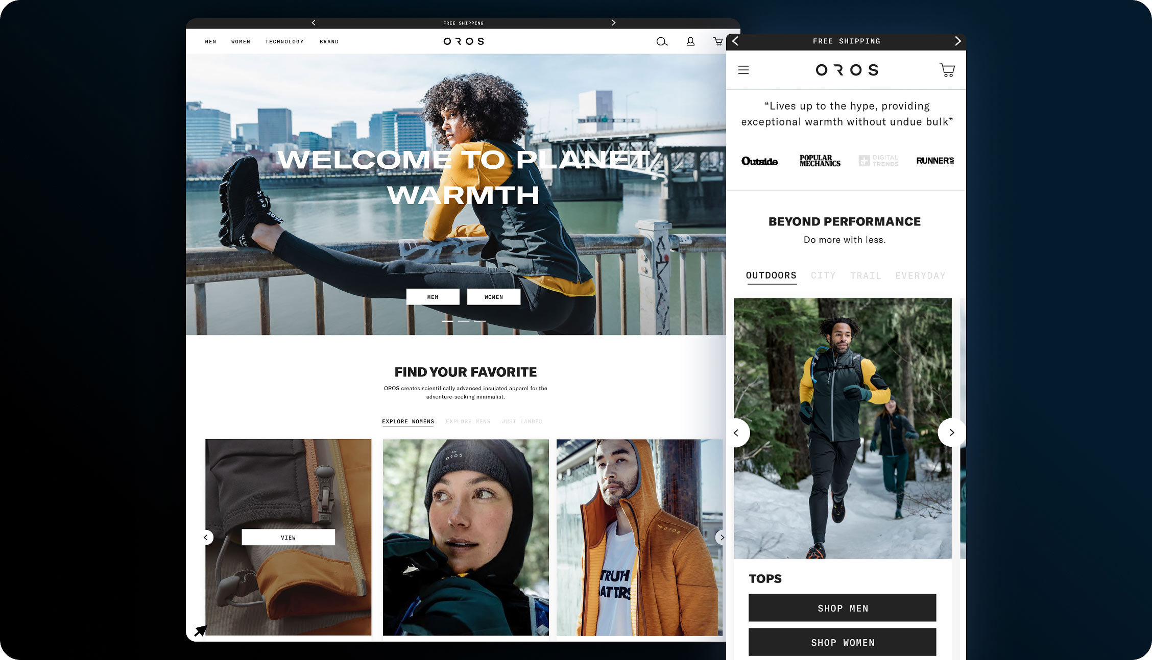
On the homepage, we updated the design to immediately grab first-time visitors’ attention and clearly explain OROS’ value proposition.
Exceptional social proof and press was leveraged to validate their “otherworldly” claims, and navigation was simplified to make it dead simple for the customer to get to the right product faster.

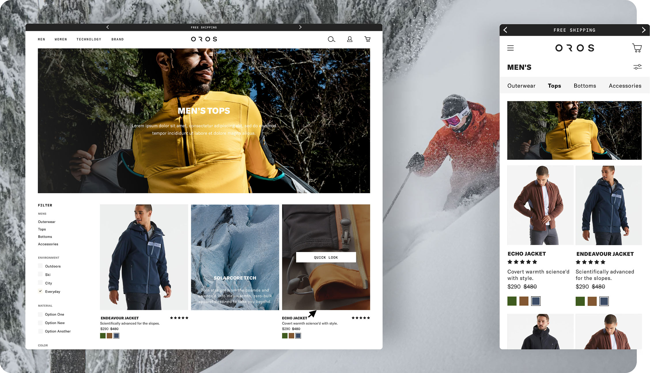
Next, we focused on the collections pages where we reminded customers of the value propositions of the OROS products and implemented simple filtering.

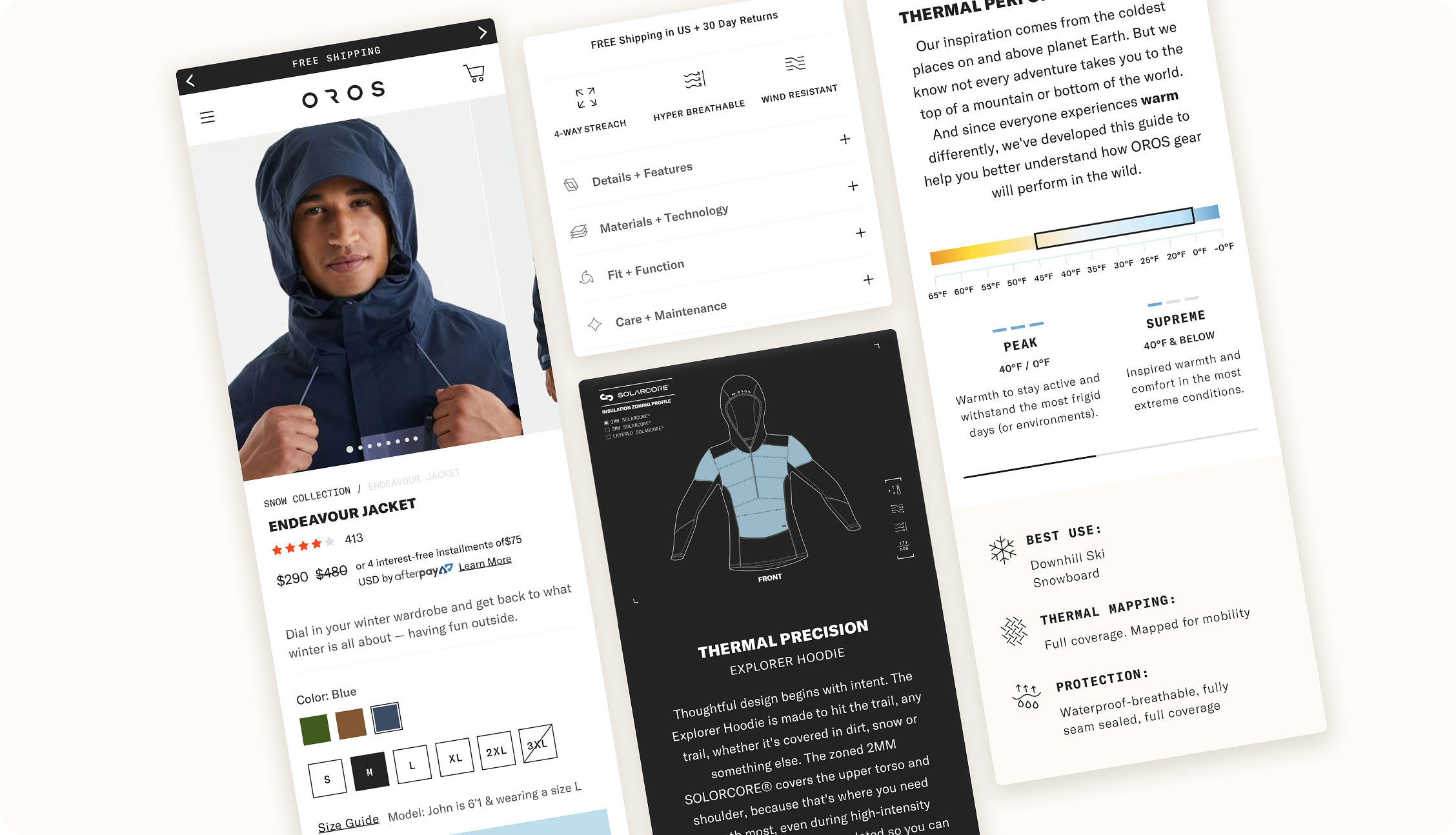
Finally, on the product page the design centered around visual story-telling of what makes OROS different from the competition (to sell customers emotionally) and answering all logical questions and perceived risks of the product.
Summary of Improved Stats
Overall, the redesign and relaunch of the OROS website on Shopify plus pushed the brand to record Q4 sales with a 60+% increase in holiday sales from the previous year.

“Our experience with BlueStout has been amazing, and exceeds any relationship we’ve had with previous web development partners. Their team is extremely responsive, collaborative, and goes above and beyond to bring our vision to life in a quick and efficient manner. Throughout working with them we’ve continued to improve our stores conversion rate and AOV, and we’re constantly getting feedback to ensure these metrics continue to grow.”
Michael Markesbery
www.orosapparel.com


