
Answer questions EARLY for the best conversions.
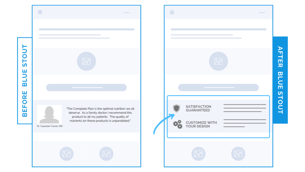
In a recent test, we got creative with content and swapped out a doctor quote for a benefits section on a client’s product page on mobile – boosting conversions by 7.5%.
While the quote from the doctor was validating, it didn’t offer any user benefits, add to the brand story, or provide details to convince the potential customer arriving on this page WHY the product is great and worthy of approval.
The stakes are high for product detail pages, especially when it comes to mobile. This is your brand’s ultimate sales pitch! You can’t afford to not be strategic.
Here’s Why it Worked
Removing this important but distracting quote from this major section on mobile keeps visitors focused on the product and encourages a further scroll to get more information they need.
What Most Brands Do Wrong
Most brands, especially those in CPG, think you have to share every validating element to satisfy the customer right away, or you’ll lose ‘em. This is not the case.
We’re all about strategic UX placement specific to the medium instead. The more clarity you can provide to back up your product FIRST, the better.
Keep the top of your product page focused, light, and informational. Add reviews further down on mobile & test.
Try it out:
Move up important elements on mobile to help the users understand what they’re getting. Test, review, repeat.