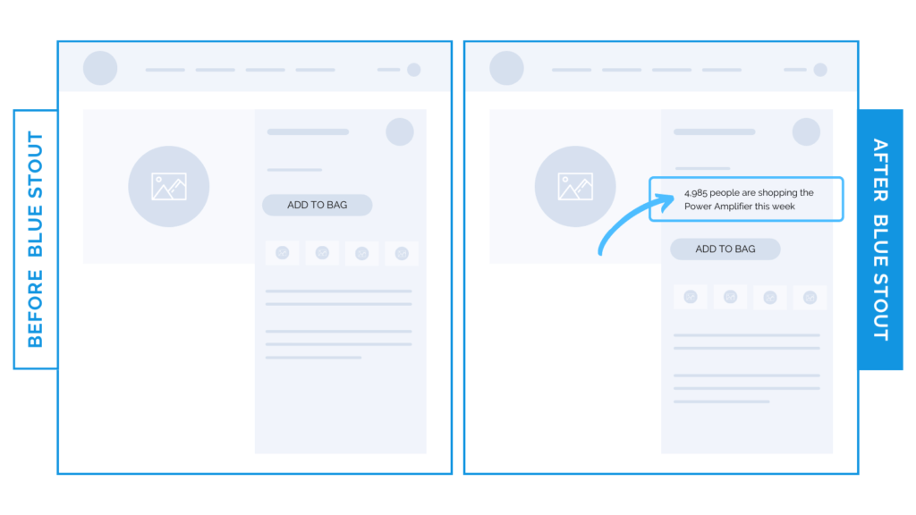
QUICK TIP: Use visitor data for a 42% uplift in conversions.
In a recent test, we included a line of text before the ATC button showing how many visitors viewed our client’s high-end electronic product. It increased conversions by a whopping 42%.
The lesson? Creating a sense of urgency on your product page can add major sales to your store.

Here’s Why it Worked
When you add REAL numbers of people shopping for your product, especially if it’s on the pricey side, it can be a golden ticket for conversions.
Now, keep in mind that this language would likely not work well on any other page but the product page, right next to the add-to-cart button.
When placed with intention, this sense of urgency makes your customer perceive its popularity, leading to a confident purchase.
Nobody likes missing out on what’s popular.
What Most Brands Do Wrong
If you have a great product and numbers that speak for themselves, don’t be afraid to use them in strategic ways. Most brands overlook the importance of thinking outside the box on the product page.
Get creative and use your visitor numbers to prove your popularity to customers.
Keep your message to the point & succinct for the best results.
Try it out:
Have customer data about purchases or visitors? We hope so! Add this to your site for a few days on your most popular product page. Test, review, repeat.


