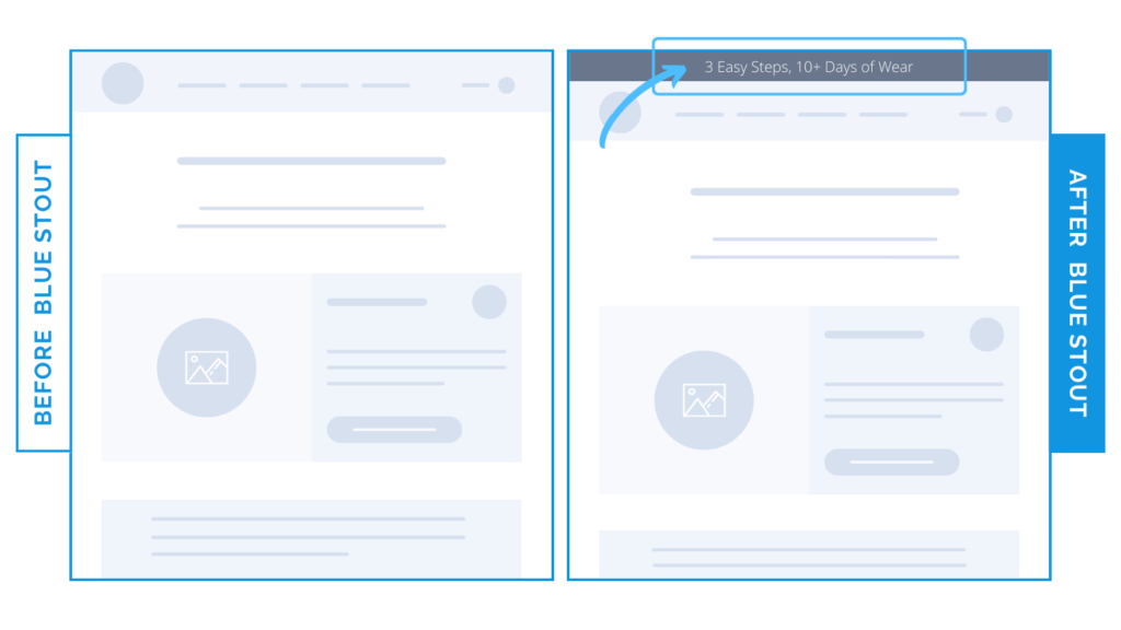
How a simple banner can improve conversions by 19%
In a recent test, we added a promo banner above the navigation and it boosted conversions by 18.8%.
So simple, so effective. To help combat fast bounces, quickly and succinctly communicate an element of social proof or a brand differentiator to grab your customer’s attention.

Here’s Why it Worked
Adding KEY brand points above navigation right when a customer lands on the page keeps the intrigue high and accessible, inspiring them to scroll & learn more about top products.
What Most Brands Do Wrong
Most brands don’t utilize their notification banners correctly. Or, they overcomplicate with too much text or other offers that don’t speak to the brand’s values.
Make yours well-designed and SIMPLE with convincing copy in line with brand values.
Try it out:
Have major selling points for your product? Add it to a banner above your navigation to help visitors understand what they’re getting. Test, review, repeat.


