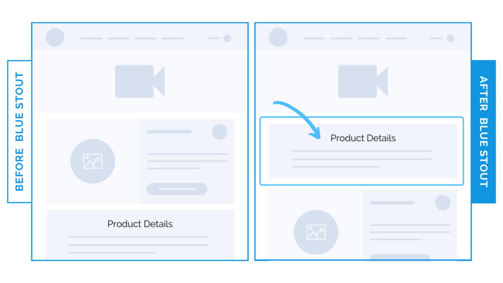
11% lift in conversions with product details higher on page
In a recent test, we placed product copy higher on the page, helping customers understand benefits sooner. This shift generated a 10.9% uplift in conversion rate.
Here’s Why it Worked
In the fast-paced, mobile-heavy world of e-commerce, visitors are scanning for the information they need.
This fashion brand sells accessories, with a video showcasing the product above-the-fold.
We wanted to keep product information top of mind and easy to see to encourage scroll depth.
So, we moved it right below the video.

With product copy higher, visitors can easily verify they’re on the right page and scan for the information they need.
Overall, conversions increased because these quick statements deliver key messages above the fold, leading to more scrolls and fewer bounces.
What Most Brands Do Wrong
Your job in this top section of the product detail page is to escort the ready-to-buy prospect to the cart.
Your copy, imagery, and story should be easy to spot right away.
Include a believable promise that your product will fulfill their needs before they scroll the page. Most brands wait too long to do this, and lose their target audience in the noise.
Test it out: Try moving your product benefit copy up. Make sure it’s intriguing and clear to increase motivation to buy.


