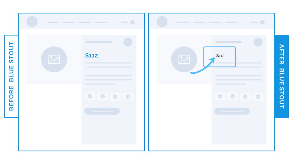
10.4% lift in conversions for an apparel brand by reducing price font size on product page
In a recent test, we decreased the font size of the price displayed on a product page and changed the color to black. This new pricing presentation elevated conversions by 10.4%.
Minimize aversions to cost by shifting their attention.

Here’s Why it Worked
When we reduced the price’s font size:
- The price became consistent with the rest of the content on the page.
- Then, the customer’s focus moved to product benefits.
Overall, this simple size reduction made the product appear more affordable.
With a smaller font, customers can focus on the product’s potential to improve their lives,
not the price.
What Most Brands Do Wrong
Most brands don’t consider the impact of font size on purchases.
Don’t be like them.
Instead, keep customers focused on the benefits. Not the cost.
Test it out
How’s your pricing presentation? Play down the price and elevate benefits by reducing type size and changing color to neutral black.


