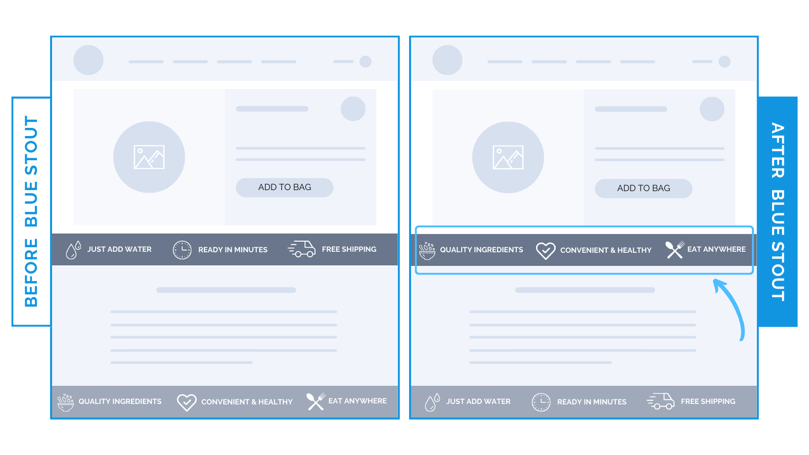
Product benefit icons lift conversions for outdoor CPG brand by 7.6%
Use product-specific benefits over brand benefits for an early emotional connection.
One of our CPG brands caters to outdoor enthusiasts.
Their best-selling product had two different icon bars featured on the product detail page:
- Brand-specific benefits: “Just Add Water,” “Free Shipping”, etc.
- Product-specific benefits: “Quality Ingredients”, “Convenient and Healthy”, etc.

Before, the general brand benefits were featured prominently at the top of the page.
To establish an early emotional connection, we switched the order of the icons to product-specific at the top of the page, lifting conversions on mobile for their best-seller by 7.6%.
Here’s Why it Worked
On the product page, focus your marketing efforts on the benefits of what your product actually delivers.
Buyers aren’t looking for general incentives there.
Specific attributes presented HIGH on the page leave room for an emotional connection to form, better product understanding, and impulse purchases.
Only after product details should you introduce brand selling points on the product page.
What Most Brands Do Wrong
Too many brands present general perks (like Free Shipping or Guarantees) where product benefits ought to be.
They distract from the point of the page, which is to paint a picture of the improved life your customer could have with your product.
Highlight what your product delivers early, especially on mobile where space is limited, for informed purchase decisions.
Steps to Try Today
Are you a CPG brand looking to optimize your product detail pages?
Make sure product benefits are high and visible, and general benefits are positioned lower.


