
How To Turn Order Confirmation Emails Into A Steady Sales Machine (Plus 5 Design Templates to Copy)
41% of marketers use email as their primary ecommerce conversion channel. (source)
That means they are sending an email designed in such a way that it compels the recipient to engage, click through a link and make a purchase.
Email can be a perfect medium to convert one-time buyers into repeat customers and some ecommerce brands, like Huckberry, even have an email-driven business model (more on that below).
But how can you turn boring transaction emails into ones with the power to convert?
In this article, I’m going to show you
- How to infuse personality into your own transactional emails
- How brands like Zulily, Harry’s and World Kitchen use their transactional emails to increase conversions
- The exact tools you need to start beefing up your own transactional email design and strategy
Let’s kick it off with talking about getting personal.
Make Your Emails More Personal to Convert Better
The best brands convert with email by optimizing them with a little personality.
One of the most well-known (and early) examples comes from Derek Sivers, founder of CD Baby. He created a shipping confirmation email that quickly went viral and netted him thousands of new customers:
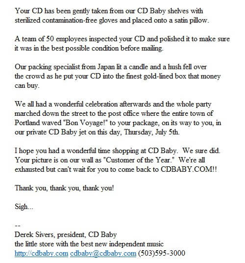

It’s not difficult to see why this email converted well: it’s personal, informative, and pretty funny.
The funny thing is: he did this before personality was really even a “thing” in ecommerce.
While most confirmations are made up of short, business-like sentences, Sivers’ email stands out as a welcome, transparent and friendly message which quickly translated into solidifying his branding.
His success story links well with what Simon Schmid calls “the personality layer”, or little details that trigger an emotional response. In this case, Sivers used humor to create positivity around both his company and his product.
Translating a positive feeling to customers builds trust and trust turns into purchases.
Sivers understood that there were real people on the other end of those emails, so he designed them not only to communicate transactional information, but also convert those people into loyal customers.
The overall lesson of today’s post is that every email you send, no matter how small, is an opportunity to provide connection for potential, current, or returning customers.
Here’s how to inject a little personality into your own emails:
Use Photos of Real People
Case studies show that photos of real people can improve conversion rates up to 50% or more over stock images.
We’ve known for a while now that stock photos are not a good solution to line up with the authenticity standard that most brands now strive toward. Once Buzzfeed makes an article like “50 Completely Unexplainable Stock Photos No One Will Ever Use”, you know they’re not a good solution for your business.
So try to be as authentic as possible and upgrade the imagery you use in transactional emails.
Use images that look more “real” and can allow your customer to see themselves in the photo, too.
Here’s a good example of a strong image in a transactional email from a digitally native vertical brand we’re watching in the cosmetics space, Glossier:
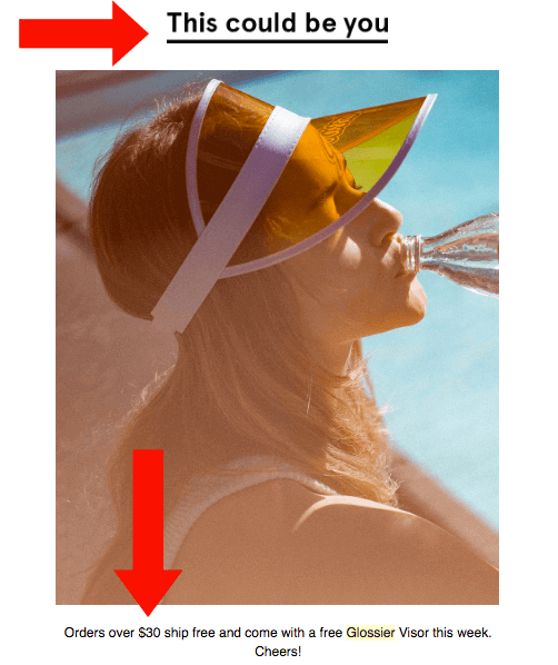

Not only have they chosen a great image for this email, but the tagline “This could be you” is 100% straightforward.
They put the recipient in the place of the model with that tagline.
Now that the context is set, they set up the call-to-action (CTA). You can get that great visor for free if you order over $30! (For their products, this price point probably equals to purchasing 2 small items).
Another brand that understands how to use imagery well in their emails is a brand we’ve written about before: Chubbies Shorts.
They use images of their actual customers and leverage what is known as user generated content (UGC).
Once you sign up to receive their newsletter, they send you a welcome email full of UGC (i.e. pictures their customers have sent in). They’re pretty funny pictures of guys in their shorts:
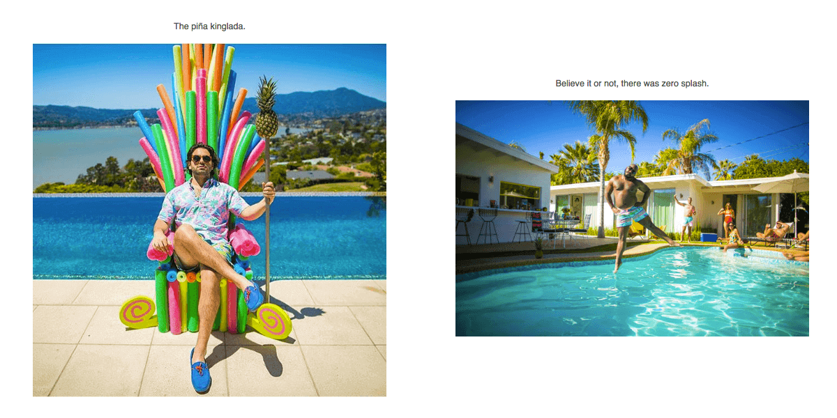

Or doing weird things while wearing Chubbies:


The right imagery helps customers relate to your business’ unique value proposition (UVP) and gives your customers confidence that your brand is trustworthy.
Present Information in a Clear Layout & Hierarchy that Makes Sense
As we often write about, creating a good ecommerce website user experience is crucial to conversions.
But if you think about it: shouldn’t everything you’re sending your customer be designed to optimize their experience?
Your transactional emails should be held to the same standard.
Ideally, your customers will not only read your email, but also engage with your company further by clicking a link that leads them somewhere else. Good user experience will help your customers choose the right path for engagement, whether it’s a link to your Instagram, a navigation section that directs to another landing page, or product images that promote things you think they are likely to buy (related products to previous purchases, etc.).

Here’s an example of a transaction email with a clear layout and well-designed information hierarchy.
What Huckberry does well here is they keep their user engaged by breaking the email up into sections which feature very different products. This keeps the user interested and engaged as they scroll down further to see what’s next. Toward the bottom of the email, they feature other popular content like their “Distractions” section which are links to interesting content on other sites.
You don’t have to create as many sections as Huckberry does in your email design to be effective and convert more.
To establish the best layout and information hierarchy make sure:
- The information is clearly presented and easy to click
- The order guides the reader through the content and encourages them to scroll more and click on links
- The experience is valuable (don’t create an email that is a waste of time!)
Optimize Your Design For Mobile
One of the most important usability factors to consider is how your emails are appearing on mobile.
This report shows that in April of 2016, mobile email opens soared to 56% over desktop and webmail.
But if your emails aren’t mobile-friendly, you could potentially lose business. 61% of users will go to the competition if they can’t access the information they need on their mobile devices – and that includes emails, as 33% of all emails are opened on iPhones alone.
All of your emails should be optimized for mobile, including:
- Order confirmation emails
- Shipping confirmation emails
- Account confirmation emails
- Opt-in emails
- Shopping cart abandonment emails
- Customer feedback emails
That’s quite a few email designs to optimize, but that’s where the right tools come into play. Here are two tools that other companies have used successfully to create transactional emails that convert.
SendGrid
SendGrid is a marketing email service provider that specifically focuses on creating great transactional emails.
Zulily, for example, uses SendGrid for their fun and “wild” email confirmations:
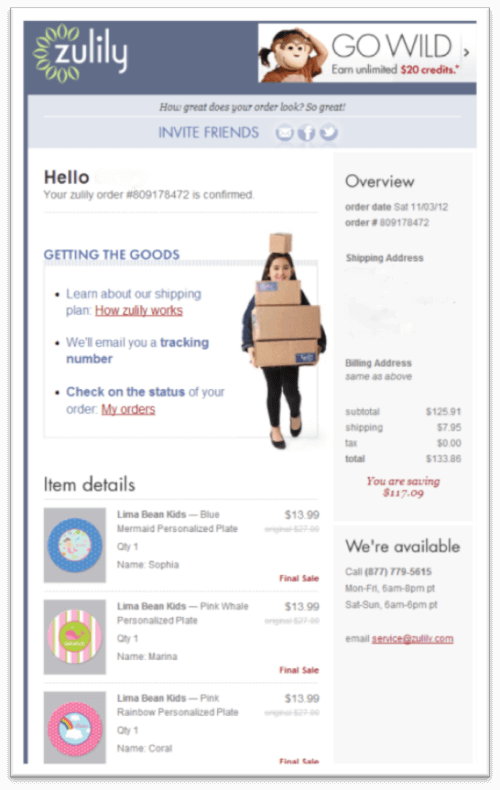

This email succeeds in being both a confirmation and a marketing email. It includes all the relevant information about the order, includes the best imagery that feels authentic to the brand, displays their social profiles so customers can further engage and squashes any doubt about the purchase by providing links to tracking info and an email for customer questions.
Overall, it does a GREAT job of establishing trust which (if you remember) equals more conversions.
Harry’s, another digitally native vertical brand (DNVB) specializing in men’s grooming products, also builds trust by being thorough and answering all of their customer’s potential questions:
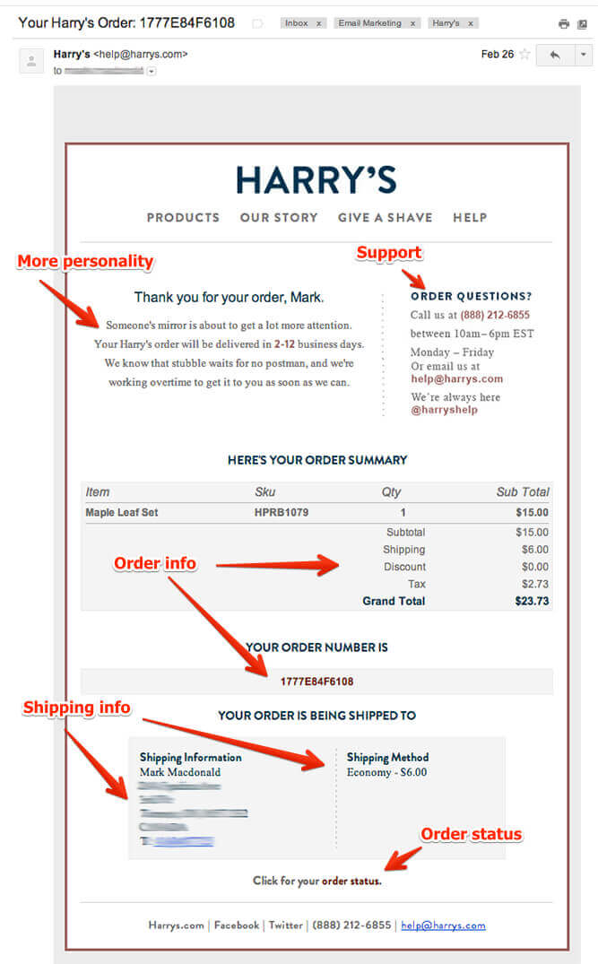

Not only is the design sleek and straightforward, but they also include a mini-navigation feature that points customers back to their website. There’s also a direct link for customers needing to check the status of their order.
They’ve infused a bit of personality (similar to Sivers’ previous example) and their emails are optimized for mobile view.
Another DNVB, MeUndies, uses SendGrid for their shipping confirmation emails:
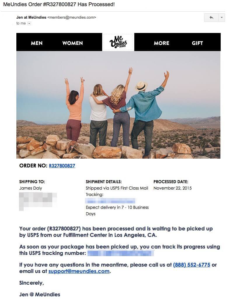

They use a fairly familiar template, but it’s well designed, incorporates a clear navigation menu, uses a positive, people-centric photo, and provides all the needed information in a clear but natural language style.
This proves you don’t have to go crazy with your email design and overwhelm your users. The MeUndies confirmation email is simple, yet effective in establishing customer confidence.
Bronto
Bronto is another email marketing platform. Their service focuses mainly on ecommerce marketing, like shopping cart abandonment emails and post-purchase campaigns.
This example from World Kitchen is a bit different because it’s an abandoned cart email, but let’s look at the effect it had on conversions:
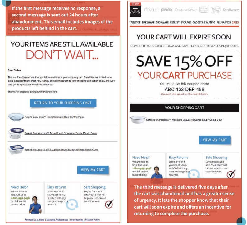

By creating a message to let users know what items they’ve left in their cart (abandoned), World Kitchen had a 286% increase in their email open rate and an additional 156% increase in click rates.
In fact, their cart recovery campaign was so effective that it resulted in a 650% increase in their overall conversion rates!
How to Focus on Creating the Best Email Experience
Here are some rules to keep in mind when optimizing your emails for the best user experience (UX):
- Use personality and design in your branding that evokes positive emotions (imagery & copy)
- Make sure important information in clear and easily accessible
- Focus on user experience that encourages engagement through various channels
- Use a mobile-friendly design that can be accessed from mobile devices (smartphones & tablets)
Remember that you don’t have to navigate these strategies alone. Email marketing tools like SendGrid and Bronto can help you create effective transaction emails that will improve your conversion rates as they have with the examples cited above.
[content_upgrade]
 DOWNLOAD 5 ORDER CONFIRMATION EMAIL TEMPLATE DESIGNS THAT CONVERT
This PDF will give you 5 email template design inspirations for you to copy that are proven to convert for some of the industry’s top-performing brands.
Click here to download the PDF now >
[/content_upgrade]
*This article was co-written by our Marketing Director, Jenna.