
4 wins from Unclaimed Baggage’s redesign.
The 4 design changes that drove a 19% purchase increase for Unclaimed Baggage.
Unclaimed Baggage had LOTS of traffic from press, but not enough conversions.
We set out with the goal of helping visitors understand the breadth and depth of their catalog to get them to the right product faster and buying.
Here’s how we did it.
HOMEPAGE
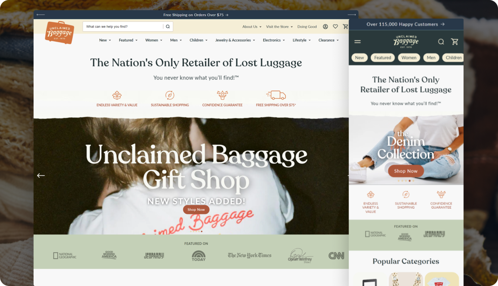
#1: Aligned brand messaging with the customer’s desires
On the homepage, it was clear right away what Unclaimed Baggage offers.
But it wasn’t clear what the value was to the buyer.
Why should they care?
To address this gap, we integrated social proof and ramped up emotional intrigue with story.
Then, we added clear unique selling propositions (USPs) to show visitors the value of their purchase.
Here’s how:
- Mobile-first layout: Before, extensive scrolling was required to understand the brand story. Streamline for mobile to immediately captivate, with clear sections.
- Moved shoppable content higher: Shift call-to-action button (ie: “Shop Collections”) higher up the page to inspire visitors to shop early.
- Added a social proof banner: Use customer reviews in a quick snippet of data. Maximize views in a top-banner with, “Over 115,000 Happy Customers.”
- Told an impactful story: Before, their charity story was split into 2 sections. Combine into one to tell the story with ease and maximum impact.
Lesson: Convert curiosity-driven visitors with brand story, social proof, clear value propositions, and a mobile-first layout.
COLLECTIONS PAGE
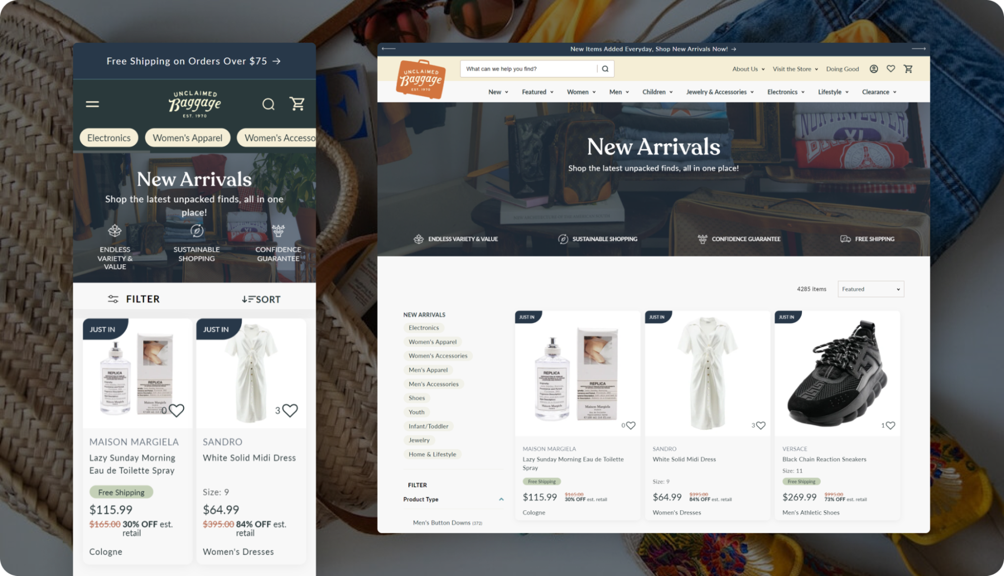
#2: Used visitor data to drive urgency and show more of the catalog
Their collection pages see a ton of traffic through social media ads and press.
For many visitors, it’s their very first experience with the brand.
Yet, the pages lacked urgency for their unique offerings, and didn’t reference any alternative products.
Here’s what we did:
- Shared wishlist data: Show number of wishlists the item is in, shout out the great discounts, and reveal current pricing as compared to retail for just-added products.
- Encouraged exploration: Once a buyer reaches the end of the page, keep them engaged and shopping with a nice visual entry for more browsing.
- Added Unique Value Propositions: Tell the product story and share benefits per-collection (jewelry, clothing, electronics) for those who may be coming into the site for the first time.
Lesson: Engage first-time visitors with compelling value and sense of urgency.
PRODUCT PAGE
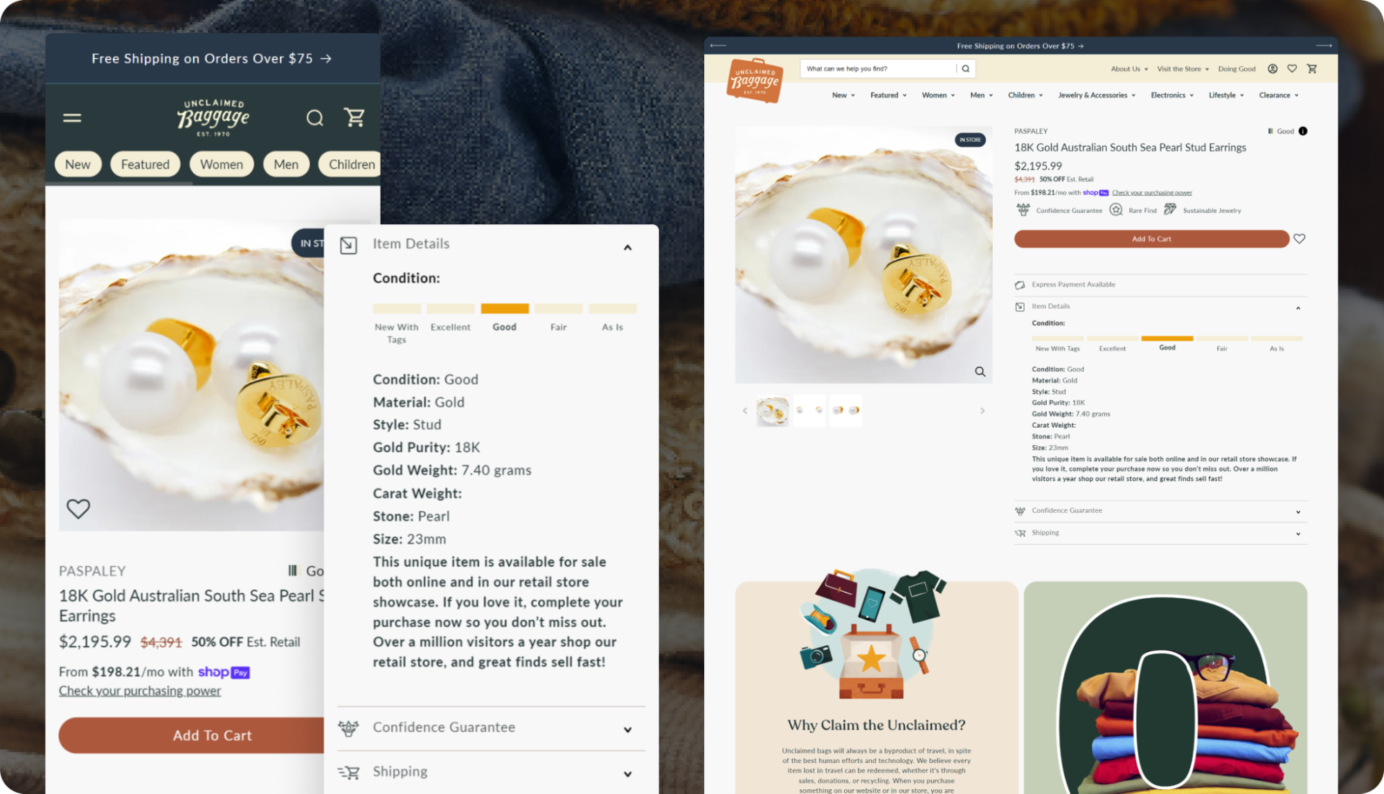
#3: Answered questions about product, process, and risk
By the time they reach the product page, customers will question the product, process, and the perceived risk of a purchase.
For Unclaimed Baggage, we needed to raise first-time buyers’ confidence to strengthen emotional connection with the brand.
Here’s what we did:
- Added scannable testimonials: Highlight social proof with short customer reviews.
- Improved access to product info: Move product copy higher and add badges (“Guaranteed Authentic”) for luxury goods.
- Place reassurances near ATC: Add risk reduction elements like returns and quality guarantees near the add-to-cart button to alleviate anxieties.
Lesson: Improve checkout completion by combining emotional storytelling with clear, logical reassurances.
MOBILE CART PAGE
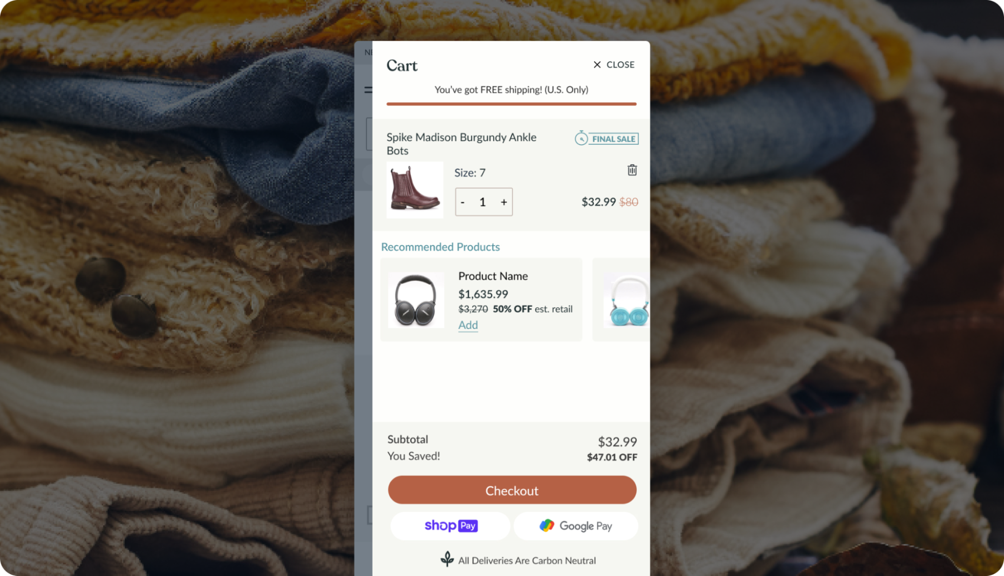
#4: Reduced perceived risk in the cart to increase purchases
Mobile website visitors account for 77% of sessions and 67% of their revenue.
But, the cart was cluttered and content-heavy, causing friction when completing a purchase.
They needed a simpler layout to build trust and cater to impulse buyers.
Here’s what we did:
- Built in upsells: Integrate above the page fold so customers can add products quickly.
- Simplified cart: Remove clutter like extra subtotals and zeroed prices for a smoother checkout.
- Highlighted savings: Move estimated savings to a prominent spot high up on mobile. Before, it was well below page fold.
- Added confidence-boosting value icons: Before, nothing addressed their perceived risk of purchase. Mention returns, free shipping, etc. to seal the deal.
Lesson: Reduce perceived risk with a streamlined cart on mobile.
After their successful redesign, UB transitioned into continued A/B testing and optimization to keep the momentum going.
Speaking of momentum: curious how this could work for your brand? Give us a shout.