
The 3 major changes that led to a 43% conversion bump in Shopify Plus migration

In Mephisto’s transition from Magento to Shopify Plus, we focused on three core areas to capture and convert the US market.
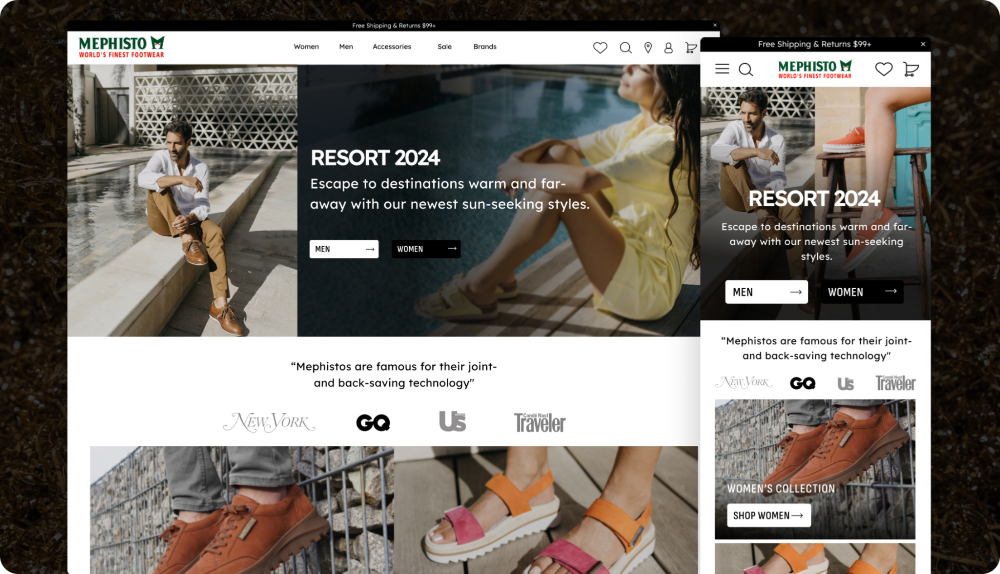
HOMEPAGE
#1: Impress with brand story & best sellers
On the homepage, it was clear right away what Mephisto does. But it wasn’t clear what the value was to the buyer. Why should they care? To address this gap, we added a brand story about Mephisto’s legacy with displays of their top products to boost visitor engagement and trust.
Here’s how:
- Brand intro section: Highlighted Mephisto’s unmatched quality and heritage to immediately captivate visitors and make a great first impression.
- Customer reviews: Added reviews to build credibility and trust, essential for converting browsers into buyers.
- Best sellers in place of new arrivals: Showcased popular items to guide new customers using social proof, simplifying their shopping experience.
Lesson: Make a memorable first impression. State your clear value proposition to buyers, then validate that proposition immediately with social proof (press, testimonials, etc).
MOBILE
#2: Streamline for social savvy shoppers
Mephisto’s strong social media presence drove a lot of mobile traffic. But, the site was cluttered and content-heavy, causing unnecessary friction. They needed a simpler, mobile-friendly site that builds trust and caters to impulse buyers.
Here’s what we did:
- Curated IG images grid: Integrated a homepage grid featuring Instagram posts that link directly to products, making it easy for social followers to shop.
- Pop-up cart: Added a confirmation pop-up for reassurance that items were placed in the cart, enhancing customer experience.
- Simplified cart: Streamlined cart page by removing clutter like extra subtotals and zeroed prices for a smoother checkout.
- Mobile-specific icons: Addressed the lack of mobile visual cues by adding product benefit icons exclusively for mobile users, reducing perceived risk.
Lesson: Your goal on mobile is to lead customers to the correct product for them. If the layout is busy, they’ll bounce. Streamline content and fill space wisely.
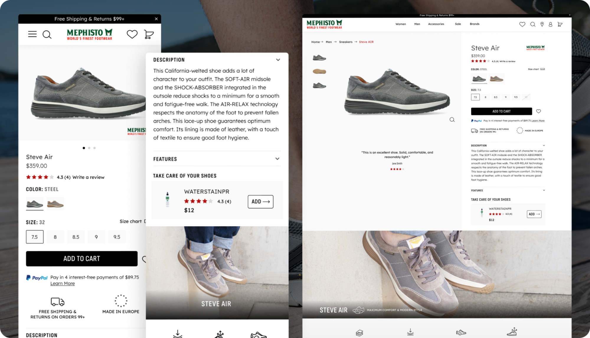
PRODUCT PAGES
#3: Answer the 3 P’s: product, process, perceived risk
Emotions drive purchases, logic justifies them.
By the time they reach the product page, customers will question your product, process, and the perceived risk of a purchase. For Mephisto, we need to raise first-time buyers’ confidence.
Here’s what we did:
- Improved imagery: Before, cold browsers were forced to scroll for imagery. We positioned a carousel of high-quality images at the top to pique interest.
- Scannable benefits: Made unique benefits easily scannable, lifting them from heavy copy to highlight emotional and practical value.
- Risk reduction elements: Placed reassurances like returns and quality guarantees near the ATC button to alleviate anxieties.
Lesson: Dismantle any barriers to purchase. Share your product, explain the process, and reduce perceived risks for a high-converting page.
Key Stats:
- Magento to Shopify Plus Migration
- ARPU: Up 15%
- CVR: Up 43%
- Gross Purchase Revenue: Up 59%
- 40% decrease in Total Cost Of Ownership
Maintenance and service costs to keep Mephisto’s storefront up and running was unsustainable with Magento (to the tune of $100k/year). Switching to Shopify brought a 40% reduction in Total Cost of Ownership, allowing the team to reinvest into a better customer experience, product, and brand.
Steps to Try Today
- On homepage, impress new visitors with your story & best sellers.
- On mobile, streamline and simplify for mobile savvy shoppers.
- On product pages, answer the 3 P’s for a high-converting page.
Then, test!

Blue Stout went above and beyond in bringing our vision to life with a seamless migration to a new website platform. Their outstanding responsiveness and collaborative approach made the process effortless, and they consistently exceeded our expectations in every aspect of the project.
Logan Bird | Vice President
Mephiso